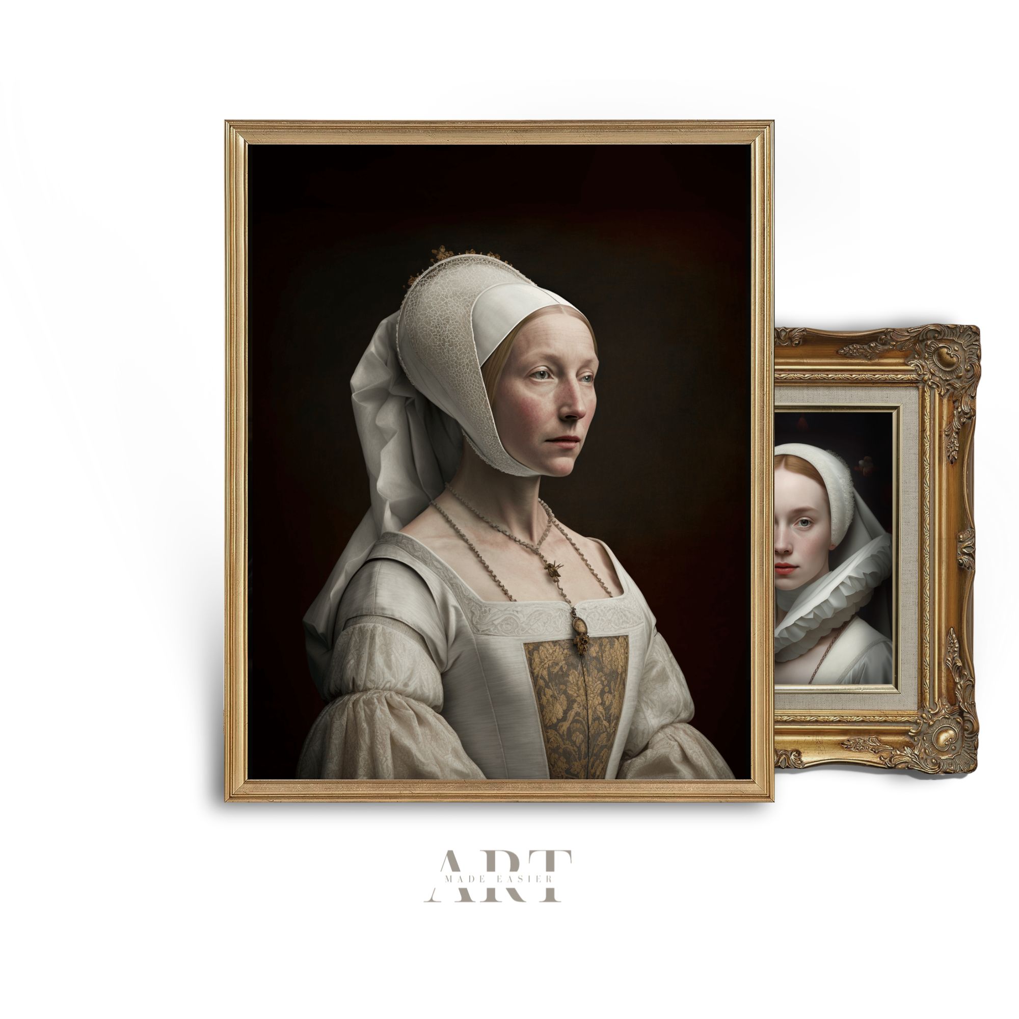
The Shocking History Behind “Emerald Green” Paint
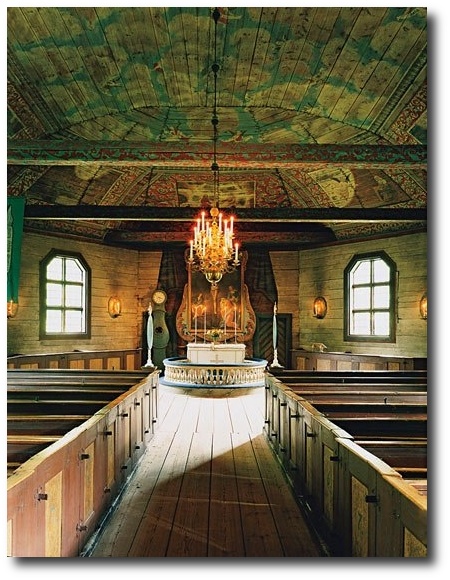 Seglora Church -Relocated From Western Sweden
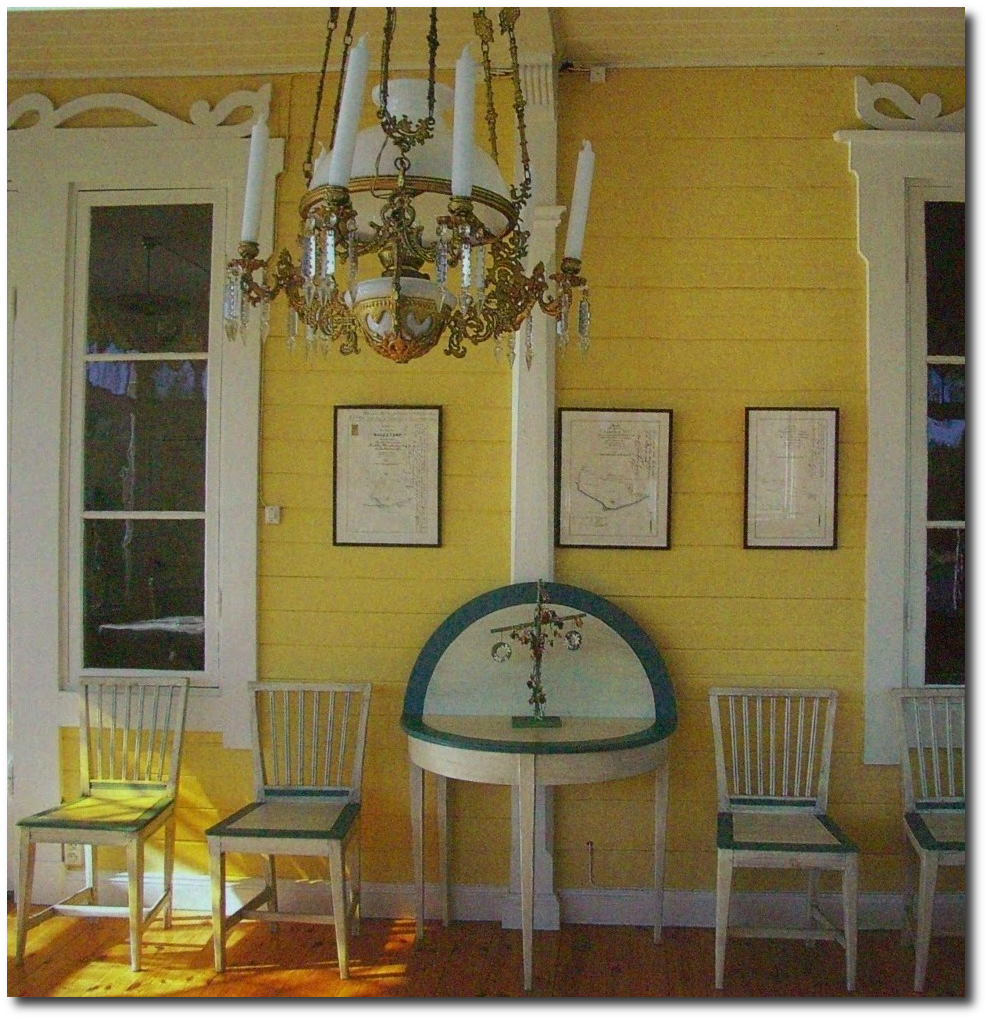
*Disclaimer*-The pictures contained in this post are to illustrate the BEAUTY of yellow and green paint used in 18th century interiors. We have no knowledge what so ever of the paint used in the rooms or furniture. Emerald Green and Yellow colors are absolutely stunning colors to decorate a home around.
The History Behind Emerald Green
Emerald Green, is the color of the year for 2013, yet what many people don’t know is the color “Emerald Green” at one time, killed people.
This brilliant blue-green color was extremely popular in the mid- 1800s, because emerald green paint was cheap to manufacture, and it had such a great depth of color.
In 1814 in Schweinfurt, Germany, two men named Russ and Sattler tried to improve on Scheele’s green, and made a paint made with copper arsenite. The result was a highly toxic pigment called “emerald green”. This paint was made with arsenic and verdigris and the bright green color became an instant hit within the design community.
The vibrant color was not only used as artist paint, but as well as household paint amongst other things. Many people at that time didn’t know the paint was made with poisonous arsonic, and who is to blame them when we don’t know ourselves what kind of unhealthy additives are contained in our foods. As soon as the color was produced, it was picked up by many companies far and wide. The emerald green dye wasn’t only used for paint, but wallpaper and as liquid dyes.
In particular, in damp rooms where mold grew, the arsonic in the wallpaper paste would be turned into a toxic gas which would be deadly for anyone living in the room. By 1830, wallpaper production had risen to 1 million rolls a year in the UK, and by 30 million in 1870. Tests later revealed that four out of five wallpapers contained arsenic.
Leopold Gmelin (1788-1853), a German chemist, suspected in 1815 that wallpaper could poison the atmosphere, that he made several efforts to warn the people in his day to strip their rooms of the paper, and advocated banning Scheele’s green. He noticed that the substance gave off a garlic-like odor when the paper was slightly damp. Experiments at the end of the 19th century proved that arsenic pigments in damp or rotting wallpaper were lethal. If only they listened to Leopold Gmelin’s warnings!
The color “Emerald Green” became so popular and widely used in the cotton industry which used the chemical in pigments and dyes. It was also used by other industries such as glass manufactures as a de-colouriser, and in the production of leather tanning, soaps, lampshades, pharmaceuticals, agriculture for sheep dips, children’s toys, and candles.
Emerald green was also used to color cake decorations. In a few recorded instances, this dye was used to color icing, much like we do today. In one case, the industry making the dyes employed hundreds of young girls, who later died from chronic arsenic poisoning. At a banquet held by the Irish Regiment in London in the 1850’s, sugar leaves that were dyed with the Emerald Green, and used as table decorations. Many of the guests took the decorations home to give to their children to eat as a treat, whom later died. Another dinner in 1860, a chef produced a spectacular green sugar dessert, used Scheele’s green and later, three of the diners later died. If this is shocking, read this up on our modern day Aspartame. It has been proven that this popular sweetener used in coffee is toxic to your brain. In fact, they say that when aspartame is added to hot waters, exceeding 86 degrees F. the Aspartame converts to Formaldehyde, and then to Formic Acid, which damages the brain….. yet this substance isn’t pulled off the market.
Here is the sad part- Even though they knew all the scientific evidence of its highly toxic nature, production of emerald green paint was not banned until the 1960’s.
The History Cinnabar Red
One of the most difficult to use and costly pigments on the market. Cinnabar red is obtained from a mineral (the principle ore of mercury). The Romans obtained it from the Almaden mines in Spain, which is still today an important locational source of mercury. In order for it to be used as a pigment, the mineral had to be purified, then synthesized and then ground to the correct fineness. If improperly handled, it could turn black.
“Red’s hard. There are so many bad ones. They’re either too bordello or too raspberry nail polish. Or they’re so brown it’s like eating in a Southwestern theme restaurant, or so primary and overly frank that you want to ask, ‘Where do I put the presidential seal?’ I’m always looking for either a juicy pomegranate red, a Chinese lacquer red, or a really good oxblood. Because it’s such an important color, red needs nuance, subtlety, and depth, so in those rare instances that I break it out, I like to do it as a glaze, a lacquer, a fabric upholstery, or as red leather walls so there’s variation to the tone.” —CELERIE KEMBLE
See: The Top Shades Of Red Paint By The Most Famous Designers- The Painted Furniture
The History Behind Lead White
The poisonous qualities of Lead White have been noted since Ancient Rome, when the color was made in Rhodes (Greece ) where workers would put shavings of thin lead over a bowl filled with vinegar. The acid on the thin metal would cause a chemical reaction and leave a white deposit of lead carbonate which was then powdered, flattened and left to dry in the sun. The small amount of lead white still manufactured today follows this same formula.
The History Behind Naples Yellow
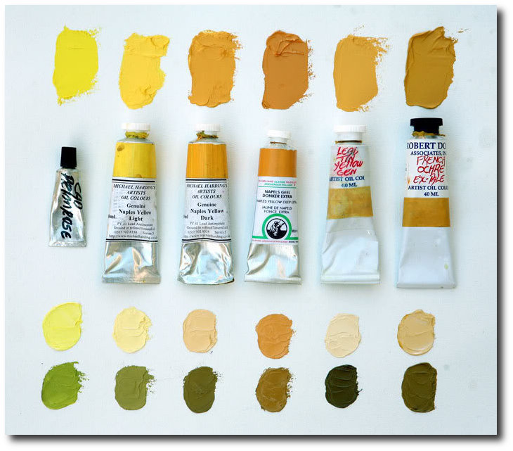
The 18th and 19th century saw the discovery and manufacture of synthetic pigments and dyes, which quickly replaced the traditional yellows made from arsenic, cow urine, and other substances. Naples Yellow is one of the oldest synthetic pigments. Naples yellow was essential to the landscape tradition because it has a quality of appearing to recede, making it perfect for capturing the essence of the sun. The genuine pigment is toxic, and it is believed that Vincent van Gogh’s mental illness and suicide was a result of his frequent use of true Naples yellow.
Have scientists finally discovered why Van Gogh’s paintings are turning brown? Mail Online
Hope For Today
Today we have a wide variety of organic paints available within reach. More than ever paint manufacturers are producing low VOC paints as people are looking at safer brands for their homes and health. Olympic Premium and Benjamin Moore Aura have shown to have lower VOC levels than other tested paints and did a good job in this hiding test, according to Consumer Reports. VOC levels have been toughened because VOCs are linked to respiratory illnesses and memory impairment.
The top paints in the Consumer Report Ratings had among the highest claimed VOC levels, including Behr Premium Plus Enamel low-luster and flat and Benjamin Moore Regal semigloss. They reveal that lowering the VOC levels can affect performance. “When you take out VOCs, you still need strong performance properties, but you have to find other ways to achieve them,” says Carl Minchew, product-development director at Benjamin Moore. Still, some no- and low-VOC paints did well in performance revealed in the Consumer Report Ratings. Posted in the Consumer Reports Magazine issue: March 2009
See: Green Dreams: Environmentally Friendly Restoration Furniture– The Painted Furniture
This information below comes from www.wetcanvas.com
“PY41 is genuine Naples Yellow (Lead Antimonate), tubed paints come in two yellow versions, Light and Dark (sometimes available in a “red” pigment as well). Available from Vasari, Michael Harding and Robert Doak. Genuine Naples offer a smooth blending mild tinting yellow that works in more delicate situations, like portraiture. Here is a comparison of both Michael Harding genuine Naples Yellows along with others similar colors, including OH’s PBr24 imitation Naples Yellow Extra. The lower mixes show the colors tinted with white above, and black below.”
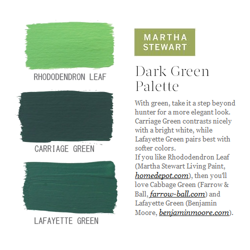
Green Paint Colors Featured On Martha Stewart
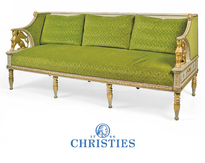
A Swedish Parcel Gilt and Gray Painted Sofa
The Brian Juhos Collection From a Domaine in Southern France- Christies
Picture Credit To Bellis Vintage Blog
The Elegance Of Scandinavian Old World Interiors
Michael Eastman Cuba Mercedes Living Room
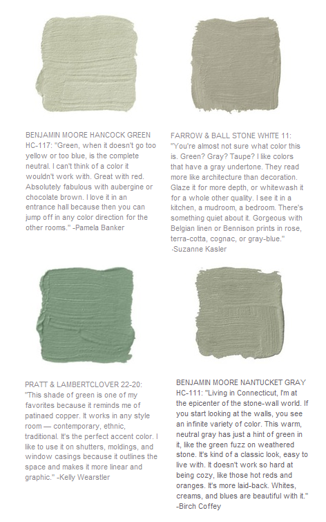
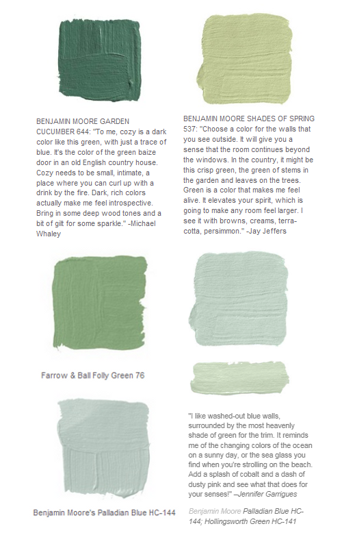 Green paint Colors Featured on House Beautiful
Goethe’s house who was one of the first color theorist of the 18th century.- Emerald Green Interiors Blog
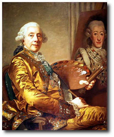
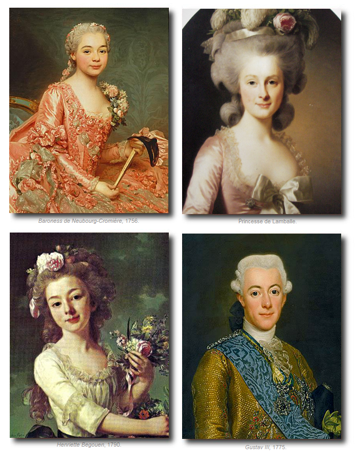
Alexander Roslin (July 15, 1718 – July 5, 1793) was a Swedish portrait painter. Many of the colors he used were Carbon Black, Burnt Sienna, Burnt Umber, Venetian Red, Yellow Ochre, Lead Tin Yellow, Naples Yellow, Vermilion, Lake, Lead White
Get reproduction paintings of Alexander Roslins work here
Alexander Roslins Paintings
Picture Credit To Bellis Vintage Blog
The Elegance Of Scandinavian Old World Interiors
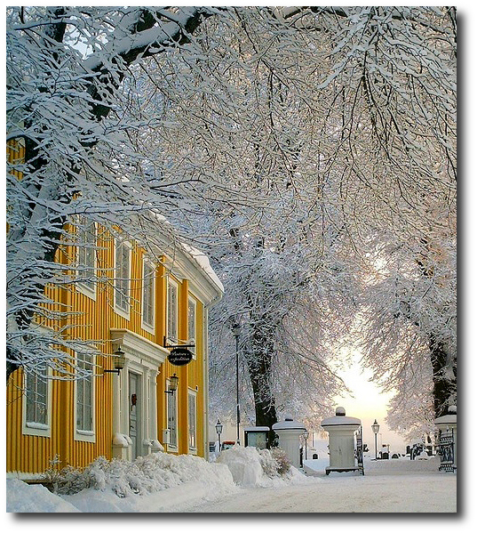
Norway, Sweden, Denmark- Winters In Scandinavia
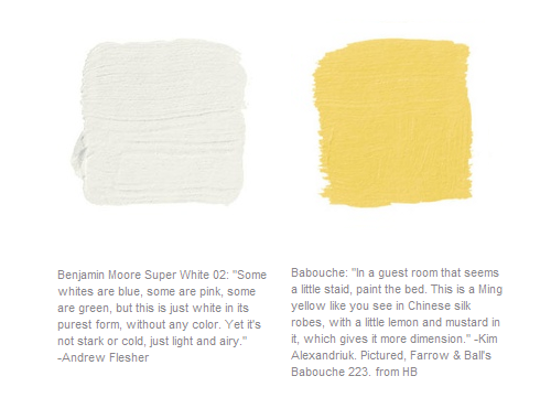
Paint Colors Featured in Home Beautiful Magazine
Paint Colors Featured in Home Beautiful Magazine-
Pictured, Super White Interior Room and Little Angel 318 both by Benjamin Moore.
Swedish Architecture Yellow-www.tumblr.com
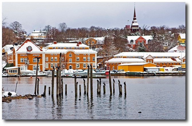
Mergansers on Djurgarden in the Swedish Maritime Administration in Stockholm
Picture Credit Flicker
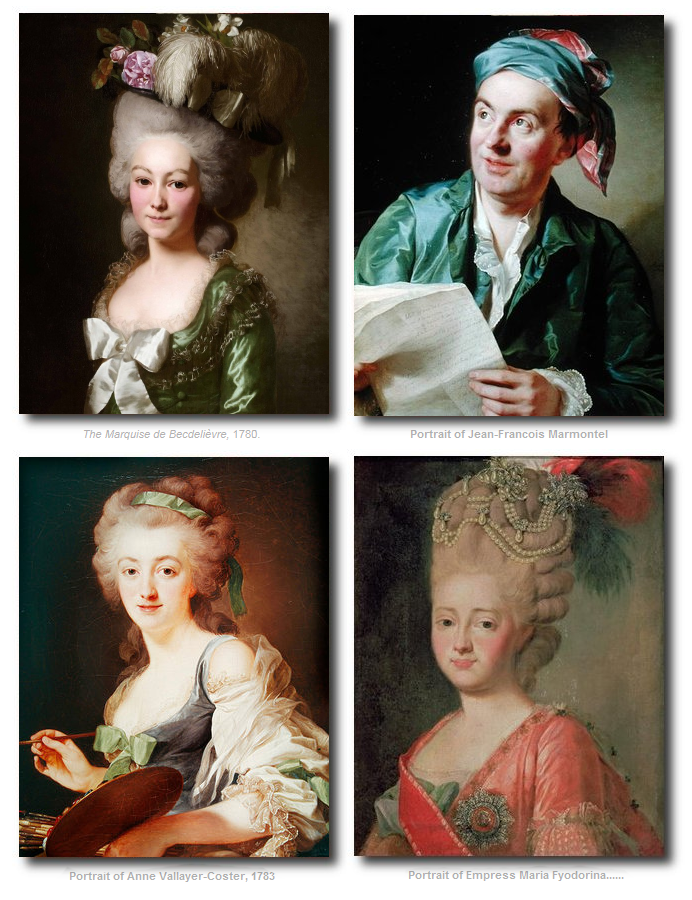


Quiet luxury inspired by 18th-century Sweden
Light - Patina - Heritage

Restoration Tools
- Matte Topcoat
- Pro Grade Brush Set
- Finishing Sealer In Matte
- Bronze Spray For Hardware
- Sticks To Everything Primer
- Dead Flat Varnish
- Stick To Everything - Matte Primer
- Transparent Aged Glaze
- Sticks To Everything Brown Primer
- Prima Transfers
- Dyke Brown Glaze
- Escutcheons
- Medallion Silicone Mold
- French Key Molds
- Portico Scroll
- Rusty Paint Finishes
Recent Posts
- 200 Swedish Antiques A Person Can Look For
- Rococo In The Nordic Countries
- For The Love Of Collecting Antiques – A Swedish Interior
- Gustavian Furniture – How to get the look – Ulla Kloster
- 3 Swedish Must Haves – Decorating A Home Around Swedish Antiques
- The Beautiful Wall Paintings Of von Echstedtska gården In Sweden
- 400 Professional Designers Picked Green As The New Color To Watch
- 5 Scandinavian Interior Design Tricks – Megan Slack
- 30 Gray Toned Paint Colors For Swedish Styled Interiors – Behr
- DIY Upper Kitchen Cabinets – Lindsay – White Buffalo Styling
- Bringing The Garden In For The Winter
- The Home Office – Why Not Make Yours Unique ?
- The Light And Airy Furniture Of Sweden
- Slipcovers Have Always Been Popular Through Time – Swedish Decorating
- The Couple Behind D. Larsson Interior and Antikhandel – Swedish Antiques
- 6 Colors You’ll Find In Every Scandinavian Home – Laura Barry
- 5 Decorating Mistakes Not To Make – By Gabrielle Savoie
- Designer Marshall Watson’s Scandinavian Newport Beach Home
- Designer Marshall Watson’s Scandinavian Summer House
- Swedish Inspired Kids Bedrooms
- 5 Kitchen Design Lessons You Can Learn from Scandinavian Interiors
- Jenny’s DIY Wide-Plank Plywood Flooring Studio Renovation
- Decor Mistakes All 20-Somethings Make
- Can I Stain Over Paint To Produce A Patina?
- Q&A With Swedish Designers Edie Van Breems and Rhonda Eleish
- How To Avoid Yellowed White Painted Furniture With General Finishes Products
- Colleen Martin, Founder of Swede Collection Tells Us Her Journey Of How She Began Reproducing Gustavian Furniture
- Expect To See More Warm Grays, Blues And Creams In Gustavian Decorating
- 8 Brands Of Gold Spray Paint Were Compared To Find The Best Color
- Essential Characteristics Of 18th Century Swedish Interiors
- Gustavian Style By Kristie Barnett
- 7 Places To Find Swedish Design For Toddlers
- Study Shows The Gustavian Period Has Defined All Tastes Through Time In Sweden
- Mix Old and New Like the Scandinavians Do- Chloe Taylor
- Swedish Furniture Design – What Makes The 1800’s So Obsessive
- 5 Pieces Of Wise Decorating Advice From Tricia Foley
- Impressive History Of Fine Swedish Table Linen
- Linen Has An Incredible History- Find Out Why……
- Life In 17th Century Norway & Sweden
- How To Select The Right Linen For Your Children’s Bedroom- Kids Room Decor Ideas
- Nordic Style Kids Bedroom Decor Ideas
- Decorator Tricia Foley’s Signature White Interiors
- 10 Tips From Interior Designer Furlow Gatewood
- Living In Norway- Norwegian Life In The 18th & 19th Centuries By Elisabeth Holte
- Investing In Mora Clocks – Expert Advice From Jo From Swedish Interior Design
- International Interior Decorating Magazines Worth Buying
- Swedish Council Of America Articles
- 5 Homes Decorated Around The Nordic Style
- Swedish Reproduction Furniture At Solgarden
- Behind The Rundale Palace in Latvia
- Nordic Style Historical Interior Decorating Books – Living Museums in Scandinavia
- Decorating Around Red- Historical Interior Design Ideas
- Florence De Dampierre Comments On Nordic Furniture In Sweden And Denmark
- 12 Designers Pick Their Favorite Paint Colors – House Beautiful
- 7 Of The Most Famous Swedish Furniture Designers And Decorators
- New Research Suggests Swedish Furniture In The 1700’s May Have Had Strong Colors
- Swedish Tripod Tilt-Top Candle Stand Tables
- Decorators Who Have Embraced The Nordic Style – 30+ Pictures
- A Look Behind Skogaholm Manor -18th century Swedish Decorating
- Decorating With Swedish Country Antiques- Darlene Peterson Buchanan
- 12 Interior Designers Pick Their Favorite Swedish Paint Colors
- 50+ Decorating Books Worth Looking At
- Swedish Decorating Inspirations In Yellow, Ivory And Beige- 50+ Pictures
- Decorating Around The Color Green – Swedish Style
- A Dallas, Texas Home Decorated Around The Swedish Style
- 3 Houses Decorated Around The Rustic Swedish Style
- Reproduction Distressed Furniture And Home Decor From Bliss Studio
- Buy The Swedish Style For Less
- 3 Swedish Style Homes Featured In Magazines
- Swedish Antiques From Debenham Antiques
- The History Behind Jean Bernadotte Otherwise Known As Karl Johan
- 5 Faux Wall Painting Techniques That Are Easier Than You Think
- Swedish Kids Rooms: 6 Ideas To Get The Look
- 5+ Nordic Homes Decorated Around White
- 10 Of The Best Tours In Sweden
- 3 Rustic Scandinavian Country Homes – Borrow Ideas From Norway and Denmark
- Spring Summer Checks and Florals For The Swedish Home
- 70 Swedish Furniture Pieces That Sell For Less- Swedish Decorating On A Budget
- Decorating With Blue: Swedish Style Decorating Ideas
- An Interview With Daniel Larsson- The Go-To Guy For Swedish Antiques
- 7 Scandinavian Country Decorating Books
- 75 Swedish Nordic Pinterest Pages! Oh Yes…More Eye Candy!
- 69 Inspiring Pictures Of Nordic Country Style Decorating
- 20 Scandinavian Gift Ideas
- 5 Ways To Add Life Into Worn-Out Furniture
- Mora Clocks: Investing In Swedish Heritage
- How To Decorate With Botanicals
- Buying Property In Sweden
- Get The Swedish Look By Installing Tongue And Groove Paneling
- The Lavish Interior Of The Swedish Häringe Castle
- The Swedish Wreta Gestgifveri Inn
- Paint It White He Says…. Washington Interior Designer Darryl Carter – Swedish Decorating
- 5 Pro Painting Tips For Black Furniture
- The Swedish Artist Carl Larsson
- A Guesthouse Decorated in The Swedish Style
- Swedish Furniture From Bukowski Market
- 216 Selections From Wallpaper Direct – Swedish Decorating
- A Look Behind The National Museum of Stockholm
- Antique Swedish Dealer Jane Moore’s Home Veranda Magazine
- A Swedish Collected Home In Upstate New York – Swedish Gustavian Decorating
- $100+ Solid Braided Rugs
- 60 Scandinavian Country Folk Art Books On Amazon
- 50 Examples Of Swedish Folk Country Interiors
- Designers Pick Their Favorite Gray Paints
- HOW TO: Paint Gustavian Finishes
- “Söderbo” A Home Untouched Since 1920
- Designer Martha Angus Loves Gustavian Style
- Les Indiennes Fabrics
- Decorating Secrets- 60 Quotes From The Best Experts In Design
- Swedish Kakelugn Stoves
- Helen Olsen’s Rungstedlund Home Revealed In Gods & Gardar Magazine
- The 1700 Collection Swedish Furniture
- Swedish Plaster Medallions
- The History Behind Empire Furniture From The Karl Johan Period -Liza Laserow
- Swedish Styled Wallpaper
- Nordic Style Drapery And Window Coverings
- The Gentle Palette of Swedish Antiques-Corey Amaro
- Custom Reproduction Swedish Furniture From Garbo Interiors
- 30 Spectacular Picks From Frantz Hemeleers Antiques
- Go Bold With Red- Part 1 Grand Sophisticated Interiors
- Go Bold With Red- Nordic Country Interiors
- The Baroque Style Of Switzerland
- Daniel Romualdez’s Swedish Montauk Home
- The Shocking History Behind “Emerald Green” Paint
- Stylish Looks For Slip-covering Your Furniture
- The Best 5 Websites For Purchasing Antique Hardware
- Fired Earth’s Anniversary Paint Collection
- Swedish Furniture Auctions -Uppsala Auktionskammare
- Louis Masreliez- The Designer Behind Gustav III’s Pavilion At Haga Park
- A Nordic Design Staple- The Swedish Kakelugn Tile Stove
- Swedish Antique Mirrors
- How To Decorate A Child’s Room In The Swedish Style
- Ruby Beets Swedish Rustic Home
- The Country Side Of Sweden- An All White Based Home
- Akerö in Södermanland, Sweden
- Krusenberg Herrgård: An 18th Century Swedish Luxury Hotel
- Wood Plank Flooring, A Swedish Design Must Have – Part 1
- Vinyl Plank Flooring, A Swedish Design Must Have – Part 2
- Laminate Wood Flooring, A Swedish Design Must Have – Part 3
- Plywood Plank Flooring, A Swedish Design Must Have – Part 4
- Painted Wood Flooring, A Swedish Design Must Have – Part 5
- The Romantic Baroque Style: Part 1- Stromholm
- The Romantic Baroque Style: Part 2 King Gustav Vasa
- The Romantic Baroque Style: Part 3 Skokloster & Steninge Palace
- The Romantic Baroque Style: Part 4 – A Collectors Home
- The Romantic Baroque Style: Part 5 Add Color
- Sweden’s Empire Decorated Rosersberg Palace
- The Most Beautiful Rococo Library In The World:The Anna Amalia Library
- 4 Resources For Swedish Decorating
- How Important Are Accent Pieces In A Swedish Home?
