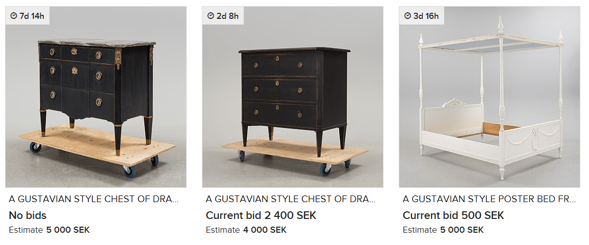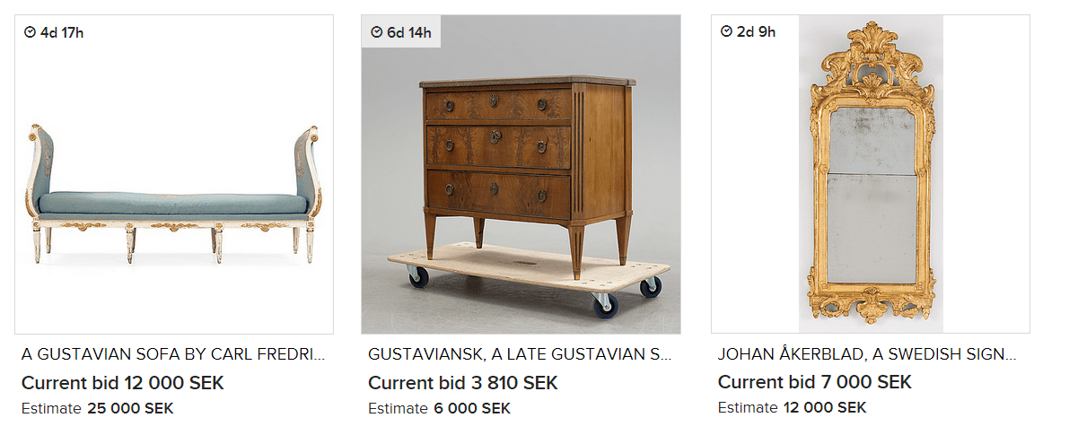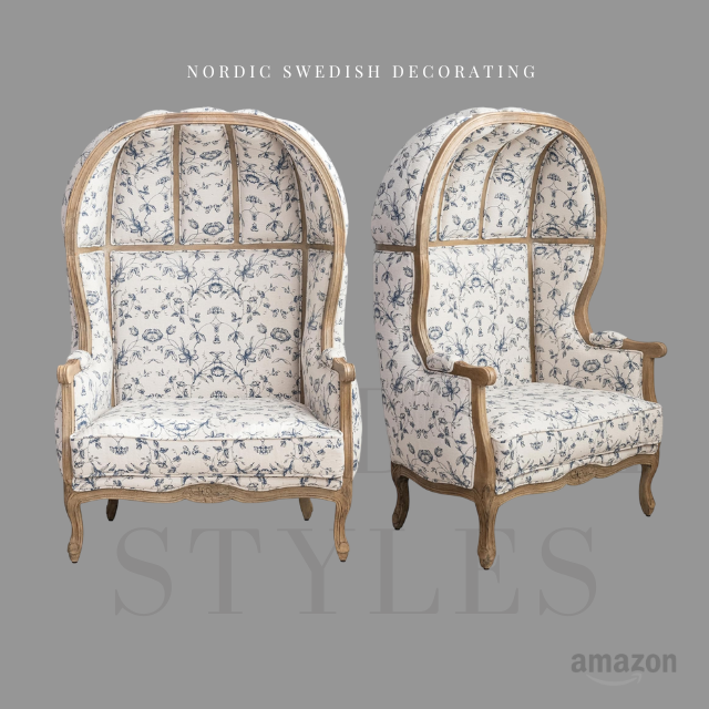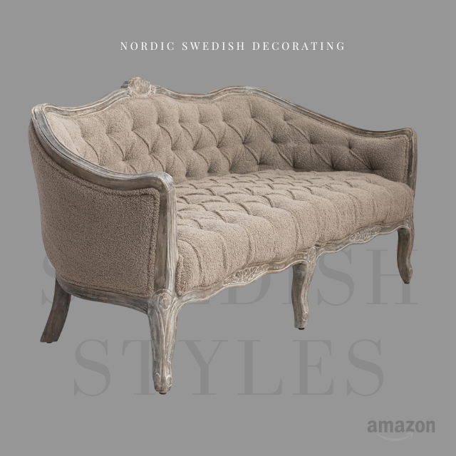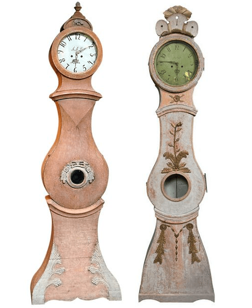
French Commode Lacquered Red From Live Auctioneers

The color red is grand, and is a color everyone considers for their home at one time or another. The color red is a symbol of privilege and wealth. Official seals often use the red, as a gesture of confidence and authority. Red can make a statement in your home in a very powerful way, although it can be hard to execute. We show you 5 ways to pull off this color with success.

5 Ways Of Using Red In Your Home

1. Use Red In The Kitchen Or Entry Way

Red is the color of passion and has been known to stimulate blood pressure and heart rate. Red also sparks passion, love, and enthusiasm, so it is color often used in romantic restaurants. What better place to encourage conversation and hunger, than at the dinner table.

Consider painting your dining room table red. Instead of painting the whole table red, leave the top untouched, in it’s natural wood state. To add a Swedish touch, consider painting the details in gold. In this post, you can see how lovely a red can look in a country provincial style.

2. Use Red In A Pattern on Decoupaged Furniture

There are many ways of decorating with red other than painting your walls. One way of doing this is decoupaging furniture. Decoupaging is rather easy, and you can execute the process a number of ways.

One way is to use cut outs. Simply find an image you like from a magazine or on the Internet, and photocopy it several times over, which you can then cut out, and apply it to a piece of furniture. This Swedish tiled stove would be an excellent example of how lovely a red floral pattern would look on a chest.

You can even take fabric and glue it to a chest, with modge podge glue. Add pattern into your home, or finish off a room based around patterns by decoupaging your furniture.

Inspirational Posts On Decoupaged Furniture

How To Decoupage FurnitureThe Swedish Furniture

Louis XV Style Red Lacquer Side Table From Hastening AntiquesProvincial Furniture

4 Easy Steps To Decoupage Beautiful FurnitureThe White Dresser

Decoupage Is Simple! Update Your Kids FurnitureKids Room Decor

Swedish Interiors: How To Decorate With The Color RedThe Swedish Furniture

3. Use Red In Acessories

-Add a bit of a modern glam using abstract art with bold touches of red. Consider using a heavy ornate frame with a modern poster. Modern Styled Paintings or Posters would add a modern touch in a home with plenty of antiques.

Juju wall hats are a perfect way of adding a bold touch of red in a room. You can purchase these hats in a number of vibrant colors, which can be placed above a dresser, a console table to add in a bold touch of color into your room.

-Below you see the Stockholm apartment in Sweden with the red room. Below it shows a picture of the living room based in white with natural wood furniture. If you want a room based in lighter colors, consider a large area rug in red, like they did. An over-sized floor rug can make a bold impression.

– Another way of adding saturated color into your rooms is to accessorize with red wool blankets. Point blankets can add a rustic touch to your home, and can be thrown over the sofa, or used on the bed, or stacked on a shelf.

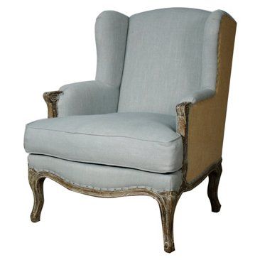
– Chairs are a great way of implementing red into a room. Chair frames can be painted red, or upholstered in red fabric.

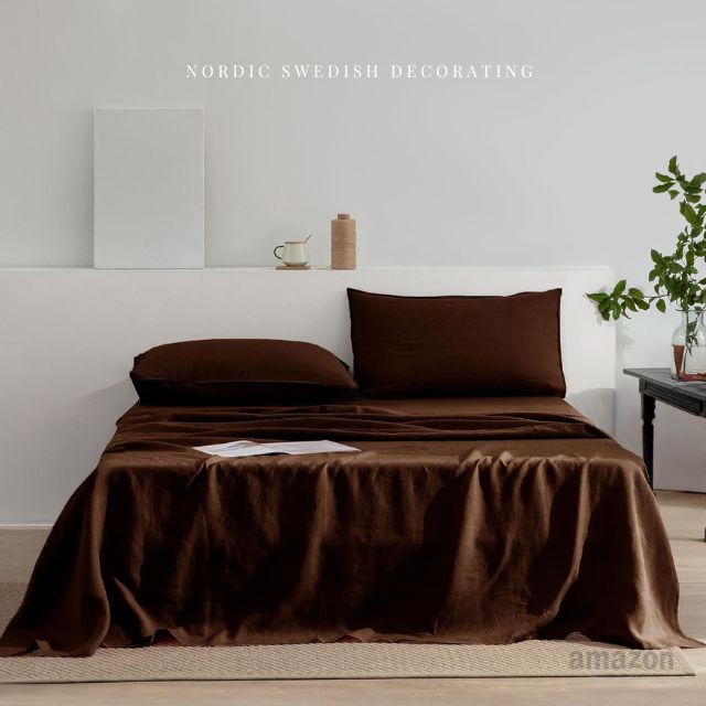
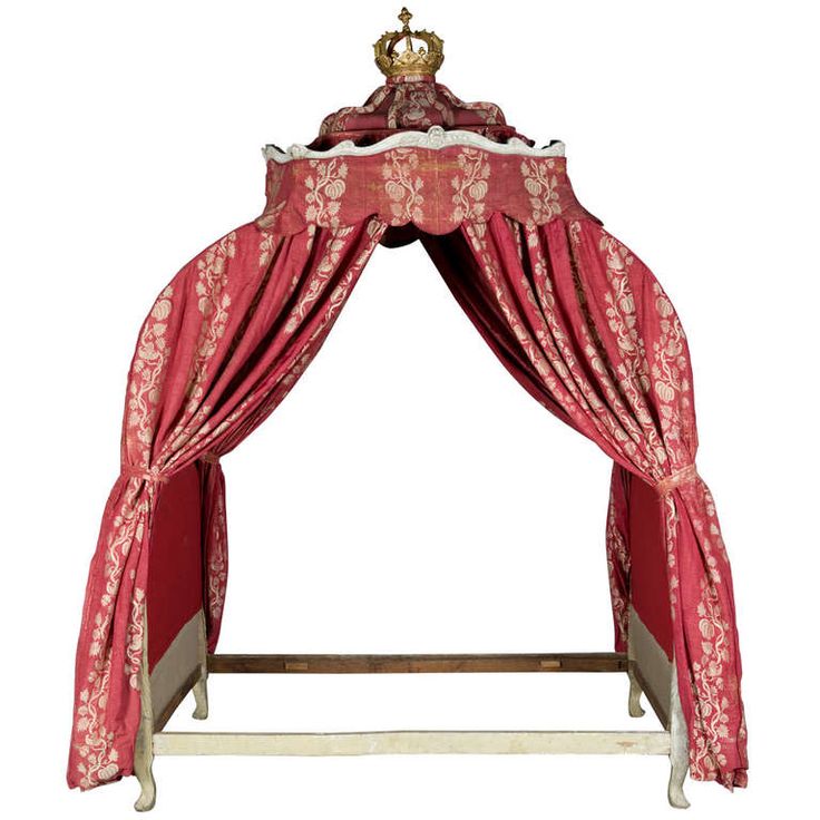
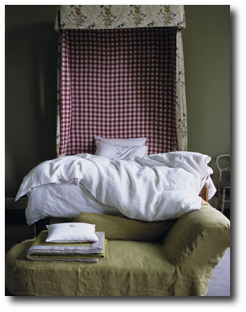
-If red walls are a bit too risky for you to consider then why not consider red and white bedding? Paint your bed-frame red, with touches of gold, and consider getting a comforter, sheets,a pillowcases all in red. Or paint the frame gold and red, and go with an all white sheeting as you see below.

Chesa Planta house, located in Samedan, a picturesque village 6 km northeast of St Mortitz, Switzerland featured an exhibition of Rich Owens’s exquisite furniture designs photographed by Adrien Dirand. The collection was minimalistic, evoking a sense of goth meets luxury. Owens’ minimal aesthetic contrasted perfectly with baroque grandeur of the chateau. Some of the highlights included the bone chairs with stag antler backs, and a petrified wood sofa. Built in 1595, the house had been restored to convey the look of an 18th century Engadin aristocratic home. “Engadin” or “Engadine” identifies a long valley in the Swiss Alps located in southeast Switzerland. The Engadin is protected by high mountains on all sides and is famous for its sunny climate, beautiful landscapes, and outdoor activities.

There is a strong architectural presence of the Romanesque style in Switzerland, which can be found in the cathedrals, castles and fortresses around the country.  The Gothic and Baroque style became fashionable through the Renaissance, where a large number of architectural masters came from Italy.  The hand painting of the walls in the Chesa Planta house shows a Italian influence which is found in the region.   Switzerland lies at the crossroads of several major European cultures, which includes three major languages, German, French and Italian which form the national languages of Switzerland, along with Romansh, spoken by a small minority. Therefore Swiss culture is characterised by diversity, which is reflected in a wide range of traditional customs, which also influenced the art and interior design of the country through history.

Folk art was kept alive all over the country. In Switzerland, it is mostly expressed in painting, dance, music, embroidery and wood carving. The most common form of woodcarving found in Switzerland is called chip carving. Chip carving decoration is normally found on everyday objects, such as milk stools, wooden spoons, or walking sticks. In some areas, the façades of houses are richly decorated using woodcarving. Embroidery has been a common element on historical traditional clothing in Switzerland. Embroidery has always been used for the decoration of fabric, but because the art is time intensive, it is sold for premium prices.  Embroidery was something that served as an art in the home in past centuries and today is often found in tourist outlets where vintage and antique products are sold.

Interesting Books

Swiss Furniture and Interiors in the 20th Century by Arthur Ruegg and Arthur Rüegg– For the first time, the development of interiors and furniture in Switzerland from the end of the nineteenth century to the present day have been surveyed and documented. A fully illustrated catalogue of over 300 objects from furniture to ceramics and household objects and around 150 biographies conclude the publication.  

Mountain Houses by Philippe Saharoff and Gwenaëlle LepratNowhere is the beauty of living in the mountains more evident than in the Alps, where the spectacular landscape has given rise to equally
gorgeous homes. In Mountain Houses, photographer Philippe Saharoff takes us to 30 of these lovely chalets, farmhouses, and cottages, located in Chamonix, Gstaad, and other picturesque towns of
the Swiss and French Alps. More than 300 stunning photographs, taken in all seasons, bring the rustic charm and timeless comfort of each home to life. While wood and stone are the predominant materials,
the houses are decorated in a wide range of styles.

Alpine Interiors (Interiors (Taschen)) by Beate Wedekind and TASCHENIf you think that laying your hat in the Alps means having to choose between a rustic mountain hut or a log-burning ski lodge, then you’ll be
amazed when you get a glimpse of this latest inspiring volume in the Interiors series. The mountains of the Alps are a unique terrain unlike anything else in Europe, thus when constructing and decorating a place
to live, architects and designers have to be conscious of adapting to the extremes of landscape and climate. The desire to make your home a beautiful thing, to find a balance between Function and elegance,
becomes particularly significant in the Alpine region. Primarily Famous as a location for skiing resorts and muesli, the Alps straddle the borders of so many European countries, and this has allowed for a lively
interaction and exchange between many peoples and cultures. The selections in this book are impeccable. For example Reinhold Messner’s castle. There’s everything From baroque villas to farmhouses, famous
designers/ architects to the ordinary Alp-lander with very good taste.

For More Inspiration See These Posts:

The Romantic Baroque Style: Part 1- Stromholm

The Romantic Baroque Style: Part 2 King Gustav Vasa

The Romantic Baroque Style: Part 3 Skokloster & Steninge Palace

The Romantic Baroque Style: Part 4 – A Collectors Home

Europe -Switzerland- Location, Flag and Coat Of Arms-

A Picture of An spectacular estate in Switzerland

The indoor dining room features doors painted by an artist who lived in the home
in the 1930s. Wallstreet Journal

It is no doubt that the hottest designers are using distressed Gustavian furniture in their own homes. Designer Daniel Romualdez is one of those designers.  His Montauk, New York home also shows off a captivating white based interior.  Romualdez breathed new life into the home using only splashes of blue, white and black.  The main dining room shows a beautiful collection of seashells in weathered frames.  The room is furnished with 18th century Gustavian furniture with a geometric blue and white upholstery.  Most of all the pictures we picture below are credited to the Wallstreet Journal.  Here are a few links to this homes interior from Corbis.  Here is a picture of the stairway that was installed in limed pine, in line with the Swedish styles found through the house.

Decorating with seashells can add a natural touch to your home.  Here are 10 tips to getting a high end look with seashells:

1.  Paint your walls in soft pastels. Keeping the wall color light will create a serene feel and allow you to play off the colors found in the lighter natural tones of seashells.

The ocean and the sky are both blue, so blue should be incorporated into the color scheme. Borrow looks from Daniel Romualdez’s home by choosing upholstery in blue and white.  White based backgrounds for upholstery choices keep within the classic textile choices found in Sweden.

-Light blue or green walls are also great colors for a room decorated with seashell decor.

-If you do use brighter blues, consider using it in an accessory as Daniel Romualdez’s does with a vibrant floral centerpiece.  Add layers of duller blues in your rooms with accents of brighter tones of blue sparingly.

2. Mix in reds, oranges, and golden hues within your home decor to provide a contrast to the white walls, and white shells such as what Daniel Romualdez’s does with the black hand painted doors, and black frames on the walls.

3. Consider installing wall panelling, which can be stained in a soft cream or white.  Wood adds an organic layer that is commonly found in Swedish decorating. Clean, brilliant white walls make a great backdrop for bold color splashes or natural wood accents.

4.  Sofa or floor pillows incorporate the feeling of comfort.  This Sea Shell Linen Pillow Cover with Jute & Mother Of Pearl Embroidery has both the linen fabrics found in Swedish decorating, as well adds a bit of the pearl shine we find in the sea.

5.  Cover furniture or home decor with shells.  A neoclassical bust with smaller seashells is a sophisticated approach to using shells in your decor.  All you need is a nice looking neoclassical bust, hot glue and a variety of seashells.

-Make a crown for the bust or display it on it’s own.

Here we see a rustic bust, with a seashell crown.

Here we see a mirror made with hand collected shells and Ikea mirror frame.  All the shells are facing the same direction rather than the sporadic placement that we see with seashell art.

Here we see a beautiful floral display with an urn decorated in seashells

Plaster Busts on Ebay

7.  Consider presenting your collection of shells as a display on your wall with corbels.  Instead of displaying the smaller shells, collect the larger seashells, which can make more of an impact.  Swedish decorating is known for clean, uncluttered looks, so bigger shells are better in a Swedish scheme.  Corbels can be rather expensive, but there are ways of getting corbels that match without spending $300 on each corbel.  Make your own shelves for pennies with concrete molds such as this one from Mold CreationsConcrete Success has the perfect mold shelf featuring a sea shell in the design, selling for $34 dollars.  This allows you to make endless shelves for your collections, without spending any more than for the mold itself, and the plaster or concrete.

Interesting Finds on Ebay And Amazon

This square sea shell mold would be a rather interesting texture to cover an entire accent wall in a bathroom with. It has a rather primitive fossil quality to it.

-Silver Tone Decorative Spiny Jewel Nautical Sea Shell Home Decor $27

-Luxury Lane Hand Blown Art Glass Seashell Centerpiece 7.5″ tall by 12.5″ long $25

-White Pearlized Chambered Nautilus Sea Shell Decor 5″ – 6″ $25

-100% Real Sea Shell-4.5″ Original From Haiwaii,$9

-Small Brass Compass Rose Nautical Wall Plaque $50

-Bathroom Decor- Set of 3 Decorative Clear Glass Bottles with Nautical Sea Shell $71

-Luxury Lane Hand Blown Art Glass Seashell Centerpiece 4.5″ tall by 9″ long $25

-Aluminum Sea Shell Decor 4″H, 10″W $36

-Round Rustic Wooden Nautical Porthole Mirror– $70

-Set of 2 Seafoam Green and Cream Sea Shell Pattern Rustic Aged Decorative Bowls $110

-Gorgeous Set of 4 Mini Sea Shell Covered Spheres $48

-Decorative Wooden Paddle  $19

-Wooden Nautical Sailboat Yacht Model w/ Shell Sail $24

See our other post Daniel Romualdez’s Breathtaking Late-Eighteenth Century Farmhouse

Daniel Romualdez’s Montauk Home-www.williamwaldron.com

Another View Of This Room From www.corbisimages.com

You can see the trim was painted blue, and the floors limed.  In addition, the doors were touched up.

Seglora Church -Relocated From Western Sweden

*Disclaimer*-The pictures contained in this post are to illustrate the BEAUTY of yellow and green paint used in 18th century interiors.  We have no knowledge what so ever of the paint used in the rooms or furniture.  Emerald Green and Yellow colors are absolutely stunning colors to decorate a home around.     

The History Behind Emerald Green

Emerald Green, is the color of the year for 2013, yet what many people don’t know is the color “Emerald Green” at one time, killed people.

This brilliant blue-green color was extremely popular in the mid- 1800s, because emerald green paint was cheap to manufacture, and it had such a great depth of color.

In 1814 in Schweinfurt, Germany, two men named Russ and Sattler tried to improve on Scheele’s green, and made a paint made with copper arsenite. The result was a highly toxic pigment called “emerald green”. This paint was made with arsenic and verdigris and the bright green color became an instant hit within the design community.

The vibrant color was not only used as artist paint, but as well as household paint amongst other things. Many people at that time didn’t know the paint was made with poisonous arsonic, and who is to blame them when we don’t know ourselves what kind of unhealthy additives are contained in our foods.  As soon as the color was produced, it was picked up by many companies far and wide. The emerald green dye wasn’t only used for paint, but wallpaper and as liquid dyes.

In particular, in damp rooms where mold grew, the arsonic in the wallpaper paste would be turned into a toxic gas which would be deadly for anyone living in the room.  By 1830, wallpaper production had risen to 1 million rolls a year in the UK, and by 30 million in 1870. Tests later revealed that four out of five wallpapers contained arsenic.

Leopold Gmelin (1788-1853), a German chemist, suspected in 1815 that wallpaper could poison the atmosphere, that he made several efforts to warn the people in his day to strip their rooms of the paper, and advocated banning Scheele’s green. He noticed that the substance gave off a garlic-like odor when the paper was slightly damp. Experiments at the end of the 19th century proved that arsenic pigments in damp or rotting wallpaper were lethal.  If only they listened to Leopold Gmelin’s warnings!

The color “Emerald Green” became so popular and widely used in the cotton industry which used the chemical in pigments and dyes. It was also used by other industries such as glass manufactures as a de-colouriser, and in the production of leather tanning, soaps, lampshades, pharmaceuticals, agriculture for sheep dips, children’s toys, and candles.

Emerald green was also used to color cake decorations. In a few recorded instances, this dye was used to color icing, much like we do today.  In one case,  the industry making the dyes employed hundreds of young girls, who later died from chronic arsenic poisoning.  At a banquet held by the Irish Regiment in London in the 1850’s, sugar leaves that were dyed with the Emerald Green, and used as table decorations.  Many of the guests took the decorations home to give to their children to eat as a treat, whom later died.  Another dinner in 1860, a chef produced a spectacular green sugar dessert, used Scheele’s green and later, three of the diners later died.  If this is shocking, read this up on our modern day Aspartame. It has been proven that this popular sweetener used in coffee is toxic to your brain.  In fact, they say that when aspartame is added to hot waters, exceeding 86 degrees F. the Aspartame converts to Formaldehyde, and then to Formic Acid, which damages the brain….. yet this substance isn’t pulled off the market.

Emerald green was also called Schweinfurt green, Paris green, and Vienna green. The toxicity of emerald green was not initially recognized, until the recipe was published in 1822. Napoleon’s death in exile on St Helena was possibly a result by his exposure to the Emerald green wallpaper in his favorite room. The French painter Cezanne had an attraction for using paris green, and later it was known he suffered from severe diabetes. Later, the use of this pigment was abandoned when it became general knowledge that people who wore clothes dyed with this green tended to die early.

Here is the sad part- Even though they knew all the scientific evidence of its highly toxic nature, production of emerald green paint was not banned until the 1960’s. 

See: 10 Tips for Buying Used Furniture Online- Painted Furniture Online

The History Cinnabar Red

One of the most difficult to use and costly pigments on the market. Cinnabar red is obtained from a mineral (the principle ore of mercury). The Romans obtained it from the Almaden mines in Spain, which is still today an important locational source of mercury. In order for it to be used as a pigment, the mineral had to be purified, then synthesized and then ground to the correct fineness. If improperly handled, it could turn black.

Red’s hard. There are so many bad ones. They’re either too bordello or too raspberry nail polish. Or they’re so brown it’s like eating in a Southwestern theme restaurant, or so primary and overly frank that you want to ask, ‘Where do I put the presidential seal?’ I’m always looking for either a juicy pomegranate red, a Chinese lacquer red, or a really good oxblood. Because it’s such an important color, red needs nuance, subtlety, and depth, so in those rare instances that I break it out, I like to do it as a glaze, a lacquer, a fabric upholstery, or as red leather walls so there’s variation to the tone.”CELERIE KEMBLE

See: The Top Shades Of Red Paint By The Most Famous Designers- The Painted Furniture

The History Behind Lead White

The poisonous qualities of Lead White have been noted since Ancient Rome, when the color was made in Rhodes (Greece ) where workers would put shavings of thin lead over a bowl filled with vinegar. The acid on the thin metal would cause a chemical reaction and leave a white deposit of lead carbonate which was then powdered, flattened and left to dry in the sun. The small amount of lead white still manufactured today follows this same formula.

The History Behind Naples Yellow

The 18th and 19th century saw the discovery and manufacture of synthetic pigments and dyes, which quickly replaced the traditional yellows made from arsenic, cow urine, and other substances. Naples Yellow is one of the oldest synthetic pigments. Naples yellow was essential to the landscape tradition because it has a quality of appearing to recede, making it perfect for capturing the essence of the sun. The genuine pigment is toxic, and it is believed that Vincent van Gogh’s mental illness and suicide was a result of his frequent use of true Naples yellow.

Have scientists finally discovered why Van Gogh’s paintings are turning brown? Mail Online

Hope For Today

Today we have a wide variety of organic paints available within reach.  More than ever paint manufacturers are producing low VOC paints as people are looking at safer brands for their homes and health.  Olympic Premium and Benjamin Moore Aura have shown to have lower VOC levels than other tested paints and did a good job in this hiding test, according to Consumer Reports. VOC levels have been toughened because VOCs are linked to respiratory illnesses and memory impairment.

The top paints in the Consumer Report Ratings  had among the highest claimed VOC levels, including Behr Premium Plus Enamel low-luster and flat  and Benjamin Moore Regal semigloss.   They reveal that lowering the VOC levels can affect performance. “When you take out VOCs, you still need strong performance properties, but you have to find other ways to achieve them,” says Carl Minchew, product-development director  at Benjamin Moore. Still, some no- and low-VOC paints did well in performance revealed in the Consumer Report Ratings.  Posted in the Consumer Reports Magazine issue: March 2009

See: Green Dreams: Environmentally Friendly Restoration FurnitureThe Painted Furniture


This information below comes from www.wetcanvas.com

“PY41 is genuine Naples Yellow (Lead Antimonate), tubed paints come in two yellow versions, Light and Dark (sometimes available in a “red” pigment as well). Available from Vasari, Michael Harding and Robert Doak. Genuine Naples offer a smooth blending mild tinting yellow that works in more delicate situations, like portraiture. Here is a comparison of both Michael Harding genuine Naples Yellows along with others similar colors, including OH’s PBr24 imitation Naples Yellow Extra. The lower mixes show the colors tinted with white above, and black below.”

Rococo & Empire Pulls- House Of Antique Hardware

Most do-it-yourselfers know that adding new hardware to new or existing furniture or cabinetry is a great way to dress it up. These seemingly small touches make a huge impact on the overall appearance of a piece.

You can create the look you want. Hardware pieces are available in a variety of finishes, designs, and styles. You can walk into any local hardware store and find shiny chrome and brass knobs and handles as well as modern sleek knobs that have clean simple lines.

The only time there seems to be real problems finding the right hardware and accessories is if you want antique hardware. However, the Internet has made it easier to find what you are looking for; this article offers a list of the top five online resources for antique hardware. It’s a list you can refer to time and again.

Antique Hardware & More

Antique Hardware & More provides a great selection of knobs and pulls for all types of furniture and cabinetry. Whether you are looking for antique pulls or knobs to add an elegant touch to your dining room furniture or to bring out the charm on your kitchen cupboards, this place is worth checking out.

The site includes a search feature to make finding what you need easy. Antique Hardware & More also sells the tools and other supplies needed for restoration and antique refinishing projects.

House of Antique Hardware

House of Antique Hardware offers a comprehensive resource of reproduction hardware. You can shop according to type, such as door hardware or cabinet and furniture hardware, and you shop by style and special collections. This online store provides a phone number for questions and assistance. House of Antique Hardware accepts credit cards online, and it is accredited by the BBB.

Kennedy Hardware

With more than 25 years in the business, Kennedy Hardware must be doing something right. This shop offers wholesale prices on restoration hardware. You will find a huge selection of all types of hardware. This includes architectural hardware as well as hardware for furniture and cabinetry. This company can provide skeleton keys, glass knobs and handles, furniture casters, and much more. If you are into antique restoration, Kennedy Hardware is definitely a site you should check out.

Rejuvenation

Rejuvenation has everything from doorknobs to window hardware and light bulbs. Shoppers can search and browse according to category, by room, or style. Styles include such classifications as arts and crafts, colonial revival, deco, mid-century modern, period basics, and Victorian. Rejuvenation provides a phone number as well as a live chat for questions and assistance with orders.

Signature Hardware

Signature Hardware offers a large collection of hardware pieces in a variety of styles. Shoppers can browse according to departments, and the search can further be narrowed down according to specific categories. Signature Hardware offers an online signup for a free catalog and an email newsletter. The site accepts a variety of payment options including PayPal.

Final Thoughts

A replaced hinge and a new knob or handle is all it takes to make an old piece of furniture new again.

This list is not complete. There are other online resources that offer quality products at good prices. If you know about some of those resources, please share them.

Restoring furniture is a fun and cost-effective hobby. It is a way of preserving our heritage and passing on history. And many times, the simple addition of new hardware is the magic that brings furniture back alive again.

If you have an old piece of furniture hidden in the attic or basement, why not give it new life? Add some new hardware and let it live again.

Debbie Allen is an online marketer and professional writer.

House Of Antique Hardware – Swedish Styled Keyholes

A Swedish Gustavian chest of drawers veneered with elm, walnut and amaranth

Antique Hardware & More

Louis XVI Style Matte Black Cabinet Ring Pulls 12 Pulls For $24 Dollars


These beautiful paints  are the result of a recent collaboration between Fired Earth and the National Trust.

Founded in 1983 , Fired Earth began as a Terracotta supplier, and later expanded to offer bathroom and kitchen cabinetry, and hardware.  Although Fired Earth has a wide selection of house products, they are best known for their beautiful paints.

With their 30th Anniversary, they launched archive colours from their extensive library of paint pigments and featured six new colours named Delias Secret, Mad King George, Jazz Cafe, Hansel and Gretel, Eton Mess and Terracotta Warrior.

Fired Earth has also worked in collaboration with Kevin McCloud, a well known British designer and author and leading authority on colour.  Together, they created color formulas from carefully selected pigments, minerals and resins, chosen for their qualities of opacity, density, light fastness and durability. The paint was developed with minimal and low VOC’s.  These water-based paints are available in 120 colours in matte and eggshell finishes.

Kevin McCloud is best known in the UK as the color go to guy with a knowledge on every design style from historical to modern.  The Telegraph had an interesting article titled Are Posh Paints Really Worth It?they ask the question – Why spend the money, when you can get your local paint store to match the shade, and spend less? Here are a few interesting points from the Telegraph interview…..

McCloud, a self-confessed paint “anorak”, is unequivocal in his defence of posh paints. “Having used many, many different brands over the years, it is very clear to me that the more you pay, the better the paint,” he says. “Cheap paint has more water in it, less pigment and less binder.” Thus, as a rule, the more expensive paint covers better and lasts longer. It is also more environment-friendly, being lower in “Volatile Organic Compounds“.

“There is a place for cheap paint, and McCloud concedes he has painted his own kitchen in “bog ordinary trade white emulsion”, but the cheaper paints are made with synthetic pigments. And pigment, he explains, is what gives paint its quality and depth of colour. – “Traditional pigments tend to be made of rocks and minerals, earth and clay,” he says. “And consequently they are impure, and rather complex. The more complex the pigmentation, the more interesting the colour. It gives redolence and depth, and you get undertones – colours which subtly change in different lights.”

“One can say that this was a colour used in this particular house, on a certain day in, say, 1818, but the colour has probably faded, or gone darker, or yellowed. It’s very difficult to ascribe a particular nuance
of colour to a room for a particular date.”

The book ‘Choosing Colours’ by Kevin McCloud- Credit Nicola Holden Designs

Kevin McCloud’s Books

Choosing Colors: An Expert Choice of the Best Colors to Use in Your Home by Kevin McCloudAmazon

In this stunningly produced guide, internationally renowned interior designer Kevin McCloud puts together over 1,000 color chips arranged in over 80 palettes. Each palette—which includes anywhere from 6 to 16
color swatches—forms a blueprint for a unique decorative scheme. A palette based on old Chinese silk, for example, is seen reinterpreted in a contemporary New York apartment. Each palette features gorgeous photographs that bring the color scheme to life, along with invaluable advice and tips for using the colors to transform a room. This book provides manufacturers’ paint references and numbers, lists of suppliers, and much more.

Kevin McClouds Complete Book of Paint and Decorative Techniques by Kevin Mccloud- Amazon

From the earthy hues of Italian farmhouses to the cool elegance of Scandinavian interiors, color has always played a crucial role in decorative schemes. In the first section of the book a unique cut-out color selector illustrates the eight essential earth colors on the decorator’s palette and shows how to create and combine them successfully by clever intermixing of pigments. These essential colors, together with five secondary colors, are then used in the techniques throughout the book, so that all the stunning decorative effects can be easily recreated.

The techniques section that follows contains instructions and step-by-step photographs for more than 35 glorious decorative effects, plus countless variations. Each technique contains a list of essential ingredients, step-by-step photographs and a close-up of the finished surface or object.

Decorative Style: The Most Original and Comprehensive Sourcebook of Styles, Treatments, Techniques by Kevin Mccloud- Amazon

Using innovative, easy-to-master techniques and surprisingly inexpensive materials, Kevin McCloud — a brilliant young set designer turned interior decorator — shows you everything you need to know to design and create your own stunning adaptations of today’s most popular decorating styles.

There are forty styles in all — from Santa Fe, Shaker, Miami Deco, and Caribbean to Bauhaus, Biedermeier, Mackintosh, and French Country (to name just a few) — each designed and created especially by the author and stunningly photographed, with literally hundreds of styling options and color variations to choose from.

The decorative effects and other components of each style are analyzed, rephotographed with a full range of imaginative alternatives, and cross-referenced to all the techniques, tools, and materials needed to create each unique effect.

Kevin Mccloud’s Colour Now by Kevin McCloud- Amazon

Love blue but don’t know which shade to choose? In this dazzling new book, Grand Designs presenter Kevin McCloud has taken over 120 particular colours into 70 tried-and-tested palettes that are guaranteed to transform your home. A short introduction describes the history of colour and its replication, colour theory, how to combine colours into a palette and advice on how to use the book. Thereafter the bulk of the book is devoted to the colour palettes themselves – each made up of a collection of between 3 and 8 colour swatches and featuring an inspirational photograph demonstrating its possible use. Every palette is also introduced by a short piece of text describing its influences, potential and variety.

Choosing Colors: An Expert Choice Of The Best Colors To Use In Your Home by Kevin McCloudAmazon

This decorating guide explains techniques ranging from craquelure to marbling, colourwashing to liming wood, and provides information on tools and materials. The step-by-step photographs show exactly what to do, while the life-size details show the effect being aimed for.

Kevin McCloud’s Complete Decorator by Kevin McCloud- Amazon

This lovely 272 page book is filled with dozens of color photos showing many different decorating styles. It includes a unique cut-out graduated colour section, step-by-step instructions for a vast range of paint
techniques, easy colour mixing, working with different surfaces and objects and so much more.

Techniques of Decorating (Dk Living) by Kevin McCloudAmazon

Kevin McCloud is a leading influence in interior design. His unique and refreshing approach stems from a background in art history and the theatre. Using a repertoire of techniques ranging from the traditional to the self-invented, he offers an unsurpassed array of rich effects and a sure guide to effective styling. Each of the more than 30 creative effects – including gilding, verdigris, clair bois, stained glass and woodgrain – is explained in detail, while close-up, step-by-step photographs show exactly how to achieve it. A comprehensive section at the back of the book provides details of tools and materials needed and lists the addresses of suppliers.

‘Blue-ish greys are military and came into their own as World War I battleship camouflage. The really interesting greys, however, are those made with purple. They have a warm, brownish cast that flatters flesh tones and brings natural woodsy materials to life. They’re not popular, but they should be.’

‘Often the most stimulating colour combinations come from strong cultural influences – from the environment, from food or from nature. Here’s a pretty worldly palette: one of stone and sea and earth and sky.’

Principles Of Home by Kevin McCloudAmazon

On my list marked ‘fastidious obsessions’, getting the right fine old French grey comes pretty high on the list. If you were a colour expert, you could take some chalk-white casein distemper, add raw umber and a little raw siena and you’d be there. Note I didn’t mention black there – when you mix black and white the resulting colour is so cold you might as well call it blue. No, for a good grey, go greenish and go with earth colours. Fine complex colours are the tinctorial equivalent of a fine old French wine.’

“The hardest colours to get right are the four optical primaries: red, blue, yellow and green. The colours that will make your life a positive misery are tints of those colours. Most modern paints are coloured with a limited range of powerful synthetic dyes. The most interesting colours are those made with muddy, traditional earth pigments or complex arrangements of colourants.”

“The best pinks – those that change colour under different lighting conditions – are those on the cusp of red and purple, made with red oxide pigments. The best yellows or creams – those that can withstand bluish northern light and never look green – are made with yellow ochre.”

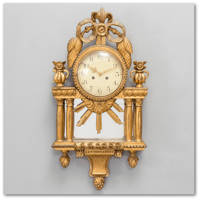
  Rococo Period Clock– The Dial Is Marked Stockholm.

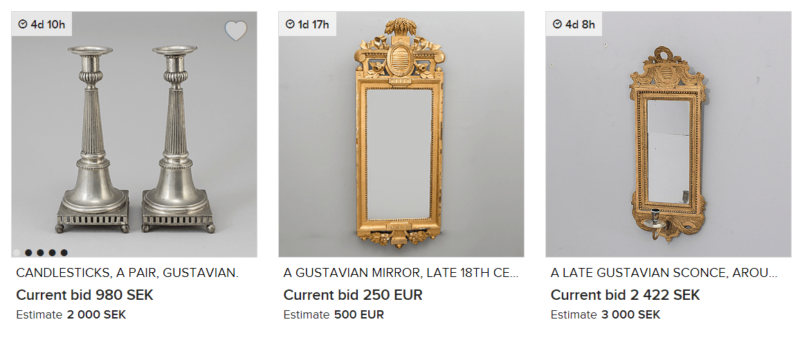
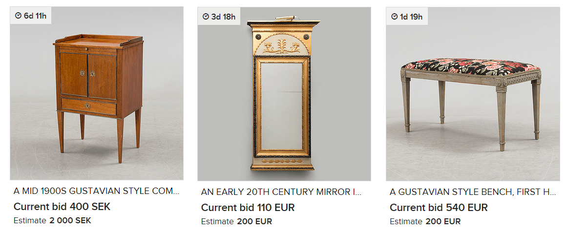
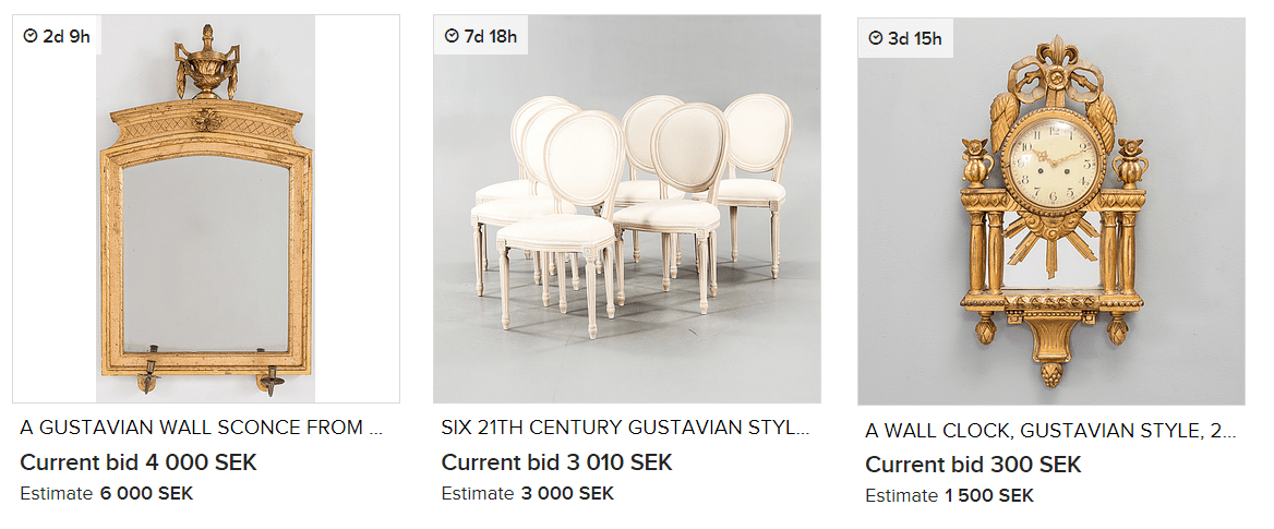
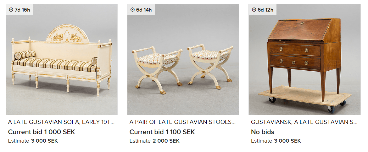
Uppsala Auktionskammare is known to present some of the finest collections of antique furniture. Uppsala Auktionskammare has been known to feature exquisite collections of silver, furniture, and art from Swedish private homes at their auctions. In the spring of 2008, Sweden’s most expensive furniture ever was sold at Uppsala Auktionskammare, a unique bureau by Nils Dahlin for 18 million.

They carry a beautiful selection of European art; everything from the Renaissance until the late 19th century.  They are known to collect an array of antiques from mirrors, table clocks, chandeliers, table lamps, candlesticks,bronzes, figurines, and much more.

They are known to carry mirrors, candlesticks and bronzes by the following masters: Burchard Precht, Pierre-Philippe Thomire, Carl Henrik Brolin, Ehrhart Göbel, Johan Åkerblad, Fredrik Ludvig Rung, Niclas Meunier, and others.

Uppsala Auktionskammare features many prominent furniture designers such as Gottlieb Iwersson, George Haupt, Nils Dahlin, Christian Linning, Ephraim Ståhl, Jonas Hultstén, Anders Lundelius, Gustaf Foltiern.

They also are known to feature silver from Pehr Zethelius, Jonas T. Ronander, Petter Eneroth, Gustaf Stafhell, Arvid Floberg, Isak Sauer and Kilian Kelson

Check out some of Gustavian furniture and decorative collections from Uppsala Auktionskammare below…..

A Gustavian Chest of drawers, attributed to Jonas Hultstén.

A Swedish Gustavian Chest Of Drawers, by Nils Petter Stenström.

A Pair of Swedish Gustavian Armchairs.

If you have seen the previews for the movie The Girl with the Dragon Tattoo, it features a captivating estate many Nordic lovers would instantly recognize as Swedish.  This striking castle featured in the movie is “Yxtaholms Castle”, located on an island in Sörmland, just like it is seen in the movie.  Yxtaholms Castle was built in 1753 by Baron Gustaf N. Clodt.

Released in December 2011, The Girl with the Dragon Tattoo, tells a murder mystery family saga, a love story, and adds political intrigue to produce a multilayered story line.

The movie sets around a charactor- Harriet Vanger, whom is from one of Sweden’s wealthiest families, and had disappeared over forty years ago. Years later in the film, her aged uncle (billionaire Henrik Vanger), continues to seek the truth of her disappearance. He engages Mikael Blomkvist (a journalist ) into his quest to find the truth, by offering to financially back the struggling Millennium magazine if the journalist will solve the mystery.

The thriller, set in Sweden, shows the beauty of the Scandinavian cold winters and elegant interiors, which are highly contrasted by a pierced and tattooed punk Lisbeth Salander, who is a computer hacker with photographic memory.  She joins forces with Blomkvist to uncover the truth about the 40-year-old disappearance.

The Yxtaholms Castle Website tells us that the castle, stables and wings were built in 1753.   Yxtaholm  began to flourish in the 17th century and today it is a modern hotel, restaurant and conference centre.  Design Guy University Blog tells us that the castle is now owned by owned by female Polish millionaire Iwona de Jong who bought the property for $35M in 2010.  Today it functions as a hotel, and has been
updated.  The conference center is now located in the large stable building. Yztaholms castle has 79 rooms and is about an hour and a half drive from Stockholm.

Additional Pictures of Yxtahoms

-A picture of Yxtaholms Castle on Flicker

Design Guy University Blog– Historical Details on  Yxtaholms with great pictures!

Lovisas Guldkorn Blog– Showing pictures of the suite in one of the wings, and in the hall where an amazing wooden ceiling is painted.

-Another picture of Yztaholms Exterior- Flicker

-Another look at this hotel from John Haudi’s Flicker

-Another picture of Yztaholms Exterior Halsokallan.blogg

Yxtaholms Castle – www.svenskamoten.se

Gustavian Interiors- Swedish Tiled Stove From Michael Perlmutter Photography

These beautiful stoves were first designed in Sweden in the 18th century, as a result of an economic crisis that pushed Swedes to come up with a better way of extending the life of their firewood.  It was then that the famous Swedish stove “kakelugn” was born.

Early versions of the tile stove date back to the Middle Ages, however, two clever Swedes created smoke channels beneath the tile, that held the heat for an extended amount of time.  They  introduced vents that controlled the burn speed, giving an additional 24 hours of comfortable radiant warmth. With the heat-retaining cast iron core and long multi channel flues, the kakelugns were able to retain heat, keeping rooms warm up to a whole day after the fire is out.

These antique stoves vary in shape.  They are often seen round, rectangular, or columnar, and positioned in a a corner or against a wall.  Heights range from about 5 feet 10 inches up to 9 and 10 feet tall.

In an article written by Stone Mason, they describe these amazing stoves:

“The period between 1500 and 1800 was known as ‘Europe’s little ice age’. In Sweden, where it was even colder than it is nowadays, it was clear that the constant use of fireplaces from morning till night would eventually lead to the total depletion of the nation’s forests. It was most fortunate, then, that in 1776 Adolf Frederik, the King of Sweden, commissioned Carl Johan Cronstedt to develop a stove that would make better usage of the country’s timber resources.”

“Cronstedt, an Earl, architect, inventor and scientist, was given the tall order of producing a design that would use much less wood while still heating Swedish homes efficiently. An interesting side effect of this commission was that not only was a model developed that accomplished the King’s request, but it turned out to have other unforeseen environmental benefits.”

“Very little smoke is seen coming out of a chimney where these stoves are being used. In the course of the year, a kakelugn regularly used will burn the wood of one medium sized tree”

“One main advantage of the kakelugn is that it burns very hot, typically 1110-1200 C, whereas a standard iron stove burns at around 650-700 C. However, you can safely touch it and feel only warmth”

Stockholms Lans Museum provides us additional information on these stoves:

“The decoration was initially cobalt blue but later extended with yellow, green and brown violet. First with the new colors were Rörstrand factory and from 1758 dominated the all colors. But it was rare for more than three patterns of colors in the same oven.”

“In the mid-1700s it was not unusual for dinnerware pattern was used for The Fireplace tiles. The tiles were decorated with repeating patterns where palm branches, Chinese patterns and blomrankor were common motifs. The designs were painted by hand on each tile, always against a white background. ”

“Gradually began to Swedish architects interested in the design of the stove. The workshops were to start from pattern drawings made by Swedish architects rather than making use of foreign models. Fireplace Manufacturing became a domestic crafts.”

“These fine stoves occurred only in castles, mansions and wealthy burgher.  But even in these environments were those in the representative areas, the easier rooms put you in the cheaper and plain tile usually green or yellow.”

This pretty mirror is listed by Junkteer On Ebay

Period 18th Century Danish or Swedish Mid-18th Century Pier Mirror

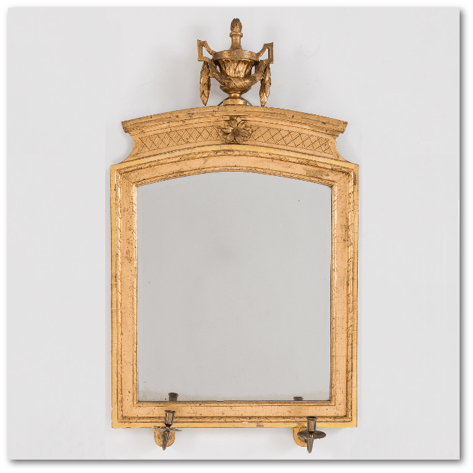
A small Swedish Gustavian giltwood mirror, Late 18th Century

Swedish mirrors have undergone a number of styles since they were introduced in the country in the 1600s.

German glass makers helped to lead the way, and they created mirrors in the baroque style of their home country. This included carved frames and a single pane of glass. Carvings could be simple or ornate, and frames could be square or rectangle, as seen in this mirror From Cupboards and Roses

Mirrors could also be made more ornate by hanging a curtain over them. This added a bit of flair and formality to the mirror.

A century or so later, more people began acquiring mirrors and the style switched to that of Swedish Rococo. This style featured carvings of shells or arabesques, and the frames were gilded and asymmetrical.

Shortly thereafter, another style evolved. The Gustavian style saw mirrors that were influenced by neoclassical aesthetics. Frames were richly carved and featured intricate leaves, ribbons and crests.

These neoclassical mirrors feature a pair of sphinxes on each mirror on either side of a fruit-bearing
pedestal. 

By the early 19th century, the aesthetic was changing again. Roman and Egyptian influences made themselves known, and mirrors featured carvings of things such as lions, sphinxes, and griffins. The frames also took on a distinctive shape, with semi-circular domes at the top and straight edges along the bottom.

This Swedish pier mirror, shows neoclassical details inspired by Napoleon’s Egyptian campaign.

By the middle of the century, mirrors became much more common in everyday households, and production methods became more base. Decoupaged frames became common, or they were veneered.

The style evolution of Swedish antique furniture mirrors was influenced by a number of factors, and it produced some gorgeous mirrors that make excellent collector’s items now.

What is your favorite style of Swedish antique furniture mirror? Share your thoughts or your finds in the comments!

About the Author:

Alexis Bonari writes for one of the largest open databases of college funding opportunities. Specific topics like scholarships for cosmetology school are described in detail to provide multiple resources for students.

Lars Bolander’s Scandinavian Design

Swedish Transition Rococo/ Gustavian Mirror

Gustavian Mirror

Turn Of The Century Apartment In Sweden- Interior Design Files

This fine Swedish Adolf Fredrik period rococo gilt wood mirror has carved C-scrolls and foliate motifs.

Swedish Rococo Mirror with gold leaf on wood carved frame and a mirrored
inner frame. Stamped NM (Niklas Meunier), active between 1754-1797.

Vintage Children’s Set On Ebay

With Neoclassical-style fluted details and a high-gloss finish, this chest is a cross between old and new, says Gambrel—“like a country cabinet dressed up for the city.” Given the playful juxtaposition of form and
finish, the 31.5″-tall piece would be at home in a girl’s bedroom. $2,000; chelseatextiles.com

Children dream in vivid color, and anything is possible to them, so why not create a room fit just for their personalities?  When it comes to decorating your child’s room, you simply cannot go wrong, because almost anything is pleasing to them.  Even if you try to create something special, they are overjoyed at your choices!  Children love rooms where they can express themselves, and be creative.  Imagination and playtime, – think of those two concepts while you are gathering ideas for their room, and you will do well with an overall theme…..

Most parents feel they can go a bit more daring in a child’s bedroom than what they would do for the rest of the house, which is why it is so darn fun to design kids rooms- you can be a bit crazy and get away with it.

Here are a couple tips to getting a great look for your kids room decor……

1. Invest In A Few Key Pieces- Don’t be afraid of buying an expensive piece of furniture for your kids room.  A great chest, or genuine chair can stay in their room for years, and stay in the guest room when they move out and get married.

A great vintage reproduction play table would be a great focal point in a child’s room.  Functional pieces that are also visually attractive should be the goal.   This Louis XVI Child’s chair would match the Swedish styles quite well.  Consider upholstering it with material that matches your child’s drapes and bedspread. This play-table would be great in a little boys room where red, and dark blue would say “I am a Boy“.

Get the general look of the Swedish style, by re-purposeing furniture.  Change the hardware, paint furniture, and use a lot of distressing techniques to get the old appeal into the overall look.  Buy transfer-ware tea sets for your little girl, and use a vintage french provincial end table, and re-purpose it with child’s chairs.  Add wheels to the bottom of the end table to lift the table higher to give your children’s legs room to stretch out. French style play tables aren’t so common, so get the look using a vintage french end table.

 Decorating doesn’t have to be expensive.  Look out for vintage toys at your local flea markets, antique stores and thrift stores for great looking toys to decorate with.  Wood has always been a signature style of the Swedish look.  Melissa & Doug have great faux food which will make you want to join in for “tea time”

2. Decorate With Vintage Toys- Antique wood furniture can be painted, and roughed up unlike plastic. Greenleaf Doll Houses come in kits which you can set up, and paint.  A vintage nightstand from ebay or craigslist might be a perfect match for a dollhouse. Customize the table to match the dollhouse.

Buy a wood rocking horse, and paint it yourself.  You CAN get these horses for less than $1800!  On ebay some of the vintage horses sell for $150 or so, which would allow you to customize it yourself.  Kids are pretty rough on furniture, so putting genuine antiques in their room, isn’t the best of ideas.  Buy something that looks great, but also something that if it gets damaged, you won’t be bent out of shape over.  Invest in a few key pieces for their room, such as a bed, or a chest.  The bigger pieces will set the theme, rather than the smaller items.

3.  Invest In Storage Furniture– Kids have a heck of a lot of toys, and spending money on decorating a kids room does no good if there is no place to house their endless play toys.  Ikea has a number of shelving which can be stacked and customized.  The Expedit series has worked well for organizing kids toy collections.  Organize your kids toy collections with shoe boxes.  Buy matching bookshelves which you can devote an entire wall to.  Back your child’s bed up to the bookshelves, which costs you only a couple of inches of space, but also save you from walking all over their toys.

For more ideas check out my pinterest page devoted to Children’s rooms……

Kids Mark French Chairs

Children Looking Into A Swedish Antique Shop- Credit

This boy is sitting by a lovely Gustavian childs table. The table has hand carved fleur medallions and a hand carved pearl bead border. The small Gustavian childs chair has the same hand carved pearl bead border. –blog.dnevnik.hr

Childrens Room With Swedish Bench

3D wallpaper from an installation by Swedish Deisgn Front Group

In a corner of the living room, a 1940s mercury glass lamp stands on a rough, round Empire-style table next to two 1920s Scandinavian painted chairs. The graceful wing-backed chaise dates from the 1930s and is upholstered in simple white canvas duck, with natural linen pillows from Ruby Beets.- House Beautiful Magazine

If you haven’t ever seen Ruby Beets home, you are in for a treat.  Featured in House Beautiful Magazine back in July of ’06 , this house has the perfect mix of old world charm,and rustic surprises that make it very interesting to the eye.  The raw painted furniture, iron decorative items, wood panels and paint color choices are particular elements of the interior styles found in Sweden.

If you enjoy the country cottage looks, but want something more upscale, borrow ideas from this home. Here are a couple suggestions from this interior.

1.  Have Slipcovers Made- Spend the extra money and have tailored slipcovers made that will give you the comfortable feel like this home.  Swedish textiles were mostly made from organic materials.  Consider materials like muslin, duck, or canvas.  Many people are taking drop cloths sold in hardware stores and bleaching them.  Today you can buy pure white duck or canvas cloth in off white, and various shades of cream, and blue amongst other colors.

2.  Invest in Great Antiques– I am not one of those people who are afraid of touching antiques.  My best advice, is if you find a sensational chair, improve it and make it your own.  Buy the upholstery fabric that makes you happy.  Buy the hardware that you will enjoy looking at day after day.  Make it YOU!

It is amazing what a strip job will do for your wood furniture.  Taking off the varnish will allow the paint to sink into the wood, that when you do to distress the wood, the overall finish looks so much better than painting it alone.  For years I have used a chemical stripper until I bought a heat gun, and I never knew that stripping furniture was soooooo easy and fast!  If you want to get a rustic look for your furniture, working with the bare wood is the ticket to high quality Swedish looks.

3. Use Black Somewhere- Swedish interiors are usually based around light colors such as blue, light greens, gray and so forth.  You would be amazed how nice black stands out against a lightly colored wall.  I used to love black painted furniture, that everything was painted black until I fell in love with lighter painted furniture, and all of our furniture was repainted in white or gray.  Our walls in our house are painted a light blue, and after debating what color to paint a hallway floor clock, I decided to plunge for black, and was it ever a great decision!   Everyone comments on it, because it sure stands out against the lighter colored walls.  Contrast can be a surprise!  Black colored furniture looks exceptionally well in lighter interiors.  Even if you have just one piece in black, it can look sensational!

Here are some of the comments from Ruby Beets featured in Home Beautiful that were particularly interesting

“I was a vintage clothing dealer in the’70s. I’ve been buying old stuff forever. Ruby Beets used to be about the found object school of antiques. My partner and I would buy a dresser and it would have peeling paint and we thought that was romantic. But now we want the drawers to work—enough with the drawer bottoms falling out! The new store is a cleaner, more modern and edited version of what we used to do. My house is too. Life is irritating enough at a certain age. Anyway, I like a lot of white, you can see that. All the furniture is slip-covered in muslin or cotton duck so I can remove it and wash it, which I do every six weeks. I guess, unless something horrible happens. I like big graphic shapes. Those white dishes and things in the kitchen cabinets, some are vintage and some are new ironstone, which we carry in the store. That cabinet we
bought from the local hardware store here. It went out of business, and they had 52 feet of glass cabinetry that we took and put in the kitchen. ”

“When you walk in, you don’t know what age the house is, but it feels like something old. I love it because it feels transparent inside. Hie boards are painted gray like the sea in winter, and because we have no near neighbors we have nothing on the windows—you can see from the front door all the way through to the water at the back. You can see a lighthouse in the distance. The girls used to say they lived in a lighthouse.”

“My husband is an obsessed fisherman, but he’s catch-and-release. He also collects taxidermy fish. He probably has 50 or 40 in his office.”

What is the significance of the name, Ruby Beets?-“Oh. I don’t know. I made it up years ago. But it’s catchy, right?”

Wood has always played an integral part in the Swedish home life. Beech, birch and pine are the most popular woods in the Nordic region. Hardwoods such as mahogany were rarely used in Sweden as they would have to be imported, as well as the blonder woods were native to the land making it practical to make everything out of wood other than the kitchen sink. Swedish design is known for their use of pale wood, paneling, and solid wood furniture. Furniture was often elaborately painted, or left bare.  In this country home we see this very design; shades of white, minimal design, and outstanding Swedish wood furniture.

Tips From This Interior To Your Home:

1. Add Interest- This Swedish interior is based around whites. They add an interesting floor mat to spice things up. A guitar hangs on the wall, which adds a stamp of personality into the home.  Make your textiles count in a minimal home.  Consider fabrics that have a Swedish styled patterns.  Look for upholstery fabric, slipcovers, tablecloths with a distinct Swedish design.

2. Skip Painting Some Pieces. If you are hoping to decorate around white, add in plenty of untouched wood pieces to the overall scheme. Raw wood furniture can be very beautiful. This directoire style chest is washed with solid paint in a unique way that shows off the wood, but at the same time presents a very rustic edge to the style.  Use the paint technique for your own wood pieces.  Give a Swedish touch to these raw pieces by adding a oil rubbed hardware…. The rustic details won’t be overlooked.

Carl Gustaf Tessin

In the region of Bettna there are Manor houses abound, the most famous being Åkerö, beautifully positioned on the shores of lake Yngaren. The old mother tree to the famous Åkerö apple still stands in the gardens.    The castle has its own apple variety. The parent tree was planted in 1759 and still stands in the park and gives fruit every year.  Buildings have been on the property since the 1200s.  Several of the farm’s owners have belonged to Sweden’s most distinguished noble families;  Natt och Dag, Tott, Sture and Bielke.

In the mid 1500’s  a castle was built with turrets and towers that are depicted in Dahlberg’s “Suecia Antiqua”.  A part of the palace was burned a hundred years later and never refurbished.

The members of the Tessin family have been important in Swedish history. Nicodemus Tessin the Elder arrived there in 1636 and, alongside Jean de Vallée, became the country’s leading architect. His most famous work is Drottningholm Palace, which was completed by his son, Nicodemus Tessin the Younger, an even more significant architect whose major work is the Royal Palace in Stockholm. Nicodemus the Younger’s son, Carl Gustaf Tessin, was formally in charge of completing the Royal Palace, but was more noted as a diplomat and politician than as an architect. Carl Gustaf was one of the founders of the Hat Party and became one of the 1700s most important politicians with titles such as councilors, top Marshall and the Office of the President, the latter equal to the prime minister.

Carl-Gustaf Tessin purchased Åkerö in 1748.   Carl-Gustaf Tessin was then superintendent of the Royal Palace . The architect Carl Harleman was good friends with Tessin, and when CG Tessin wanted to retire from political life, they settled on the land and hired Carl Harleman. Harleman then designed the main building and proposed two wings. The result was one of the most beautiful rococo seats were filled with art treasures of Europe’s leading artists. As ambassador in Paris and during trips to Italy and Vienna had CG Tessin acquired a sound knowledge of architecture and art.

 Åkerö manor is beautifully surrounded by water from all sides. Beautiful maples, ash and linden trees are planted all around. Wall paintings, mirrors, door lintels, floors and countless antiques fill the space of the castle. .  The National Museum has a large part of Tessin’s art collection at the Royal Library in Stockholm. Nowadays, concerts are put on at Åkerö Manor in cooperation with Södermanlands Music & Theater.

There are not many pictures of Akerö, just these three below

Akerö in Södermanland, Sweden- Picture 1

Akerö in Södermanland, Sweden- Picture 2

Akerö in Södermanland, Sweden- Picture 3

Books Available on Amazon:

Nicodemus Tessin the Elder: Architecture in Sweden in the Age of Greatness

Nicodemus Tessin the Elder was an architect, gentleman, and founder of the artistic dynasty that was immensely influential at the Swedish court in the seventeenth and eighteenth centuries. He was architect to the crown, to the nobility, and to the city of Stockholm, and he supplied buildings for a wide range of functions, from palaces to banks, courthouses, and fortifications. His unusually extensive travels in the Netherlands, Italy, France and Germany provided him with a comprehensive picture of contemporary European architecture, which he drew on as he synthesized a new group of buildings that would attract
international attention as models for princely architecture. His productivity required a new approach to architecture, and he was part of the first generation of architects in northern Europe to develop the architectural studio, distinguishing the design process from the business of building, and in the
process recreating himself as the modern architect.

Essays on Scandinavian History

This book examines important aspects of the history of Sweden and its Nordic neighbors between the later eighteenth and the beginning of the twenty-first century. Historian H. Arnold Barton has selected thirteen of the numerous essays  he has published over the past forty years on the history of Scandinavia.

This is a companion volume to Barton’s The Old Country and the New, an essay collection on Swedish emigration and the Swedes in America. Included here are studies of the special significance of the eighteenth century in Sweden’s history and culture, the relationship of King Gustaf III to the eighteenth-century Enlightenment, the impact of the American Revolution in Sweden, and Gustaf III’s ambitions in the East Baltic region. Also detailed are the king’s early reaction to the French Revolution and his efforts to
organize a European coalition to crush it, a reassessment of the reign and internal reforms of Gustaf IV Adolf, and the Swedish succession crises of 1809 and 1810.

In addition, Barton examines the increasing tension between the Pan-Scandinavian movement and the rising Finnish national movement. He deals with the historians of the Danish Agrarian Reforms of 1784-1814, parallel developments in Finland and Norway between 1808 and 1917, the discovery of Norway abroad, Swedish national romanticism, and Sweden’s transition from a warfare state to a welfare
state, now exemplifying the rational and humane ideals of the twentieth century.

Essays on Scandinavian History highlights important topics in the history of the Scandinavian region, which has remained all too little known outside the Nordic lands themselves, while also offering broader perspectives on Europe since the mid-eighteenth century. Twelve keyed-to-text illustrations, a bibliography of Barton’s publications on Scandinavian history, essay endnotes, and an index augment this work.

A ‘musical’ Trompe l’oeil in one of the rooms of Akerö in Södermanland,

Sweden with a Rococo “Bonheur du Jour” Picture Credit –La Pouyette Blog

Gustavian Trågsoffa, via Skona Hem

Wood floors are one of the most recognized design feature of the Swedish Gustavian look. Rustic planked wood is a top choice for flooring in the design industry. Wood floors are easy to maintain, and they are associated with the utmost quality and taste. Hardwood flooring will outlast carpet in any competition making it a smart investment.

If you have children or pets, carpet gets dirty. Pets that come in and out of the house bring dirt back into the home, and over time, the carpets become soiled. In this situation, carpeting only looks good after they are shampooed. While I am not here to beat up carpet, as there are many styles of carpet that are elegant choices, wood flooring maintains better over the years. Even if you decide to go with one of the less expensive wood alternatives, you are assured that this look is easier to maintain than carpet.

It wasn’t until the Baroque Era began, that wood flooring became an option for the home. Before 1625, most European houses continued to have dirt floors. Wealthy families utilized elm or oak boards which were held on joists.   Once wood floors gained popularity, it became known as a more affluent design choice.   Throughout the 17th and 18th century wood flooring flourished.  Solid wood plank flooring, was  installed in many homes, and many trend setting homes painted their floors.  Upscale homes installed the richer designs such as parquet and marquetry wood patterns. Wood flooring today is still the most desired flooring, surpassing stone flooring.

Gustavian Trågsoffa, via Skona Hem

 Gustavian Trågsoffa, via Skona Hem

Gustavian Trågsoffa, via Skona Hem

Gustavian Trågsoffa, via Skona Hem

Pine Plywood | Design Build Love

I stumbled across a DIY trend out there where people are cutting their own “planks” out of plywood.  It seems rather unusual at first, but the results really surprised me.  You get the look of real wood flooring which you can sand, paint, stain, varnish, or white wash, for fractions of the cost.

“We tore up nasty old carpet, then cut grooves in the plywood that was under the carpet to replicate plank flooring with a skill saw – and used a dremel to get closer to the walls. This worked better than the router which was recommended in the web article I got this idea from. We stained and then did three coats of poly. Everyone’s amazed that this isn’t ‘real’ plank flooring! We varied the width of the planks, using a 2×4 as a guide.”

There are a couple of links I want to share that might move you in the direction of considering this look.

1.  Layers Of Learning Blog Flooring Transformation

Layers Of Learning Blog posted absolutely stunning photos of a room that they used plywood cut into 6″ strips of wood.

They mention in their article that plywood floors allowed them to transform their WHOLE house because of the low cost of the materials.  This certainly a reason to consider this option. Many people can only afford a couple rooms with the other options.  Plywood is so inexpensive, that you can do it yourself, and it is affordable.

Plywood gives you the option to cut wide planks with real grain.  For those of you who want the REAL thing, this would be an affordable way of getting the look for less.

Buying plywood allows you to do one room at a time.  It doesn’t matter if your project takes you a couple months to a year to complete, because plywood is practically the same from store to store.    The finishing process allows you to dent, distress, and apply paint or stain which unifies the space.

Another plus to plywood floors is if something is spilled on the floors, which ruins several boards, all they would have to do is rip up the damaged boards, and replace them with the same finishing paint, stain or varnish!

PLY Wood Floors By Layers Of Learning Blog

Here are some of their costs:

Living room – 20′x13′ which equals 260 square feet.

$13.97 each on 9 sheets of 11/32″ “CD” grade plywood = $125.73, See the rest of the break down on their blog Layers Of Learning Blog

Here are some of their tips to consider.

Don’t Buy the Premium Brand Of Plywood

“There are different grades of plywood. “A” grade is the nicest, it comes with one very clean and sanded side. This is not what we went with because, as the guy at Lowe’s said, we can sand it ourselves and save big $$$. A sheet of “A” grade plywood costs about $28 in our market, but a sheet of “C” grade plywood is only about $14.”

Let The Wood Adjust To The Temperature Of The Room 

” After the plywood is cut, stack it in the room where you’ll be laying it for a couple of days.”

2. Quarry Orchard Blog

Quarry Orchard Blog also put together a beautiful floor made from Plywood.  In their “Plywood To Plank Flooring Tutorial

They decided to tackle a redoing the room above their garage with a square footage of approximately 533.  They decided to go with 6 inch strips that were all 8 feet long.  They were shocked that it only took them an hour and 45 minutes to cut the sheets into the planks.

A Couple Tips From The Quarry Orchard Blog

– They started with the first board and squared it with the wall, leaving a 1/16 inch gap between the first board and the wall.

– Be sure to use a nail punch to make sure that the nails at least flush with the flooring.

– Clean up the look by being sure the nails are all in line and evenly spaced. Have a helper that can measure and mark the wood. They measured every 16 inches for each nail. Consider making a jig to help with the measuring and marking for where the nails are to go. This will enable you to line up the previous board and mark rather than measure for every single nail.

Check out the final pictures of this room!  What a transformation! 

A Break Down Of Their Material Costs:

16 sheets of 15/32 pine plywood @ $16.49 per sheet
9 gigantic tubes of Liquid Nail @ $4.75 each
10 lbs of cut nails (ordered from Tremont Nail Company) @ $69.63 (includes s&h)
4 gallons of Varathane polyurethane @ $37.46 per gallon
2 quarts of stain @ $9.99 each

3.  Tidbits From The Tremaynes Blog

For their stunning transformation they used 4×8 sheets of plywood; cut into 8 inch strips, and laid it like a regular hardwood floor.  They used an old nailgun, some pennies to space out the wood, for the old  farmhouse-style look.  The cost was $60.  Fabulous!!

4.  The Picklee Blog

About to open a shop in Newport, RI, store owner Jordan decided to tackle the outdated carpet flooring that came with the shop.  Being that the shop was a historic home built in the early 1700′s, she wanted something more period appropriate.

She decided to go with the standard 1/2″ thick 4′ x 8′ sheets at a cost of just under $20 each.   In order to have zero waste, she chose to have the boards cut into 8 inch by 8 foot lengths, giving her six planks per sheet of plywood.

When she got back to the shop, she laid them out, and sanded all rough edges and splinters, and decided to white wash them before nailing them down.  She mixed up 1/4 CeCe Caldwells Simply White Chalk Paint and 3/4 water.  She then used a roller attached to a broom handle to apply a coat of the white washed paint to all of the planks.

After all the planks were dry, her fiance Brett, started working on nailing the planks to the flooring.  They used Bostik flooring adhesive to the backs of the plywood planks, which were then laid into place and nailed into the floor.  Brett used 1 1/2″ nails and shot them in on an angle.  The nails were spaced out about every 12″, placing two all along either side of each plank.  Brett used a metal straight edge for a spacing guide, which gave the perfect distance between planks.  As Brett went on nailing down the boards, he used a table saw to cut some of them into different lengths so that the boards would have more of a staggered look.

Onni Hotelli Kuvia Picture Credit Ranskalainenpatonki.blogspot

Painted wood floors are making a come back, and we believe that painted floors will become even more popular than we see today. In the past, finer homes installed decorative parquet floors and inlaid patterns. In the 17th and 18th century paint also was the means to create these decorative patterns on the floor, many which mimicked parquetry. Painted wood floors made it possible for more light to enter into the home, as the winter season in Sweden was quite dark. Rustic unfinished wood over time, darkens, and painting the wood just seemed like a practical approach of having a brighter home without spending a bundle.

Raw wood accepts paint so much nicer, and allows the paint to distress beautifully over time. Sanding wood, allows the paint to soak into the wood, compared to painting over varathane floors which may scratch easier with foot traffic. Homeowners with existing floors often have to carefully think carefully about how they go about re-finishing their wood floors,because the process can be pretty involved.   Refinishing wood floors can seem more labourous than painting, and often times it is. Sanding wood floors can be a time-consuming task.

There are a couple steps that cannot be skipped and we list them out below:

1. Prep

This involves removing your furniture from the room. Once you start belt sanding the floors, there will be dust everywhere. It can be a bit time consuming sealing off the house with drop cloths, or plastic tarp, but it is necessary for a great finish.

2. Sanding

The most time labourous part by far is sanding. Using a belt sander will kick up a ton of saw dust, and cleaning up the dust, which ends up everywhere becomes a tedious job. Sanding an entire floor can take up to 4 hours or several days depending on the size of the room.

Renting industrial professional tools saved my husband and I a lot of time when we refinished parquet floors in a rental in Virginia. Drum sanders are large machines that can handle large floors, and are very easy to operate. Drum Sanders can be rented at around $40 to $50 per day. I would highly recommend it than using a small scale sander that you can buy from a Hardware store.

Most homeowners choose to rent the specialty equipment and then purchase the more standard tools at their local hardware stores. Edge or orbital sanders are terrific for sanding the edges of the floor that the drum sanders cannot reach. A handheld power tool lets you tackle the tight corners, and are worth purchasing outright from Home Depot or Amazon. They allow you tools for additional furniture projects in the future.

3. Staining, or Painting

While everyone in the design community has their favorite paint brands, I would highly suggest going with a oil based paint. Oil holds up longer and has a tougher finish than any water based brands.

I would highly suggest sanding your room down to its bare wood, before painting. Painting over an existing paint is always possible, but the extra work pays off when the paint naturally distresses over time, which shows the wood through rather than an unsightly under color.

Sanding down to the natural wood also allows you to pickle the floors. White washed floors in my opinion are much nicer than painting the floors, because the wood gives the room a bit of depth and natural appeal.

In this post I show a photo of the Behr Wood Stain that is highly recommended. The stain is available in a number of colors, and evens out nicer than just paint that is mixed with water. Behr has a number of colors available that are off white, gray, beige that would work nicely with the Swedish interior schemes.  Mixing paint with a bit of water or stain work rather nicely.

Many people suggest applying paint with a professional paint brush which gives a smooth finish, rather than with a roller, which creates a stippled finish. Today you can purchase smooth rollers which can be used with extension pole to apply paint. Rollers are inexpensive ranging from $4 to $7 per pack. A pole will be anywhere from $5 to $40, depending on length and material.

You can choose a variety of different approaches with your paint choices….

If you decide to work with an existing painted floor, a great oil based primer is “Coverstain by Zinsser” This paint can be tinted almost any lighter color, dries very fast, and can be mixed with most other oil paints. Coverstain is in fact a primer that will adhere to almost anything, and would be a fantastic choice for the floors.

One gals review of Coverstain -“Zinsser oiled based primer is like gold

(Please note that Kilz or Coverstain primers should never be used on concrete floors. Go to Lowes or Home Depot, and buy stain or paint made just for concrete floors. Concrete stain doesn’t flake off on concrete like paint does)

As a top coat on your wood floors, you can purchase a Water-based polyurethane clear varnish, to seal in the tinted paint, or purchase water based, or oil based paint for your top coat. I have tinted this paint many shades of gray, blue, green and yellow. It is marvelous on furniture. This primer dries flat, allowing almost any other paint to be applied to it. It serves as your primer and your base paint, allowing you to just then seal the color in with a water based sealant.

If you are working with a previous painted floor, floors need to be sanded for the paint to stick properly. The worst is when you skip sanding, and the first time you move a furniture piece only to have the paint come off in sheets, or scratch. You will have regretted not sanding.

Sand first, and then paint the floors with a paint formulated for the flooring. We had painted our deck with paint formulated for the outside, and we are so glad we spent the extra money, because rain or snow, the paint hasn’t chipped.

4. Sealing

Polyurethane is an oil based sealant, that is NOT suggested for lighter colored paints. If you use this over your floors, in a week or a matter of days, the floors will have a tinge of yellow. You might then have to consider re-painting your white floors.

Polyurethane works perfect on unpainted wood, or on darker paint colors such as red, navy, black and so forth. A water based varnish is required for lighter based floor colors such as light gray, white, or cream.

You’ll have to wait 6 hours for each coat of polyurethane sealant to dry. It is recommended that most floors require at least 3 coats to achieve best results, and many professionals suggest 24 hours in between each coat of urethane.  It also takes up to 3 days before you can move furniture back into the room and walk on the floors again.

Onni Hotelli Kuvia Picture Credit Ranskalainenpatonki.blogspot

If the Renaissance history is of interest to you, chances are you will love Baroque style.  It is a design style isn’t that commonly seen in magazines, because the antiques are harder to find.  If you are thinking about a design that is different and unique, this is certainly it!  Baroque style originated in the 1600s in Italy before spreading throughout the rest of Europe. It originated in Rome, where the style was representative of the Catholic church, and was later adopted in the court of Louis XIV at Versailles.  From there, the style spread to The Netherlands and Britain, and went on for almost two entire centuries, and became a less dramatic by the time the end of the 1700s.

Baroque didn’t go out of fashion suddenly. Rococo style was adopted, beginning in France in the late 1720s, especially for interiors, but the Baroque style continued to be used in architecture and interior design until the clean lines of Neoclassicism became the dominant style in the later 18th century.

Baroque style is a very ornamented style.  Characteristics of this furniture are heavy, grand, theatrical, elaborate, and often rich in molding.  The furniture is often very heavy detailed, did we say very heavy detailed?  It is common to find baroque pieces which are intricately hand carved, such as turned legs and twisted columns. Louis XIV style is considered to the most identified example of Baroque style.

Baroque furniture is often larger in size.  Canopy post beds are a good example of this.  They were often grand with an excessive amount of carving. Cabinets, beds and chairs are all common pieces of furniture made in the Baroque style.

Sweden’s Strömholm’s yellow palace embraces the baroque style.  This palace is a perfect mix between the baroque style with a Swedish flavor that is not at all Italian.  Strömholm is located on the largest of three islands in the Kolbäckså river delta at Lake Mälaren. King Gustav Vasa had a farm on the property during the 1500’s.  In 1560 the current castle was built between 1669 and 1681 for Queen Hedvig Eleonare. Strömsholm palace is one of the countries best examples of Baroque style.  The Palace has royal interiors that are well preserved.

Additional Furniture To Admire

– A Swedish Baroque Table with Original Paintwork 1720s

-A mid 18th Century Swedish baroque drop-leaf table with its original blue paint

-A Swedish Baroque Centre Table circa 1750

-In Love With Swedish Baroque Mirrors

-Swedish Baroque drop-leaf table with original paint- Dienst + Dotter Antiques Picture 11

– Swedish Tray Topped Tea Table. Scraped to original blue paint. Beautifully shaped top with edge molding.Balustra shaped base on three legs.

A Swedish late Baroque 18th Century commode, attributed to J. H. Fürloh.

The Dienst’s Home

A Baroque Wing Chair Upholstered In Gray Linen, sits beside a Baroque Chest

In Sweden, the Middle Ages lasted for approximately 500 years, until Gustav I of Sweden seized power in 1523. Most all of the buildings were constructed out of timer, until the 12th century, where stone became the predominant building material for the construction of the churches. Lund Cathedral, and Husaby Church are excellent examples of this style. The Gothic style brought brick to Sweden as a new fashionable building material, and many of the cathedrals were fashioned out of brick, while others were made of limestone. 1,500 of Sweden’s 4,000 churches from the Middle Ages survive from this period. The 13th century city walls around Visby are some of the best-preserved medieval city walls in Europe, and in fact, the street layout of Stockholm’s Old City still can be seen designed with a medieval flavor.

Sweden rose to a great Power in the 17th century, the privileged class and government began to build again. The idea of the architect and designer was established and the profession developed. During this time works of Simon De la Vallée and Nicodemus Tessin the Elder became well known in Sweden. The work of Nicodemus Tessin the Younger moved the architectural development in Sweden during this time into High Baroque, such as Stockholm Palace.

As we discussed in Part 1, a notable example of the Baroque style in Sweden was seen in Strömholm. In part 2, we discussed King Gustav Vasa, whom was the ruling power at the time, and how the Catholic church dominated the design circles which influenced art across Europe and abroad. In Part 3, we discussed both Skokloster & Steninge Palace as striking examples of the Baroque style, which architect Nicodemus Tessin the Younger was responsible for. In part 4 and 5 we hope to inspire you to achieve this look in your own home looking at an example of a collector of Swedish antiques and what they did for their own home working with Baroque Swedish antiques in particular.

Jill Dienst’s owner of Dicost + Doner specializes in Scandinavian antiques from the 17th century to the mid-20th century.  Jill Dienst’s passion for collecting for her own home over the years paved the way for her success as an antique dealer.   Before opening up her own business, Jill Dienst spent decades at some of the finest institutions in the art, which allowed her to gain an appreciation for antiques and design world.

All images and information from Martha Stewart.

The centerpiece of the living room is a Gustavian sofa, which has been
upholstered in plain linen.

Mid-twentieth-century pieces by Danish designer Poul
Henningsen are mixed into the room

The simple, roll-up window shades are the same kind used in Swedish manor
houses, but these are made from a sheer fabric.

The living room walls and mantel were painted slightly different variations of
the same color. 

The painting is a 1911 portrait of Swedish boys in school uniforms sit above the mantel.

The statues came from a rustic church in southern Sweden.

The candlesticks work beautifully with the gilt portrait of the Swedish boys

The Dienst’s home is an excellent example of a home decorated around the Baroque themes with a distinct Scandinavian design. The Baroque styles originate in Italy so most commonly we see examples of this style from that region, but rarely from the north or the south or any other region for that matter. In addition, the Dienst’s home is designed around some of the very best Swedish antiques making their home inspirational to all who are hoping to project this style for their own homes.

With so many modern variations of this style, there is no right or wrong when it comes to decorating and color. In fact, you may find that many top designers tend to embrace color to an extreme when working with the Gothic / Renaissance interiors. Many modern professional styled homes set around the Baroque period style tend to favor brighter colored interiors which do give the really primitive styled furniture a modern, updated look. Hot pinks, cobalt blues, reds and bright yellows mixed with the Baroque antiques give rooms a very premium designer feel.

You’ll also find that Baroque furniture is also painted in a plethora of colors. Painted furniture in hues of purples, blues, greens, reds, yellows, oranges can then be matched up with paint colors that work with the original paint on the antiques.

Fresco wall painting can also capture the picturesque look into a room. Stuccoing it can add that castle appeal that are seen in the ancient stone buildings. Many of the Swedish Baroque castles featured elaboate walls covered in wallpaper. Choose wallpaper with a colorful, detailed, motif pattern can still fit into the Baroque schemes.

While many people like to keep the windows rather minimal, study the designs to see what appeals to you best. Windows have been known to be one of the main characteristics of Baroque designs. Consider buying heavier draperies made from velvet, damask or silk which can be hung in a modern way. With this approch, your home can look updated using the right styles of fabrics without it looking like a museum.

Flooring, can truly make a break a room all on its own. Paint can transform a room without much cost, so I always suggest that any budget should be spent on flooring, and a few carefully chosen period antiques. Sweden has been known for its vast forests, so it made sense that flooring was made from wood. You simply cannot go wrong with pine flooring. Pine flooring also allows you to get away with vibrant paint shades on the wall, and almost any wallpaper pattern.

Baroque styled interiors rarely used rugs or carpeting. Rooms in the Baroque era usually used geometrical-patterned wood flooring.  Besides parquet flooring, you can also use marble and stone floor tiles that were also used during that period. Make your own stone for the floor or walls using concrete molds. There are a variety of shapes and styles making period stone features inexpensive to produce at home.

Baroque furniture is typically large and heavy. With the modern bedrooms being much smaller in size, plan the furniture out before purchasing to make sure everything will fit to the bedroom. Consider investing your bedroom budget on a bed. A canopy bed with ornate carving and tall posts from which you can hang drapery would be an ideal choice.

Chairs upholstered in Ceylon et Cie’s Ikat print collection

Upholstered chairs are an easy way to match up patterns that match the drapery, bed canopy and the color of the wall. The bedding should match the theme of the drapery, wallpaper, upholstery, and the bed canopy. Ikat patterns have become tremendously popular in the last several years. There are so many different versions of this ethnic, bold weaving style that is likely one of the oldest patterns in existence. Get some examples from Kelli Ford & Kristen Fitzgibbons.  Look for combinations of colors paired with white. Indigo and ocher and vibrant contrasting colors would be a great choice for a Baroque interior.

Period styled decor will also strengthen the overall design. Consider a combination of candlesticks and lamps. Choose a heavy crystal chandelier with both brass and glass to enhance the Baroque feeling. Add ceramic vases and bowls with floral oriental patterns to enhance a room that has color, or lack of color. Invest in large scale paintings or very heavy mirrors with ornate gilded frames.

In the two pink rooms, Dienst’s small parlor off the entry features an early-baroque spark screen. The mirror is Danish rococo, and the crystal chandelier it reflects is Gustavian. Brass propellers complete the look. Gray wainscoting and bare floors soften the vivid color of the walls, which are adorned with an array of small paintings, sea fans, and a framed collection of starfish. The Gustavian settee is upholstered in linen, the stool is from the mid-nineteenth century, and the side chair is baroque. A mid-twentieth-century Danish lamp stands on the floor by the settee.

Reclaimed Wood Dining Table From A Tyner Antiques 

A.Pair of Swedish Baroque Commodes

B. A late-18th-century Baroque Swedish table with center drawer. Original red paint.

A black painted baroque Swedish desk sits in a guest bedroom.

The small side cabinet is rococo, and
the lamp is Danish.

Swedish Baroque Table From the 18th Century

Rosersbergs Slott From Lennatt Durehed Photography

Corridor and Niche at Rosersberg Palace From Corbis Images

Rosersberg Palace (Swedish: Rosersbergs slott) is one of the Royal Palaces of Sweden. Situated on the shores of Lake Mälaren, on the outskirts of Stockholm, it was built in the 1630s by the Oxenstierna family and became a royal palace in 1762.  It was then that the state gave it to Duke Karl (later Karl XIII), the younger brother of Gustav III of Sweden.

Today at Rosersberg the rooms remain almost untouched from the 1795-1825 period.  The interior takes you back in time to the authentic royal interior from the turn of the 19th century.

The second half of the 17th century, the Renaissance Palace became to be dated.  Chancery President Bengt Oxenstierna acquired the estate, and renovated the home in the Baroque style that was fashionable at the time.  He sought out the country’s leading architect, Nicodemus Tessin the Younger, and new wings were added to the building.  The tall Renaissance gables were taken down and the exterior of the building was updated with a new hipped roof.

Then in 1747, Rosersberg was acquired by Baron Erland Broman.  More alterations to the buildings were directed by one of the country’s most prominent 18th century architects, Jean Eric Rehn.  On Broman’s death in 1757, the property was acquired by the State.

The property was then placed at the disposal of the young Duke Karl (later King Karl XIII) of Södermanland.

When Duke Karl (XIII) moved in around the 1760s, he modernized the palace in late Gustavian style. The interiors at Rosersberg Palace differ from the Gustavian style interiors of other royal palaces in Sweden. At Rosersberg the style has been known to trend after the Empire style.  The palace combines the two styles: Neo-Classicism and the “Empire style”.  Get some ideas from this beautiful castle for your own home.

Sweden’s Rosersberg PalaceFrom Flicker

Pair of Louis XVI carved and painted Fauteuils. Having oval backs, carved flower crest and apron on stop fluted legs.

Pair Classical Pate-sur-pate Vases Urns & Lids From Vintage Views Ebay

A Swedish Empire Sofa with Classical Gilt Detailing Upholstered by Talisman circa 1790