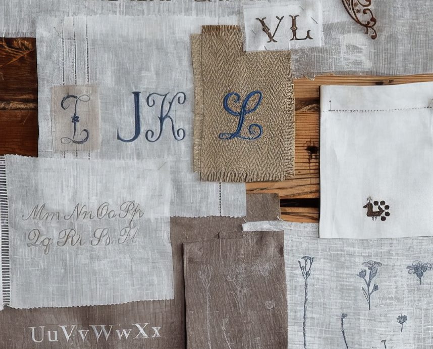
Impressive History Of Fine Swedish Table Linen
Guest Post, Jason Phillips
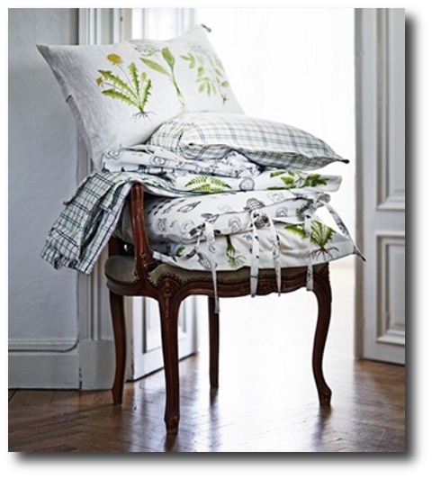
Linen has been a part of humanity for thousands of years. The ancient Egyptians used it to dress and as cloths. Pieces of linen have been found which date back to 4,200 BC although there are not many which have survived! Swedish linen today is made in a very similar way to those original processes. During the 1500’s tablecloths were used by the wealthy, the cloths were made from damask linen which was imported by Flanders and Holland. The cloths were ornate and decorative; it wasn’t until the 1800’s that the use of tablecloths became a common item in many homes.
Linens In The 18th Century
In 1730 a man called Stephen Bennet set up a linen factory in Sweden; the business had approximately eighty looms and produced some of the best quality damask of the period. The factory was operated until 1845 when it, unfortunately, closed down. During this time Sweden was building a reputation for producing high quality flax and linen; this is the origins of the fine quality Swedish table linen available today.
The Production Process
Men were generally responsible for the heavier work; this mainly involved the carrying and lifting of the heavy materials involved in the production process. Women and children were used to create the actual linen. This was generally split between the ones who had a high degree of manual dexterity; these were the ones who made the fine quality table linen and used one of the looms. The less able children and women dealt with the more mundane work; which was essential to ensure the production was successful.
It was the women who were usually responsible for coloring the flax. This could be a time consuming and awkward job as the majority of the dyes were not colorfast. Most of the dyes were created from natural materials such as leaves, lichens, moss and bark.
A Sound Reputation
The process of weaving fine table linen may have been complicated but its quality was becoming known in many places around Europe. There are many stories of satisfied customers. One particular example which has been told many times over the generations is in regard to a gentleman called Calle Redhe who owned one of the weaveries in Sweden. He used to personally take some of his linens to Norway and the story tells of the summer he went to Norway and met an elderly lady.
The lady knew who he was and, upon confirming his identity, immediately asked for some napkins to go with a tablecloth which she had purchased nearly sixty years before. The tablecloth had been made by Calle’s father and was produced on the same loom; something which delighted the elderly women and ensured she told everyone she knew.
Modern Productions
The high quality linen produced today in many of the factories across Sweden utilizes the same methods as were used so many years ago. The overshot weave cloth is still patterned and is made to at least the same quality standards as the original pieces. The production methods may be ancient but they have stood the test of time and many people are able to purchase elaborate, ornate pieces of linen which look and feel like they should belong to royalty. The industry today is proud of its heritage and works hard to produce items which will also stand the test of time and inspire those in the future.
Just as you can buy something today which will match something your grandmother bought; so too will your children or even grandchildren be able to match your purchase. As long as linen making is a part of the Swedish culture it will be possible to purchase your own piece of history!
Whether you’re hunting for table linens or bed sheets, it is important to focus on quality. The best fabrics are Egyptian cotton and silk. While it’s true that these are more expensive than polyester or cotton blends, they last longer. They’re hypo-allergenic and they have a functional purpose too. Good quality cotton traps moisture and it protects your furniture. Used in the kitchen or dining room, luxury linen fabrics prevent dust from settling and they have an appealing design too; just make sure the set chosen for your bedroom matches with the overall appeal of your room.
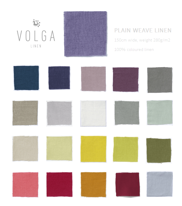
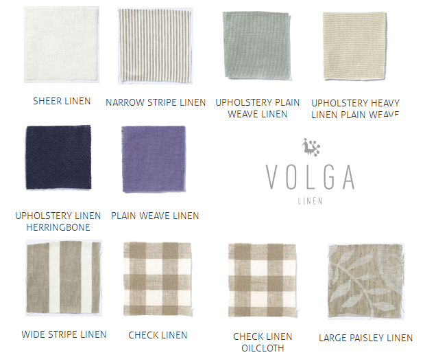
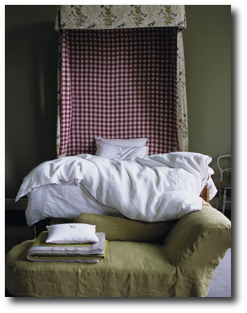
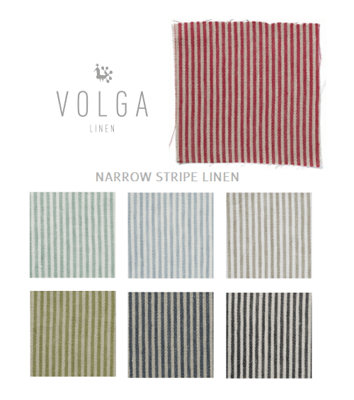
Picture Credits, Volga Linen Styling by Simon Kämpfer, Photography: Yuki Sugiura
Life In 17th Century Norway & Sweden
In the 17th and 18th centuries, the Nordic people had various desires and aspirations influenced by the social, economic, and cultural context of the time. Here are some of the most sought-after things during those centuries:
Wealth and Land: Accumulating wealth and owning land were significant aspirations for many people in the Nordic region. Land ownership represented social status, economic power, and provided opportunities for agricultural production and resource exploitation.
Trade and Commerce: Nordic countries, such as Sweden and Denmark, were engaged in international trade during this period. Merchants and traders sought to establish profitable connections with other European countries and expand their commercial ventures.
Access to New Goods: The growing trade networks allowed for the introduction of new and exotic goods into the Nordic region. People sought after luxury items like spices, silks, ceramics, and other commodities that were not readily available locally.
Education and Knowledge: The Enlightenment period in the 18th century brought an increased emphasis on education and the pursuit of knowledge. People sought access to education, particularly in fields like philosophy, science, and the arts.
Social Status and Prestige: Nobility and social hierarchy played an important role in the Nordic societies of the time. Many individuals desired to attain or maintain their noble status, associating themselves with the upper echelons of society.
Cultural and Intellectual Trends: The Nordic region saw an influx of ideas and cultural movements from other European countries. People sought to be part of these intellectual trends, embracing new philosophies, literary works, and artistic movements.
Scientific Advancements: The 17th and 18th centuries witnessed significant scientific discoveries and advancements. People were eager to access and learn about the latest scientific theories, particularly in fields such as astronomy, physics, and medicine.
Political Influence: As in other parts of Europe, power and political influence were highly sought after. Many individuals aspired to hold positions of authority, whether in local governance, regional politics, or the national administration.
It’s important to note that the desires and aspirations of individuals varied depending on their social class, occupation, and personal circumstances. These general themes provide a glimpse into the aspirations of people during the 17th and 18th centuries in the Nordic region.

18th Century Antique Swedish Rococo Tragsoffa | Vinterior
 Picture –thisivyhouse
Life In the 17th century Nordic countries
Daily Routine: People in the 17th century generally woke up early, as daylight was essential for most activities. They would begin their day with personal hygiene tasks like washing their face and hands, often using water from a basin. Due to limited sources of artificial lighting, the evening hours were typically dedicated to rest and sleep.
Work and Occupations: The majority of the population in the 17th century lived in rural areas and worked in agriculture. Farmers would tend to their crops and livestock, while women would engage in domestic tasks such as cooking, cleaning, and caring for children. In urban areas, people were involved in various trades and crafts. Merchants conducted business, artisans practiced their respective crafts, and apprentices learned skills from their masters.
Religion and Church: Religion played a significant role in daily life during the 17th century, particularly in Europe. Most people adhered to Christianity, and attending church services was a central part of their routine. Church buildings often served as community centers, where people gathered not only for religious activities but also for socializing and discussing local matters.
Education: Formal education was limited during this period, and literacy rates varied across regions. Wealthy families could afford tutors or send their children to private schools, while the lower classes often received basic education through informal means. Education focused on religious teachings, reading, writing, arithmetic, and vocational skills.
Entertainment and Recreation: In their leisure time, people in the 17th century engaged in various forms of entertainment. Popular recreational activities included playing games, such as cards, dice, and board games like chess or backgammon. Sports like archery, bowling, and tennis were also enjoyed. Social gatherings and events, such as dances, music performances, and theatrical plays, provided further amusement.
Art and Culture: The 17th century witnessed significant advancements in art and culture. Renowned artists like Rembrandt, Caravaggio, and Vermeer produced masterpieces during this period. Literature flourished with the works of influential writers like William Shakespeare, Miguel de Cervantes, and John Milton. Music, including compositions by composers like Johann Sebastian Bach and Antonio Vivaldi, also thrived.
Fashion and Dress: Clothing in the 17th century varied based on social class and occupation. Wealthy individuals wore garments made of fine fabrics and adorned with elaborate embellishments, while commoners dressed more simply. Fashion trends were influenced by the styles of the monarchy and the aristocracy, and clothing choices often reflected social status.
Food and Drink: The diet of people in the 17th century consisted of locally available food sources. Common staples included grains like wheat, barley, and oats, along with vegetables, legumes, and dairy products. Meat was primarily consumed by the wealthy, while the less affluent relied more on fish and poultry. Alcoholic beverages, such as beer and wine, were commonly consumed due to the limitations of safe water sources.
It’s important to note that the specifics of daily life in the 17th century varied greatly depending on the region and social circumstances.

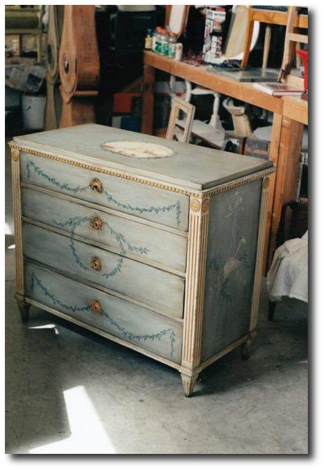
The painted detail of a 18th Century Swedish Gustavian Chest – 1st Dibs


Antique Swedish Furniture

Swedish 18th Century Gustavian Clock with Original Paint – averydash.com/
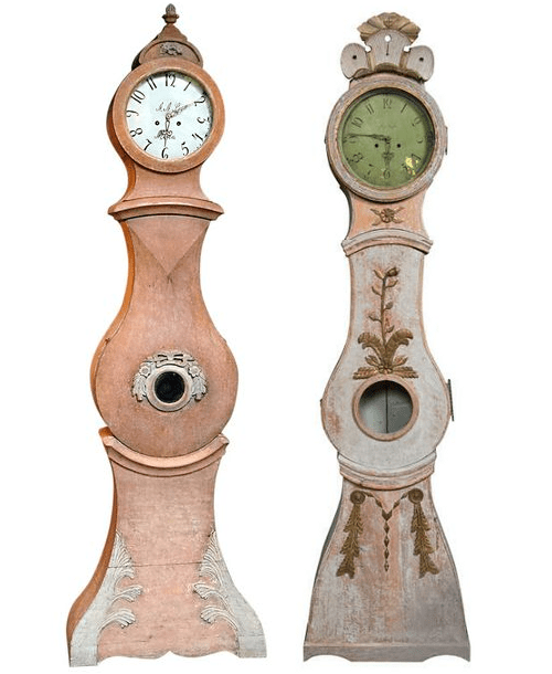
Mora Clock in Original Salmon Paint Found on 1stdibs.com
Swedish Tall Case Clock, ca.1780-1800 Found on 1stdibs.com
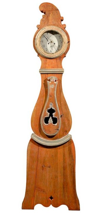
19th Century Swedish Orange Painted Wooden Clock Found on 1stdibs.com
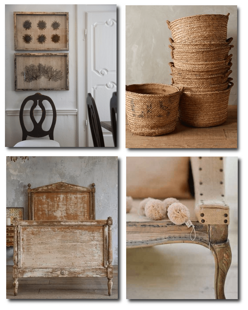
Gustavian Style Found on houzz.com
Harvest Basket, Found on anthropologie.com
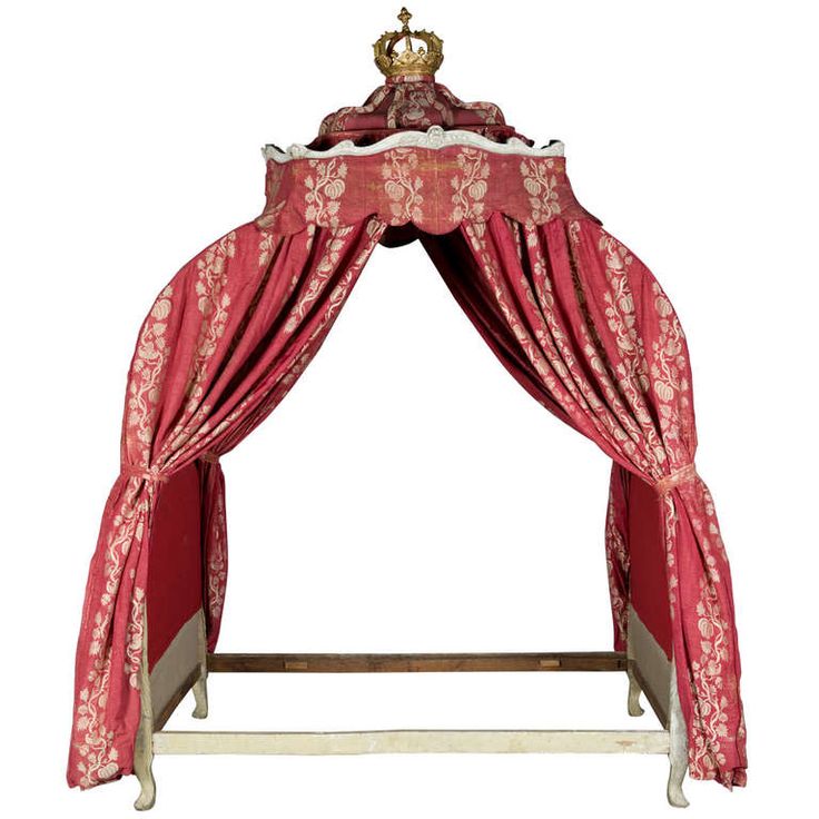
Directoire Bed, Found on eloquenceinc.com
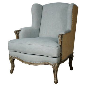
De-constructed Chair – Found on inspired-design.tumblr.com
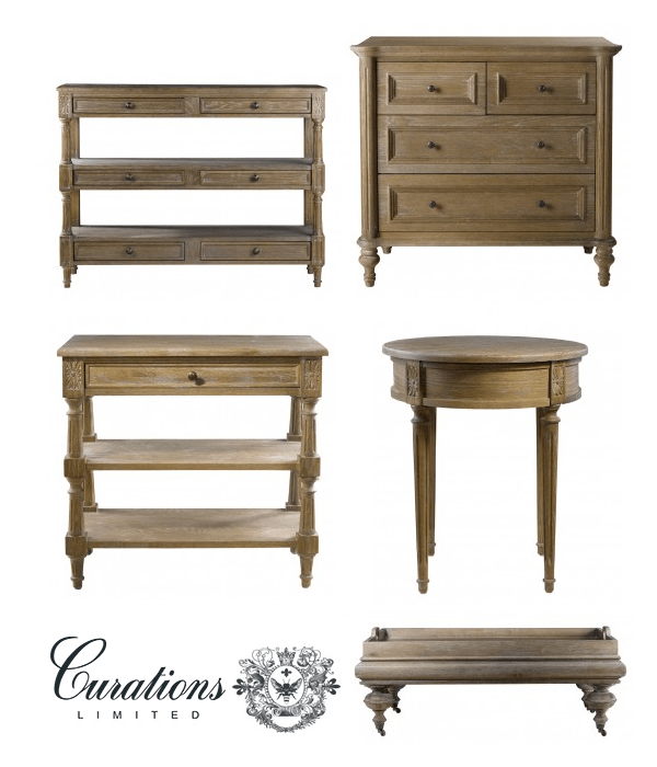
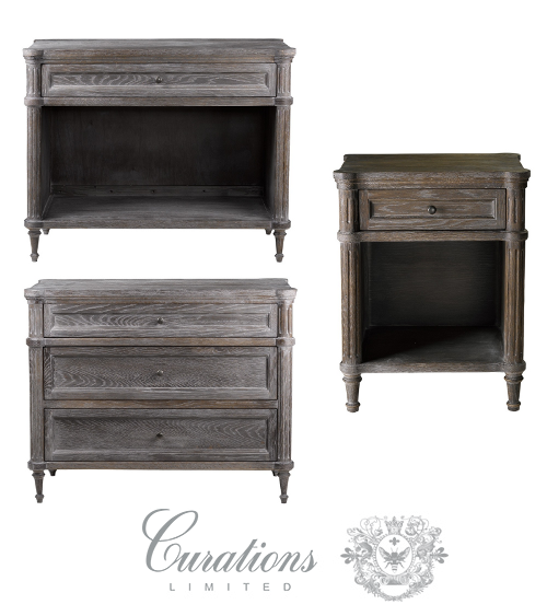 Alden Furniture Collections- Curations Limited
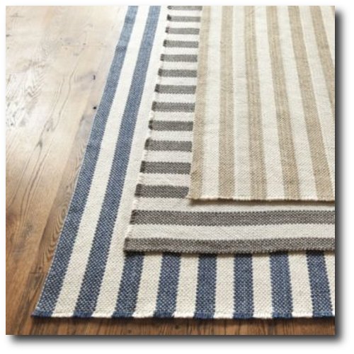
Vineyard Stripe Rug Ballard Designs
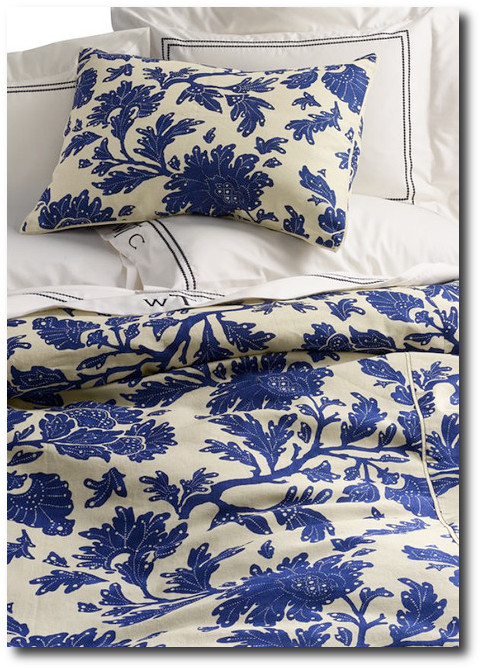
Harbor Springs Floral Duvet Cover, Lands End
Buy Authentic Historical Textiles online at Ljungbergs Factory
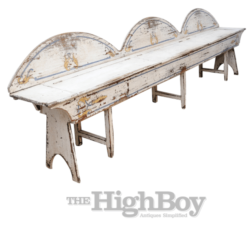
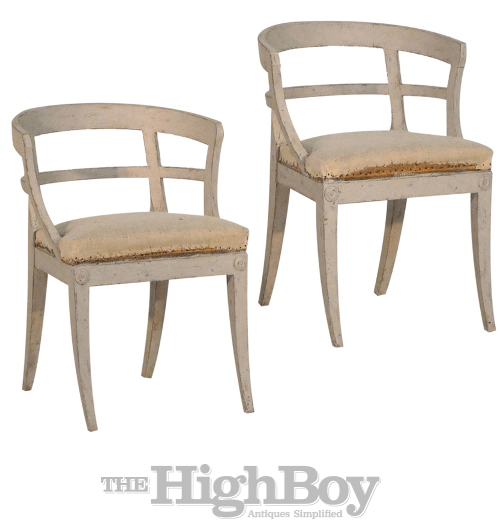 Pair of Swedish Sulla chairs with curved and open H-form backs, with original upholstery raised on splayed legs.- Highboy Antiques

An antique looking mailbox – Amazon

A mailbox with a blue distressed finish – Amazon


Mid 19th Century Painted Water Carrier – debenhamantiques

Living In Norway- Norwegian Life In The 18th & 19th Centuries By Elisabeth Holte
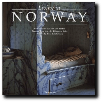 Living in Norway by Elisabeth Holte, is a book you need to look though. This book features 250 lovely photographs of Norwegian interiors which specialize on folk motifs, and countryside homes. The book is divided into the four seasons: fall, winter, spring and summer.
When it comes to antiques, this book shows them in their historical natural settings. View homes that look untouched from the 18th and 19th centuries. Many of the “hytta” or cabins found in Norway have been now turned into bed and breakfasts or museums which have kept much of the traditional interiors intact.
Look through many examples of traditional rosemaling on the walls and on the outside of the shadow box beds that show you the sheer talent of country people in the 19th century. In this book you will find a rich selection of Norwegian homes, interior and exteriors images, focusing on mostly historical homes, with the exception of one home set in the modern style.
214 pages show a variety of pictures, with a special section at the back featuring a visitors guide. While this book was published in 1999, this book is breathtaking, and be a classic example of the interiors found a long ago that we never get tired of.
Quotes I found most interesting:
On The Style Of Houses In Scandinavia “As Far back as ancient times, the Swedes usually constructed lightweight buildings with wooden facades, while the Danes, who claim practically no forests, built their (hatched cottages in stone and clay: the Norwegians built their solid valley farms of logs, one farm often made up of twenty buildings for different uses”
On Dragon Viking Style In Norway – “It was only in 1005 that Norway became a monarchy again with the coronation of the Danish prince Charles (the grandfather of the present King Harald), who came to the throne under the name Haakon VII. A renewed national consciousness was expressed in architecture and furnishings by the adoption of the Dragon style, inspired by a pseudo-Viking nationalism. As a people, therefore, we are both old and young, which explains the dominant rural trait in Norwegian culture”
On The Popularity Of Dragon Style “Dragon chairs that had been banished to the attic are now being brought down for a fresh look. The style originated in Sweden at the beginning of the 19th century and spread to Norway. The Swedes and the Danes tired of it in the 1880’s but Norwegians maintained the Dragon style and used it as a symbol of their ongoing struggle to leave the threadbare union with Sweden, which ended in 1905. Considered a pure Scandinavian tradition, totally independent of what was happening on the continent, the Dragon style was an expression of the pride of the Viking age”
On The North Summer Nights “As the days get longer, nobody wants to go to bed. In the south, it is possible to read outside in the garden until eleven o’clock at night and the sun is already up again by four in the morning. North of the Arctic Circle, the sun doesn’t set at all, creating an almost unreal atmosphere. During those ‘white’ nights of the midnight sun. time seems to stand still. In enjoy the beauty of the midnight sun at its most breathtaking”
On Rose Painting Artists “Rose Painting was distinguished as any of the country’s more widely known cultural representatives. Rose-painting was a rustic art made by local masters who traveled from farm to farm, often spending months in one place carving and painting the most magnificent interiors. The tradition of rose-painting started at the beginning of the 18th century and reached a peak towards the beginning of the l9th, surviving until the middle of the 19th century. For the owners of the houses, rose-painting was a way of expressing new-found prosperity, and farmers and peasants wanted to show off their wealth and their improved social status, much as the prosperous merchants and civil servants in the towns displayed theirs”
Norway’s Coastlines “Along Norway’s southeastern coast the climate is sometimes so mild that even herbs like thyme, cultivated on the terrace to flavour summer meals, survive the winter . One of summer’s highlights on the Sorlandet is the Trebatfestivalen (Wooden Boat Festival)
which takes place in August in the fine little sailboat town of Ris0r, whose harbour is lined with white wooden houses. Timber trade with Holland led to the creation of Risor in the 17th century, and it grew to become an important trade and ship-building port in the 18th century without ever losing its charming small-town atmosphere.”
On Rose Painting Art “Rose-painting was an amalgam of local tradition and personal style. Artists generally knew of the major artistic trends and skilfully incorporated this knowledge into their designs. Although rose-painting lagged behind stylistically in relation to the major artistic trends that were evolving on the continent, you can nonetheless find elements drawn from all the major styles—Renaissance, baroque, rococo and Empire. The leitmotif of rose-painting, the elegant, sweeping baroque tendril, could play different roles within a design, in conjunction with flowers, in elaborate geometric patterns or as a structure for other motifs;. Popular motifs included human figures (the artist might paint the farmers wife if he found her pretty enough), flowers, trees, religious scenes, and soldiers on horseback with little dogs running at their feet. Artists chose pure, bright hues to produce vivid but harmonious effects”
On Popular Antique Furniture “For two or three generations, there has been a craze for antique farm furniture and objects in Norways towns, ranging from fine and costly 18th-century tables and dressers to a more basic lyed farm table or the antique wooden bowl. It is only recently that urban antiques have started to attract attention. Mainly of these come from Sweden, Denmark and Norways southern coast, and are made From birch or old English mahogany in the Empire style. However, bondemobler, or old farm furniture, remains the most sought after type of antique”
On Artist Peder Aadnes “One of the most renowned 18th-century painters in the lowlands to the east was Peder Aadnes. He created delicate, baroque, floral designs in soft blues, but his style tended to be more urban than that of his fellow masters. When rose-painted furniture attributed to Peder Aadnes or his fellow masters appears on the antique dealer’s circuit in Norway today, you have to be prepared to pay enormous sums for a major item such as a sideboard. The colors and forms are so beautiful that you could put that sideboard in an empty room and need little else”
On Antiques In The Countryside “Even in the most modern Norwegian homes, it is unusual not to find at least one small remnant of the countries rural heritage —a bowl, a table, a rose-painted chest of drawers, or a painted dresser. (It would also be unusual not to find an example of Norway’s innovative contemporary handblown glass or pottery.) Up until the middle of this century, there was little appreciation of antique farm furniture in the rural areas and much of it was bought up cheaply by city dwellers dealers. These days, most farmers value their heirlooms—their painted beds, massive tables, rose-painted or stenciled walls—and take good care of them. On some farms, whole interiors can be works of art. Because craftsmen not only made furniture but also carved and painted entire rooms, including the bonded timber walls and the ceilings. Baroque tendrils and rococo shells adorn the massive wooden walls and beamed ceilings, while carvings of soldiers or king- with sabres drawn, brings doors to life. Many of these 18th century rooms still survive intact in farmhouses in the valleys and on the lowlands of southern and eastern Norway. Some are still used by the descendants of their original owners. Often, though, the present-day owners have made themselves modern houses next to the old ones, with luxuries such as electricity and plumbing”
Rugs Made From Scraps Of Cloth “Yli farm in Telemark is one of Norway’s finest folk art interiors, with 1797-1807 richly carved box beds and exquisite rose-painting. The lush, colourful rose-painting, rosemaling, by renowned local masters, involved far more than mere flower decorations and usually did not include any roses at all. In many valley’s dialects, rosut (rosy) simply meant decorated; rose-painting was the general name for the luxuriant rural decorative art in the 18th and 19th centuries. In the old days, weaving cotton rag rugs (left) was a way to make use of worn household textiles and clothes.”
Get the book Living In Norway, By Elizabeth Holte, Photography by Solvi Dos Santos from $12 dollars on Amazon


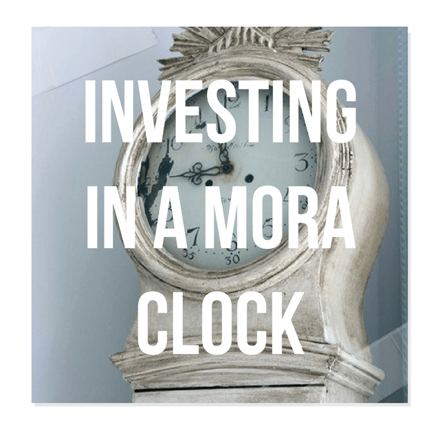
Investing In Mora Clocks – Expert Advice From Jo From Swedish Interior Design
Swedishinteriordesign.co.uk specializes in Swedish Antique Gustavian, Biedermeier, Rococo and Country Painted, Veneer and Natural Wood Furniture.
In the Homes and Antiques April 2014 Issue, Swedish Interior Design was asked to spill about Mora Clocks. Here is what they had to say:
A grandfather clock by another name?
A Mora clock is specifically a longcase clock made in the town of Mora in central Sweden during the l8th and 19th centuries.
Why there and and why then?
Bad harvests in the 1700s meant that the farmers of Mora, which was a largely rural community,
had to come up with a way to supplement their income. The pendulum clock had been invented by Dutch scientist Christian Muygens in 1656 using the sketches of Galileo so there was already something of a tradition for making clocks of this sort in Scandinavia and the cottage industry quickly developed. Each family in Mora look responsibility for making a certain part: the pendulums, the faces, the brass mechanics and so on.
Tell us about the clock’s defining features…
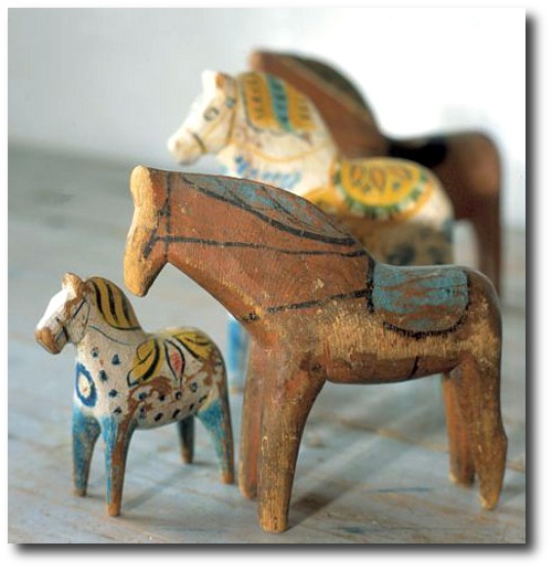
They are known (or their curvaceous hourglass shapes and are more often than not painted in pale greys, whites or blues as these colours reflected candlelight better on long dark evenings. Sometimes they will have ‘kurbits’ folk art designs – a form of bold, painterly decoration most
recognizable from wooden Dala horses that originate from Dalarnia, the same region that
Mora clocks come from.
How easy are they to come by?
Oddly the largest collection of Mora clocks is here in the UK. It is owned by Jo and Madeleine
Lee who run Swedish Intorior Design and have just moved their business to an old granary near Shoreham where you can find over 50 of the clocks in stock. Look out for ones marked ‘AAS’. They may well be made by the first Mora clockmaker Krang Anders Andersson whose oldest known clock dates to 1792. Be wary though, the moniker has been copied onto later clocks so check for documentary evidence of his craftsmanship.
Jo spills some of his secrets of how he goes about refreshing Swedish antiques that need a facelift.
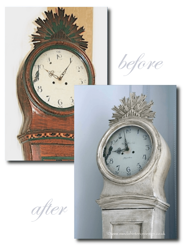
He discovered this Mora clock about many years ago, and it was one of the first pieces he found in Sweden. He loved the clock but wanted the overall look to fit into their 1886 apartment which was decorated around whites and greys.
The clock was found painted in a “Kirbits Folk Art Style…..
“It was statuesque, superbly proportioned, elegant and painted in reproduction Kurbits Folk Art style. The repaint was probably done in the early 1900s and the colours they had used and the painting style were rather garish. The original Kurbits Folk Art Style was prominent in Sweden in the early part of the 1800s and was a freehand style using feather shapes, swirls and subtle earth tome colors (reds, ochres, yellows, oranges) to create a visually sumptuous but definitely country style. You can see examples of the kurbits painting from the early 1800s by looking at the 360 degree view of the Swedish Interior Design Kitchen where we have freestanding cabinets from 1799, 1803 and so on with the original Kurbits paint.”
Jo tells us how he made this clock look antique with paint:
Step 1 – “Key the entire clock with medium sandpaper (180 grit) to allow the paint to grip and look it over to decide whether there were any bits that needed gluing or fixing. Generally I prefer to leave pieces ‘as is’ if possible rather than fix them up to much as the life they have undergone is part of their character and makes them real”
Step 2 – “Prepare The Tools In this case a variety of brushes of different sizes to allow me to get a fine coat on to the clock without filling up the wonderful crenulations and shapes on the body with excess paint. You can get very carried away with special brushes but actually we generally use pretty standard ones – my brush heads don’t have to include virgin yak tails from Mongolia! In this case I used a Craig and Rose acrylic paint (I used Regency White in the Chalky Emulsion finish), which dries nice and quick and that goes on very smoothly with a nice chalky texture. I didn’t use a primer in this case but you can if you want. Alternatively, any chalk-like paint such as Farrow and Ball’s Estate Emulsion, Chalk or Milk Paint could be used. With Chalk and Milk Paint, you would have to wax the piece and not glaze it as I did, which I will talk about a bit later.”
Step 3 – Base Coat “A nice smooth stroke with a larger headed brush to keep an even spread and smaller headed brushes or ones where I’ve cut them to an angle for getting in and under things! Always be careful not to let the paint pool or drip and consider it from several angles to make sure the coverage is good. Once I’d built up the base coat, I added 2 further coats at a slightly watered down consistency until I liked the visual texture“
Step 4 Sand “Light sand to matte the paint down a bit with 320 sandpaper and then some judicious distressing either in the right places where you would naturally get a lot of use (like the handle in the pendulum door) or for effect (to highlight a special feature). I also use a razor blade too sometimes for a different look”
Step 5 Antiquing. “Now that I like the basic color and the level of distress, I decide how and if I should antique it. When well done, antiquing really adds to the feel of a piece and can highlight its decorative mouldings, giving them a 3D effect. But if overdone or clumsily applied..awful! Many people like to use wax but I prefer to make up my own antiquing fluid using an acrylic glaze as a base. I mix the acrylic glaze with a dark brown, grey, red or yellow paint so I can create an antiquing color that matches the color tones I want to effect and it still looks like the real ‘dirt of ages’. So sometimes it’s greyer, browner, more yellow, ochre or red – whatever you need for a special job. The key is “think” where naturally dirt would accumulate and build it up in layers and once that’s done to see if you want to use it as a special effect to highlight any feature. Another light dusting with 320 sandpaper in places and then stand back and admire the handiwork”
You can see their unique collection of antique mora clocks, and other Swedish furniture by viewing by private appointment 7 days a week.
Call +44 1273734371 or visit the website at www.swedishinteriordesign.co.uk
Also, look up at Swedish Interior Design blog for more tips of how to decorate with Swedish furniture.
Follow Jo on Facebook, follow his wife’s blog Madeleine Lee.com
- Madeleine In their Swedish Home
- Picture Credit- Swedish Interior Design
- Beautiful creamy whites and golds seen in their home
- Pictures taken in their home for a fashion editorial in Coco Indie Magazine, see more at bellakotakphotography.com
- Swedish Interior Design
- Clock 1: Unique Early 1800s antique Swedish mora clock with an incredible original trompe l’oieil wreath motif and a very unusual larger head with stunning roman numeral clock face
- Clock 2: Early 1800s antique Swedish mora clock in original white paint.The mora clock is in good condition and features the makers name ‘Roth of Norkoping’ and elaborate beautiful handpanted gold curlicue designs.
- Clock 3: Very early 1800s Swedish mora clock in original paint. Incredible ribbed crown motif on the hood and very distressed but structurally sound.
- Mora Clocks From Swedish Interior Design



 decorativecollective.com