
Here are 200 different types of Swedish antiques that a person can consider buying: Gustavian-style dining table […]
The Rococo style, which emerged in the early 18th century, originated in France and quickly spread throughout Europe, […]
“After about seven years, I could buy a really nice piece of furniture once a year,” she […]
Set of 6 Gustavian Chairs – 9k 1st Dibs The Gustavian Chair Gustavian furniture is pure style […]
You love Swedish style but don’t know exactly where to start. Here are a few ideas for you […]
See more pictures of these wall paintings on Miras Mirakel’s blog. Picture Credit – naturbilder.biz […]
HomeGoods Style Expert Beth Diana Smith predicts that, in 2022, many will go green by decorating around green-hued […]
At last, I can say it is finished! Painted and waxed on all sides. Of course things never […]
Look at this winter cake designed by Maria_Altynbaeva. If you are looking for a European themed […]
Lighter Colors are used in this interior, whose picture appeared on the cover of Classic Swedish Interiors 1. […]
In this link, Quinn pieces together 30 of the best gray paint shades from Behr. Where it gets […]
You must see this step by step transformation of installing upper kitchen cabinets with a custom made […]
Chinoiserie Green Gold Late 1700s Gustavian Rococo Mora Clock – 1st Dibs Swedish Long Case Mora […]
The Home Office When the country was instructed to work from home if possible, there were some happy […]
Dawn Hill Antiques Swedish furniture is in a class of its own. From the exuberant decoration of the […]
Larsson, Carl (1853-1919) Among the Swedish artist Carl Larsson’s many watercolours of the house he shared with his […]
In the nine years since they founded D. Larsson Interior and Antikhandel, Daniel and Cristina Larsson have become […]
As a former editor for home decor magazines, Dara Caponigro has spent her career immersed in decorating. Dara […]
Swedish 18th Century Gustavian Pine Desk –1st Dibs The regions fondness for natural materials, muted color palettes and […]
1. Being Afraid Of Contrast “People with great style have a natural understanding of scale and proportion,” New York-based […]
This beautiful home is decorated around pops of lemon yellow. Swedish antiques can be seen through out this […]
In the Swedish archipelago, designer Marshall Watson let the landscape guide his palette. The result is a serene […]
Located in a sunny 1,250-square-foot bungalow, Madre features children’s clothing and accessories, furniture, lighting, artwork, handmade ceramics, […]
[vc_row][vc_column][vc_single_image image=”26617″ img_size=”large” alignment=”right”][vc_column_text]Fabric can be costly today, particularly when you are requiring a great deal of it. […]
Picture Credit – ladyinspirationsblogg.se Guest Post – Jason Phillips Elegance and style along with a sense of simplicity […]
Check out these absolutely beautiful pictures of Jenny’s studio space made over with plywood cut into planks: I […]
Can you see yourself in some of these? Vogue pulls together 12 pieces of advice from design experts […]
Adding stain over paint on furniture, or exterior wood surfaces such as siding or a deck can […]
Q: Clearly, you are scholars on Scandinavian style. For you, what is the essence of it? A: Recognition […]
This vintage butlers desk has the perfect lines for a Swedish Gustavian styled home. In the picture above […]
Christine Adams Wood Finishing Technical Writer at General Finishes October 21, 2017 A TUTORIAL ON WATER BASED TOP […]
Swedish design in American interiors is at an all-time high. Chosen for its qualities not as a fad […]
Christine Adams Wood Finishing Technical Writer at General Finishes January 6 · 2018 is here and it is […]
Let’s find the best can of gold spray paint I bought a bunch of mini terracotta pots to […]
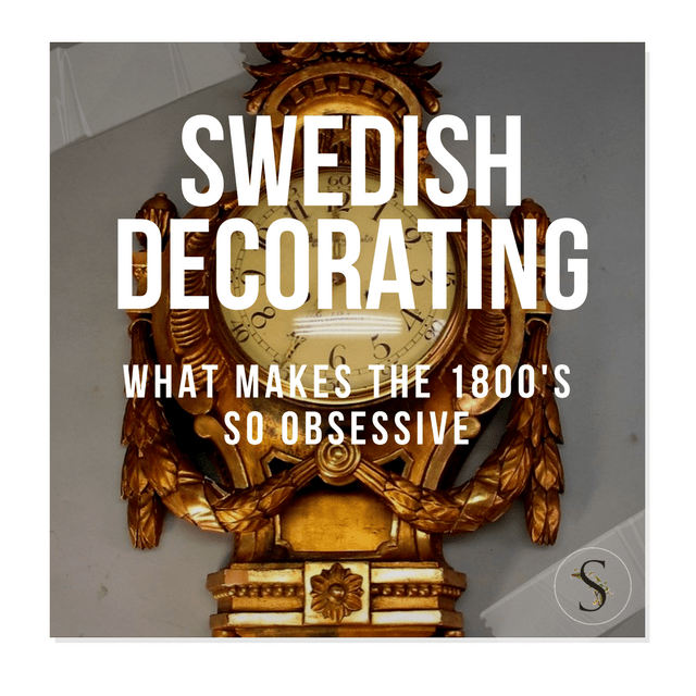
Guest Post by Jason Phillips The 18th century Swedish interior was a manifestation of neo-classism across Europe. It […]
I don’t know what kind of leader King Gustav III of Sweden was, but he really had some […]
A Swedish twist on French neoclassicism, Gustavian décor may date back to the 18th century, but its suddenly popping […]
Children are gifts that need to be pampered every time. When you are expectant and planning to prepare […]
A New Dissertation From Uppsala University Shows How Gustavian Style Has Defined Swedish Tastes In Art Why has […]
This post was featured in the 18th Century Sewing Group Christine Yoo Millar with Matthew Millar. After 375 […]
Picture Credit Quality Is Key On Ebay Image 1 source: www.swedishinteriordesign.co.uk, blog.thehighboy.com, Guest Post -Chloe Taylor Scandinavian […]
I bet you could find a few different spots for this spectacular sofa in your house. Dark gray, […]
If you are looking for something elegant in blue, look at this sweet loveseat that could be a […]
There is a masculine side to the Swedish style, and this is it. Can you imagine this in […]
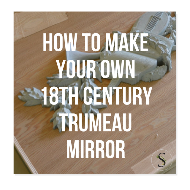
If you are looking for an inexpensive way to dress up your walls, this might be it. I happen to adore the 18th century style, but don’t want to spend a ton of money to achieve the look in my home.
Decorative carved plaques were quite popular in France, and eventually Sweden perfected the look. Musical instruments, hunting motifs, and florals seemed to be the most popular carved designs in the 17th and 18th centuries. These wood carved decorative elements were often seen framed within wooden decorative trim and commonly found above doorways, or fireplaces.
Today you can see these beautiful plaques on pieces of wood in some of the most beautiful interiors decorated after the European styles of the past.
I have created a few of these plaques for my house and I really love how they have turned out. They give me the look of a large piece of art, without having to complicate my interior with lots of colors. Best of all, this project is fairly simple to create.
Vintage Syroco
Rococo is a design most popular in the 1730s. The design heavily influenced architecture, painting, sculpture and eventually furniture and decor.
Mirrors made after these styles became popular in the 50’s by a company called Syracuse Ornamental Company who at the time produced ornamental carvings to embellish furniture. The company was founded in the late 1890’s by Adolph Holstein who was a talented Austrian woodcarver.
The opportunity for his business to expand when Holstein developed a casting technique which produced a high quality product without the laborious intensity and time of wood carving. Holstein used Syroco to create perfect replicas of their original carvings.
Many of their molds featured a wood grain within the mold, giving their overall product a higher end feel for less money. As the modern movement hit in the 1940’s their business turned from ornamental embellishments to novelty items which didn’t profit as well, so the company returned to making the highly ornate wall mirrors, sconces, and decorations in the 1950’s which became a huge sensation.
These very same items from the 50’s can be found on ebay, and made to look high end with layers of paint in shades of gray, white and beige paint for a higher end European look.
The Materials Used For My Project
The materials you need are plywood, decorative trim, a decorative element that you want to frame, a miter box and a compressor with a nailing attachment certainly helps.
The pieces that I have purchased for my creations are Dogwall plaques from syroco, and two large vintage burwood musical plaques.
I tend to make my projects as simple as possible. For this project I simply cut a piece of plywood, and made my own miter box to hand cut the decorative edging that was placed around the edges of the wood.
The decorative edging I used was from Home Depot. You can find a picture with the number of the product below. The edging was simple, and easy to work with.
I made my miter box by simply screwing a piece of 2 x 4 wood together with two wood sides. I then took my miter saw, and cut the wood to give me a guide. It was as simple as that. I found that using my saw was not only dangerous with thin wood edging, but also that the wood would be torn apart with using the fast blade. My advice, buy a miter box or make your own like I did.
Next, I used a compressor with a nailing attachment to add the trim and the decorative element. I used wood filler to fill these holes, along with adding wood putty to the sides of the plywood to give it a finished appearance.
In a previous article, I described using Durhams putty to seal the edges between the wood and the decorative relief. You can find more pictures of this project in this post there. The beauty of Durhams putty is that it dries in a shade of light yellow. When you paint your object, what I do is wash off parts of the motif with a damp cloth, and the putty appears to look like wood painted. Working with this product is a perfect way of faking this whole look.
I love this look and these plaques happen to be my favorite pieces in my house. What do you think? Do you love it?
More Inspiration:
- A plaque made by Bliss Studio- here
- Plaster medallions of Carl Michael Bellman & Ulla Hopken – here
-
Swedish Plaster Medallions- here
- Wood Wall Plaques- here

Burwood musical plaques before they were painted

The molding I used from Home Depot

Pair of Late Gustavian / Neoclassical Chairs

The Scandinavians are known around the world for creating simple, stylish and functional furniture; its style reflects its origins, furniture and décor which maximized the available light and space. The look is minimal, yet honest with an earthy flavor. It is the perfect style to use when you are looking to revitalize an old, gloomy house and create a contemporary yet practical flare. To really get the 1800s Swedish feel in your home you will need to follow these tips:
Wooden Flooring
The flooring should be light and preferably wood, although a laminate will have the same effect. This allows the sunlight entering the house to bounce around the room and help to create a feeling of space, warmth and light. The bathroom is the only exception to this rule as a darker, warmer color will make the room feel more inviting.
Color Palettes Of Brown And Grey
The original Scandinavian design would be for white walls and a pale grey or light blue; either as a feature wall or as part of the design; the color of the furniture or the accessories. However, there have been several other influences in the Scandinavian scene and it is possible to introduce some bright colors through the accessories or even the flowers in the room. These will draw the eye and make the room feel friendly and inviting. It is also possible to opt for wood on one of the walls; it is a natural material and adds a layer of warmth to the property. If the wood is too yellow for your taste than it can be white washed or you can use grey oil to dilute the color.
Furniture Lines
The handmade designer furniture you use in your Scandinavian room must have clean lines. The majority of Swedish furniture elements will already have the lines you require. This simplistic approach will provide a calm, tranquil room in which to relax.
Functional Furniture
The Swedish pride themselves on providing stylish yet functional furniture. Every piece has a specific purpose and it is well designed for that purpose. This ethic should apply across the entire house; it avoids unnecessary clutter and encourages the simple, minimalistic style. Furniture may have been designed recently or may be genuine antique pieces. Either will work as the elements of design have stayed true throughout time; every Swedish piece has a classic beauty in its simplicity and will sit perfectly in a room today. The way this furniture has been designed allows it to blend with any room, creating a stylish, yet practical living area.
Corner Fire
Swedish winters are generally much colder than those in many other parts of the world. A fire is an essential part of surviving these winters. However, they are not the feature point of the room; they are seen as another piece of furniture. Swedish fires are often tiled and sit in the corner of the room. They are usually very simple in design and may hardly even be noticed with their doors closed. The corner approach also allows the heat to radiate out across the room effectively.
The Environment
The Swedish are well known for adding environmentally friendly features to their houses. This can be as simply as embracing the energy efficient light bulbs, to adding solar panels or a ground source heat pump. Insulation and triple glazing are also standard on new builds and help to create the warm, inviting interior of a Swedish house.
Less is more
Scandinavian design does not incorporate an abundance of ornaments and accessories. The approach is minimalistic in order to keep the clean lines and bright spaces that they desire. Among the few accessories will usually be a plant or bunch of flowers to add a touch of the outside to the décor. Blend your minimalistic approach with natural materials and you will have a beautiful house that you can
actually live in!
Embrace the Swedish home design and transform your home into a welcoming, truly inviting living nest. Choose a dominant color that best lives up to your expectations, and don’t be afraid to improvise. Oversized throw pillows, flower pots with seasonal flowers and custom-made furniture items are everything you need for a Swedish-inspired home.

A Swedish Early Gustavian Period Console Table circa 1770 1st dibs

19th Century Swedish Gustavian Pedestal Table

Set of Four 18th Century Swedish Gustavian Chairs

19th Century Swedish Gustavian Style Bench
Tricia Foley {staircase} by recent settlers on Flickr “I think that many people try to copy what’s trendy […]
Theriault’s Antique Doll Auctions, Found on theriaults.com –Antique baby carriage by rubyblossom. on Flickr Stationary Panel Crib W/ […]
Home Office Chair with Casters, Unfinished$130 (Affiliate Link) Sidetable from International Concepts (Affiliate link)- $84 here Imagine […]