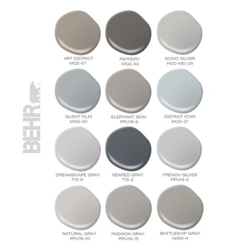
30 Gray Toned Paint Colors For Swedish Styled Interiors – Behr
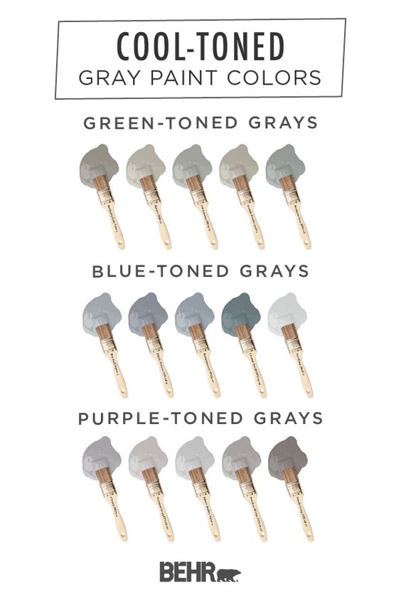
In this link, Quinn pieces together 30 of the best gray paint shades from Behr. Where it gets interesting is for you to determine exactly what undertones you like.
In this article, there are 5 categories of undertones. Blue, Purple, Green, Orange and Red. Over time, most people usually lean towards either a cool collection, or warm arena.
Later in the article, what really makes the choice more complex is LIGHTING. An example is given in the article, where a room is photographed at different times of the day. One picture shows a light gray, and another showing a very clear blue. Long story short, test your samples before buying large quantities of paint.
Have you ever found a paint color that looks absolutely incredible day and night in a particular room, only to bring it into another room, and have it look entirely different?
I recently painted over my basement this summer. I had a color that worked in any room in my upstairs, so I figured, I would just go with that color downstairs too.
Many years ago I hand mixed colors, and found one that worked. It works night and day. It just looks incredible. Its a darker gray, with undertones of green. Its not overly dark.
I had it made up for my basement, and it turned out awful in that room. No matter how hard I tried messing around with the shade, the simple fact, the lighting is different in my basement. I shoved the paint in a closet, and started over.
You need to read the article- Behr
Can I Stain Over Paint To Produce A Patina?
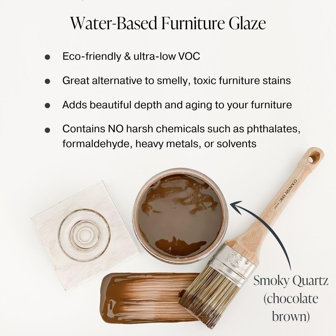
Adding stain over paint on furniture, or exterior wood surfaces such as siding or a deck can give furniture and any other project a new lease on life. Clear or semi-clear stains can provide a distressed appearance and add patina. They highlight those areas where the paint has worn away or where the paint color varies. Solid-color stains, on the other hand, generally coat well and provide a durable finish to a variety of projects. Consumers must sand, clean and dust surfaces before staining them. You want a good wood base from which to coat your stain, and you should set aside a few hours to get the job done.
Using Stain to Add Patina
Patina describes the look of something that appears aged, delivering a gloss or sheen. Interior decorators often use this term to describe distress, or the aged look of furniture, where paint has faded or colors have lost some of their brightness. While a patina also can refer to metals such as bronze, it’s used in this case to refer to wood furniture. Staining is one option available to add patina to furniture that already has a coat of paint on top. A clear or lightly colored stain adds the best effect to most wood surfaces, and is a great option for those who don’t want a messy painting project.
Applying Clear Stain for Patina
Consumers who want to apply clear or lightly colored stain to add a distressed look or a patina must first prepare the surface of the project by using sandpaper to remove any debris and previous painting imperfections, then wiping the surface with a clean, dry cloth to remove any dust.
Decorators should coat the surface, applying the stain with a rag in small sections. It should dry completely; after a short amount of time, wipe it away with a clean rag. If the stain looks uneven, sand it down and apply another coat.
Read more about how you can work with stains at Ebay
 Single French Louis XV Style Painted Beech Wood Fauteuil Armchair, 1920s- Ebay
 Hand Painted French Writing Desk Drop Down Lid- Ebay
 French Louis XVI Style Parcel Gilded White Painted Arm Chair Fauteuil circa 1940- Ebay
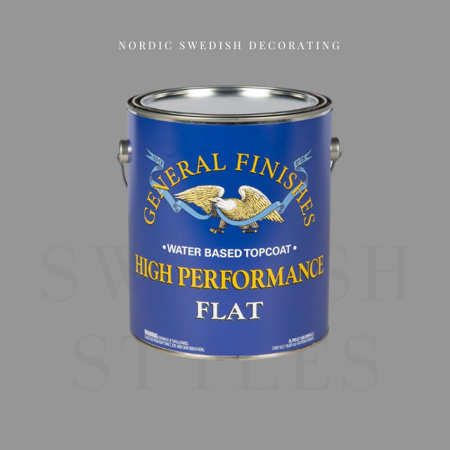
How To Avoid Yellowed White Painted Furniture With General Finishes Products
 Christine Adams
Wood Finishing Technical Writer at General Finishes
A TUTORIAL ON WATER BASED TOP COATS YELLOWING OVER BRIGHT WHITE PAINT
Many you may have noticed that the labels on our bright white paints, Snow White Milk Paint and Chalk White Chalk Style Paint now carry a warning label regarding the yellowing of topcoats. All bright white paint will yellow slightly with time, with or without topcoat. Water-based topcoat is reactive and more likely to draw out substances in the wood such as tannins or unknown substances in existing finishes causing the topcoat to yellow. This is an industry-wide issue. Don’t carry the cost of white paint yourself– pass the cost on to the consumer who wants it with a fair upcharge. White paints, even if they did not yellow, require more coats to achieve coverage.
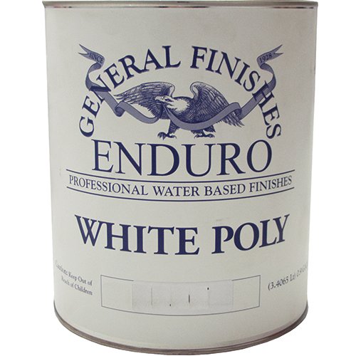
General Finishes background was originally on the professional side, and the incidences of yellowing topcoat over white paint were almost nil, and when our sprayable professional finish, Enduro White Poly, is used, there have been no incidences. But as the use of our paints has increased in the up-cycling and furniture refresh markets, we have heard more reports of our topcoat yellowing. Our response was to teach about prepping, testing you finish schedule and finally creating Stain Blocker, our stain blocking primer, but this is not enough. Just as we advocate prepping all finishes, we are now advocating NOT using a clear water base topcoat over BRIGHT WHITE paint.
General Finishes is in the process of developing a brushable version of our professional Enduro White Poly (available only in gallons), but that will take some time and rigorous testing before we can release the product. Here is what you should know to protect yourself and also some immediate suggestions to decrease chances of yellowing.
There is no way to reliably predict yellowing ahead of time. Sometimes yellowing occurs, sometimes it does not. Every existing finish is different and we rarely know the finishing provenance on an existing piece. Every tree is different and every piece of wood is unique. Wood can bleed tannins immediately after the topcoat dries or months later with a change in temperature that comes with a change in seasons. Oak, pine, mahogany, and Douglass Fur are particularly prone to bleed-through.
As is true of most “water-white” topcoats, our High Performance Water-Based topcoat is a clear drying finish over a non-reactive substrate such as plastic. When paint is used over something as unpredictable as wood, all bets are off. Yellowing can be caused by the top coat activating the tannins in raw wood or aniline dyes, stains or contaminants in a pre-existing finish. This is most evident when using BRIGHT WHITE paint and most prevalent in the sculpted details of furniture, where the topcoat can collect, intensifying the color change to an unacceptable level.
To add to this issue, all bright white paint will yellow slightly with time, with or without topcoat. You have probably tried to touch up white woodwork in your home after several and noticed that the new paint is brighter.
Summary:
• Whites have a lower “hide” quality and are more transparent than most other colors. Most bright whites require additional coats to achieve the desired color and minimize color variation. This can increase cost of paint finishing. Always include a clause in your contracts addressing the need for additional coats to achieve coverage.
• Bright white paints can yellow over time with or without topcoat.
• The underlying finish or wood species can affect the final color of light paint.
• Details and inside corners are difficult to cover with any paint color, but this property tends to be more noticeable with whites. This is a naturally occurring phenomenon in paint application and does not necessarily constitute a defect in the paint finish or your technique.
TIPS FOR PROTECTING YOURSELF AND PREVENTING YELLOWING
1. Use a disclaimer in your contracts or recommend a softer white such as Antique White or Linen. Upcharge for the extra coats needed and ever guarantee a white finish over a piece that you cannot trace the provenance on. Here is a suggestion: Terms of Agreement and Warranties: ________ (Initials) I have been informed that more coats are required when painting with bright whites, reds, greens or yellow. I understand that white paint can yellow over time and that water based topcoats can occasionally react with the substrate or existing finish under white paints causing yellowing, even is a stain blocking primer is used.
2. If it is a low use project, use a premium white paint that is self-sealing and does not require a topcoat. A clear top coat is not required on our Milk Paint for increased durability, as it is a self-sealing, exterior rated coating with very high durability and performance properties. However, top coats provide a smoother surface that is easier to clean and boost durability for high use projects such as table tops and kitchen cabinets.
3. Get a spray gun and use a professional “white coat” such as our Enduro White Poly. It is a white paint with “increased topcoat properties”, is a stand-alone finish when 3 coats are applied and does not require sealing with a topcoat.
4. If you are still brushing, try adding 10-15% of the paint you are using to the first or second application of topcoat. The last layer of topcoat should not have paint in it, to maintain durability. We have had good reports of this technique from customers but have not tested in the lab over a long period of time.
5. Always test your project’s entire finishing schedule (from cleaning to topcoat) on an inside door or a more hidden area of the piece. This does not help if the yellowing occurs later but you will at least know if there is an immediate problem.
6. Always apply a stain blocking primer under white or light-colored paint such GF Stain Blocker or a shellac based primer. Always let any primer dry overnight. Some of the primers we have seen suggest a 3 hour dry time and that is not enough.
7. If you are working on period pieces such as a 1940’s serpentine mahogany desk which were often finished in stain containing aniline dyes that cast a pinkish bleed through under light paint, stay away from light colors. Not every piece of furniture is suitable for up-cycling with a light paint color. Pine, Mahogany, and furniture of the 1940’s and 50’s are a red flag.
8. Last, not all manufacturer’s topcoats are compatible with other finishes and may react with a color change. Always follow best practices by not rushing, and testing to your satisfaction first.
Hope this helps and wish us luck on our next paint endeavor- Chris
12 Designers Pick Their Favorite Paint Colors – House Beautiful


House Beautiful often features the best designers with their favorite go-to paint colors. Sometimes having the just-right color can make a tremendous difference in a room, or on a piece of furniture. Here are some of my favorites that work with the classic Gustavian/ Swedish interior design themes.
Ann Wisniewski – Sherwin-Williams Emerald Fawn Brindle SW 7640,
Cathy Kincaid – Farrow & Ball Estate Emulsion Pale Powder 204
Kerry Joyce – Benjamin Moore Natura St. Johns Bay 58
Lisa McDennon – Sherwin-Williams Harmony Conservative Gray SW 6183
Whitney Stewart – C2 LUXE Seedling C2-188
Allison Caccoma – Benjamin Moore Regal Harbor Haze 2136-60
Paul Corrie – Benjamin Moore Regal Select Blue Lace 1625
Ashley Whittaker – Farrow & Ball Estate Eggshell Pink Ground 202
Mara Miller – Ralph Lauren Paint Willow RLVM270
Kevin Isbell – Benjamin Moore Aura Buttered Yam AF-230
Lynn Morgan – Benjamin Moore Advance Nosegay 1401
Deborah Walker Sherwin-Williams Duration Gray Screen SW 7071
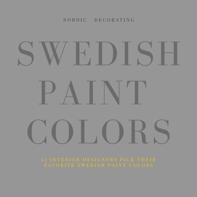
12 Interior Designers Pick Their Favorite Swedish Paint Colors


House Beautiful’s September 2014 issue- Photographer Michael Croteau
Seen In House Beautiful’s September 2014 issue, interior designers spill on their favorite “Swedish” inspired paint colors.
Tori Golub suggests- Only Natural SW 7596 From Sherwin- Williams
Shea Soucie suggests- Blue Gray 91 Farrow & Ball
John Danzer suggests Pavement C2-988 C2 Paint
Jill Dienst suggests Donald Kaufman Color DKC-67
William Cummings suggests Skylight 206 From Farrow & Ball
Rhonda Eleish suggests Pavilion Blue 252 From Farrow & Ball
Laura Bohn suggests Sensible Hue SW 6198 Sherwin Williams
Jayne Michaels suggests Donald Kaufman Color DKC-6
Sara Story suggests Pavilion Gray 242 From Farrow & Ball
Christine Markatos suggests Milk White 15-32 From Pratt & Lambert
Sandra Nunnerley suggest Lamp Room Gray 88 From Farrow & Ball
Eileen Kathryn Boyd suggests Sleepy Blue 6225 From Sherwin Williams
5 Faux Wall Painting Techniques That Are Easier Than You Think
If you are wanting depth to your walls, here are some of the very simple faux finishes you can do yourself.
Start by selecting a color theme for your room. In this post you will see a variety of color examples from pale blue, to lighter warm yellows and lighter greens.
Working with glaze, crackle finishes, and distressing techniques can make your furniture appear older than it is. Likewise, layering paint on your walls will also create depth and give you that old world look we all have fallen in love with. Here is how to do it…..
1. Ragged Finishes
Color washes are finishes that are produced with rags and paint.
Color washing is usually is achieved by a using rags which attach to a roller.
The trick to achieving this finish is to work with translucent glaze. Don’t attempt this finish with solid paint. Using a glaze mixture of (half glaze, half paint), paint is applied over a previously painted wall. The effect it produces a subtle textured finish.
A Primitive Effect Using Green, seen on www.ralphlaurenhome.com
Notice the whole wall isn’t ragged, just a small portion of it. Also painted furniture in the same tones are paired in this room to join together the various looks.
Keep All Tones In The Same Color Family
- One tip that I have learned through ragging finishes is to have the glaze mixture matched to be a few shades darker or lighter than the wall color. If you decide to do three colors, keep the tones quite close in color. The overall effect will be soft, and subtle.
Glaze + Paint For A Final Top Coat
- Another trick I have learned is to go over your entire project with a layer or two of glaze mixed in with a small amount of paint. The entire effect of the tinted glaze dulls the look slightly, and hides the roller effects. The idea behind this is to make your work appear subtle. You want to keep people guessing as to what you used to complete the finish.
2. Dry Brushing
Brushed finishes, is an effect which is achieved by dipping your brush into paint, and then removing most of the paint, on a rag. The small amount of paint allows you to add a very soft effect over a previous layer of paint.
The effect depends much on the brush you use. If you use a badger softening brush which tends to be very large and soft, it will produces a soft effect with paint.
I have used this effect with an old broom handle. The bristles are thicker, and harder, and produces lines than a soft shading.
Again, mixing together paint + glaze will allow you to get the look of an additional layer with a faux effect, and you may not have to wipe off the excess paint.
- In this picture, this effect can be achieved by using a dark brown artists oil paint. Most of the paint must be removed from your brush to achieve this look. This look can be achieved using brown artists oil paint over a muted orange base coat, slightly brushing the which highlights some of the raised details.
- Achieve depth to your furniture by applying a lighter coat over top of a painted finish. As you can see with this look, a lighter shade of green-gray is applied over a darker shade of green. This look could be achieved by dry brushing.
3. Sponge Finishes
Sponged faux finishes are those which a paint mixture is applied with a sea sponge.
Sponge painting is still the best and most frequently used mediums when it comes to classic faux finish painting.
Using a sponge, you can use multiple glazes layered over solid paint which gives the illusion of great depth.
Ideally, like most finishes, you want to start with a base coat, and build on it using a glaze mixture. The overall effect should be soft and serene.
Sponging can also be used on furniture to give an old world Swedish look.
In the past, I would use a base coat of brown, and then after it was dry, I would apply a base of oil paint in butter yellow and use a rag, or a textured paper towel to remove the paint. Within just a few minutes of applying the paint, I would remove it, and the oil paint which was wiped off on the rag I would then slightly dab here and there, on the furniture to create a very soft effect, making it seem as there was more layers to the paint finish. After it was dry, dry brushing with the same oil paint was used to blend in the textured effects.
4. Faux Leather
Terrific faux effects can be produced using a very heavy garage bag. Again working with a wall that has been painted, apply a layer of a glaze mixture on the wall. More than half glaze to paint.
Tape the wall in rectangular sections and apply the glaze in the taped area.
Next apply a heavy weight garbage bag to the wall allowing the folds to be pressed into the wall using your arms and hands.
Take the garbage bag off, and the folds of the bag produces a beautiful faux finish.
This is a very easy way to create a classy effect on the walls.
– Great Article- How To Faux Paint
5. Stenciling
Stenciling can be very powerful if it is done right.
Create your own stencils using a stencil cutter which is a fine heated tip that cuts through the plastic blank stencils with precision. Lay a piece of glass in between the stencil and the pattern, and cut away.
17th and 18th Century stenciling has always been the very best model of inspiration.
Here are a few very well done Swedish stenciled homes:
– Book Review: Jocasta Innes Scandinavian Painted Furniture
–Ted and Lillian Williams chateau in Normandy, France
-Neoclassical White Stenciled Walls-Petit Trianon
-Antique Original Red Hand Painted Trunk with Rosemaling Floral Motif
-This photo shows a great example of wall framing simply made by stencils and paint
-Here we see a stunning Rococo design stenciled, or hand painted on the walls for a distinct Swedish look.
6. Complicated Faux Finishes – Marble, Tortoise Shell, Walnut Woods
Not all faux finishes are easy. Some of the advanced finishes are rather difficult. To get an idea of a master faux finisher, check out Pierre Finkelstein. He is the author of The Art of Faux– The Very Best Book for advanced faux finishes. He focuses on the advanced finishes such as Marble, Granite, lapis and malachite, and everything in between.
Marble and any stone for that matter can be painted to produce the high end looks that are often seen in expensive mansions and castles. Faux marble can be painted on to columns, trim, doors, crown molding, and fireplaces.
Anyone can learn these finishes with practice and the right guidance.
Check out my inspirational “faux” gallery in the Swedish and French Decorating Group.
Book Friday: Scandinavian Design On Martha Stewart
Magnus Anesund | Söderberg Agentur
Lars Bolander’s Scandinavian Design
Lars Bolander’s Scandinavian Design Found on US Interior Designs Blog
Faux Marble Bombe Chest- Ebay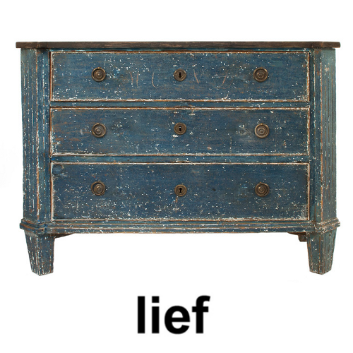 Three drawer Gustavian Chest in a worn black and blue patina- Lief
Lars Bolander’s Scandinavian Design Found on The Essence Of The Good Life Blog
Swedish Interiors- Judith Miller
Antique Swedish canape – Augustus Brandt
Swedish Interiors- Judith Miller
La Cuisine… Before And After,Two Maisons.com
“Dishes are stored in an 18th century armoire from Uzes, very simple, sober lines. It’s a brownish purpley color that I also have in some of the pottery scattered around from the Alsace region of France. (The purpley brown glaze was created using magnesium.) Antique Swedish chairs and French Directoire table that we can extend to feed a crowd.”
La Cuisine… Before And After,Two Maisons.com
“I scraped the paint off of an 18th century door to use on the pantry, inch by tiny little inch.”
Swedish Design – Seen On lamaisonfou.blogspot.com/
Swedish Gustavian Decorating Ideas- Primitive Faux Wall Painting
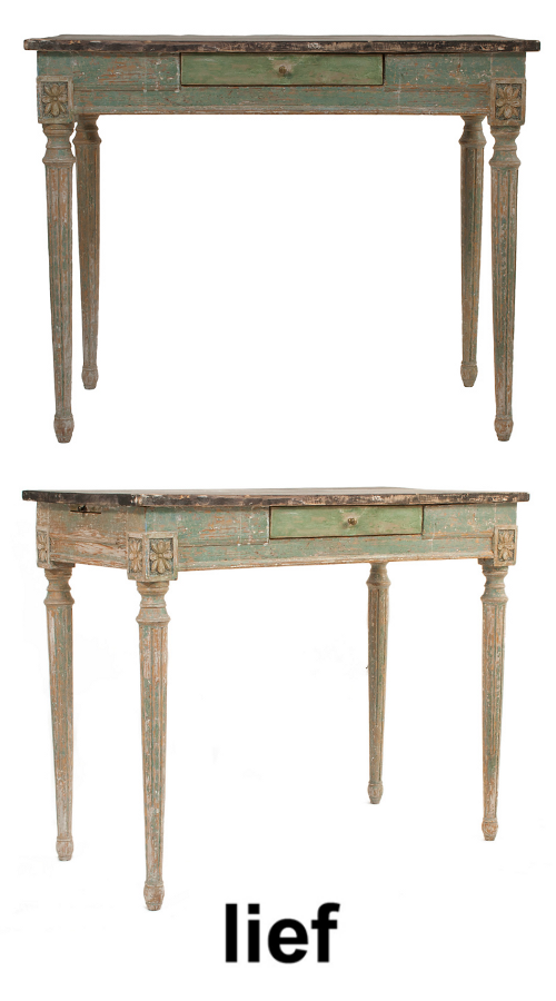 Small Gustavian Desk in a worn green and black patina – Lief
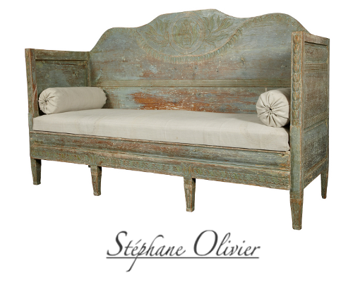 Gustavian Pale Green Swedish Sofa With Tall Back Stephane Olivier
The Houses of Veranda – ALL the Best Houses Featured in Veranda Magazine $37
The Houses of Veranda – ALL the Best Houses Featured in Veranda Magazine $37
Architectural Digest, Southern Accents, Veranda and others all regularly feature homes that have faux finishes on everything from walls to furniture. Paint finishes have evolved since the 80’s when faux finishing was given a bad rap. With many interior magazines featuring upscale 17th and 18th century European homes with extravagant antiques there has been even more of a push towards painted faux finishes to achieve the same look for less.
Faux finishes can be applied to almost any surface. Paint has been used since the earliest of times to transform walls, ceilings and furniture, and today it is being used on cabinetry, floors, ceilings, walls and all types of solid furniture.
The most popular decorative finish techniques include sponging, ragging and to the harder techniques such as marbling and wood graining. The above finish was likely paint rubbed into raw wood. Multiple layers of blue which are then sanded down to produce the effect above.
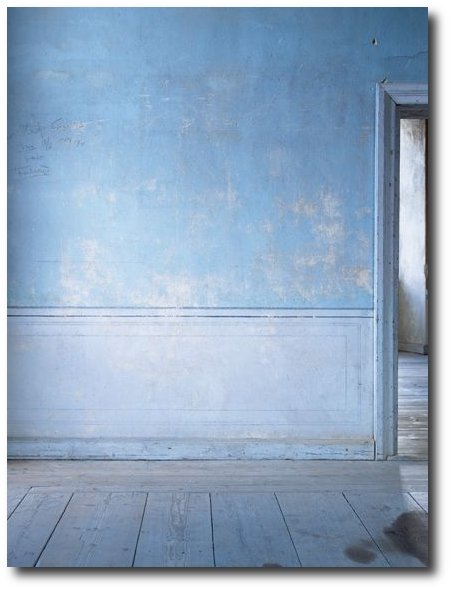
Swedish Paint Finishes Lars Sjoberg
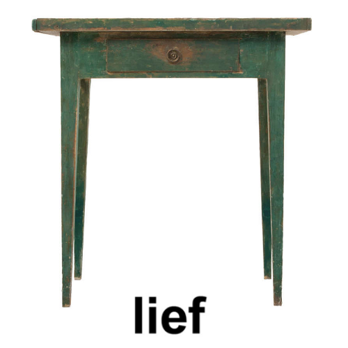 Gustavian Side Table with one drawer in a worn green and black patina
A very soft faux finish using two colors
Lindsay McCrum’s Chicks with Guns on Juxtapoz.com
Bunny Mellon’s Garden At Her Oak Spring Estate in Upperville, Virginia
Bunny Mellon’s Garden At Her Oak Spring Estate in Upperville, Virginia
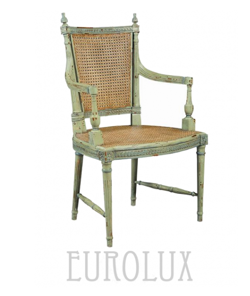 Chair From Eurolux Antiques $1,001.00
Vreta Uppsala Sweden Taken By Eric Boralv’s Flicker
Scandinavian Bedroom Featured on Decorology Blog Originally Seen on Scandinavian Chic
I ran across Pbc Style Blog featuring larger pictures of this estate I was excited to find out more about this home. The Mount is classical revival in style, complete with formal gardens. Wharton designed it herself, based on the ideas she outlined in The Decoration of Houses. The house is located in the Berkshires, more specifically, Lenox, Massachusetts, and Wharton drew inspiration for its design from Belton House, a 17th century Palladian-style English country house.
Borrow this look by painting molding in a color that stands out. Here we can see that molding can really speak volumes and add so much personality into a room
Layer two greens to get the look of this headboard. Dry brush a lighter green to produce a layered effect.
Decorating Using Green From World Of Interiors Featured on Trouvais Blog
Outstanding Mural Finishes, obviously completed by a very talented painter.
Photographs from Will Pryce – photographer based in London Will Pryce Photos
Louis XVI Style Square Table with Marble Top Bella Cottage
Hand-Painting Faux Marble Photography by Pieter Estersohn


Paint It White He Says…. Washington Interior Designer Darryl Carter – Swedish Decorating

Washington, D.C., interior designer Darryl Carter certainly has made a memorable mark on the color white. Fifteen years ago he had a busy career as a lawyer when he decided to change course and open his own interior-design firm. He made a name for himself by transforming rooms that were grounded in a neutral palettes with an appreciation for showcasing art and antiques. Swedish interiors have always been known for their white based interiors. In an interview by Veranda, designer Darryl Carter gives his best tips for using the color white in your home.
1. Pick Your Paint First
“It’s not a cop out,” he insists. “It’s a way to harmonize a house in its entirety.” Once you’ve chosen your paint, select textiles next—preferably a hue that closely matches the walls. “Navigate the drapery into the wall color so that you are not so aware of the window treatment,” he suggests.
2. Paint Your Architecture In White
He says that architecture looks best in white. He gives an example pointing to a bookshelf cabinet in a Virginia townhouse which was painted to blend into the walls. The coffered ceiling was also painted the same color, which added a subtle architectural element to the space.
3. Don’t Shy Away From White Or Cream Around Kids
He tells Veranda, that you don’t have to sacrifice style and serenity because there’s a toddler in the house. “There is a presumption that neutral cannot be kid-friendly,” says Carter.
“Instead of shying away from softer shades, he suggests changing the materials. Try enamel finishes and high-gloss paint in high-traffic areas, as well as durable faux leather and outdoor fabrics for upholstered pieces that withstand the wear and tear of young children”
4. Unite Your Kids Rooms Into The Rest Of The House
Carter encourages parents to integrate their child’s room into the larger experience of the home.
“You don’t want to open the door and suddenly wonder where you’ve landed,” he says.
In one family home, Carter created a space in the child’s room which matched the overall modern style of the family’s home. Over time, parents can adjust the space with different pillows and textiles as the child matures.
5. A White Backdrop Makes Antiques Feel Modern.
I love a monumental secretary in a white space,” says Carter. Despite its size, he says, the piece could easily be lost in a wallpapered room.
“People often tell me that my rooms are very modern,” he says, “but generally they are populated with a lot of antiques.”
6. Experiment With Finishes.
“A material change in the same color can be a very subtle way to articulate the architecture of a space,” he says.
In one space, the cabinets are lacquered, the walls were matte, and the floors are reclaimed barn flooring, all washed in the same shade.
7. Revamp Old Pieces With A Coat Of Paint.
“I have redefined so many things in my house with a coat of paint,” says Carter. In the breakfast room of his D.C. home, the apothecary is now black. His latest temptation? Sepia paint, to give the Gustavian dining chairs a khaki color.
8. Be consistent, Inside And Out.
The exterior of a D.C. home was featured in Veranda’s May/June 2012 issue. Carter wanted the exterior to honor the style and presence of its surroundings. The house was painted, then power-washed until some of the original brick showed through to suggest age.
“As you approach a house, you are getting a sense of what it is,” says Carter. “I think it’s important, when you open the door, that the interior is consistent with the exterior’s approach. And then when you go out into the rear garden—the same thing.”
More About Darryl Carter:
His Website- www.darrylcarter.com
Darryl Carter On Facebook
Interesting Articles:
- – Home Decorating Ideas: DarrylCarter‘s DC Townhouse –Elle Decor
- – Darryl Carter’s New Store |DC by Design Blog
- – DarrylCarter‘s Paint Tips – Veranda –Veranda.com
- – DarrylCarter Updates A Home Near Washington, D.C. :Architectural Digest
- – DarrylCarter Paint Colors-Benjamin Moore
- – DarrylCarter and the thrill of the hunt –Washington Post
Darryl Carter Books
Darryl Carter Colors by Benjamin Moore, perfectly encapsulates his painting philosophy: “It’s more about tonality than saturation. I always suggest the fainter color.” For more on Carter’s design philosophy, his new book, The Collected Home ($24, Amazon)
The New Traditional, Darryl Carter laid out the principles of his recognized design, which balances comfort with a subtle color palette to achieve a timeless style. Darryl explores the essence of what brings a home to life, from textures to furniture to unexpected objects.
The Collected Home dazzles with gorgeous photographs of rooms that are extraordinary. Darryl provides advice for approaching home design, Lavishly illustrated, this book is a must-have for anyone who desires a home that feels richly layered, full of character, and unquestionably calm.
Reviews:
As a designer, every time I see Darryl’s work, I marvel at his talent to “white out” what would otherwise be same old traditional or colonial spaces. In other words, he can take your typical (and sometimes cluttered) design and edit it, clarify it to such a poetic yet livable state, that you wonder how modern it is despite the very colonial roots. Not that anything is wrong with color or traditional design (I’m a fan of both), but his work feels like the antithesis to hundreds of well-designed but boring spaces that seem to have a complete lack of innovative design given the modern world we live in. His second book, The Collected Home, is a heart-felt rendition of some of his latest work, his aesthetics and guiding principles. I particularly enjoyed the photographs that beautifully illustrate his strong emphasis on architectural integrity and how little ornamentation you really need if the bones are exceptionally designed. A personal favorite quote from the book, as he describes his first show house experience “..young and intimidated by the veteran designers also presenting their work, I thought, “This is not at all the way a home should be experienced.”” Knowing the context, I can completely relate to that feeling – Raji Radhakrishnan / Murali Narasimhan
By NJLeoOH
This book inspired me. I sat through only about 10-15 pages before jumping up, moving furniture, shelves, display items, putting items away and taking others out for prominent positioning. I discovered my colors (which were there all along but I didn’t see them!). Highly recommend and have shared my copy with friends for their own inspiration.
Modernism was in part a reaction to the excessive ornamentation that characterized the late Nineteenth and early Twentieth Century. Modernists craved clean lines and simplicity. Function rather than beauty dictated form. Some early modernists thinkers decried ornamentation as a crime. In pursuit of their aesthetic project, the modernists rejected 2,500 years of classical wisdom.It is into this hotly waged conflict that Darryl Carter enters. With great tact, Carter strips away excessive ornamentation and works his way back to the nature inspired origins of classical thought. He is able to find common ground between these two not so disimilar aesthetics. Carter has the artist’s gift of mixing what initially appear to be dissimilar objects and finding a coherent overall vision. His “cool” approach reminds of Swedish neo-classicism. This is Carter’s second book. Like his first book, “The Collected Home” is a great success. Highly recommended.
Picture Credits :
- The Relished Roost Blog
- Elle Decor
- Veranda Magazine
- Veranda Magazine
- June 2012 Elle Decor
- Veranda
- Elle Decor
- Architectural Digest
- Darryl Carter via 1stdibs
- Darryl Carter-Veranda Magazine
- Elle Decor
- Darryl Carter-One Kings Lane
 Darryl Carter- Seen On The Relished Roost Blog
 Darryl Carter- Seen On The Relished Roost Blog
 Darryl Carter- Elle Decor


5 Pro Painting Tips For Black Furniture

Anyone can paint a piece of furniture black, but there are certain tricks to make your painted pieces appear more valuable than they really are. Many of us feel that sensation of discovering a beautiful piece of furniture at a garage or estate sale, and then dreaming of what to do with it next. If you are anything like me, scrolling through pictures of paint chips, and color combinations can be a thrilling experience.
If you love lighter colored interiors such as white, light blue, or mint green, then black furniture might be a consideration for your interior. Painting a piece of furniture black can create tremendous contrast for your interior. Here are a couple tips to making your painted furniture look antique:
1. Use Matte Paint
You won’t find shiny finishes on the old antique furniture in Sweden. This article won’t cover the modern black painted furniture that one would expect to see in the 50’s or 60’s , but rather the aged furniture that someone could come across 100 or more years ago.
When selecting a sheen, consider starting out with a matte finish. Once the piece is dry you can add either a tinted wax or a tinted glaze to the final finish to give it even more depth. The sheen will then produce a look between flat and satin. Starting out with a low sheen will keep the overall finish looking rustic even after you apply additional paints.
2. Paint Your Hardware
While there are so many ways to feature hardware on black painted furniture, painting the hardware can be a smart way to making a black piece look understated yet elegant. Take a look at a French Provincial chest painted in olive by Knack Studios. The hardware was painted and carefully distressed. In this case, a little bit of distressing went a long way. Compare that photo, with this photo of a black painted bombe chest which is also painted in black. The hardware is painted, but not distressed. While bombe chests are considered some of the most spectacular pieces of furniture, this piece falls short for me.
– Darken your hardware with chemicals. Rockler sells a brass darkening solution that ages brass, copper and bronze metal. It allows you to change the color gradually so you can control how dark the final product turns out.
– American Accents by Rustoleum sells an Oil Rubbed Bronze spray paint that I have used on many pieces of my own furniture. After the paint has dried, simply distress the hardware with a sponge sander.
3. Show Off The Wood With Distressing
Adding a bit of interest to your furniture can go a long way. There are several ways to add patina. Two ways that come to mind is by distressing, and another is by layering paint.
A: Distressing is a sure way of adding depth and interest to a vintage piece of furniture. Some people like a LOT of distressing, and others like MINIMAL distressing. It is rather interesting to see how people fall into those two categories. Look at a few pictures on pinterest to decide what appeals to you. The best thing about distressing is if you go too far, simply just repaint the areas, which will tone down the distressing.
Style 1 – A Little Distressing:
Well cared for furniture that really isn’t moved a lot over the years will only have a little bit of distressing. When I think of a little bit of distressing, I think of my own grandparents home. I can remember a china cabinet sitting in the exact same spot for 30 years or longer. When this same china cabinet was passed to my cousin, it was in perfect condition.
This look is favored by many painters. A little distressing can go a long way. Areas to distress would be around the knobs on a chest of drawers, the legs of chairs, the back of chairs, and around drawer sides. The trick to distressing is to look for the areas where natural wear would occur. On a desk for example, arms would naturally rest on the front portion of the desk, so that would be the area to remove paint.
Style 2: A LOT of Distressing:
This is the style that I tend to enjoy the most. It can be a tricky finish to accomplish, and I will show you how I have achieved my personal looks over the years.
When I first began painting, I always made sure I primed my furniture, because I wanted the paint to stick to the furniture. I was afraid of the paint lifting off the furniture, so I always made sure I primed. As I experimented and advanced in my painting, I found I was pretty limited when it came to distressing as black primer doesn’t exist. I would buy gray primer, and see the gray paint in the areas I distressed. It wasn’t until much later, (almost a year later) that I discovered if I sanded well I could skip the primer all together. Many of the pieces I worked on were wood, and not metal, or plastic. The options then started opening up for me.
A few years later when I stopped turning over furniture, and just worked on my own furniture, I discovered the real trick to getting the Swedish finishes were to remove the polyurethane, stains or paint all together. I found the raw wood went a long way to getting the results I was after.
I have always been attracted the paint finishes that looked as though they have been left out in the outside elements for several years. Layering your paint with this technique can really open up the overall finish.
Distressing Tricks:
Sponge sanders found at your local hardware store can be a great tool for distressing I have found using a sponge sanders can give you the flexibility and control than electric sanders. Using a hand electric sander can take off A LOT of paint, which often times forces you to go back and repaint some of the areas. Using a hand electric sander might come in handy if you have several layers of paint that you want to expose. Another trick is to remove the paint before the paint is dry. Many of us have used this technique because it is simply easier. With sponge sanders, purchase the ones what work with water. In this instance, have a warm bucket of water and wash out your sponge sander as you go.
4. Add Patina To Your Black Paint Finishes
When it comes to really ornate furniture such as Louis XV styled furniture, why not highlight some of the intricate details? One simple way to do this is with paint. Often times painters will try to replicate this aged look by applying a beige or gray paint to bring out the beautiful depths of heavily carved furniture.
How is this done? Glaze is the easiest way to achieve this look. Simply mix half and half paint to glaze ratio in a bowl. I have simply painted on the glaze in the past, and with a wash cloth, wiped it off within a few minutes. The glaze paint mix will dry to have a transparent look, than a solid paint look. This works great in corners of detail where dust would collect over time.
Many years ago, I highlighted an black painted empire dresser with light gray paint. I wasn’t pleased with the look, because the gray painted areas looked too heavy, than natural.
I washed it off and noticed that the watered down remnants of paint that were left, perfectly highlighted the areas. It did a remarkable job of making the dresser look more expensive than it was. If you do plan on trying out this technique, dilute your beige/gray paint with a glaze, and be sure to have a damp rag to remove the extra paint. Just a little highlighting paint will go a long way.
Black Metal Furniture:
I never considered using a green wash on black until I had seen it done on an antique metal canister, so I tried it for myself. Simply mix together a bit of a grayed green color with glaze. Like the gray / beige paint in the suggestion above, you can remove the paint with a wash cloth, or create a sponged effect with the glaze on the paint to get the look of rust. Like any aged furniture, you want to try to leave the green paint where rust would normally happen. I have used it on ornate chairs, and it has really pushed the value of my furniture up a notch.
5. Add Interest By Leaving Some Areas Natural
One solid color all-over looks fantastic on most pieces of furniture. While occasionally you may come across a piece where you can break up the paint with the natural wood. Consider adding dimension to your desks, dining table, side tables, which all have tops that can be left in it’s natural raw wood. Consider washing the wood (paint diluted with water) over raw wood, and painting the rest of the piece a solid black.
Paint the can be another way of adding depth. Painting only some of the areas of your furniture can allow for a more unique and interesting look. For example, the inside of a secretary can be left in it’s natural wood, or painted a different color.
If you have paint tips to share, please leave a comment below. Please link to your blog or website to your articles about painted furniture. We look forward to hearing from you.

Painted Black Furniture Swedish Desk – Picture Credit Master Henry Blog
Black painted writing desk, Sweden circa 1760 with slant front and two over two
drawers. The interior in blue paint has multiple drawers and cubbies, with two
hidden compartments. Simple bun feet. (Depth when open is 34″.)
Black painted Swedish period (1650-1750) Baroque chest of drawers.- Old Is New Blog

Marie Desk– Swedish Furniture By Gustavian Price: £2,600.00
Rustic Wire Baskets – Painted Furniture Glass Cloches From Næslund Antikviteter
 Swedish Rococo Desk. Black lacquered Stockholm Work with gilt bronze fittings.
 This beautiful picture credited to Lars Sjoberg was featured on the Swedish Blog Designe
Swedish Decorating With Rustic Looks – Sköna Hem
Rustic Elegance – Sköna Hem
 via:thedecorista.tumblr
Rustic Elegance – Sköna Hem
Chest of three drawers, Denmark circa 1750, with serpentine drawer fronts,
shaped top, and bracket base. The hardware and painted surface are original
Rustic Elegance – Sköna Hem
Black Painted Mora Clock From Tone on Tone

French Louis XV Hand Painted Commode –Carrocel Restorations
Each facet of this commode has intricately hand-placed inlay using old-world techniques. The inlays are absolutely beautiful. The ebony finish on the wood is a great contrast to the more vibrant inlay. Also, take note of the smooth clean lines that flow up and down the piece – met at top and bottom with solid brass floral carvings. This piece would certainly be a welcome addition to a hallway entrance, bedroom, or living room.
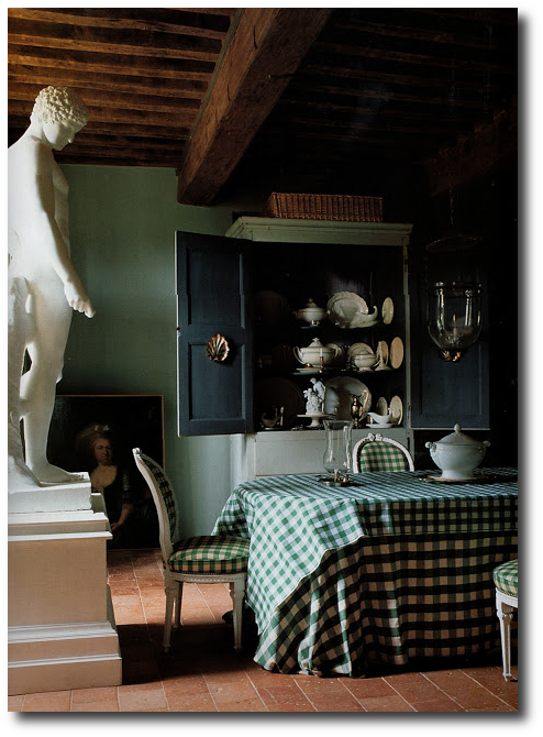 The Dining Room At An 18th Century Manor House In Burgundy
The World of Interiors, Jun 2005 genusloci.blogspot.com
Christopher Howe offers a very unique stock. Since the age of 20, he has acquired items dating from the 17th through to the 20th centuries. Most of his stock is available to view online or can be seen in his shop located on the prestigious Pimlico Road in London.
Distressed Swedish Antiques From Næslund Antikviteter
 Galerie Half in Los Angeles is selling a stunning Swedish secretary which is still painted in its original milk-painted finish. The distressed paint and its brass handles really provide a great contrast against the black paint. You can see that this secretary has a really dark painted finish that you often don’t get with normal latex paint. The color is striking and would look terrific against a classic gray painted wall.


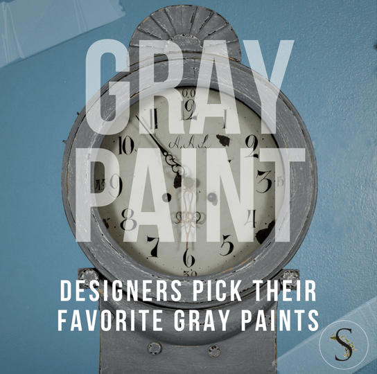
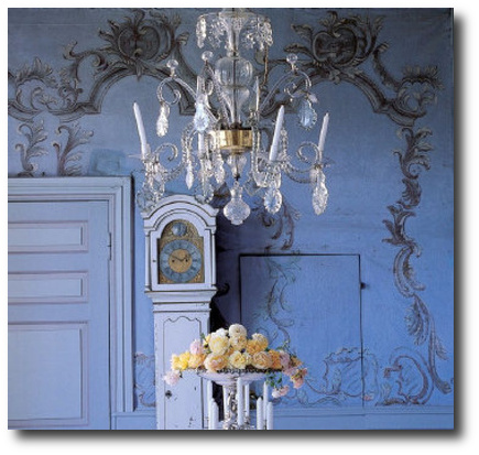
Designers Pick Their Favorite Gray Paints

Picture Credit –Scandinavian Antiques Co On Ebay
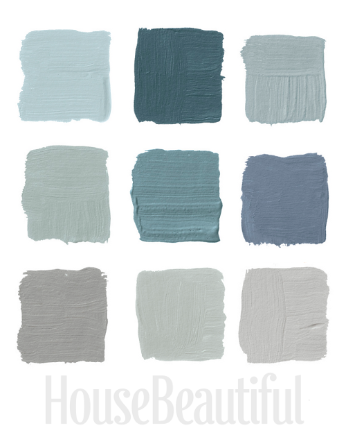
Featured above are the colors, Top Row: Pratt & Lambert’s Argent 1322, Farrow & Ball’s Claydon Blue 87, Farrow & Ball’s Green Blue 84, Middle Row, Farrow & Ball’s Light Blue 22, Benjamin Moore’s Sea Star 2123-30, Benjamin Moore’s Wolf Gray 2127-40 Bottom Row, Benjamin Moore’s Graytint 1611, Sherwin-Williams’s Magnetic Gray SW-7058, Benjamin Moore’s Stone Harbor 2111-50
Home Beautiful featured an article on 26 Designers who shared their favorite Grays. Gray painted interiors can be the perfect color palette for Swedish Gustavian or Rococo antique furniture. Gray can showcase antiques like no other color, because it is neutral, and doesn’t compete with the furniture and decor. The last thing you want after spending thousands on a piece of furniture, is to have someone notice anything but what you spent your hard earned money on! Pair your painted gray antiques with a backdrop of white gray interior walls and trim, and add a punch of color with your upholstery, accessories, and flowers.
Many of the designers featured in the article, were those of Richard Gluckman, Stephanie Stokes, David Kleinberg, Tori Golub, Stephen Sills, Phoebe Howard, Steven Gambrel, Gerrie Bremermann, and Sharone Einhorn and Honey Walters.
Here are just a few of the designer quotes:
“Mesquite is a flattering light moss green without much yellow. I love it because it doesn’t shout ‘I’m green!’ It says, ‘I’m a very beautiful color.'” –Jennifer Garrigues, Benjamin Moore’s Mesquite 501
“Lago Argentino is a glacier lake in Patagonia, and it’s the most amazing color, an aqua, milky because as the ice melts it pulls minerals off the mountain. I stayed in an inn with a stunning view of the Perito Moreno glacier.” –Suzanne Rheinstein , Ralph Lauren Paint’s Blue-Green GH81
“For me, the most appealing colors in summer are not hot but cool. You don’t need to be reminded of the sun and heat — you’re in it. What you want is a cool breeze through the pine trees, like this chalky gray green.” –Frank Roop, Benjamin Moores Soft Fern 2144-40
“In my cutting garden I have morning glories climbing over a lattice obelisk painted this wonderful silvery sage green. It reminds me of lavender leaves.” –Michael Whaley, Benjamin Moores Cedar Grove 444
“I have a big, hugely functional Georgian Revival lawyer’s desk in tired dry mahogany, bought from a tired dry lawyer. I painted it this pale gray-green in an oil-base stain finish, cleanable, very calm, but not so pale that it dies. The gimmick is the old-fashioned desk in an unexpected color. It catches light and makes for a more interesting surface.” –Carey Maloney, Donald Kaufman Color Collections DKC-10
“It’s kind of robin’s egg blue, and with mahogany furniture and neutral upholstery, it looks great. I see dining rooms as mostly evening rooms, and this has life to it. It’s very soothing.” –Mariette Himes Gomez, Benjamin Moore’s Sage Tint 458
“Green is the great neutral, all the way from pond scum to soft sage or pale celery. I recently moved into a new house surrounded by greenery, and when I was thinking of what color I might use for a drapery lining, it came to me to reflect the green that is present year-round right outside that window.” –Barbara Barry – Donald Kaufman Color Collection’s DKC-8
“This is the color of the sky in Old Master paintings, when the varnish has yellowed; it’s luminous. Paint just the floor and you’d feel as if you were floating.” –Thomas Jayne, Benjamin Moore’s Heavenly Blue
“In my cutting garden I have morning glories climbing over a lattice obelisk painted this wonderful silvery sage green. It reminds me of lavender leaves.” –Michael Whaley, Benjamin Moore’s Cedar Grove 444
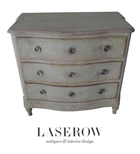 Gray Painted Swedish Furniture – Laserow Antiques

18th Century Swedish Tray Table – Jacqueline Adams Antiques

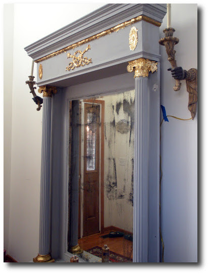
This mirror would have been part of a room paneling. It features a beautifully hand carved and gilded top panel of a basket with flowers and grape bunches before crossed mallets and grape branches and is surrounded with a square, gilt molded frame. Beneath is a square mirror framed with a beaded, molded edge
HOW TO: Paint Gustavian Finishes
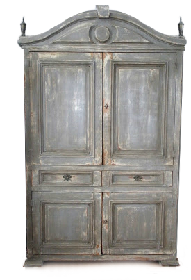
Andie, from Divine Theatre Blog, posted an amazing transformation of an outdated Mexican armoire, which was converted into the classic Gustavian styles with layers of distressed paint and new hardware. Andie shows us how to do it ourselves….
“These pine Mexican Armoires are outdated, having seen popularity in the mid to late 90’s, they are a trend whose time has come. It is evident by the sheer volume of pieces like this on Craigslist. This particular armoire is a bit different in that it has a domed top with a carved cutout in front.”
In the post, the biggest challenge with the armoire was changing out the hinges. Hinges can be really tricky. Transforming my own armoire, I know all too well, that not every hinge is alike. Be careful when removing existing hardware. Save the existing hardware until you find another set that will work well.
More From Andie about Hinges….
” There are more than 20 different types. Three of those types made their way into my home and had to be returned because they would not work on this piece. The doors are very thick! I ended up using plain old butt hinges. I chose 2 inch hinges and merely placed them under each existing strap hinge and drilled small pilot holes, then attached them all and finally removed all the existing strap hinges. I then filled the holes with wood putty and let it dry overnight. I also filled the knotholes with wood putty. It required two applications, allowing the putty to dry thoroughly between applications. I then sanded the putty with a fine grit sandpaper”
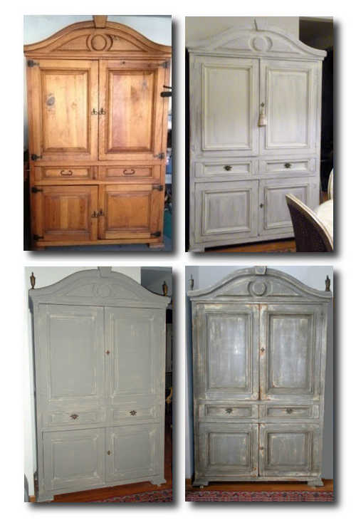
Painting Steps:
1). One Coat Annie Sloan Old White
2). (Not Shown) Second Coat Annie Sloan Old White
3). One Coat French Linen
4). Sand with Medium grit sandpaper.
Andie explains more about the Swedish paint finishes:
“Following these foreign impulses the Swedes created a more restrained or austere style of decoration more suitable for Sweden than the over embellished continental Baroque and Rococo styles. Original 18th century finishes were achieved by multiple layers of a pigment such as black Iron Oxide, mixed with linseed oil. The typical Gustavian grey was reached by mixing these two ingredients and the depth of the color depended upon how much iron oxide was used. A high sheen is not common among Gustavian painted pieces.”
“When I paint a piece I peruse hundreds, if not thousands, of photographs, as well as old paintings. I look to see how the piece withstood the ages, where the paint is worn away and the patina of time and use. With this piece I imagined it came from a large home that had only fireplaces for heat and candles for light. I was heavy handed with the Annie Sloan Dark Wax to mimic the acrid, clinging smoke that no amount of cleaning could erase. Then I sanded the corners, where busy hands may have grabbed the doors through the centuries, taking bits of paint and depositing oils. I then sanded around the hardware to mimic the efforts of the housekeeping staff to keep the hardware clean. I imagined a servant buffing in the same pattern each time she was assigned the task of cleaning this armoire. Up and down…side to side…year after year… until the pattern became engraved upon the surface. The mops they used sometimes nicked the base of the piece and removed paint.”
Andie’s Paint and Hardware Suggestions:
– Remember to have clean t-shirts or terry towels on hand to rub the wax in after it is applied.
– Place laurel, torch keyhole escutcheons on each drawer and used mock key pulls as well. In this post, “The Best 5 Sites For Purchasing Hardware” shows these torch keyholes. Find additional Swedish and French hardware here
– “The mock key pulls had a shiny brass finish. I first soaked them in acetone to remove the clear sealer, wiped them off , rinsed in hot water, then boiled them in a mixture of salt and white vinegar. I used a ratio of one cup to one cup. After you boil them for 10 minutes, remove them from the vinegar and salt solution and place them on a baking sheet in the oven at 450 degrees for ten minutes. Please be cautious when working with chemicals and high temperatures!”
– Add additional architectual details such as the large finials Andie found on ebay
Additional Posts From Andie:
-Craigslist Mirror Transformation and Tutorial – Divine Theatre Blog
-Louis Chairs Before and After- Divine Theatre Blog
-Rags To Riches- A Table Transformation- Divine Theatre Blog
– Craigslist Tutorial -The Craigslist Guru is sharing her secrets!- Divine Theatre Blog
-More Ormolu For Louis –Divine Theatre Blog
-You did What? A Table Transformation- Divine Theatre Blog
Gold Leaf Process Victoriaan Pier Mirror- Divine Theatre Blog
Paris Grey With Dark Wax