How To Decorate With Yellow For A Historical Look

- Swedish Decorating Colors- Blue, Yellow, Navy And Gray- Painting of King Gustav III
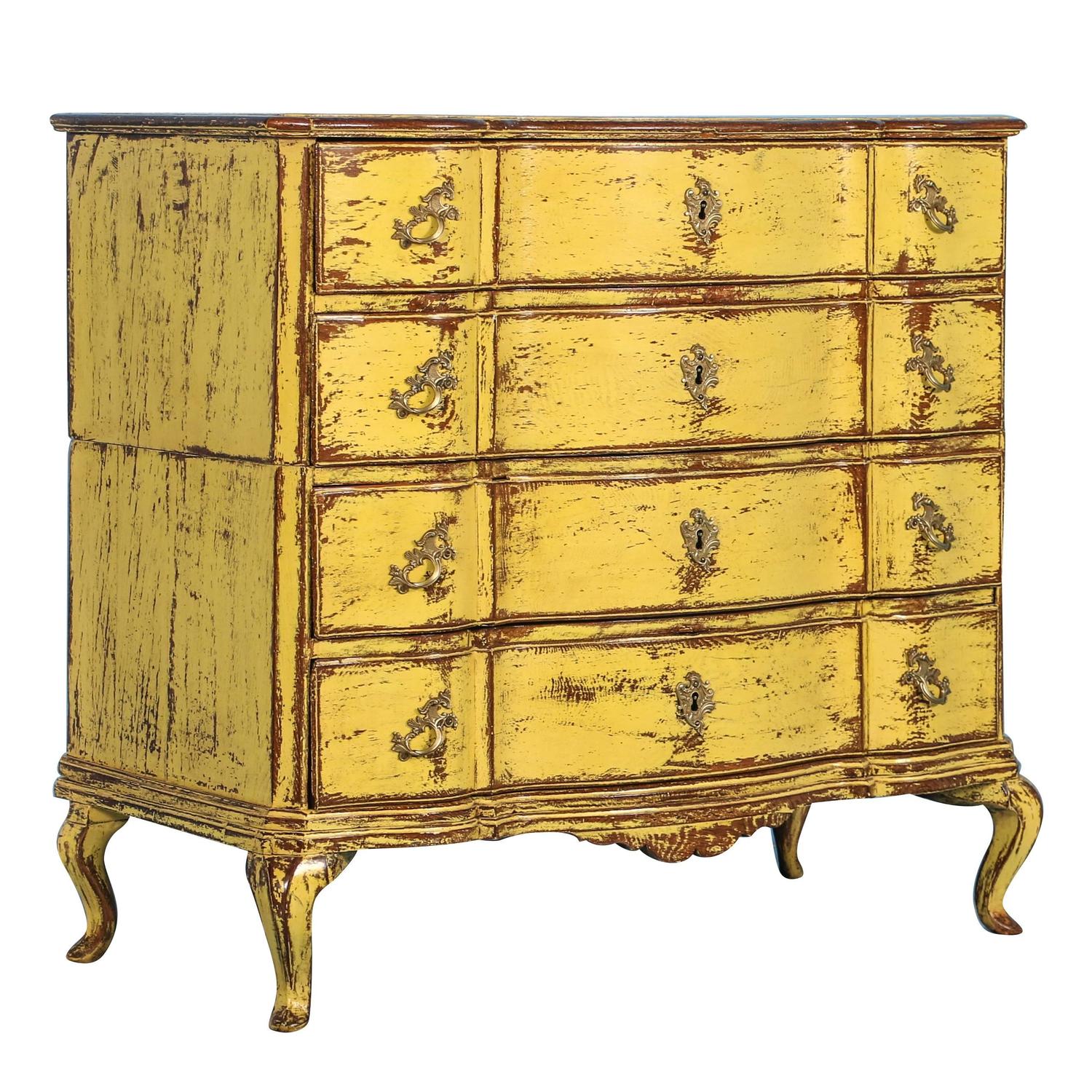
- Antique Yellow Rococo Chest- Scandinavian Antiques 1st Dibs
Yellow along side blue and white are colors that are known to be distinctively Swedish, so when it comes to picking a color for a room around, yellow is a fantastic choice. If you have ever based your home around the darker colors such as red, or black, over time it can be very overwhelming, and just gloomy. Yellow produces the opposite effect. It is enlightening, encouraging, and uplifting.
The color yellow can apply to so many decorating styles, so when considering a period look that is Swedish, here are three tips to keep in mind to make it uniquely Gustavian.
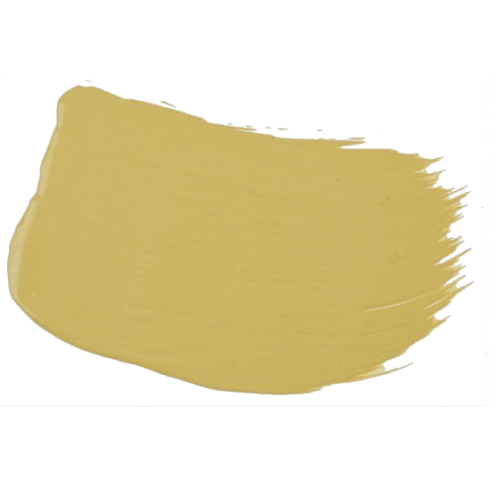
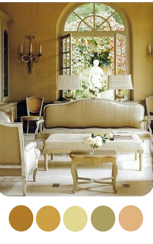
1. Pick the Right Hue– Yellows such as pale yellow or ocher yellow are more historical than high-voltage tones. Brighter tones of yellow can be very fluorescent, which are not at all what you want for a period room. Choose yellows that have a rich brown or slight reddish undertone for the best period looks. Take an ochre yellow and go a few shades darker or lighter on the scale for a perfect tone.
2. Don’t rely on the Paint Chip- A hue that appears just right on the paint chip will usually intensify once it’s on your walls.
In our small town we don’t have a paint store close to us which can match customized colors, so I experienced this very thing when I went to our local hardware store last week for yellow paint. Our local paint store cannot custom match pre-mixed colors, so I had to pick from the selection that was available for sale. The color which was almost right in the store turned out to be very bright on my outdoor table. I added in every can of yellow paint that I had left in my home, and a gallon of dark ochre, and it happened to work out to be the perfect shade for the project I was painting. The shade of ochre works every time I find when I am customizing colors.
With that being said, consider getting a couple samples of paint which cost only 2 or 3 dollars than getting a whole gallon of the shade you think is right. Consider the color you think is right, and try a shade a few shades lighter.
3. Combining 2 different tones of yellows can be quite stunning.
This classic Gustavian room that appeared in “Classic Swedish Interiors,” by Lars Sjoberg, featured on Mentar Mentar Blog shows classic painted paneling. The paneling is a saturated tone of yellow, which is very rich in color. The walls are painted yellow, which appears to be a duled down yellow. The combination is absolute perfection. You can see in this photo, they dressed up this room with a white painted Swedish Mora clock and a black painted french styled desk with a brown leather desk chair. The three tones are perfect color combinations for a Gustavian effect in this yellow based room.
Again the same tones appear in this photograph of the Drottningholm Theatre. Like the leather desk chair in the above picture, you see the same tone of burnt umber on the doors and window frames. White is the second dominant color in this photograph. You can also take tones of the gray marble from the base of the marble statue. The light blue sky is a beautiful accent color.
You cannot go wrong with adding in a couple different shades of yellows. Choose your dominant color of yellow, and add in a few more shades of yellow in the accessories. Neoclassical lamps often feature a pedestal of some sort and a fluted section which can be painted in three tones. Pick a shade of yellow, and combine it with black and gold, or yellow, gray and gold. Paintings also allow you to add in several rich tones of the Gustavian palette. Painted furniture is another way of adding in the just right tone into a scheme.
5. Picking out the right upholstery fabric and throw pillows can go a long way in making your room more period in style. Gustavian decorating often features fabrics that are based on white backgrounds. Picking a fabric that is floral, check or stripe will give you that period style you are looking for. Finding the right fabric can be a true battle, but remember you have so many other elements that can work in your favor to create the Swedish effect.
Picking the right paint tone, along with the right tones for your accent colors will go a long way in recreating a Gustavian home.
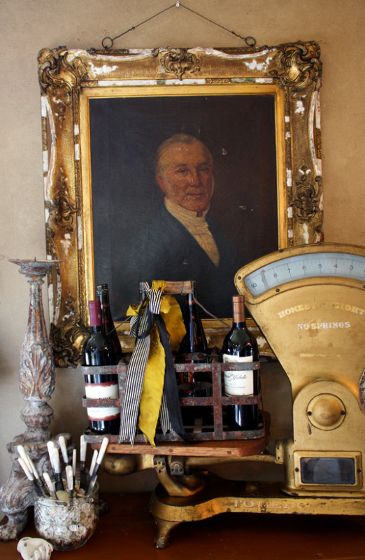
You can see in this photograph a slight yellow tone on the wall, which may be from the camera flash. If you can imagine the wall painted a yellow tone, with layers of gold paintings on the wall, and gold brass accents. The weigh scale has a slightly brown tray holding black bottles, with a very bright yellow ribbon. The various tones of black, yellow, red ( the bottom of the photograph) and navy, seen in the scale itself is the perfect color palette for Gustavian styled decorating.
“I like a buoyant, light-filled house, so I usually use all warm or yellow-based colors. This ocher is really a contemporary yellow shade with an antique resonance. It doesn’t draw attention to itself as, say, bold yellow or even white would. The ocher walls provide support for the exceptional paintings and furniture. Bright-colored walls would visually compete. This shade flatters everyone — it complements every skin tone.” – designer Thomas Jayne
You can see in this photograph of Gustav IV Adolf of Sweden his suit is a brighter yellow against a backdrop of yellow ochre. You can see the painting has a stunning blue sash, and a darker blue jacket, that isn’t quite navy. The brighter yellow, and the peach tones such as the colors in his face would be a great color scheme for a yellow room.
Take some inspiration from the brighter yellow interiors found in the Swedish Chinese Pavilion. The interior featured brighter yellows and bold fabrics on upholstered Swedish chairs.
Here we find a combination of yellow and orange at the Chinese Pavilion. The walls are lined with a light blue paint.
In this picture we find a combination of greens, lighter greens and pastel tones with brighter colored yellow ribbons. Consider a scheme of pastel greens and yellows.
Designer Mary Douglas Drysdale uses brighter tones of yellow in her neoclassical room with Federal antiques. She combines a brighter yellow check pattern in the upholstery and for the window drapes
This ravishing yellow silk gown from 1760 gives off the perfect tone of yellow.
This 17th Century styled room features tones of beige, gray, and natural wood herringbone wood floors and a brightly colored yellow fabric cover. Consider using yellow as your pop of color, such as they did in this room.


Quiet luxury inspired by 18th-century Sweden
Light - Patina - Heritage

Restoration Tools
- Matte Topcoat
- Pro Grade Brush Set
- Finishing Sealer In Matte
- Bronze Spray For Hardware
- Sticks To Everything Primer
- Dead Flat Varnish
- Stick To Everything - Matte Primer
- Transparent Aged Glaze
- Sticks To Everything Brown Primer
- Prima Transfers
- Dyke Brown Glaze
- Escutcheons
- Medallion Silicone Mold
- French Key Molds
- Portico Scroll
- Rusty Paint Finishes
Recent Posts
- 200 Swedish Antiques A Person Can Look For
- Rococo In The Nordic Countries
- For The Love Of Collecting Antiques – A Swedish Interior
- Gustavian Furniture – How to get the look – Ulla Kloster
- 3 Swedish Must Haves – Decorating A Home Around Swedish Antiques
- The Beautiful Wall Paintings Of von Echstedtska gården In Sweden
- 400 Professional Designers Picked Green As The New Color To Watch
- 5 Scandinavian Interior Design Tricks – Megan Slack
- 30 Gray Toned Paint Colors For Swedish Styled Interiors – Behr
- DIY Upper Kitchen Cabinets – Lindsay – White Buffalo Styling
- Bringing The Garden In For The Winter
- The Home Office – Why Not Make Yours Unique ?
- The Light And Airy Furniture Of Sweden
- Slipcovers Have Always Been Popular Through Time – Swedish Decorating
- The Couple Behind D. Larsson Interior and Antikhandel – Swedish Antiques
- 6 Colors You’ll Find In Every Scandinavian Home – Laura Barry
- 5 Decorating Mistakes Not To Make – By Gabrielle Savoie
- Designer Marshall Watson’s Scandinavian Newport Beach Home
- Designer Marshall Watson’s Scandinavian Summer House
- Swedish Inspired Kids Bedrooms
- 5 Kitchen Design Lessons You Can Learn from Scandinavian Interiors
- Jenny’s DIY Wide-Plank Plywood Flooring Studio Renovation
- Decor Mistakes All 20-Somethings Make
- Can I Stain Over Paint To Produce A Patina?
- Q&A With Swedish Designers Edie Van Breems and Rhonda Eleish
- How To Avoid Yellowed White Painted Furniture With General Finishes Products
- Colleen Martin, Founder of Swede Collection Tells Us Her Journey Of How She Began Reproducing Gustavian Furniture
- Expect To See More Warm Grays, Blues And Creams In Gustavian Decorating
- 8 Brands Of Gold Spray Paint Were Compared To Find The Best Color
- Essential Characteristics Of 18th Century Swedish Interiors
- Gustavian Style By Kristie Barnett
- 7 Places To Find Swedish Design For Toddlers
- Study Shows The Gustavian Period Has Defined All Tastes Through Time In Sweden
- Mix Old and New Like the Scandinavians Do- Chloe Taylor
- Swedish Furniture Design – What Makes The 1800’s So Obsessive
- 5 Pieces Of Wise Decorating Advice From Tricia Foley
- Impressive History Of Fine Swedish Table Linen
- Linen Has An Incredible History- Find Out Why……
- Life In 17th Century Norway & Sweden
- How To Select The Right Linen For Your Children’s Bedroom- Kids Room Decor Ideas
- Nordic Style Kids Bedroom Decor Ideas
- Decorator Tricia Foley’s Signature White Interiors
- 10 Tips From Interior Designer Furlow Gatewood
- Living In Norway- Norwegian Life In The 18th & 19th Centuries By Elisabeth Holte
- Investing In Mora Clocks – Expert Advice From Jo From Swedish Interior Design
- International Interior Decorating Magazines Worth Buying
- Swedish Council Of America Articles
- 5 Homes Decorated Around The Nordic Style
- Swedish Reproduction Furniture At Solgarden
- Behind The Rundale Palace in Latvia
- Nordic Style Historical Interior Decorating Books – Living Museums in Scandinavia
- Decorating Around Red- Historical Interior Design Ideas
- Florence De Dampierre Comments On Nordic Furniture In Sweden And Denmark
- 12 Designers Pick Their Favorite Paint Colors – House Beautiful
- 7 Of The Most Famous Swedish Furniture Designers And Decorators
- New Research Suggests Swedish Furniture In The 1700’s May Have Had Strong Colors
- Swedish Tripod Tilt-Top Candle Stand Tables
- Decorators Who Have Embraced The Nordic Style – 30+ Pictures
- A Look Behind Skogaholm Manor -18th century Swedish Decorating
- Decorating With Swedish Country Antiques- Darlene Peterson Buchanan
- 12 Interior Designers Pick Their Favorite Swedish Paint Colors
- 50+ Decorating Books Worth Looking At
- Swedish Decorating Inspirations In Yellow, Ivory And Beige- 50+ Pictures
- Decorating Around The Color Green – Swedish Style
- A Dallas, Texas Home Decorated Around The Swedish Style
- 3 Houses Decorated Around The Rustic Swedish Style
- Reproduction Distressed Furniture And Home Decor From Bliss Studio
- Buy The Swedish Style For Less
- 3 Swedish Style Homes Featured In Magazines
- Swedish Antiques From Debenham Antiques
- The History Behind Jean Bernadotte Otherwise Known As Karl Johan
- 5 Faux Wall Painting Techniques That Are Easier Than You Think
- Swedish Kids Rooms: 6 Ideas To Get The Look
- 5+ Nordic Homes Decorated Around White
- 10 Of The Best Tours In Sweden
- 3 Rustic Scandinavian Country Homes – Borrow Ideas From Norway and Denmark
- Spring Summer Checks and Florals For The Swedish Home
- 70 Swedish Furniture Pieces That Sell For Less- Swedish Decorating On A Budget
- Decorating With Blue: Swedish Style Decorating Ideas
- An Interview With Daniel Larsson- The Go-To Guy For Swedish Antiques
- 7 Scandinavian Country Decorating Books
- 75 Swedish Nordic Pinterest Pages! Oh Yes…More Eye Candy!
- 69 Inspiring Pictures Of Nordic Country Style Decorating
- 20 Scandinavian Gift Ideas
- 5 Ways To Add Life Into Worn-Out Furniture
- Mora Clocks: Investing In Swedish Heritage
- How To Decorate With Botanicals
- Buying Property In Sweden
- Get The Swedish Look By Installing Tongue And Groove Paneling
- The Lavish Interior Of The Swedish Häringe Castle
- The Swedish Wreta Gestgifveri Inn
- Paint It White He Says…. Washington Interior Designer Darryl Carter – Swedish Decorating
- 5 Pro Painting Tips For Black Furniture
- The Swedish Artist Carl Larsson
- A Guesthouse Decorated in The Swedish Style
- Swedish Furniture From Bukowski Market
- 216 Selections From Wallpaper Direct – Swedish Decorating
- A Look Behind The National Museum of Stockholm
- Antique Swedish Dealer Jane Moore’s Home Veranda Magazine
- A Swedish Collected Home In Upstate New York – Swedish Gustavian Decorating
- $100+ Solid Braided Rugs
- 60 Scandinavian Country Folk Art Books On Amazon
- 50 Examples Of Swedish Folk Country Interiors
- Designers Pick Their Favorite Gray Paints
- HOW TO: Paint Gustavian Finishes
- “Söderbo” A Home Untouched Since 1920
- Designer Martha Angus Loves Gustavian Style
- Les Indiennes Fabrics
- Decorating Secrets- 60 Quotes From The Best Experts In Design
- Swedish Kakelugn Stoves
- Helen Olsen’s Rungstedlund Home Revealed In Gods & Gardar Magazine
- The 1700 Collection Swedish Furniture
- Swedish Plaster Medallions
- The History Behind Empire Furniture From The Karl Johan Period -Liza Laserow
- Swedish Styled Wallpaper
- Nordic Style Drapery And Window Coverings
- The Gentle Palette of Swedish Antiques-Corey Amaro
- Custom Reproduction Swedish Furniture From Garbo Interiors
- 30 Spectacular Picks From Frantz Hemeleers Antiques
- Go Bold With Red- Part 1 Grand Sophisticated Interiors
- Go Bold With Red- Nordic Country Interiors
- The Baroque Style Of Switzerland
- Daniel Romualdez’s Swedish Montauk Home
- The Shocking History Behind “Emerald Green” Paint
- Stylish Looks For Slip-covering Your Furniture
- The Best 5 Websites For Purchasing Antique Hardware
- Fired Earth’s Anniversary Paint Collection
- Swedish Furniture Auctions -Uppsala Auktionskammare
- Louis Masreliez- The Designer Behind Gustav III’s Pavilion At Haga Park
- A Nordic Design Staple- The Swedish Kakelugn Tile Stove
- Swedish Antique Mirrors
- How To Decorate A Child’s Room In The Swedish Style
- Ruby Beets Swedish Rustic Home
- The Country Side Of Sweden- An All White Based Home
- Akerö in Södermanland, Sweden
- Krusenberg Herrgård: An 18th Century Swedish Luxury Hotel
- Wood Plank Flooring, A Swedish Design Must Have – Part 1
- Vinyl Plank Flooring, A Swedish Design Must Have – Part 2
- Laminate Wood Flooring, A Swedish Design Must Have – Part 3
- Plywood Plank Flooring, A Swedish Design Must Have – Part 4
- Painted Wood Flooring, A Swedish Design Must Have – Part 5
- The Romantic Baroque Style: Part 1- Stromholm
- The Romantic Baroque Style: Part 2 King Gustav Vasa
- The Romantic Baroque Style: Part 3 Skokloster & Steninge Palace
- The Romantic Baroque Style: Part 4 – A Collectors Home
- The Romantic Baroque Style: Part 5 Add Color
- Sweden’s Empire Decorated Rosersberg Palace
- The Most Beautiful Rococo Library In The World:The Anna Amalia Library
- 4 Resources For Swedish Decorating
- How Important Are Accent Pieces In A Swedish Home?
