Go Bold With Red- Nordic Country Interiors

To start thinking about how you would like to include red in your home, here are a couple questions you must ask yourself:
- Into which room do you want to add red? kitchen, living, bath or entryway?
- How prominent do you want the color to be? All over color or an accent pieces in red?
- How much daylight is in the room? morning, afternoon, or both?
House Beauiful compiled 24 of the best reds from the top leading designers. Here are my favorite 9 red shades of paint from their selection of 24
TOP ROW:
1.”This is a really deep coral, kind of like a cheerful Chinese red. Pinks and reds to me are synonymous with frozen drinks and relaxing.” –Richard Mishaan, Benjamin Moore’s Chili Pepper 2004-20
2.”When I look for red, I want a pure, true red, like the color in the American flag. Ralph Lauren does absolutely the best. It’s the essence of red. It makes me think of boating or polo.” –Suzanne Kasler , Ralph Lauren Paint’s Dressage Red TH41
3. “Red never goes out of style. It’s full of life — always fresh, always fun to wake up to. We go for reds with less blue in them and more orange because they’re happier to live with.” –William Diamond and Anthony Baratta, Ralph Lauren Paint’s Lattice Red IB57
MIDDLE ROW:
4. “It’s a true, deep red. I like the temperature of it: it’s a bit cooler. But a little red goes a long way. It’s good in areas where you don’t spend much time or in boring areas that need a strong burst of color.” –Roderick Shade Pictured, Benjamin Moore’s Million Dollar Red 2003-10
5. Benjamin Moore’s Redstone was used in Eldon Wong’s cupboard.
6. “All my life I’ve pursued the perfect red. I can never get painters to mix it for me. It’s exactly as if I’d said “I want Rococo with a spot of Gothic in it and a bit of Buddhist temple” — they have no idea what I’m talking about.” –Diana Vreeland, Benjamin Moore’s Red 2000-10
BOTTOM ROW:
7. “Red is the color of excitement, and I tend to go for corally orange reds. With red, you know you’ve arrived and you glance in the mirror and realize how great you look and breeze right in.” –Keith Irvine, Benjamin Moore’s Salsa 2009-20
8.”I prefer the warm, vibrant reds to the historic reds, which are beautiful but sedate. This is a daring red, a real fire engine red. It has a playfulness that reminds me of a little red schoolhouse.” –Ruthie Sommers, Fine Paints of Europe’s Dutchlac Brilliant Tulip Red W1001B-M
9.”Lately I’m on this anti-completely-neutral kick. You have to have some seasoning in your rooms. Sangria is good, universal-donor red — not too blue, not too orange, not too dark.” –Elissa Cullman, Benjamin Moore’s Sangria 2006-20
Get samples of your chosen color, and paint a large section of your wall to determine what color looks best through out the day. Some colors will appear more grayed, while others may appear more saturated.
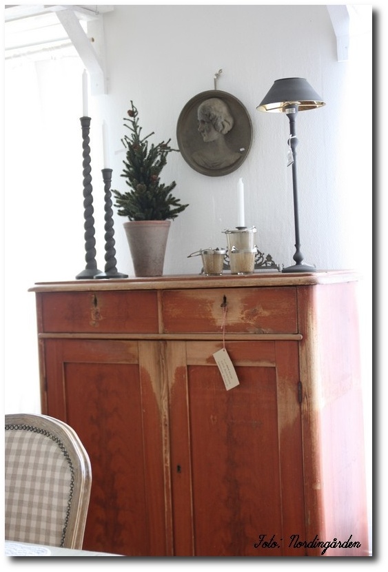
4. Paint Your Furniture Red Than The Walls
If you want an all-white based room, consider painting larger furniture pieces in red. In this post we show you a red provincial chest in a country style.
For a rustic country look, start by striping your furniture of it’s prior paint and urethane. I find using a heat gun the best way to strip furniture without using chemicals. Ideally you want the wood to soak in the paint, which will allow you to distress it better, when it is dry. I find even if I paint a piece of furniture that has urethane on top, the sanding doesn’t look as great compared to wood that is raw. Use a flat or satin red paint on the piece. Distressing is the key to this look. Later, adding brown glaze to the top of the paint, which you can either paint on, or wipe off will blend the wood and paint color together to give you that aged look. These three steps have allowed me the best results to achieving an old world antique painted furniture looks. Don’t be afraid of going crazy with the distressing. You cannot go wrong with over distressing, expecially when you start with raw wood. You can always go back, touch up the areas that have too little paint, and distress again to blend the areas together.
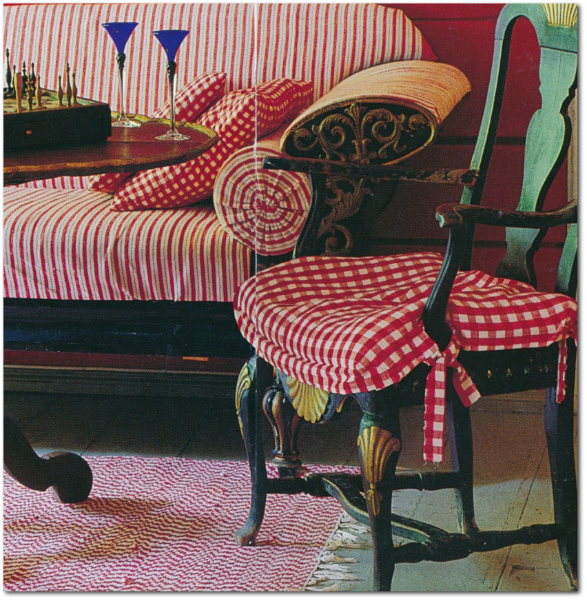
5. Combine Red With Natural Wood or Black Painted Furniture
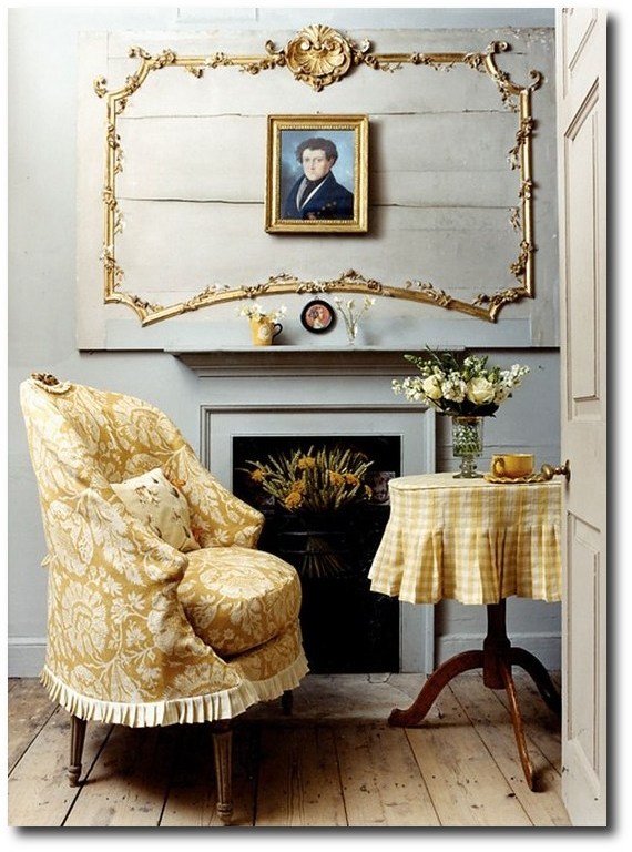
The picture below shows a Scandinavian entry way in a traditional red, featured in Lars Bolander’s Book- Scandinavian Design, this entryway is furnished like a real room instead of a transit area. A black painted rococo side chair with gold details contrasts nicely against the red painted plank walls.
- If you choose to paint your walls red, such as the room below, consider placing furniture that is painted and heavily detailed. White, black or natural wood furniture looks the best against saturated colored walls such as the picture below. Find furniture with some detailing. Perhaps a solid wood unfinished chest with gold detailing. Another way to go in the picture below is a wood chest with black detailing.
- Staffan Johansson From Palm Beach Daily News
- Lars Bolander’s Book- Scandinavian Design
- D.LARSSON Interiör & Antikhandel
- Louise Bourgeois exhibition at the Nordic Watercolour museum-Camillaengman.blog
- Distressed Red Chest From Gruvgatan13 Blog
- House To Home
- Swedish-style Dining Room – House to Home Magazine
- Varke magazine at scandinaviankitchens.com
- Combine Red and Gray Together-Næslund Antikviteter
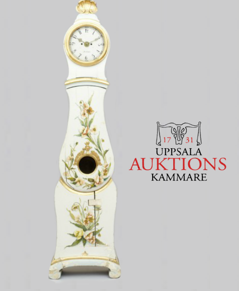
- Mora clock from Lone Ranger Antiques

Swedish Baroque Captain’s Arm Chair c. 1750

Beautiful 18th Century Swedish Chair. Painted black with intricate gold-leaf detail.
This lovely grandfather clock boasts the traditional curves of the Swedish Mora design. The original black paint is accented with gold flourish detail, while the bottom has a lovely pastoral scene with lake and swan in forefront.

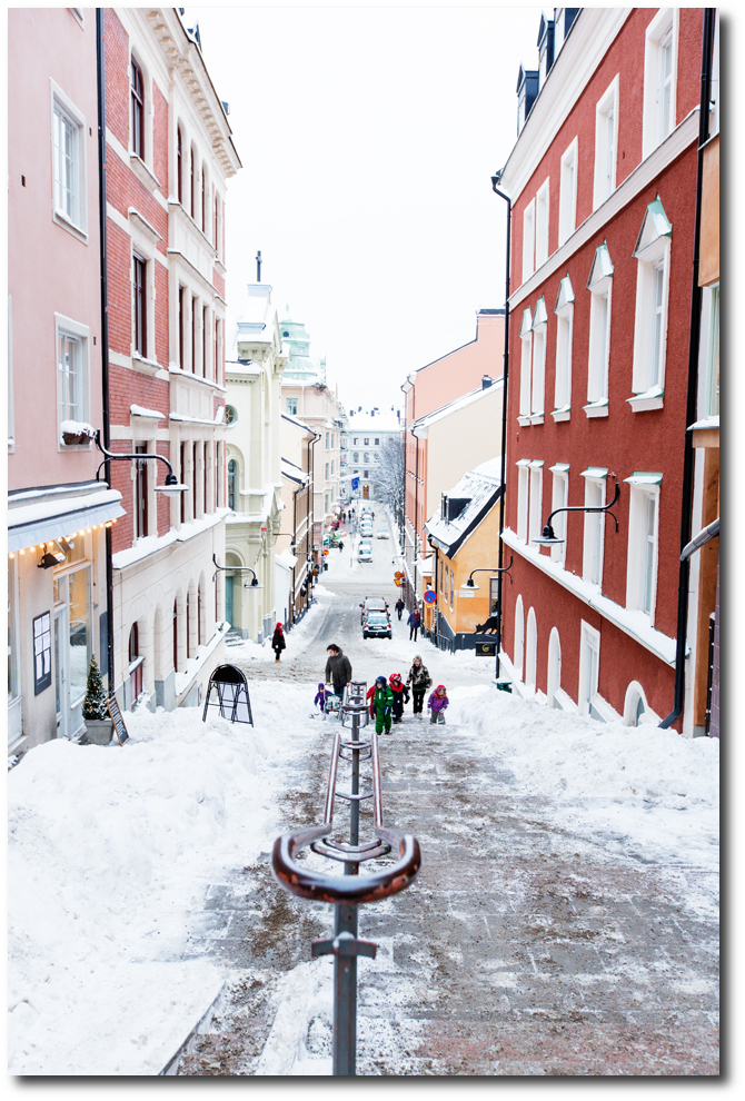
2012 Swedish Winter Photo from Fantastic Frank

Period Gustavian two over two chest of drawers in red paint. Egg and dart molding at the top, with fluting and carved rosettes on the chamfered sides. Cupboards & Roses
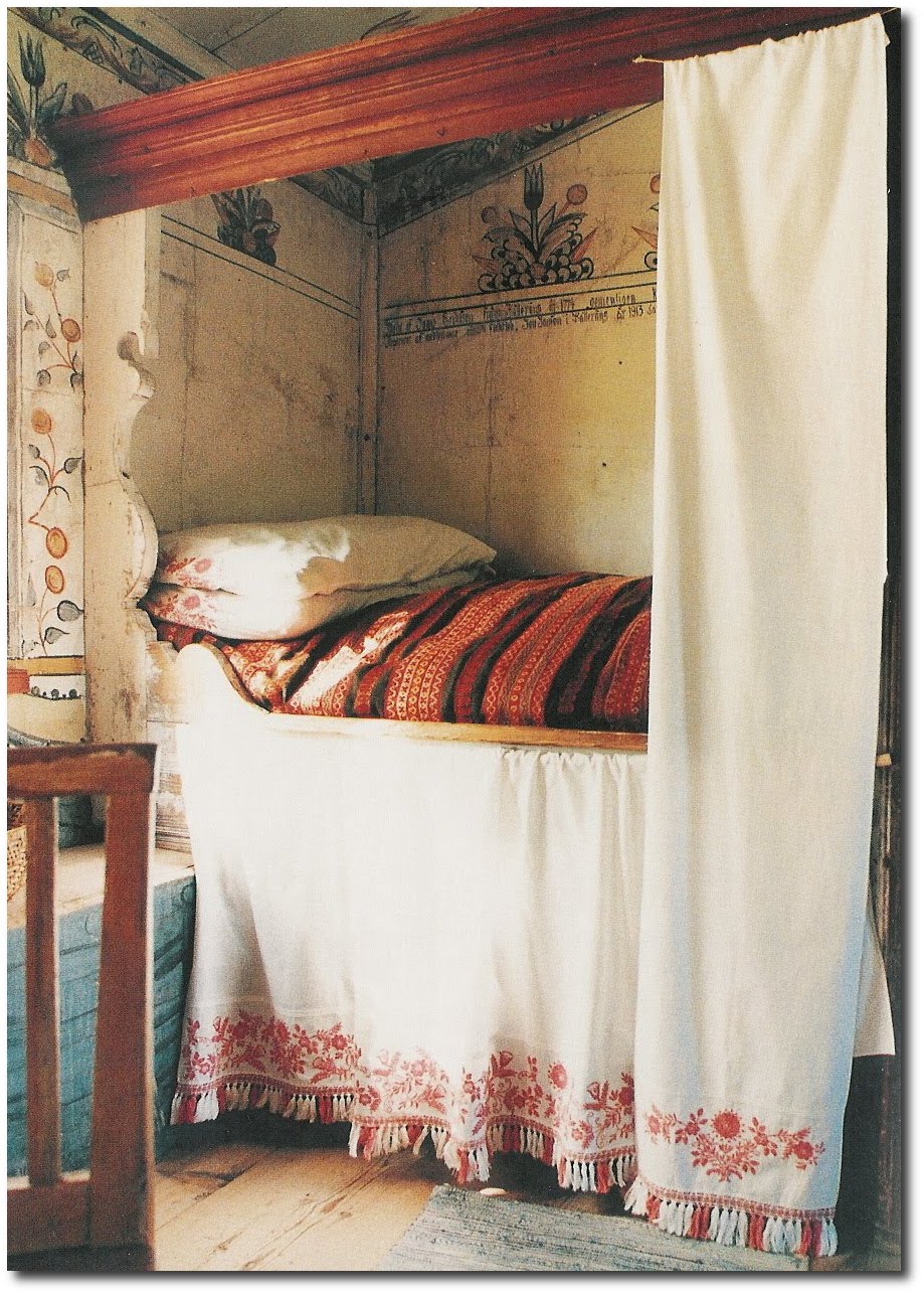
Swedish Cupboard Bed From Moon To Moon Blog

Classic Swedish rocking chair with unusual paint. These chairs were usually painted black.
The wood grain and floral finish is rare. This six legged style was made between 1830 and 1850, after that the 4 legged version took over.

18th C. Swedish Rococo black painted chest with rare brass hardware decorated with crown and cross, circa 1760.
Swedish at Tone on Tone Antiques
Swedish Gustavian Bench, 18th century, with traditional “Falu” red paint

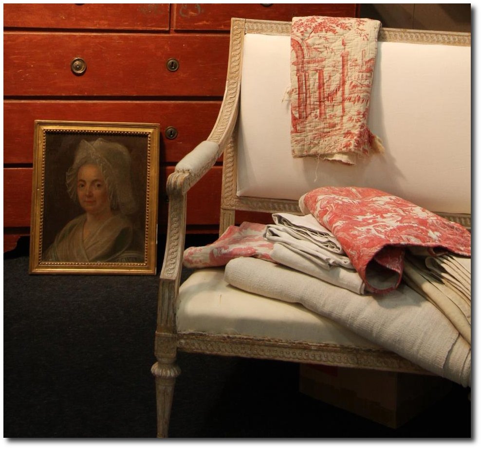
Antique Vintage French Fabric ~ Project Bundle From Loody Lady on EBAY


A Close up of the chair
The French Elle Decor December 2008 issue

A Bleached/Painted Gustavian Commode with Reeded Front- $5,500

Baroque Commode Germany circa 1760


The Baroque Style Of Switzerland
Chesa Planta house, located in Samedan, a picturesque village 6 km northeast of St Mortitz, Switzerland featured an exhibition of Rich Owens’s exquisite furniture designs photographed by Adrien Dirand. The collection was minimalistic, evoking a sense of goth meets luxury. Owens’ minimal aesthetic contrasted perfectly with baroque grandeur of the chateau. Some of the highlights included the bone chairs with stag antler backs, and a petrified wood sofa. Built in 1595, the house had been restored to convey the look of an 18th century Engadin aristocratic home. “Engadin” or “Engadine” identifies a long valley in the Swiss Alps located in southeast Switzerland. The Engadin is protected by high mountains on all sides and is famous for its sunny climate, beautiful landscapes, and outdoor activities.
There is a strong architectural presence of the Romanesque style in Switzerland, which can be found in the cathedrals, castles and fortresses around the country. The Gothic and Baroque style became fashionable through the Renaissance, where a large number of architectural masters came from Italy. The hand painting of the walls in the Chesa Planta house shows a Italian influence which is found in the region. Switzerland lies at the crossroads of several major European cultures, which includes three major languages, German, French and Italian which form the national languages of Switzerland, along with Romansh, spoken by a small minority. Therefore Swiss culture is characterised by diversity, which is reflected in a wide range of traditional customs, which also influenced the art and interior design of the country through history.
Folk art was kept alive all over the country. In Switzerland, it is mostly expressed in painting, dance, music, embroidery and wood carving. The most common form of woodcarving found in Switzerland is called chip carving. Chip carving decoration is normally found on everyday objects, such as milk stools, wooden spoons, or walking sticks. In some areas, the façades of houses are richly decorated using woodcarving. Embroidery has been a common element on historical traditional clothing in Switzerland. Embroidery has always been used for the decoration of fabric, but because the art is time intensive, it is sold for premium prices. Embroidery was something that served as an art in the home in past centuries and today is often found in tourist outlets where vintage and antique products are sold.
Interesting Books
–Swiss Furniture and Interiors in the 20th Century by Arthur Ruegg and Arthur Rüegg– For the first time, the development of interiors and furniture in Switzerland from the end of the nineteenth century to the present day have been surveyed and documented. A fully illustrated catalogue of over 300 objects from furniture to ceramics and household objects and around 150 biographies conclude the publication.
–Mountain Houses by Philippe Saharoff and Gwenaëlle Leprat–Nowhere is the beauty of living in the mountains more evident than in the Alps, where the spectacular landscape has given rise to equally
gorgeous homes. In Mountain Houses, photographer Philippe Saharoff takes us to 30 of these lovely chalets, farmhouses, and cottages, located in Chamonix, Gstaad, and other picturesque towns of
the Swiss and French Alps. More than 300 stunning photographs, taken in all seasons, bring the rustic charm and timeless comfort of each home to life. While wood and stone are the predominant materials,
the houses are decorated in a wide range of styles.
–Alpine Interiors (Interiors (Taschen)) by Beate Wedekind and TASCHEN–If you think that laying your hat in the Alps means having to choose between a rustic mountain hut or a log-burning ski lodge, then you’ll be
amazed when you get a glimpse of this latest inspiring volume in the Interiors series. The mountains of the Alps are a unique terrain unlike anything else in Europe, thus when constructing and decorating a place
to live, architects and designers have to be conscious of adapting to the extremes of landscape and climate. The desire to make your home a beautiful thing, to find a balance between Function and elegance,
becomes particularly significant in the Alpine region. Primarily Famous as a location for skiing resorts and muesli, the Alps straddle the borders of so many European countries, and this has allowed for a lively
interaction and exchange between many peoples and cultures. The selections in this book are impeccable. For example Reinhold Messner’s castle. There’s everything From baroque villas to farmhouses, famous
designers/ architects to the ordinary Alp-lander with very good taste.
For More Inspiration See These Posts:
The Romantic Baroque Style: Part 1- Stromholm
The Romantic Baroque Style: Part 2 King Gustav Vasa
The Romantic Baroque Style: Part 3 Skokloster & Steninge Palace
The Romantic Baroque Style: Part 4 – A Collectors Home
Image Credits
The home of Fawaz Gruosi and Caroline Gruosi-Scheufele
Schloss Hetzendorf in Austria

Europe -Switzerland- Location, Flag and Coat Of Arms-
A Picture of An spectacular estate in Switzerland

The home of Fawaz Gruosi and Caroline Gruosi-Scheufele’s villa, which overlooks Lake Geneva, in Prangins, Switzerland was featured in Elle Decor Magazine. 19th-century birdcages are suspended from a ceiling hand painted by Florentine artisans; the walls are decorated with framed dried flowers, the stool is wrought iron, and the cocktail table was made in Florence. Read more: A Lake Geneva Home with Traditional Decor – ELLE DECOR

Architectural Digest featured a home in Moritz, Switzerland, with architecture and interior design by Studio Peregalli. This seventeenth-century home features Italian furnishings outfit the stone-paved entrance hall; the staircase lantern is 18th-century Venetian.

Baroque chest of drawers-Switzerland, Bern area, mid 18th century.
A three-drawer chest with walnut veneer and marquetry panels.

Moritz, Switzerland Home Featured In Architectural Digest

Moritz, Switzerland Home Featured In Architectural Digest

A charming side chair with the original painted finish from Switzerland c. 1850.
The geometric form of this chair is evident from the straight lines of the legs, stretchers and seat. But the back of the chair shows a wonderful rural aesthetic in the decoration.
The top most horizontal stile has a shaped upper edge and encloses three symmetrically placed piercings that resemble the petals of a flower. In the centre of the back there is a square cross form that has been created by four smaller crosses. This shape is actually reminiscent of an elaborate Maltese Cross first seen during the Crusades and an emblem of the Organization of the Knights Templar. The combination of the rich blue and green colour on the chair is quite pleasing. Look closely at the seat especially and it is possible to see the passage of time as the paint has been worn down to reveal the pine timber because of daily use. this pattern is impossible to duplicate in a new chair and it is what makes an antique so particularly desirable.
Old Chalet Refurbishment by Bergdorf & Nick Ruef Bernese Oberland, Switzerland- Yellow Trace Blog
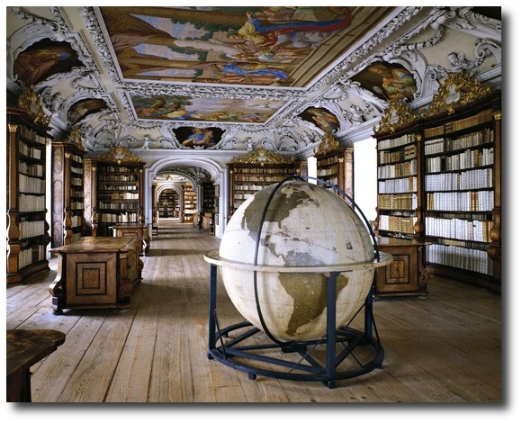
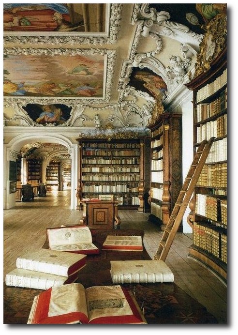
The Benedictine Monastery Einsiedeln was founded in 934.
Today it is one of most famous monasteries on the
Saint James’ Way, the pilgrimage route to the Cathedral of Santiago de
Compostela. The abbey’s library contains about 230,000 printed books,
1230 manuscripts and 1040 incunabula and early printed books including
the Versus de scachis, a Medieval Latin poem and the earliest mention of
chess in Western literature
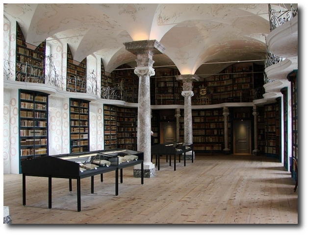
The Library Of The Kremsmünster Abbey, Austria

The Library Of The Kremsmünster Abbey, Austria

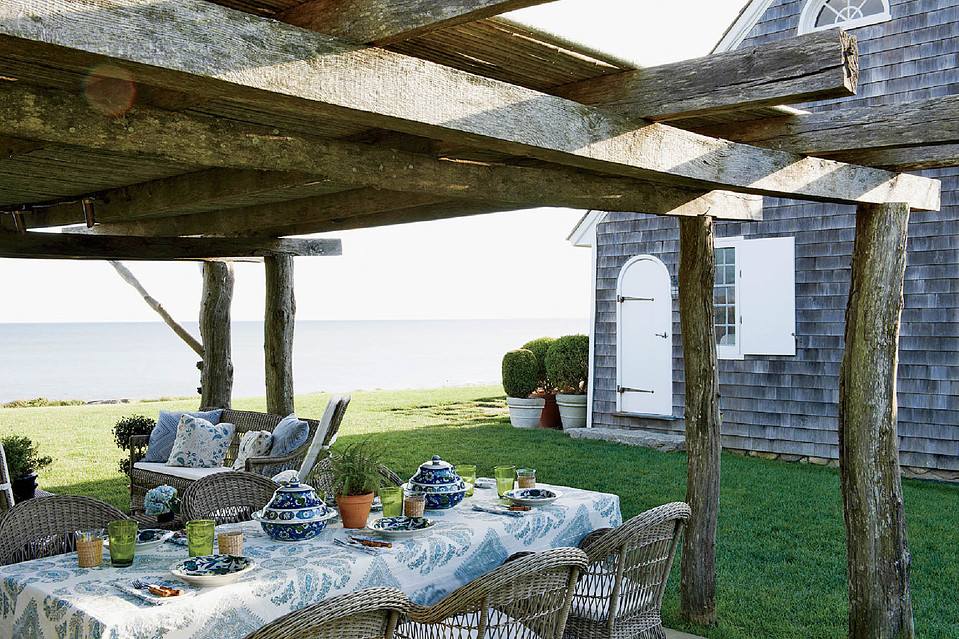
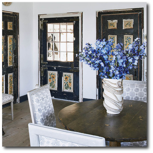
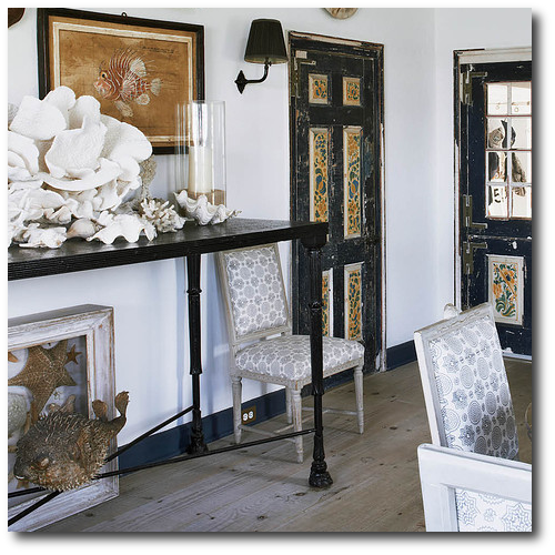
Daniel Romualdez’s Swedish Montauk Home
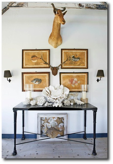
It is no doubt that the hottest designers are using distressed Gustavian furniture in their own homes. Designer Daniel Romualdez is one of those designers. His Montauk, New York home also shows off a captivating white based interior. Romualdez breathed new life into the home using only splashes of blue, white and black. The main dining room shows a beautiful collection of seashells in weathered frames. The room is furnished with 18th century Gustavian furniture with a geometric blue and white upholstery. Most of all the pictures we picture below are credited to the Wallstreet Journal. Here are a few links to this homes interior from Corbis. Here is a picture of the stairway that was installed in limed pine, in line with the Swedish styles found through the house.
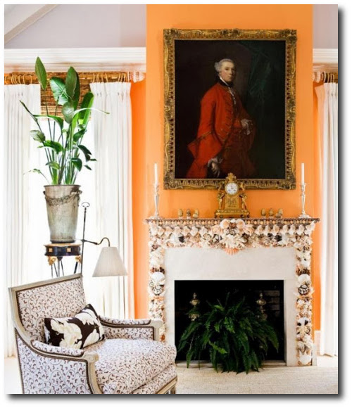
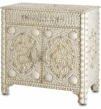
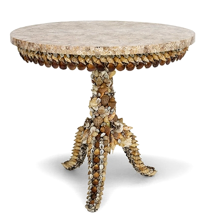
Decorating with seashells can add a natural touch to your home. Here are 10 tips to getting a high end look with seashells:
1. Paint your walls in soft pastels. Keeping the wall color light will create a serene feel and allow you to play off the colors found in the lighter natural tones of seashells.
The ocean and the sky are both blue, so blue should be incorporated into the color scheme. Borrow looks from Daniel Romualdez’s home by choosing upholstery in blue and white. White based backgrounds for upholstery choices keep within the classic textile choices found in Sweden.
-Light blue or green walls are also great colors for a room decorated with seashell decor.
-If you do use brighter blues, consider using it in an accessory as Daniel Romualdez’s does with a vibrant floral centerpiece. Add layers of duller blues in your rooms with accents of brighter tones of blue sparingly.
2. Mix in reds, oranges, and golden hues within your home decor to provide a contrast to the white walls, and white shells such as what Daniel Romualdez’s does with the black hand painted doors, and black frames on the walls.
3. Consider installing wall panelling, which can be stained in a soft cream or white. Wood adds an organic layer that is commonly found in Swedish decorating. Clean, brilliant white walls make a great backdrop for bold color splashes or natural wood accents.
4. Sofa or floor pillows incorporate the feeling of comfort. This Sea Shell Linen Pillow Cover with Jute & Mother Of Pearl Embroidery has both the linen fabrics found in Swedish decorating, as well adds a bit of the pearl shine we find in the sea.
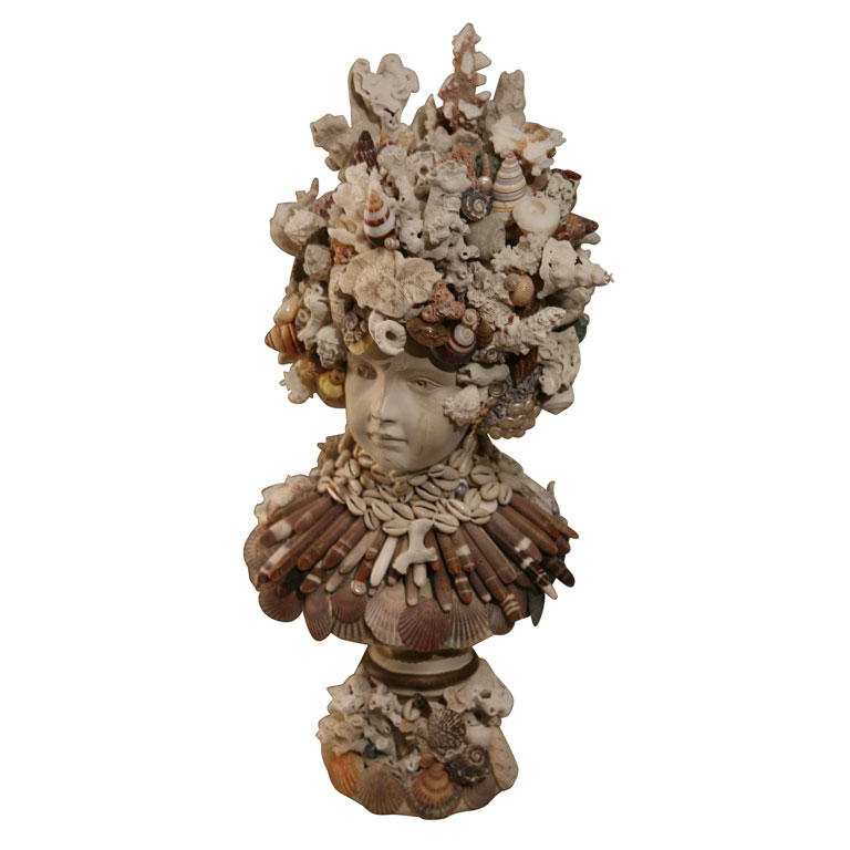
5. Cover furniture or home decor with shells. A neoclassical bust with smaller seashells is a sophisticated approach to using shells in your decor. All you need is a nice looking neoclassical bust, hot glue and a variety of seashells.
-Make a crown for the bust or display it on it’s own.
–Here we see a rustic bust, with a seashell crown.
–Here we see a mirror made with hand collected shells and Ikea mirror frame. All the shells are facing the same direction rather than the sporadic placement that we see with seashell art.
–Here we see a beautiful floral display with an urn decorated in seashells
Plaster Busts on Ebay
7. Consider presenting your collection of shells as a display on your wall with corbels. Instead of displaying the smaller shells, collect the larger seashells, which can make more of an impact. Swedish decorating is known for clean, uncluttered looks, so bigger shells are better in a Swedish scheme. Corbels can be rather expensive, but there are ways of getting corbels that match without spending $300 on each corbel. Make your own shelves for pennies with concrete molds such as this one from Mold Creations. Concrete Success has the perfect mold shelf featuring a sea shell in the design, selling for $34 dollars. This allows you to make endless shelves for your collections, without spending any more than for the mold itself, and the plaster or concrete.
Interesting Finds on Ebay And Amazon
– This square sea shell mold would be a rather interesting texture to cover an entire accent wall in a bathroom with. It has a rather primitive fossil quality to it.
-Silver Tone Decorative Spiny Jewel Nautical Sea Shell Home Decor $27
-Luxury Lane Hand Blown Art Glass Seashell Centerpiece 7.5″ tall by 12.5″ long $25
-White Pearlized Chambered Nautilus Sea Shell Decor 5″ – 6″ $25
-100% Real Sea Shell-4.5″ Original From Haiwaii,$9
-Small Brass Compass Rose Nautical Wall Plaque $50
-Bathroom Decor- Set of 3 Decorative Clear Glass Bottles with Nautical Sea Shell $71
-Luxury Lane Hand Blown Art Glass Seashell Centerpiece 4.5″ tall by 9″ long $25
-Aluminum Sea Shell Decor 4″H, 10″W $36
-Round Rustic Wooden Nautical Porthole Mirror– $70
-Set of 2 Seafoam Green and Cream Sea Shell Pattern Rustic Aged Decorative Bowls $110
-Gorgeous Set of 4 Mini Sea Shell Covered Spheres $48
-Decorative Wooden Paddle $19
-Wooden Nautical Sailboat Yacht Model w/ Shell Sail $24
See our other post Daniel Romualdez’s Breathtaking Late-Eighteenth Century Farmhouse
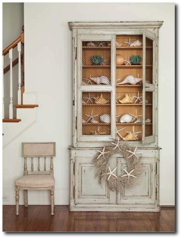
- Display cabinet with Shell Collection- vine.wisteria.com
- Dark Blue, Striped Scotchgarded Outdoor And Indoor Fabric By The Yard – $23
- Reversible Floral Upholstery Grade Fabric By The Yard – $29
- Fabric for Upholstery Suzani Blue & Beige 54″ $19
- Daniel Romualdez’s Montauk Home- An Outdoor Pergola –Wallstreet Journal
- Daniel Romualdez- –Wallstreet Journal
- Anh Duong Renovates Her Cliff-Top House In Montauk With the help of Daniel Romualdez
- Read More at GQ Magazine
Daniel Romualdez’s Montauk Home-www.williamwaldron.com
Another View Of This Room From www.corbisimages.com
You can see the trim was painted blue, and the floors limed. In addition, the doors were touched up.


Consider Topping A Bust With A Seashell Crown

Swedish Furniture UPCLOSE Wallstreet Journal
Fanciful Sea Shell Bust- www.berkshireantiques.com
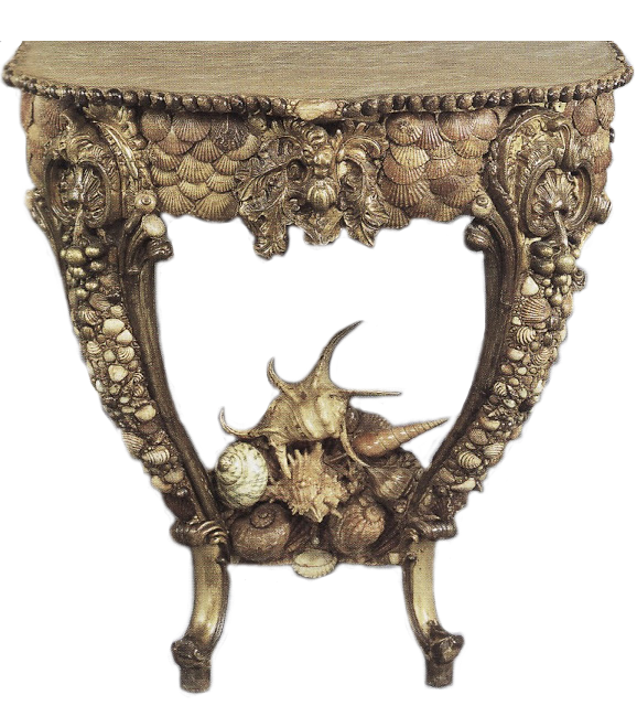
Louis XV Console Table Covered in Seashells-chintz-of-darkness.blogspot.com
 Mimi McMakin, founder of Kemble Interiors.

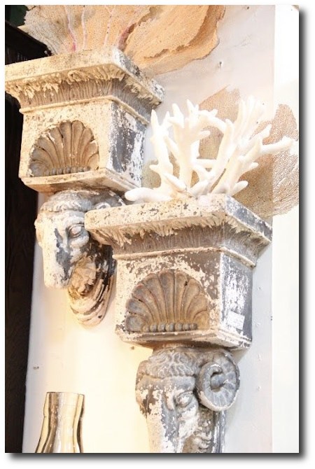
Corbels holding a collection of seashells-debrahalllifestyle.blogspot.com

Anh Duong Renovates Her Cliff-Top House In Montauk With the help of Daniel Romualdez


The Shocking History Behind “Emerald Green” Paint
 Seglora Church -Relocated From Western Sweden
*Disclaimer*-The pictures contained in this post are to illustrate the BEAUTY of yellow and green paint used in 18th century interiors. We have no knowledge what so ever of the paint used in the rooms or furniture. Emerald Green and Yellow colors are absolutely stunning colors to decorate a home around.
The History Behind Emerald Green
Emerald Green, is the color of the year for 2013, yet what many people don’t know is the color “Emerald Green” at one time, killed people.
This brilliant blue-green color was extremely popular in the mid- 1800s, because emerald green paint was cheap to manufacture, and it had such a great depth of color.
In 1814 in Schweinfurt, Germany, two men named Russ and Sattler tried to improve on Scheele’s green, and made a paint made with copper arsenite. The result was a highly toxic pigment called “emerald green”. This paint was made with arsenic and verdigris and the bright green color became an instant hit within the design community.
The vibrant color was not only used as artist paint, but as well as household paint amongst other things. Many people at that time didn’t know the paint was made with poisonous arsonic, and who is to blame them when we don’t know ourselves what kind of unhealthy additives are contained in our foods. As soon as the color was produced, it was picked up by many companies far and wide. The emerald green dye wasn’t only used for paint, but wallpaper and as liquid dyes.
In particular, in damp rooms where mold grew, the arsonic in the wallpaper paste would be turned into a toxic gas which would be deadly for anyone living in the room. By 1830, wallpaper production had risen to 1 million rolls a year in the UK, and by 30 million in 1870. Tests later revealed that four out of five wallpapers contained arsenic.
Leopold Gmelin (1788-1853), a German chemist, suspected in 1815 that wallpaper could poison the atmosphere, that he made several efforts to warn the people in his day to strip their rooms of the paper, and advocated banning Scheele’s green. He noticed that the substance gave off a garlic-like odor when the paper was slightly damp. Experiments at the end of the 19th century proved that arsenic pigments in damp or rotting wallpaper were lethal. If only they listened to Leopold Gmelin’s warnings!
The color “Emerald Green” became so popular and widely used in the cotton industry which used the chemical in pigments and dyes. It was also used by other industries such as glass manufactures as a de-colouriser, and in the production of leather tanning, soaps, lampshades, pharmaceuticals, agriculture for sheep dips, children’s toys, and candles.
Emerald green was also used to color cake decorations. In a few recorded instances, this dye was used to color icing, much like we do today. In one case, the industry making the dyes employed hundreds of young girls, who later died from chronic arsenic poisoning. At a banquet held by the Irish Regiment in London in the 1850’s, sugar leaves that were dyed with the Emerald Green, and used as table decorations. Many of the guests took the decorations home to give to their children to eat as a treat, whom later died. Another dinner in 1860, a chef produced a spectacular green sugar dessert, used Scheele’s green and later, three of the diners later died. If this is shocking, read this up on our modern day Aspartame. It has been proven that this popular sweetener used in coffee is toxic to your brain. In fact, they say that when aspartame is added to hot waters, exceeding 86 degrees F. the Aspartame converts to Formaldehyde, and then to Formic Acid, which damages the brain….. yet this substance isn’t pulled off the market.
Here is the sad part- Even though they knew all the scientific evidence of its highly toxic nature, production of emerald green paint was not banned until the 1960’s.
The History Cinnabar Red
One of the most difficult to use and costly pigments on the market. Cinnabar red is obtained from a mineral (the principle ore of mercury). The Romans obtained it from the Almaden mines in Spain, which is still today an important locational source of mercury. In order for it to be used as a pigment, the mineral had to be purified, then synthesized and then ground to the correct fineness. If improperly handled, it could turn black.
“Red’s hard. There are so many bad ones. They’re either too bordello or too raspberry nail polish. Or they’re so brown it’s like eating in a Southwestern theme restaurant, or so primary and overly frank that you want to ask, ‘Where do I put the presidential seal?’ I’m always looking for either a juicy pomegranate red, a Chinese lacquer red, or a really good oxblood. Because it’s such an important color, red needs nuance, subtlety, and depth, so in those rare instances that I break it out, I like to do it as a glaze, a lacquer, a fabric upholstery, or as red leather walls so there’s variation to the tone.” —CELERIE KEMBLE
See: The Top Shades Of Red Paint By The Most Famous Designers- The Painted Furniture
The History Behind Lead White
The poisonous qualities of Lead White have been noted since Ancient Rome, when the color was made in Rhodes (Greece ) where workers would put shavings of thin lead over a bowl filled with vinegar. The acid on the thin metal would cause a chemical reaction and leave a white deposit of lead carbonate which was then powdered, flattened and left to dry in the sun. The small amount of lead white still manufactured today follows this same formula.
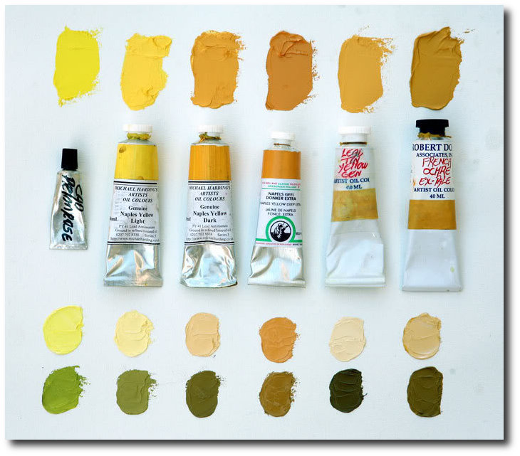
The History Behind Naples Yellow
The 18th and 19th century saw the discovery and manufacture of synthetic pigments and dyes, which quickly replaced the traditional yellows made from arsenic, cow urine, and other substances. Naples Yellow is one of the oldest synthetic pigments. Naples yellow was essential to the landscape tradition because it has a quality of appearing to recede, making it perfect for capturing the essence of the sun. The genuine pigment is toxic, and it is believed that Vincent van Gogh’s mental illness and suicide was a result of his frequent use of true Naples yellow.
Have scientists finally discovered why Van Gogh’s paintings are turning brown? Mail Online
Hope For Today
Today we have a wide variety of organic paints available within reach. More than ever paint manufacturers are producing low VOC paints as people are looking at safer brands for their homes and health. Olympic Premium and Benjamin Moore Aura have shown to have lower VOC levels than other tested paints and did a good job in this hiding test, according to Consumer Reports. VOC levels have been toughened because VOCs are linked to respiratory illnesses and memory impairment.
The top paints in the Consumer Report Ratings had among the highest claimed VOC levels, including Behr Premium Plus Enamel low-luster and flat and Benjamin Moore Regal semigloss. They reveal that lowering the VOC levels can affect performance. “When you take out VOCs, you still need strong performance properties, but you have to find other ways to achieve them,” says Carl Minchew, product-development director at Benjamin Moore. Still, some no- and low-VOC paints did well in performance revealed in the Consumer Report Ratings. Posted in the Consumer Reports Magazine issue: March 2009
See: Green Dreams: Environmentally Friendly Restoration Furniture– The Painted Furniture
This information below comes from www.wetcanvas.com
“PY41 is genuine Naples Yellow (Lead Antimonate), tubed paints come in two yellow versions, Light and Dark (sometimes available in a “red” pigment as well). Available from Vasari, Michael Harding and Robert Doak. Genuine Naples offer a smooth blending mild tinting yellow that works in more delicate situations, like portraiture. Here is a comparison of both Michael Harding genuine Naples Yellows along with others similar colors, including OH’s PBr24 imitation Naples Yellow Extra. The lower mixes show the colors tinted with white above, and black below.”

Green Paint Colors Featured On Martha Stewart
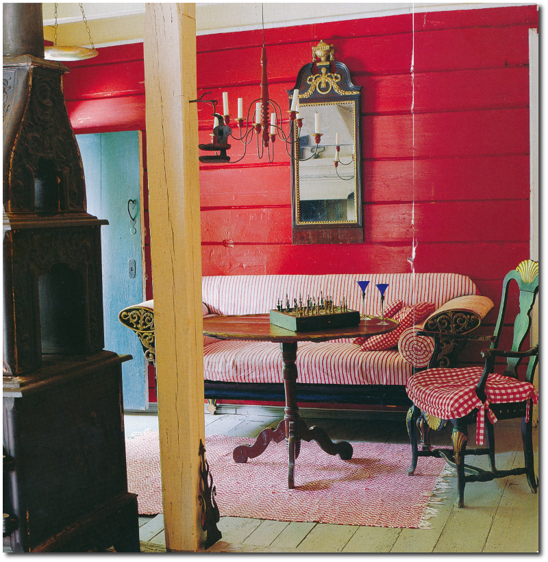
A Swedish Parcel Gilt and Gray Painted Sofa
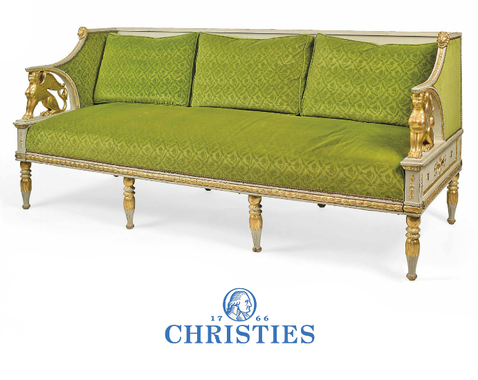
The Brian Juhos Collection From a Domaine in Southern France- Christies
Picture Credit To Bellis Vintage Blog
The Elegance Of Scandinavian Old World Interiors
Michael Eastman Cuba Mercedes Living Room

 Green paint Colors Featured on House Beautiful
Goethe’s house who was one of the first color theorist of the 18th century.- Emerald Green Interiors Blog
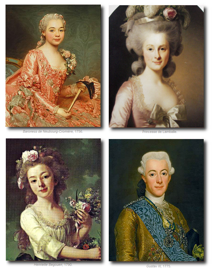
 was a Swedish portrait painter.")
Alexander Roslin (July 15, 1718 – July 5, 1793) was a Swedish portrait painter. Many of the colors he used were Carbon Black, Burnt Sienna, Burnt Umber, Venetian Red, Yellow Ochre, Lead Tin Yellow, Naples Yellow, Vermilion, Lake, Lead White
Get reproduction paintings of Alexander Roslins work here
Alexander Roslins Paintings
Picture Credit To Bellis Vintage Blog
The Elegance Of Scandinavian Old World Interiors
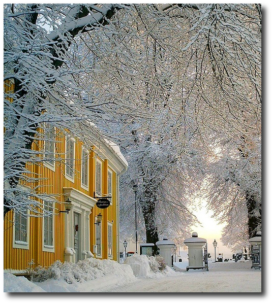
Norway, Sweden, Denmark- Winters In Scandinavia

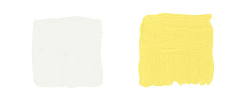
Paint Colors Featured in Home Beautiful Magazine

Paint Colors Featured in Home Beautiful Magazine-
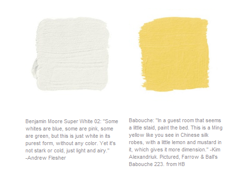
Pictured, Super White Interior Room and Little Angel 318 both by Benjamin Moore.
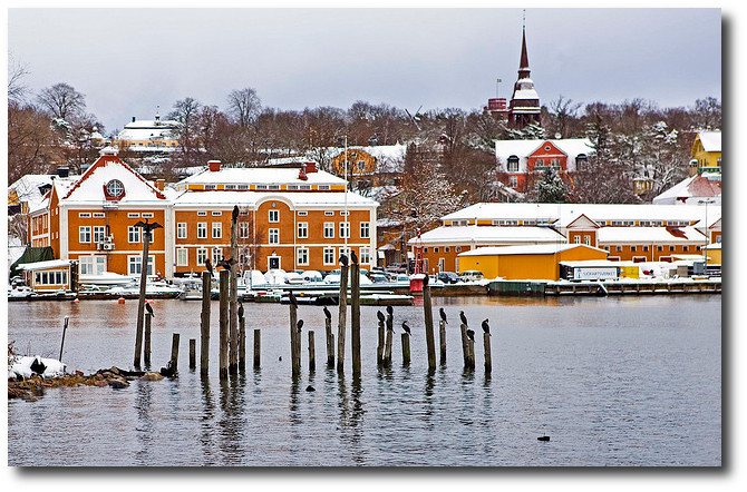
Swedish Architecture Yellow-www.tumblr.com
Mergansers on Djurgarden in the Swedish Maritime Administration in Stockholm
Picture Credit Flicker
Stylish Looks For Slip-covering Your Furniture
 Veranda May June 2012
When you think of slipcovers, you may have memories of the 80’s clunky furniture covered with slipcovers that were tied with over-sized bows and small scale stuffy florals with outdated colors. Interior design took a tumble in the 80’s and 90’s, however, interior design directions haven’t ever looked so good as they do now. Today, we are seeing an emergence of the simple raw materials become exciting again. Old weathered barns, which were once eyesores, fetch quite a bit of money, as the wood is recycled and reclaimed furniture fetches top dollar. Simpler interiors and quality materials have become a new way of life, as people throw away the cheap products mass produced overseas and opt for natural, raw, rustic and antique goods. Those who follow the design trends for the home aren’t shopping at the big box stores for their furniture, but rather they are after the unique looks which merge with their individual styles.
Slipcovers have a long history in interior design, because they offer change and functionality in the home. In the 18th century, the slip-cover had become a design tool for wealthy homeowners, who wanted a change from season to season. Slipcovers were made for furniture,and often coordinated with drapery. Slipcovers have always posed some challenges, mainly that they can be ill-fitting and poorly made. Wrinkled seats and sagging backs produce a careless appearance that gives a lax impression in even the most orderly room. Making slipcovers can be complicated, as they need to fit furniture well, just as a sharply made tailored suit can define a beautiful figure. If the slipcovers are made poorly, the lines of the furniture can be completely lost.
Slip-covers also posed some challenges with seasonal changes. Many would find the covers too tight, or too loose in different seasons. To compensate this, linen covers were made a bit larger, which could stretch with summer’s humidity and heat. The material would then have enough shrink for the change in the dry air for the winter. These difficulties are overcome by accurate measurements, and carefully following the lines of the chair when the pattern is made. Allowing several inches of material for tucking at the back and under the arms, a slipcover can be comfortable throughout the seasons.
Several Professional Tips
– One famous London upholsterer puts a strip of wood across the back of the seat before tucking the material in, to give added firmness.
– Elaborate detailing such as French pleating, cording, ruffles and special buttons add a customized look to any piece of furniture.
– Heavy linen, and cotton canvas have been popular as natural slipcover choices. The French tickings and cotton damasks make great bed covers, drapery and slipcovers. Consider using unbleached muslin with which also can be dyed in soft shades of blue, green, or yellow. Gingham and simple checks can give your room a Swedish, gustavian flair. Stripes lend a sophisticated touch to any room, and wear well, and are especially easy to launder. Chintz florals are quite attractive to look at, and do a terrific job of keeping the dust out and soil out than other fabrics. Chintz is the most expensive by far, and the most effective material for slip covers. The bold patterns of birds, flowers, and medallions of contrasting colors make it a pattern that is lovely to look at year around.
– Gathers, and wide flat box-plaits add interest to the bottom of slipcovers. These details can be used just below the seat of the chair, probably on a line with the upholstery or seat frame. This style works particularly well with French chairs with beautifully designed cabriole legs which are so decorative in themselves that they do not need to be concealed.
– Consider combining plain fabric colors with a few stripes, and some delightful flowered patterns.
Pamela Pierce – Swedish Chair Natural Fabrics
Swedish Chairs With Linen Slipcovers from Biskops Garden

Dining room slipcovers by Donna Jenkins
Stephen Sills’s Holiday Decor – Veranda.com
Slipcovers From brucebarone.com

1.Stunning Wingchair Slipcovered –thebrownshed.com
2. Slipcovers From store.theseasidestyle.com
3.customslipcoversbyshelley.blogspot.com
4. Slipcovers Featured on brabournefarm.blogspot.com
Slipcovers In Neutral Fabrics

1, 3, 4 Unknown – 2. Slipcovers Featured on stylecourt.blogspot.com
 1.Heavy Ruffling From nineandsixteen.blogspot.com
2. Upclose Detail Of French Ticking –michellefritz.blogspot.com
3. Stunning Louis XVI Chair in Pink From Rachel Ashwell
Classical Slipcovers At Monticello. Photography by Charlotte Moss.
Thibaut Ad
Green Gingham Sofa –Tilly’s Cottage

1. Green Gingham Slipcover- Country Home
2.Green Desk Chair Slipcover – flickr.com
3. French Ticking Slipcover- pinkwallpaper.blogspot.com
4. Slip-covered toile Chair – Cathy Kincaid
Slipcover Your Headboard! Martha Stewart
A slipcovered chair, photographed by Russel Sadur.

Dropcloth Slipcover – The Twice Remembered Cottage
Image from Country Home

1.Tips On Making Slipcovers With Drop Cloths- missmustardseed.com
2. Checked Linen Gathered Slipcovers- cotedetexas.blogspot.com
3.Paula & Erika Table Covers etsy.com
4. Knife Pleats Around A Sink- countryliving.com

Jackie Von Tobel- Jackie Blue Home Blog

1.Slipcover With A Beautiful Large Bow- beekeeperscottage.com
2. Beautiful Mahogany Gray Painted Chair With A Toile Slipcover- whendecorating.blogspot.com
3. How To Make Slipcovers- honeybearlane.com
4. Pleated Slipcover- thecottagejournal.com
Slipcovers Over A French Sofa – peekingthruthesunflowers.blogspot.com
French Flour Sack Linen Tablecloth-Jeanne dArc Living Blog

Designer Kelley Proxmire
The Best 5 Websites For Purchasing Antique Hardware
 Rococo & Empire Pulls- House Of Antique Hardware
Most do-it-yourselfers know that adding new hardware to new or existing furniture or cabinetry is a great way to dress it up. These seemingly small touches make a huge impact on the overall appearance of a piece.
You can create the look you want. Hardware pieces are available in a variety of finishes, designs, and styles. You can walk into any local hardware store and find shiny chrome and brass knobs and handles as well as modern sleek knobs that have clean simple lines.
The only time there seems to be real problems finding the right hardware and accessories is if you want antique hardware. However, the Internet has made it easier to find what you are looking for; this article offers a list of the top five online resources for antique hardware. It’s a list you can refer to time and again.
Antique Hardware & More provides a great selection of knobs and pulls for all types of furniture and cabinetry. Whether you are looking for antique pulls or knobs to add an elegant touch to your dining room furniture or to bring out the charm on your kitchen cupboards, this place is worth checking out.
The site includes a search feature to make finding what you need easy. Antique Hardware & More also sells the tools and other supplies needed for restoration and antique refinishing projects.
House of Antique Hardware offers a comprehensive resource of reproduction hardware. You can shop according to type, such as door hardware or cabinet and furniture hardware, and you shop by style and special collections. This online store provides a phone number for questions and assistance. House of Antique Hardware accepts credit cards online, and it is accredited by the BBB.
With more than 25 years in the business, Kennedy Hardware must be doing something right. This shop offers wholesale prices on restoration hardware. You will find a huge selection of all types of hardware. This includes architectural hardware as well as hardware for furniture and cabinetry. This company can provide skeleton keys, glass knobs and handles, furniture casters, and much more. If you are into antique restoration, Kennedy Hardware is definitely a site you should check out.
Rejuvenation has everything from doorknobs to window hardware and light bulbs. Shoppers can search and browse according to category, by room, or style. Styles include such classifications as arts and crafts, colonial revival, deco, mid-century modern, period basics, and Victorian. Rejuvenation provides a phone number as well as a live chat for questions and assistance with orders.
Signature Hardware offers a large collection of hardware pieces in a variety of styles. Shoppers can browse according to departments, and the search can further be narrowed down according to specific categories. Signature Hardware offers an online signup for a free catalog and an email newsletter. The site accepts a variety of payment options including PayPal.
Final Thoughts
A replaced hinge and a new knob or handle is all it takes to make an old piece of furniture new again.
This list is not complete. There are other online resources that offer quality products at good prices. If you know about some of those resources, please share them.
Restoring furniture is a fun and cost-effective hobby. It is a way of preserving our heritage and passing on history. And many times, the simple addition of new hardware is the magic that brings furniture back alive again.
If you have an old piece of furniture hidden in the attic or basement, why not give it new life? Add some new hardware and let it live again.
Debbie Allen is an online marketer and professional writer.

House Of Antique Hardware – Swedish Styled Keyholes

Louis XVI Style Matte Black Cabinet Ring Pulls 12 Pulls For $24 Dollars

My Swedish Hardware Picks From Kennedy Hardware

Swedish Little Girl, Old Country Door Hardware- Photography by Per Breiehagen
Swedish Chest In Old Red Paint- Ann Koerner Antiques

Cast Iron Wreath Torche Keyholes 6 For $12 Dollars
These don’t come in brass, but rather I spray painted mine.

If you are ever looking for some SMALL delicate ornate decorative knobs, consider these small round pulls from National. They remind me of the beautiful jewelry of David Yurman, who is famous for his rope gold jewelry. One of the older hardware shops in Arlington Virginia had them on their shelves, and they were inexpensive, yet beautifully decorative. The knobs themselves are 3/4″, so quite small for and ideal for dressers, small scaled furniture, furniture drawers and anything else you need a small knob for. These knobs come in a bright shiny brass, and come two per package. Amazon sells these 2 pack knobs only for $3.50.

Swedish chest of drawers with original paint and hardware, three drawers, cabriole legs on squared feet. Provenance on top drawer dates piece to 1737.

Gustavian Chest of Drawers – Painted Gray

A Swedish Gustavian Painted Commode with a Simulated Marble Top circa 1790

Swedish Bombe Chest of Drawers– Sweden circa 1860 Cupboards & Roses
Fired Earth’s Anniversary Paint Collection

These beautiful paints are the result of a recent collaboration between Fired Earth and the National Trust.
Founded in 1983 , Fired Earth began as a Terracotta supplier, and later expanded to offer bathroom and kitchen cabinetry, and hardware. Although Fired Earth has a wide selection of house products, they are best known for their beautiful paints.
With their 30th Anniversary, they launched archive colours from their extensive library of paint pigments and featured six new colours named Delias Secret, Mad King George, Jazz Cafe, Hansel and Gretel, Eton Mess and Terracotta Warrior.
Fired Earth has also worked in collaboration with Kevin McCloud, a well known British designer and author and leading authority on colour. Together, they created color formulas from carefully selected pigments, minerals and resins, chosen for their qualities of opacity, density, light fastness and durability. The paint was developed with minimal and low VOC’s. These water-based paints are available in 120 colours in matte and eggshell finishes.
Kevin McCloud is best known in the UK as the color go to guy with a knowledge on every design style from historical to modern. The Telegraph had an interesting article titled “Are Posh Paints Really Worth It?” they ask the question – Why spend the money, when you can get your local paint store to match the shade, and spend less? Here are a few interesting points from the Telegraph interview…..
“McCloud, a self-confessed paint “anorak”, is unequivocal in his defence of posh paints. “Having used many, many different brands over the years, it is very clear to me that the more you pay, the better the paint,” he says. “Cheap paint has more water in it, less pigment and less binder.” Thus, as a rule, the more expensive paint covers better and lasts longer. It is also more environment-friendly, being lower in “Volatile Organic Compounds“.
“There is a place for cheap paint, and McCloud concedes he has painted his own kitchen in “bog ordinary trade white emulsion”, but the cheaper paints are made with synthetic pigments. And pigment, he explains, is what gives paint its quality and depth of colour. – “Traditional pigments tend to be made of rocks and minerals, earth and clay,” he says. “And consequently they are impure, and rather complex. The more complex the pigmentation, the more interesting the colour. It gives redolence and depth, and you get undertones – colours which subtly change in different lights.”
“One can say that this was a colour used in this particular house, on a certain day in, say, 1818, but the colour has probably faded, or gone darker, or yellowed. It’s very difficult to ascribe a particular nuance
of colour to a room for a particular date.”
Kevin McCloud’s Books
Choosing Colors: An Expert Choice of the Best Colors to Use in Your Home by Kevin McCloud– Amazon
In this stunningly produced guide, internationally renowned interior designer Kevin McCloud puts together over 1,000 color chips arranged in over 80 palettes. Each palette—which includes anywhere from 6 to 16
color swatches—forms a blueprint for a unique decorative scheme. A palette based on old Chinese silk, for example, is seen reinterpreted in a contemporary New York apartment. Each palette features gorgeous photographs that bring the color scheme to life, along with invaluable advice and tips for using the colors to transform a room. This book provides manufacturers’ paint references and numbers, lists of suppliers, and much more.
Kevin McClouds Complete Book of Paint and Decorative Techniques by Kevin Mccloud- Amazon
From the earthy hues of Italian farmhouses to the cool elegance of Scandinavian interiors, color has always played a crucial role in decorative schemes. In the first section of the book a unique cut-out color selector illustrates the eight essential earth colors on the decorator’s palette and shows how to create and combine them successfully by clever intermixing of pigments. These essential colors, together with five secondary colors, are then used in the techniques throughout the book, so that all the stunning decorative effects can be easily recreated.
The techniques section that follows contains instructions and step-by-step photographs for more than 35 glorious decorative effects, plus countless variations. Each technique contains a list of essential ingredients, step-by-step photographs and a close-up of the finished surface or object.
Decorative Style: The Most Original and Comprehensive Sourcebook of Styles, Treatments, Techniques by Kevin Mccloud- Amazon
Using innovative, easy-to-master techniques and surprisingly inexpensive materials, Kevin McCloud — a brilliant young set designer turned interior decorator — shows you everything you need to know to design and create your own stunning adaptations of today’s most popular decorating styles.
There are forty styles in all — from Santa Fe, Shaker, Miami Deco, and Caribbean to Bauhaus, Biedermeier, Mackintosh, and French Country (to name just a few) — each designed and created especially by the author and stunningly photographed, with literally hundreds of styling options and color variations to choose from.
The decorative effects and other components of each style are analyzed, rephotographed with a full range of imaginative alternatives, and cross-referenced to all the techniques, tools, and materials needed to create each unique effect.
Kevin Mccloud’s Colour Now by Kevin McCloud- Amazon
Love blue but don’t know which shade to choose? In this dazzling new book, Grand Designs presenter Kevin McCloud has taken over 120 particular colours into 70 tried-and-tested palettes that are guaranteed to transform your home. A short introduction describes the history of colour and its replication, colour theory, how to combine colours into a palette and advice on how to use the book. Thereafter the bulk of the book is devoted to the colour palettes themselves – each made up of a collection of between 3 and 8 colour swatches and featuring an inspirational photograph demonstrating its possible use. Every palette is also introduced by a short piece of text describing its influences, potential and variety.
Choosing Colors: An Expert Choice Of The Best Colors To Use In Your Home by Kevin McCloud– Amazon
This decorating guide explains techniques ranging from craquelure to marbling, colourwashing to liming wood, and provides information on tools and materials. The step-by-step photographs show exactly what to do, while the life-size details show the effect being aimed for.
Kevin McCloud’s Complete Decorator by Kevin McCloud- Amazon
This lovely 272 page book is filled with dozens of color photos showing many different decorating styles. It includes a unique cut-out graduated colour section, step-by-step instructions for a vast range of paint
techniques, easy colour mixing, working with different surfaces and objects and so much more.
Techniques of Decorating (Dk Living) by Kevin McCloud– Amazon
Kevin McCloud is a leading influence in interior design. His unique and refreshing approach stems from a background in art history and the theatre. Using a repertoire of techniques ranging from the traditional to the self-invented, he offers an unsurpassed array of rich effects and a sure guide to effective styling. Each of the more than 30 creative effects – including gilding, verdigris, clair bois, stained glass and woodgrain – is explained in detail, while close-up, step-by-step photographs show exactly how to achieve it. A comprehensive section at the back of the book provides details of tools and materials needed and lists the addresses of suppliers.
‘Blue-ish greys are military and came into their own as World War I battleship camouflage. The really interesting greys, however, are those made with purple. They have a warm, brownish cast that flatters flesh tones and brings natural woodsy materials to life. They’re not popular, but they should be.’
‘Often the most stimulating colour combinations come from strong cultural influences – from the environment, from food or from nature. Here’s a pretty worldly palette: one of stone and sea and earth and sky.’
Principles Of Home by Kevin McCloud– Amazon

‘On my list marked ‘fastidious obsessions’, getting the right fine old French grey comes pretty high on the list. If you were a colour expert, you could take some chalk-white casein distemper, add raw umber and a little raw siena and you’d be there. Note I didn’t mention black there – when you mix black and white the resulting colour is so cold you might as well call it blue. No, for a good grey, go greenish and go with earth colours. Fine complex colours are the tinctorial equivalent of a fine old French wine.’
“The hardest colours to get right are the four optical primaries: red, blue, yellow and green. The colours that will make your life a positive misery are tints of those colours. Most modern paints are coloured with a limited range of powerful synthetic dyes. The most interesting colours are those made with muddy, traditional earth pigments or complex arrangements of colourants.”
“The best pinks – those that change colour under different lighting conditions – are those on the cusp of red and purple, made with red oxide pigments. The best yellows or creams – those that can withstand bluish northern light and never look green – are made with yellow ochre.”
Swedish Furniture Auctions -Uppsala Auktionskammare
Uppsala Auktionskammare is known to present some of the finest collections of antique furniture. Uppsala Auktionskammare has been known to feature exquisite collections of silver, furniture, and art from Swedish private homes at their auctions. In the spring of 2008, Sweden’s most expensive furniture ever was sold at Uppsala Auktionskammare, a unique bureau by Nils Dahlin for 18 million.
They carry a beautiful selection of European art; everything from the Renaissance until the late 19th century. They are known to collect an array of antiques from mirrors, table clocks, chandeliers, table lamps, candlesticks,bronzes, figurines, and much more.
They are known to carry mirrors, candlesticks and bronzes by the following masters: Burchard Precht, Pierre-Philippe Thomire, Carl Henrik Brolin, Ehrhart Göbel, Johan Åkerblad, Fredrik Ludvig Rung, Niclas Meunier, and others.
Uppsala Auktionskammare features many prominent furniture designers such as Gottlieb Iwersson, George Haupt, Nils Dahlin, Christian Linning, Ephraim Ståhl, Jonas Hultstén, Anders Lundelius, Gustaf Foltiern.
They also are known to feature silver from Pehr Zethelius, Jonas T. Ronander, Petter Eneroth, Gustaf Stafhell, Arvid Floberg, Isak Sauer and Kilian Kelson
Check out some of Gustavian furniture and decorative collections from Uppsala Auktionskammare below…..

A Gustavian Chest of drawers, attributed to Jonas Hultstén.


A Swedish Gustavian Chest Of Drawers, by Nils Petter Stenström.

 A Pair of Swedish Gustavian Armchairs.
A Set of Nine Chairs, Stockholm. So-called “Swedish model”. Consisting of nine similar chairs. Melchior Lundberg worked as a chair maker from 1774 to 1814. Oval openwork back, fluted legs with rosette carved decoration.

A Swedish Rococo Secretaire, attributed to Olof Martin.

Gustavian Sofa With White Paint and Gold Detailing

Swedish Style Stand– Mahogany Wood

Mikael Nyberg, Stockholm 1798th Gustavian, column shafts, square base plate with lattice rim and ball-feet. Solving candle rings stamped 1795th
A pair of Gustavian candlesticks, by Mikael Nyberg
Swedish Gustavian Wall Mirrors And Clock
 A Pair Of Swedish Late Gustavian Armchairs- Bronzed and carved decoration, saber shaped legs.
 A pair of Swedish Gustavian Armchairs, signed Ephraim Ståhl.

A pair of Swedish Gustavian Armchairs, signed Johan Erik Höglander.

A Swedish Rococo Tea Table
Louis Masreliez- The Designer Behind Gustav III’s Pavilion At Haga Park
Masreliez was born in Paris and began his education at Ritakademien, which was a drawing academy at the youthful age of 10. In 1769, Masreliez was given a study grant which allowed him the opportunity to travel to Paris and Bologna to study. When he left Bologna in 1773, he decided to stay in Paris for eight years,where he then returned to Sweden in 1782 to become a commissioner of the Royal Swedish Academy of Arts. He advanced the following year, when he was made a professor of art history. Then in 1805, he bacame the director of the Academy.
He was responsible for the interior of Gustav III’s Pavilion at Haga Park. In addition he also was responsible for the interior of Tullgarn Palace. Masreliez is remembered for its interior decorations at Haga, Drottningholm, Stockholm Palace in the classical Pompeian style. Masreliez was inspired by the excavations of Pompeii and Herculaneum, which could be seen in his interior design.
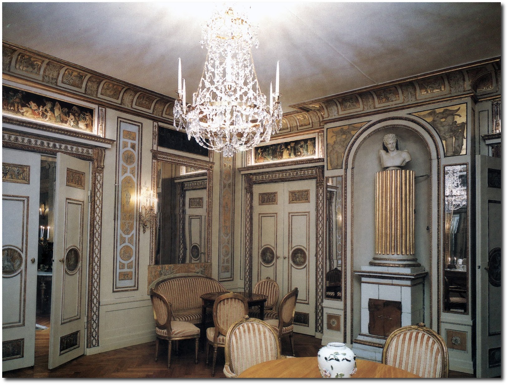
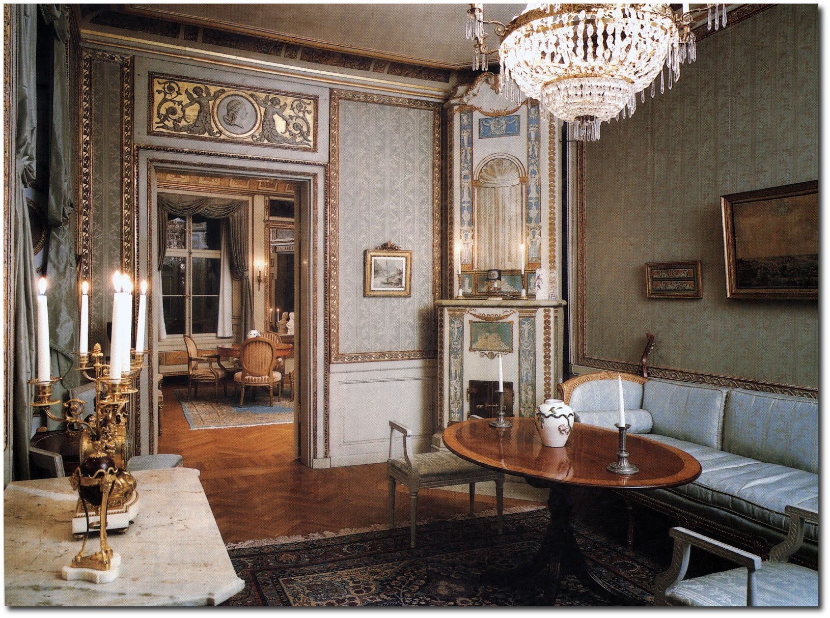
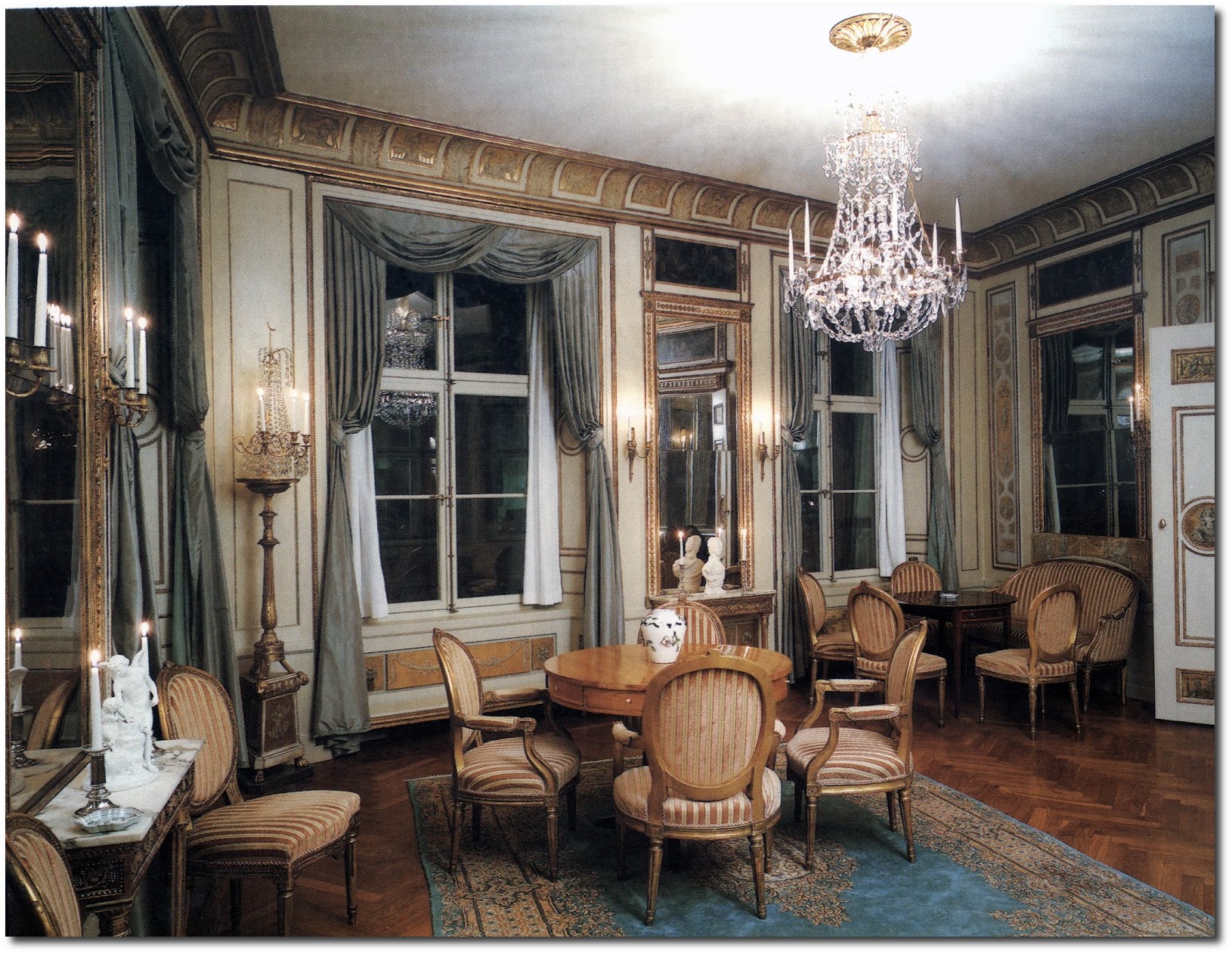
The pictures below in this post are located in Salviigränd, which is an alley in Gamla stan, old town in central Stockholm. On the second floor -Number 1, (the only building in that block not part of the Parliament administration), is a suite of rooms created by Louis Masreliez for the bachelor Wilhelm Schwardz in 1795. Dressed up in pastel, grey, and gold, the elegant Gustavian Classicism interiors features lighted candles, cut-glass chandeliers, taffeta curtains, and friezes and medallions.
A special thanks is to be given to A Connoisseurs Quest Blog for the pictures of Wilhelm Schwardz’s Home in Stockholm- See the entire post “A Peek at the Usually Hard to See House by The Gustavian Designer Masreliez in Gamla Stan, Stockholm”
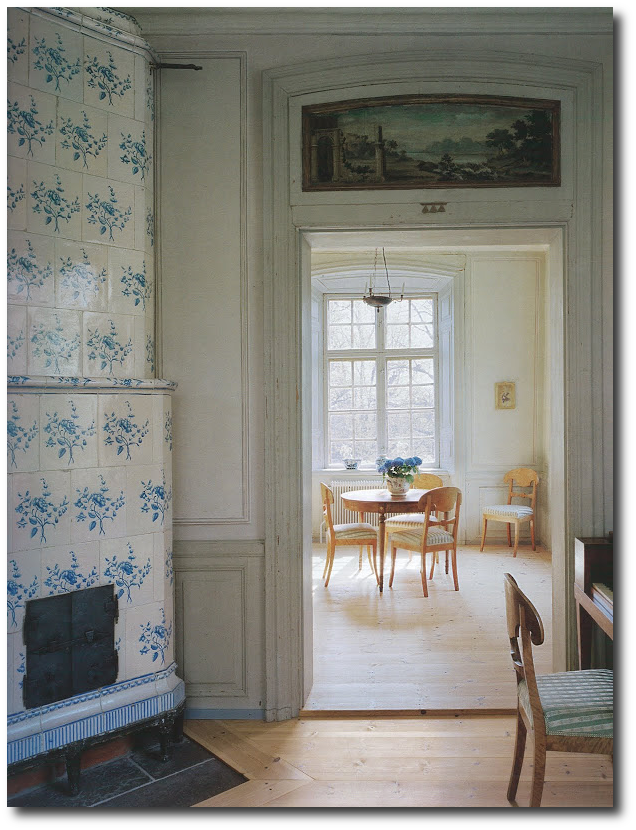
One can see parallels between the Gamla Stan and Sturehov, particularly in the placement of furniture. Larger round tables serve as focus points in both the Gamla Stan and Sturehov. Both of the Kakelugnar stoves also have classical columns which make the base of the stove.
We are happy to discover this designer with you….!

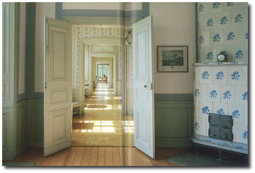
A Nordic Design Staple- The Swedish Kakelugn Tile Stove
These beautiful stoves were first designed in Sweden in the 18th century, as a result of an economic crisis that pushed Swedes to come up with a better way of extending the life of their firewood. It was then that the famous Swedish stove “kakelugn” was born.
Early versions of the tile stove date back to the Middle Ages, however, two clever Swedes created smoke channels beneath the tile, that held the heat for an extended amount of time. They introduced vents that controlled the burn speed, giving an additional 24 hours of comfortable radiant warmth. With the heat-retaining cast iron core and long multi channel flues, the kakelugns were able to retain heat, keeping rooms warm up to a whole day after the fire is out.
These antique stoves vary in shape. They are often seen round, rectangular, or columnar, and positioned in a a corner or against a wall. Heights range from about 5 feet 10 inches up to 9 and 10 feet tall.
In an article written by Stone Mason, they describe these amazing stoves:
“The period between 1500 and 1800 was known as ‘Europe’s little ice age’. In Sweden, where it was even colder than it is nowadays, it was clear that the constant use of fireplaces from morning till night would eventually lead to the total depletion of the nation’s forests. It was most fortunate, then, that in 1776 Adolf Frederik, the King of Sweden, commissioned Carl Johan Cronstedt to develop a stove that would make better usage of the country’s timber resources.”
“Cronstedt, an Earl, architect, inventor and scientist, was given the tall order of producing a design that would use much less wood while still heating Swedish homes efficiently. An interesting side effect of this commission was that not only was a model developed that accomplished the King’s request, but it turned out to have other unforeseen environmental benefits.”
“Very little smoke is seen coming out of a chimney where these stoves are being used. In the course of the year, a kakelugn regularly used will burn the wood of one medium sized tree”
“One main advantage of the kakelugn is that it burns very hot, typically 1110-1200 C, whereas a standard iron stove burns at around 650-700 C. However, you can safely touch it and feel only warmth”
Stockholms Lans Museum provides us additional information on these stoves:
“The decoration was initially cobalt blue but later extended with yellow, green and brown violet. First with the new colors were Rörstrand factory and from 1758 dominated the all colors. But it was rare for more than three patterns of colors in the same oven.”
“In the mid-1700s it was not unusual for dinnerware pattern was used for The Fireplace tiles. The tiles were decorated with repeating patterns where palm branches, Chinese patterns and blomrankor were common motifs. The designs were painted by hand on each tile, always against a white background. ”
“Gradually began to Swedish architects interested in the design of the stove. The workshops were to start from pattern drawings made by Swedish architects rather than making use of foreign models. Fireplace Manufacturing became a domestic crafts.”
“These fine stoves occurred only in castles, mansions and wealthy burgher. But even in these environments were those in the representative areas, the easier rooms put you in the cheaper and plain tile usually green or yellow.”
")
Kakelugnar empiremasonryheaters.com
Low Tech Magazine suggests that this old technology should be brought back.
“An oven stove is a very efficient and robust oven that radiates heat all day. In the US it was introduced only 20 years ago, but in Europe the technology is almost one thousand years old. Especially in Russia,Scandinavia and Central Europe the oven stove has a long and rich tradition. In the 18th century, several European governments financed research to improve the technology, as a way to overcome an acute shortage of firewood: ecotech before the term existed.”
“traditional Swedish tiled stove (kakelugnar) is so beautiful and iconic.”
Additional Links
-Stunning White Stove Taken By Kasmil on Flicker
-Blue and White Stove From Gissa’s Flicker
-A Beautiful Room In Ekebyhovs castle.
-Kakelugn Tiled Stove –Victorious Felines
-Tiled Stove –Victorious Felines
-Swedish Cafe House –Eric Ebel
-Late 19th Century Swedish Ceramic Tiled Stove- KBHS Photostream
-Kakelugnar (Swedish tile stove)