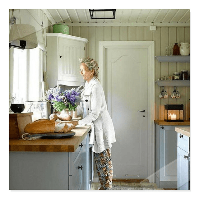
5 Kitchen Design Lessons You Can Learn from Scandinavian Interiors
 Picture Credit – ladyinspirationsblogg.se
Guest Post – Jason Phillips
Elegance and style along with a sense of simplicity and functionality, those are the words that describe the Scandinavian interior designs. More and more modern homes are seen to adopt this minimalist European design style mainly because of its modern and neutral appeal.
If you’re planning to renovate your kitchen or overall house, then choosing Scandinavian designs could offer you a vast and eclectic taste of design movement, unique, and minimalistic designs in your home.
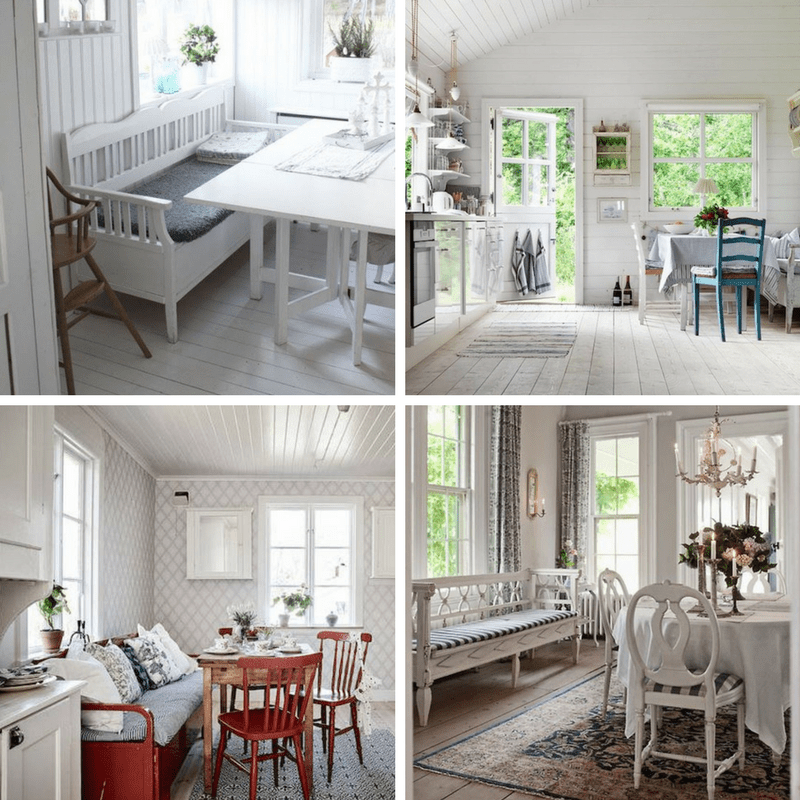
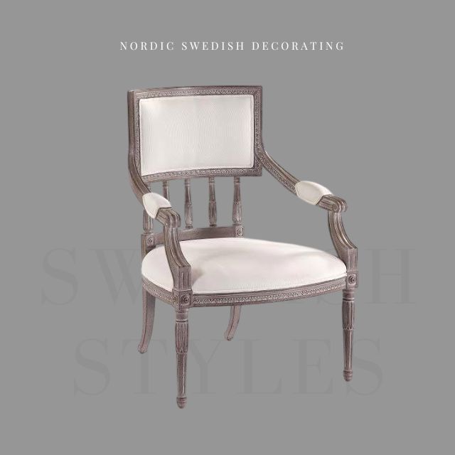
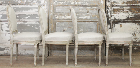
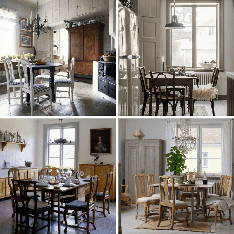 Picture 1 – godsochgardar.se
Picture 2 – lovelylife.se
Picture 3 – antikochauktion.se
Picture 4 – antikochauktion.se
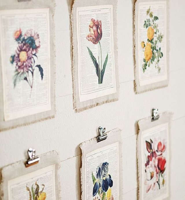
Maintaining the natural light is very important
Being in the far north, the Scandinavian designs tend to flood the interiors with light. This determined the Scandinavians to enjoy, cherish, and appreciate the important factor of natural daylight in their life. Light is very important for our well-being which is why being illuminated by the environment tend to create more positivity in your life.
To adapt to this design, during the winter season you can get rid of the heavy curtains or throw away the silly ornaments that block the light. If privacy is the main reason for those covers, you might consider using wooden shutters or sheer fabric on windows in your kitchen or any rooms in your house.
Additionally, Scandinavian designs are mostly focused on white, clean, simple, and pure color. This is because the color reflects light and encourages it to bounce around the kitchen spaces and brightens them. You should also add mirrors in your kitchen in order to let the light to stay.
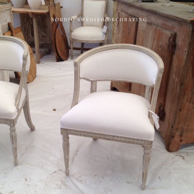
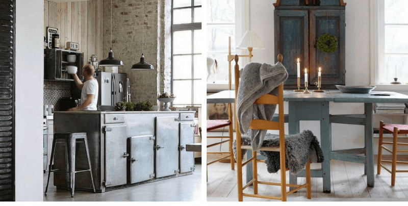 Picture 1 – mydesignchic.com
Picture 2 – lantliv.com
Cosiness and warmth
As you can see in the different Scandinavian designs, coziness and warmth are important. To adapt this, you should add more natural wood into your home, whether on furniture, floor, or wall panels or kitchen backsplash. Wood offers a welcoming feel and adds more coziness to the kitchen.
You could also add candles to produces the Scandinavian feeling of warmth and coziness. As fire is the natural source of light, placing simple stick candles on the tea holders around your kitchen or even in the living room will create a fairytale-like atmosphere.
 Picture 1- seventeendoors.blogspot.se
Picture 2 – feasthome.com
Picture 3 – snickeritallkotten.se
Picture 4 – linaostling.se
Lifestyle nature
Scandinavian designs also focus on nature as it is the heart of the design. Living the life with a healthy attitude is being cherished and practiced so to adopt this, you can add greenery and plants into your home to add more environment and natural feel. Plants are known to provide fresh air and it makes us feel better and beat the winter blues.
Rustic wood grain and interior plants and flowers is a great way to make the space more relaxing and vibrant. Remember, incorporating live elements into your kitchen space will make the interior look modern and fresh.
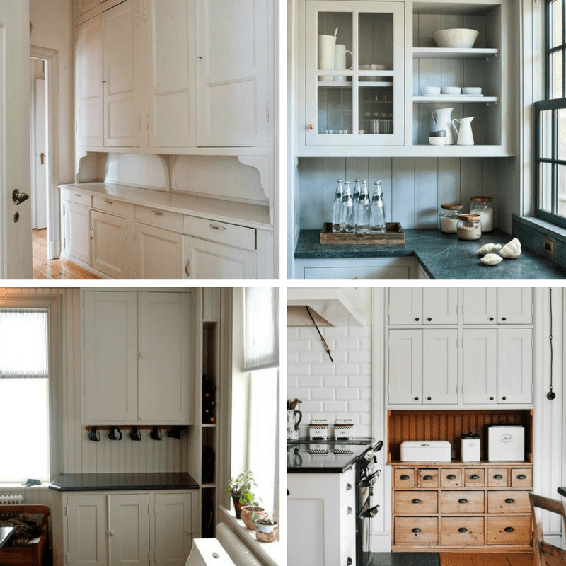
 Picture 1 – detvitadarhuset.blogspot.com
Picture 2 – myscandinavianhome.com
Picture 3 – bloglovin.com
Picture 4 – lady-gray-dreams.tumblr.com
White wood floors
As mentioned earlier, the Scandinavian design focuses on white and pure colors from floor to ceiling. So, if you want to adopt this style, renovating your kitchen floor and change it with white wood floors can make the room seem open, clean, and airy. Grey color and wood (pine or birch) are also alternative choices for keeping the interior flooring design simple yet elegant-looking.
Simplistic yet artful Scandinavian kitchen furniture
Aforementioned, Scandinavian design focuses on the minimalist designs in both exteriors and interiors of the home. Modern furniture took advantage of the innovative textiles which can be seen via antiques and current designs. Amazing craftsmanship with the use of high-quality materials will always be seen in the Scandinavian furniture designs. It is well seen and being adapted by the different kitchen designs throughout the world.
Choosing simple yet detailed and artful kitchen cabinets or countertops based on the Scandinavian design is a perfect way to adapt to this European modern design style. Adding antique components or materials with clear smooth lines and organic shapes can defy a simple and minimal design which could also add an aesthetic look to your home.
It is no wonder why more and more modern houses adapt the Scandinavian interior design because of its simplicity, functionality, minimalism, love of nature, and elegance. So, if you’re planning to renovate your kitchen, living room, or any area of your home seek for professional home renovator’s help to do this.
Jenny’s DIY Wide-Plank Plywood Flooring Studio Renovation
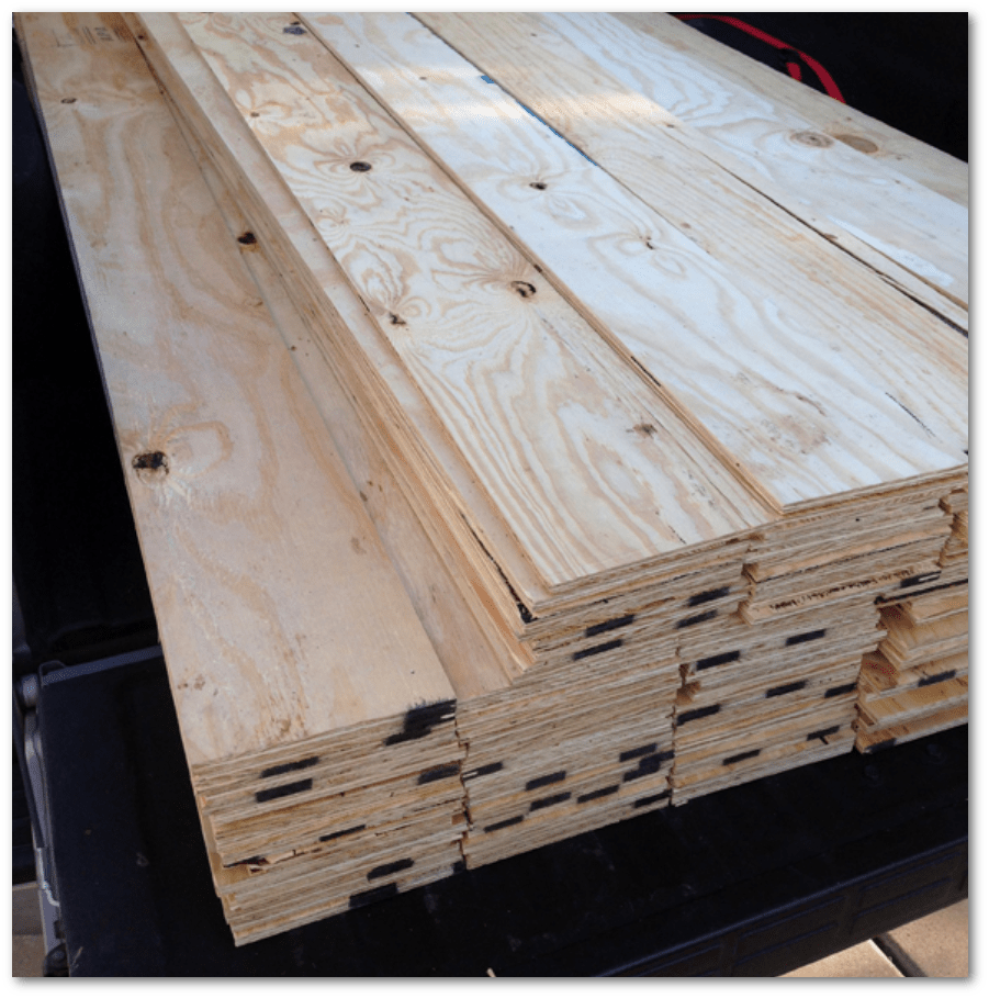
Check out these absolutely beautiful pictures of Jenny’s studio space made over with plywood cut into planks:
I found the plywood I wanted, took a photo of the price tag, and walked up to the customer service desk. I placed an order for 25 sheets and I asked for each sheet to be cut down into 8″ planks, lengthwise (which meant there was no waste – exactly six planks from each sheet). I’ll admit that I did get a few funny looks, but for the most part everyone at Home Depot was incredibly nice and accommodating, given the huge ask. I was more than prepared to pay 10 or even 25 cents per cut, like one of the guys in the lumber department suggested they might charge me at the order desk. I think I paid for cuts when I did the wall planking project in our mudroom, but this time there was no charge for all those cuts! I’m pretty sure it was because I was really flexible on timing and let them take as long as they wanted to get the order finished. And even then, it was less than 24 hours before they called to tell me my planks were ready to be picked up.
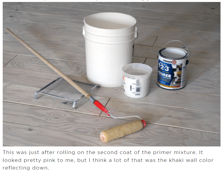
Once we had all the carpet removed and all the wood planks upstairs to the back porch, it was time to start the only tedious part of this project: all the sanding. It was actually pretty easy work, but it just took some time (actually about a minute and a half or two per plank, which really adds up). I asked Heather to sand while I was installing the planks, and usually the timing worked out well and we were able to keep a good pace.
Read more at littlegreennotebook.com
Decor Mistakes All 20-Somethings Make
Can you see yourself in some of these? Vogue pulls together 12 pieces of advice from design experts showing common mistakes young designers make. See if you think they are correct:
“Horrible throw pillows. I don’t even know where people get some of these. The ones I see are often flat and limp and look like something I’d use as a dog bed.”
—Amanda Gorski, Gimme Shelter Designs
“Twenty-somethings don’t realize the power of framing artwork. Posters taped or pinned on the walls can look crazy unless you have that artistic eye.”
—Danielle Arps, Dani Arps
“Oftentimes, 20-somethings will either try too hard to be cool (with black pleather furniture, neon beer signs, and shag carpet) or just follow the trends. For example, the zigzag pattern is everywhere—on rugs, towels, and sheets. This design is what the younger generation gravitates toward because it’s what they see everywhere, but I prefer more classic patterns that will stand the test of time.”
—Ashley Darryl, interior designer
Read more at Vogue.com
Can I Stain Over Paint To Produce A Patina?
Adding stain over paint on furniture, or exterior wood surfaces such as siding or a deck can give furniture and any other project a new lease on life. Clear or semi-clear stains can provide a distressed appearance and add patina. They highlight those areas where the paint has worn away or where the paint color varies. Solid-color stains, on the other hand, generally coat well and provide a durable finish to a variety of projects. Consumers must sand, clean and dust surfaces before staining them. You want a good wood base from which to coat your stain, and you should set aside a few hours to get the job done.
Using Stain to Add Patina
Patina describes the look of something that appears aged, delivering a gloss or sheen. Interior decorators often use this term to describe distress, or the aged look of furniture, where paint has faded or colors have lost some of their brightness. While a patina also can refer to metals such as bronze, it’s used in this case to refer to wood furniture. Staining is one option available to add patina to furniture that already has a coat of paint on top. A clear or lightly colored stain adds the best effect to most wood surfaces, and is a great option for those who don’t want a messy painting project.
Applying Clear Stain for Patina
Consumers who want to apply clear or lightly colored stain to add a distressed look or a patina must first prepare the surface of the project by using sandpaper to remove any debris and previous painting imperfections, then wiping the surface with a clean, dry cloth to remove any dust.
Decorators should coat the surface, applying the stain with a rag in small sections. It should dry completely; after a short amount of time, wipe it away with a clean rag. If the stain looks uneven, sand it down and apply another coat.
Read more about how you can work with stains at Ebay
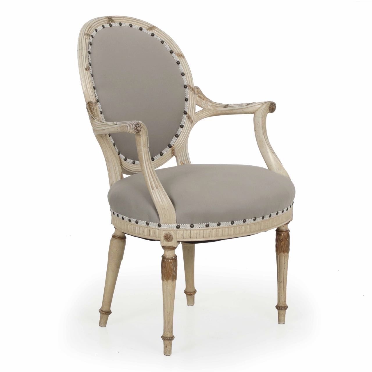
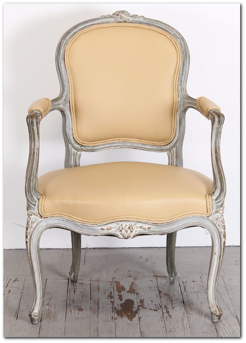 Single French Louis XV Style Painted Beech Wood Fauteuil Armchair, 1920s- Ebay
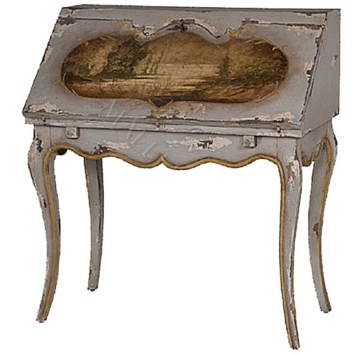 Hand Painted French Writing Desk Drop Down Lid- Ebay
 French Louis XVI Style Parcel Gilded White Painted Arm Chair Fauteuil circa 1940- Ebay
Q&A With Swedish Designers Edie Van Breems and Rhonda Eleish
Q: Clearly, you are scholars on Scandinavian style. For you, what is the essence of it?
A: Recognition of the importance of nature and the impact it has on interiors and overall lifestyles. Light, colors, and the functionality of daily living also play a huge role. In Sweden there is a wordbruskonst, which loosely translates to “useful art.” This respect for economy and intimacy with nature is an integral part of Scandinavia’s design psyche.
Q: Scandinavian antiques are usually made of humble materials, but painted to look like marbles, gilt, and fine woods. How do you make them work in modern spaces?
A: Antique pieces, by virtue of their patina and imperfections, add a depth and soulfulness to rooms that could otherwise be one-note and cold. A rough-hewn, rustic, painted farm table, for example, is going to look amazing with contemporary metal chairs or formal, tailored, upholstered dining chairs by sheer virtue of the contrast. An 18th-century Gustavian chandelier in a barn room or a rustic, painted farm chair in a severe, all-glass or marble contemporary bathroom becomes almost sculptural.
Read more at deringhall.com
How To Avoid Yellowed White Painted Furniture With General Finishes Products
 Christine Adams
Wood Finishing Technical Writer at General Finishes
A TUTORIAL ON WATER BASED TOP COATS YELLOWING OVER BRIGHT WHITE PAINT
Many you may have noticed that the labels on our bright white paints, Snow White Milk Paint and Chalk White Chalk Style Paint now carry a warning label regarding the yellowing of topcoats. All bright white paint will yellow slightly with time, with or without topcoat. Water-based topcoat is reactive and more likely to draw out substances in the wood such as tannins or unknown substances in existing finishes causing the topcoat to yellow. This is an industry-wide issue. Don’t carry the cost of white paint yourself– pass the cost on to the consumer who wants it with a fair upcharge. White paints, even if they did not yellow, require more coats to achieve coverage.
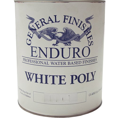
General Finishes background was originally on the professional side, and the incidences of yellowing topcoat over white paint were almost nil, and when our sprayable professional finish, Enduro White Poly, is used, there have been no incidences. But as the use of our paints has increased in the up-cycling and furniture refresh markets, we have heard more reports of our topcoat yellowing. Our response was to teach about prepping, testing you finish schedule and finally creating Stain Blocker, our stain blocking primer, but this is not enough. Just as we advocate prepping all finishes, we are now advocating NOT using a clear water base topcoat over BRIGHT WHITE paint.
General Finishes is in the process of developing a brushable version of our professional Enduro White Poly (available only in gallons), but that will take some time and rigorous testing before we can release the product. Here is what you should know to protect yourself and also some immediate suggestions to decrease chances of yellowing.
There is no way to reliably predict yellowing ahead of time. Sometimes yellowing occurs, sometimes it does not. Every existing finish is different and we rarely know the finishing provenance on an existing piece. Every tree is different and every piece of wood is unique. Wood can bleed tannins immediately after the topcoat dries or months later with a change in temperature that comes with a change in seasons. Oak, pine, mahogany, and Douglass Fur are particularly prone to bleed-through.
As is true of most “water-white” topcoats, our High Performance Water-Based topcoat is a clear drying finish over a non-reactive substrate such as plastic. When paint is used over something as unpredictable as wood, all bets are off. Yellowing can be caused by the top coat activating the tannins in raw wood or aniline dyes, stains or contaminants in a pre-existing finish. This is most evident when using BRIGHT WHITE paint and most prevalent in the sculpted details of furniture, where the topcoat can collect, intensifying the color change to an unacceptable level.
To add to this issue, all bright white paint will yellow slightly with time, with or without topcoat. You have probably tried to touch up white woodwork in your home after several and noticed that the new paint is brighter.
Summary:
• Whites have a lower “hide” quality and are more transparent than most other colors. Most bright whites require additional coats to achieve the desired color and minimize color variation. This can increase cost of paint finishing. Always include a clause in your contracts addressing the need for additional coats to achieve coverage.
• Bright white paints can yellow over time with or without topcoat.
• The underlying finish or wood species can affect the final color of light paint.
• Details and inside corners are difficult to cover with any paint color, but this property tends to be more noticeable with whites. This is a naturally occurring phenomenon in paint application and does not necessarily constitute a defect in the paint finish or your technique.
TIPS FOR PROTECTING YOURSELF AND PREVENTING YELLOWING
1. Use a disclaimer in your contracts or recommend a softer white such as Antique White or Linen. Upcharge for the extra coats needed and ever guarantee a white finish over a piece that you cannot trace the provenance on. Here is a suggestion: Terms of Agreement and Warranties: ________ (Initials) I have been informed that more coats are required when painting with bright whites, reds, greens or yellow. I understand that white paint can yellow over time and that water based topcoats can occasionally react with the substrate or existing finish under white paints causing yellowing, even is a stain blocking primer is used.
2. If it is a low use project, use a premium white paint that is self-sealing and does not require a topcoat. A clear top coat is not required on our Milk Paint for increased durability, as it is a self-sealing, exterior rated coating with very high durability and performance properties. However, top coats provide a smoother surface that is easier to clean and boost durability for high use projects such as table tops and kitchen cabinets.
3. Get a spray gun and use a professional “white coat” such as our Enduro White Poly. It is a white paint with “increased topcoat properties”, is a stand-alone finish when 3 coats are applied and does not require sealing with a topcoat.
4. If you are still brushing, try adding 10-15% of the paint you are using to the first or second application of topcoat. The last layer of topcoat should not have paint in it, to maintain durability. We have had good reports of this technique from customers but have not tested in the lab over a long period of time.
5. Always test your project’s entire finishing schedule (from cleaning to topcoat) on an inside door or a more hidden area of the piece. This does not help if the yellowing occurs later but you will at least know if there is an immediate problem.
6. Always apply a stain blocking primer under white or light-colored paint such GF Stain Blocker or a shellac based primer. Always let any primer dry overnight. Some of the primers we have seen suggest a 3 hour dry time and that is not enough.
7. If you are working on period pieces such as a 1940’s serpentine mahogany desk which were often finished in stain containing aniline dyes that cast a pinkish bleed through under light paint, stay away from light colors. Not every piece of furniture is suitable for up-cycling with a light paint color. Pine, Mahogany, and furniture of the 1940’s and 50’s are a red flag.
8. Last, not all manufacturer’s topcoats are compatible with other finishes and may react with a color change. Always follow best practices by not rushing, and testing to your satisfaction first.
Hope this helps and wish us luck on our next paint endeavor- Chris
Colleen Martin, Founder of Swede Collection Tells Us Her Journey Of How She Began Reproducing Gustavian Furniture
 Gustavian Spindle-Back Dining Chair, SC0019
Swedish design in American interiors is at an all-time high. Chosen for its qualities not as a fad or trend. White and light interiors are loved by so many. Today I am talking to Colleen Martin, Founder of Swede Collection, in the hand-crafted segment of the furniture industry, who is living her life passion reproducing Swedish furniture, particularly from the Gustavian and Rococo periods. Colleen was making console tables when the need for new dining chairs for her home arose. When she couldn’t purchase what she wanted nor find anyone to make them for her, necessity being the mother of invention, she decided to make them for her line. Swede Collection is shown at High Point market in April and October. The line can be seen at www.swedefurniture.com.
Q: How did you get smitten and bitten by Swedish style?
Gustavian is my favorite style as it makes my heart sing. To me it is eloquent, romantic and refined with a simplistic beauty. I do like a few Rococo pieces as well. What I love is that Swedish pieces have never gone out of style 200 years and counting. They are lasting, enduring and inheritable due to their design. Because they are not overly embellished, you don’t get tired of the look.
I first decorated my homes in French antiques due to access as that was what was available in antique stores where I lived and as far as I could travel to antique shows. Keep in mind this was pre-Internet years so purchasing access was limited to as far as you could travel. Even though I lived in larger cities, Swedish antiques or reproductions were not available. I loved the straight legs of Louis XVI. I have always been a huge shelter magazine reader so that is where I first saw Swedish pieces and then realized Swedish was where my true love was which was similar to French Louis XVI. When the Internet made access easier, my passion for Swedish design intensified. One could see and purchase Swedish pieces in the US and Sweden easily.
Q: Why do you think people fall in love with the Swedish look?
The colors of white, pale blue/grey and pale aqua are very soothing to the soul. I find people who love Swedish style are deeply devoted to it. Perhaps it is the peaceful feeling people experience in light toned rooms where the furniture is not stark but not overdone either. Swedish pieces have great balance and detail. With the painted frames people get a departure from the brown tones of wood. Today, décor is all about the mix. What is so fabulous about Swedish design is that it fits smoothly in any décor and very surprisingly with contemporary.
Q: Why did you decide to reproduce Swedish pieces?
My mission was to make excellent quality hand-crafted and hand-carved Swedish furniture more accessible for everyone to enjoy in their homes. I traveled to Sweden and purchased antiques which I reproduce both in Gustavian and Rococo style. This is my passion. I wanted to bring back the hand-crafted pieces originally made in the workrooms in Stockholm by the masters. Swede produces unique pieces for interior designers but also has some pieces available to the public in the retail section. We are continuing to add to the website retail section smaller pieces that can be shipped via ground. Access to Swedish design is an important part of our mission.
Some of the master furniture makers that I admire are:
- Erik Ohrmark 1747-1813 who made chairs for Haga castle for Gustav III.
- Carl Fredrik Flodin 1754-1795
- Olof Roslin 1753
- Ephraim Stahl 1767-1820
- Johan Erik Hoglander 1780
- Petter Thunberg
- Johan Hammarstorm 1780
- Erik Holm 1774-1814
Although you read that Gustavian style furniture is credited to king Gustav living at Versailles, loving the French style but having the details relaxed for Swedish pieces in his homeland, I differ from that viewpoint by giving credit not to the king who was not a furniture designer, but credit to the master craftsmen and their apprentices working in their shops all over Sweden. The king may have commissioned their work for the royal properties but I believe the design was the masters’ who presented it to the king for his approval on the commission. I really don’t believe King Gustav came up with all these fabulous designs by himself. Pehr Ljung was a known master carver at the time who was called upon for difficult carvings. There were furniture “architects” and architects who did both buildings and the furniture within. Stockholm was a furniture center with many famous workrooms but these fabulous original designs were not exclusively created in Stockholm. Some masters specialized in making mirrors or clocks. I love researching these makers and am searching for information on women designers.
Q: In your decision to reproduce Swedish antiques, do you make exact copies?
I like to honor the original creator that inspires me but I do change the scale and some details so it is not an exact copy. People were much smaller in body size at that time and particularly their chairs are too small for today’s people to sit in comfortably especially larger men. I didn’t want my husband or a buyer to “perch” on the chair, I wanted him to comfortably sit in it. Comfort is king in what I do. There is no point in making something nobody can sit in. I also produce in Maple, Ash and Cherry not Swedish Pine. I do believe these masters would be proud and thrilled to see that their designs are loved 200 years later by my bringing them back to life for today’s homes. For the most part, I own the original of what I reproduce. There are a few items in my line that my talented crew was able to duplicate just from a photo of the antique.
Q: Can you find these signed original works for sale today?
Yes, in Sweden, England and the United States and it makes my heart pound to find initials carved into the frame. There is also a mark on furniture made for the royal properties. When you see the carved initials IL for example, remember an “I” is a “J” so this could be made by Johan Lindgren. Pieces reproduced 100 years ago of the originals created 200 years ago are fairly available to purchase today.
Although pieces can be found, price is another issue. A chair can run from $4,000 to 7,000. And, you may not be able to sit on it. That is the other reason I decided to reproduce these chairs – to make them affordable. Hand crafted chairs should be inheritable for generations to come and should last another 200 years just like their ancestors.
I made the finishes on Swede Collection pieces blend seamlessly with antique finishes. Unless you have an expert eye, you probably couldn’t tell the difference. Making the new pieces allows me to fill in the blanks smoothly where unattainable pieces can’t be acquired.
Q: Can you give us an example of what reproductions Swede Collection makes?
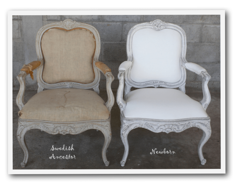
 I fell in love with this chair at Sabylund Manor. Bukowski’s auction house in Stockholm sold a set of these as well. I believe they look identical to ones made by Johan Hammarstrom which my talented team copied.
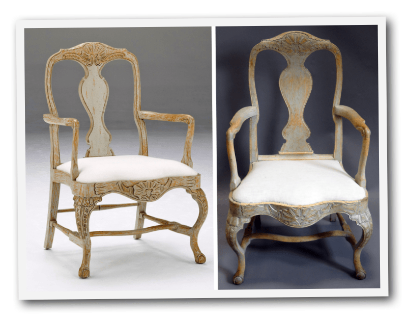
Above, these Rococo chairs have the original on the left and our newly copied one on the right.
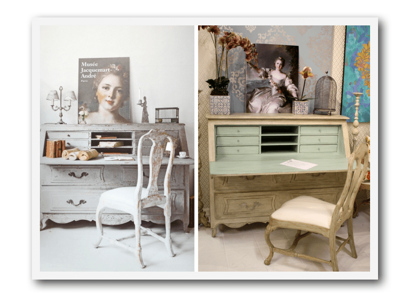 Everyone on Pinterest will recognize this desk in a home in The Netherlands on the left and Swede Collection’s version on the right.
We also went to Jacquemart-Andre museum in Paris and photoed the Nattier portrait which we made into a poster in a larger size.
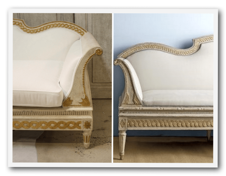 Here is another example. Antique sofa on right with Swede Collection sofa on left
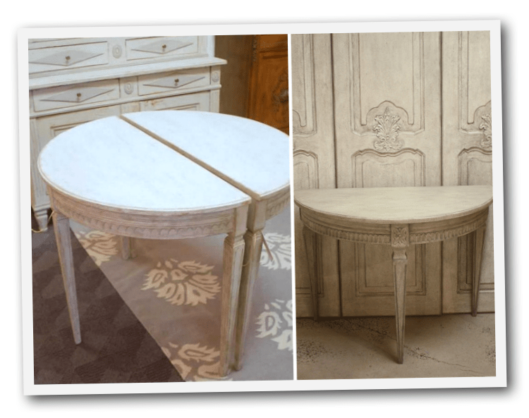 On the left are demilune tables brought back from Sweden on my 2014 trip and on the right the new Swede Collection one
 These Rococo chairs:
Q: What new pieces are you working on?
We made some hand-carved boiserie panels that buyers at market kept asking to be made into sliding doors. For April 2018 High Point market, we are introducing four sliding “barn doors”. What is different about ours is that they are elegant with hand carving on solid wood or antiqued mirror glass inserts in beautiful soft colors. You would never find them on a barn. They are great used between a master bath and bedroom instead of a traditional door. They are beautiful separators of any spaces within the home. And, we are always making more chairs and benches. We are also working on a massive tall candlestick like ones found in European cathedrals. There is a never-ending list of items to make. I am having the thrill of my lifetime making these pieces.
Visit Swedefurniture.com
Visit the 2017 Catalogue Here
Expect To See More Warm Grays, Blues And Creams In Gustavian Decorating
2018 is here and it is BOLD. Designers and Brands predict that this year is going to be more vibrant than years before. Below are a few insights into the 2018 home design trends to help you get inspired.
Before we start, remember that CLASSICS ARE ALWAYS IN. Although it’s fun to have that end table glowing in bright red, whites and blacks are the safest colors as these would work for any customer’s home. GF’s top sellers are White, Black and Gray – check some out here in our design Center: http://bit.ly/
2018 IS RICH WITH COLOR. This year, it looks like a vivid start as Pantone named “Ultra Violet” its Color of the Year, while Sherwin Williams selected the striking Oceanside SW 6496. Other colors that appear to be trending are colors such as violet, wine, amethyst and even soft lavenders. You can find some bold colors in GF’s Color Lab here: http://bit.ly/
HEAVY CABINETRY AND STATEMENT STORAGE. The white cabinet trend has faded and Country Living expects to see more warm grays, blues, creams as well as wood grain tones to take purchase in kitchens in 2018. As for storage, Anthropologie’s customer styling director Christina Frederick says “gone are the days of sacrificing style for function… There seems to be a desire for high-end organization in our personal space, a desire for things – and life – to feel pulled together.”
BRASS IS BACK BABY. Whether it be an accent or the drawer pulls on a buffet, this aged finish is making its way back into our homes.
NATURAL ACCENTS. Natural wood, earthy materials and even color iterations of stone are being implemented into designs. Ryan Turf, managing director of CB2 says, “These beautiful, natural materials add texture and depth to any design. Timeless yet very modern and fresh.” Include wood stains in your furniture designs to meet this trend. All GF stains can be compared here: http://bit.ly/
WABI-SABI. Wabi-sabi is the Japanese art of finding beauty in imperfection. For furniture refinishing this means handmade or hand-painted items that retain a deeply personal, organic aesthetic.
GRAY IS THE NEW BLACK. According to Linda Holt, it looks like the cool blue-grays have been replaced with warmer tones of gray, taupe and neutral colors such as brown. REMEMBER: don’t overuse too much neutral or your furniture or it may become so neutral you’ll miss it! Check out GF’s grays at http://bit.ly/
To read more about 2018 predictions, please go to the following links:
Architectural Digest: Sherwin-Williams Reveals its 2018 Color of the Year – https://
Country Living: 10 Trends That Are Taking Over Homes in 2018 – http://
Country Living: Pantone Color of the Year 2018 – http://
Linda Holt: 2018 Color Trends You Want to See Now: https://
Maria Killam: Colour Trends You Need to Know Right Now for 2018: http://
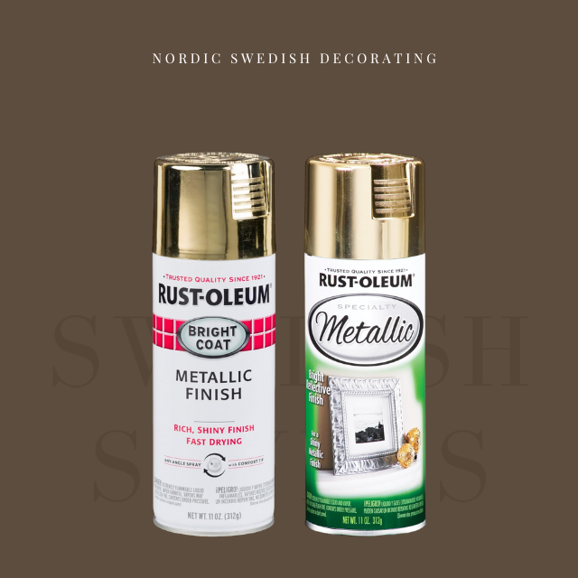
8 Brands Of Gold Spray Paint Were Compared To Find The Best Color
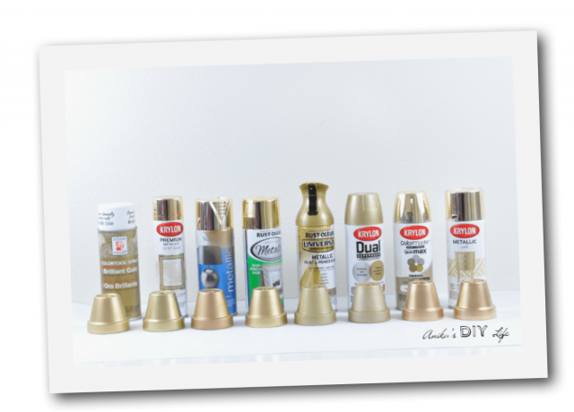 I bought a bunch of mini terracotta pots to use as the test vehicle and used my amazing Homeright spray shelter to spray each of the pots. I put the pots on a little piece of scrap wood so I could simply pick up the wood and move it out to dry while I painted the next pot.
This is the first time I have used Design Master’s and I have to say I was very impressed especially with the uniform coat and drying time. Design master’s and Rustoleum Metallic are pretty much identical in their “color”. I think they are the closest match to being “gold”. The Krylon Premium metallic which is on top has a very yellow almost artificial shine.
View more of her study at anikasdiylife.com
My Personal Favorite Golds : Rustoleum’s Metallic Gold, and Rustoleum’s Bright Coat.
My overall pick is the Bright Coat.
Essential Characteristics Of 18th Century Swedish Interiors
Horse Pattern Jacquard Craft – Amazon
Guest Post by Jason Phillips
The 18th century Swedish interior was a manifestation of neo-classism across Europe. It was made prominent by King Gustav III who introduced different styles of interiors in Sweden when he returned home from his visit to France. In 1771, King Gustav III traveled to France and was impressed with the nature of interiors that he decided to introduce the same back home. At this point in time, the effects of neo-classism had spread to Sweden but its adoption was still low. But with King Gustav’s travel to France, the adoption of foreign mannerisms began to grow. It started with the well-off members of the society but it soon spread across town to the rural areas. Key components of French interiors such as open spaces with natural light became common in Sweden. Living areas that are calm, elegant and airy became the norm. Pale greens, blues, and grays became the preferred decorating colors of the Swedish interiors. Cream, pink and white were other the colors that were used to decorate Swedish homes. Some homes would still spot deeper accents with colors such as ochre, red and gold used for the interiors. There was also the use of rich woods to style the interiors. The woods were used to make furniture, to accent the walls and to make the floor.
The main characteristics of 18th century Swedish interiors.
Here are some of the characteristics of 18th century interiors.
- Simplicity and Comfort.
Designers and homeowners strived to keep their homes as simple as possible. They would also strive to keep their homes comfortable for themselves and their guests. Most homes in Sweden at this time featured open spaces so as to let in as much natural light as possible. This feature was witnessed across the board with the rich in townhouses insisting on open designs just as the locals in country farm houses. The furniture in most homes was designed with in a simple manner so as to keep them as comfortable as possible. They would be decorated with straight line decorations and the ends arched for an appealing look. The sofas had straightened backs and featured lots of cushioning for added comfort. Blankets would be added for warmth and comfort.
- Unique decorations.
The Swedes in the 18th century would use antique items to decorate their homes. Antiques and collectibles would be located strategically in the homes for decoration. They enhanced the ambiance within the homes and made them appealing. Some of the antiques that were used in most homes included tilled and cast-iron stoves that positioned strategically in the living area.
- Natural decorations.
The Swedes would also decorate their homes using natural elements of nature such as fresh flowers, plants, pebbles and sea shells. Those that required care and attention to thrive such as flowers and plants were watered and trimmed so as to keep them fresh. They were positioned close to the windows so as to ensure that they received enough light for prosperity. Natural materials would also be used to make hand-woven decorations. Some of these materials included wood, glass and natural textile elements.
- Surface decoration.
The 18th century Swedish interior also featured surface decorations. The walls in most homes were decorated using floral patterns, checks, and stripes so as to make them much more appealing. Plain and textured fabrics were also used to line walls in some Swedish homes. Another aspect of Swedish interior was decorating the surface of furniture items such as sofas and chairs with stencil decoration, wreaths, and heart motifs.
- Proper lighting.
Sweden is very cold during winter and in an effort to bring in as much natural light as possible, homes would be built with large windows. The windows were lined with roman blinds and fine curtains so as not to obstruct the flow of light. Winters in Sweden are characterized by reduced sun hours and to keep houses well lit, candles and stoves and even chandeliers were common in most homes. Fireplaces were also common just as were table lamps. The fireplaces would also double up as sources of warmth within the household.
Swedish interiors of the 18th century were rich in style and they made the homes beautiful and interesting.
Candles – 12 Pieces – Amazon
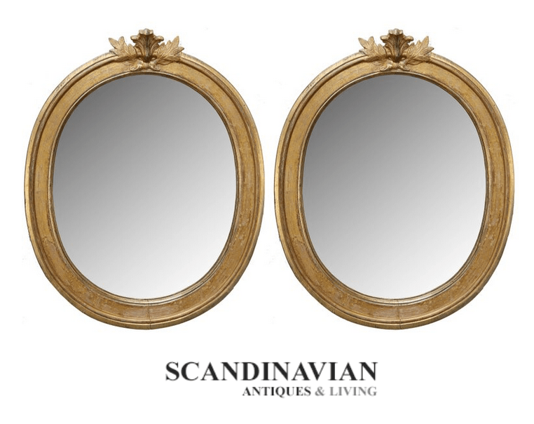 Exquisite pair of antique, Swedish late Gustavian giltwood mirrors. Lovely oval giltwood carved frames with carved oak leaves and cartouche atop each mirror.–Scandinavian Antiques & Living
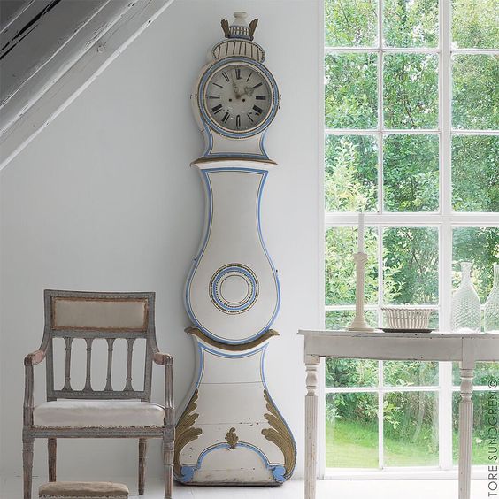
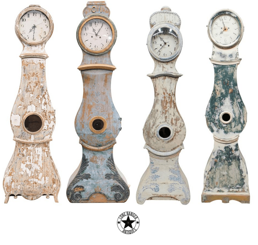 Antique Swedish Clocks From The Lone Ranger Antiques
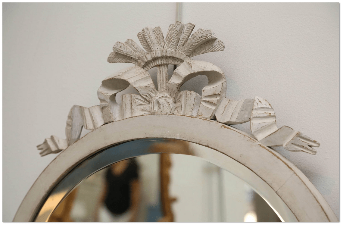 Antique Swedish Gustavian Style White Painted Oval Mirror, Mid-19th Century – Scandinavian Antiques & Living
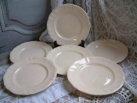 Set of 6 Antique french creamware ironstone plates –Chanteduc
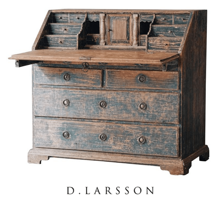
 Nina Hartmann
 D.Larsson Interiör & Antikhandel
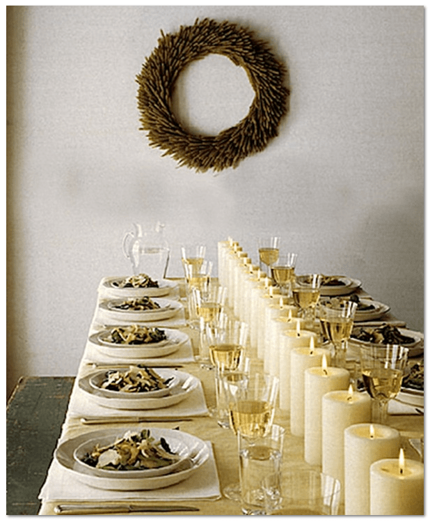 40 Thanksgiving Table Settings to Wow Your Guests – Martha Stewart
 Attributed to Jean Marc Nattier
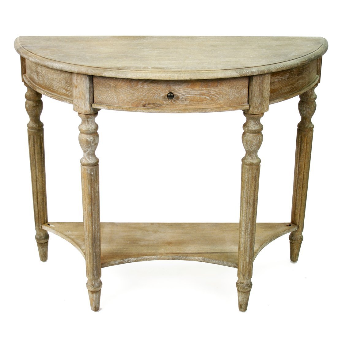 Natural Wood Table From Kathy Kuo
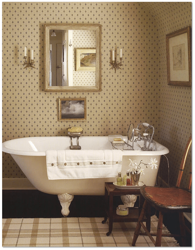 Old Clawfoot Tub – source: viendoraglass.com
 antonandk.co.uk
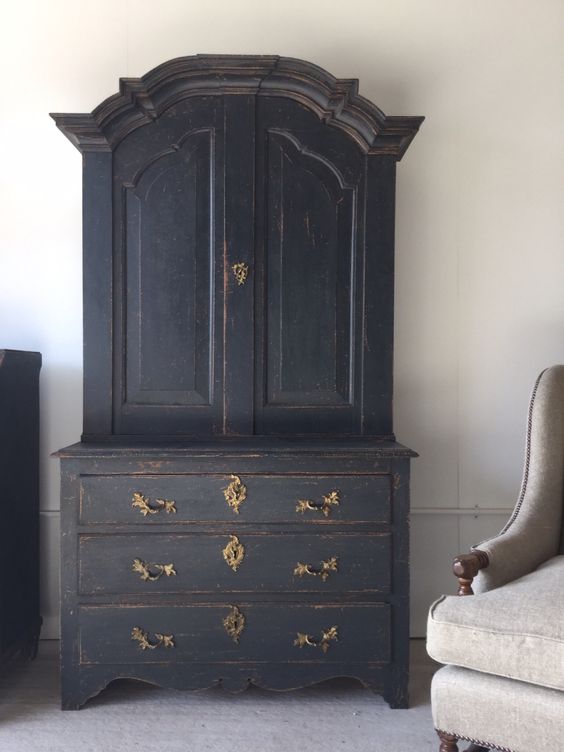
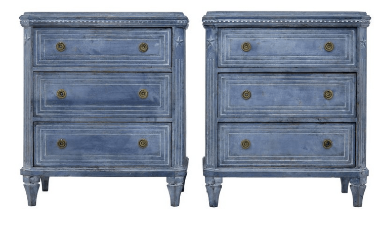 Pair of Small 19th Century Gustavian Influenced Commodes, Debenham Antiques
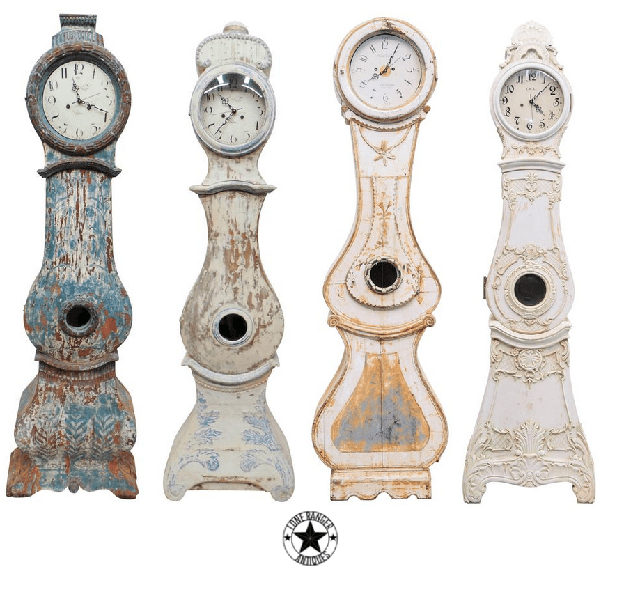 Antique Swedish Clocks From The Lone Ranger Antiques
 Habitually Chic® » Grey Day
 The Paper Mulberry