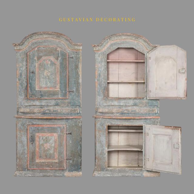
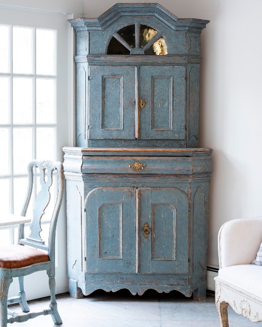
The Light And Airy Furniture Of Sweden
Dawn Hill Antiques
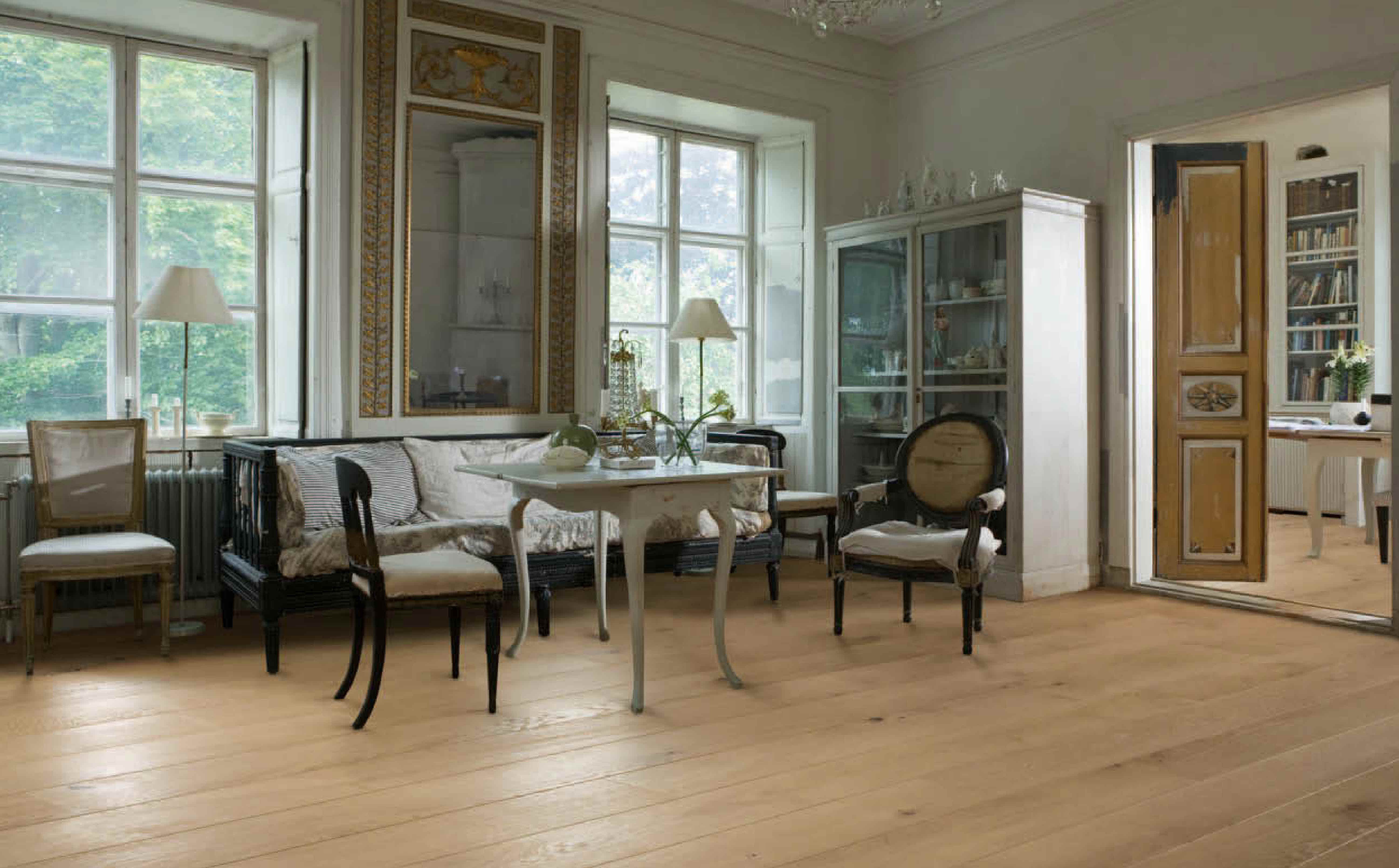
Swedish furniture is in a class of its own. From the exuberant decoration of the Rococo style with an abundance of curves and natural motifs that gave way in the late 1700s to the restrained Gustavian style, Swedish furniture appeals to many. Owing to its clean lines and simplicity, it mixes well with other styles, both traditional and modern.
“You cannot talk about Swedish design without first considering the natural environment of Sweden. It is a country of islands, with the sea on one side and the interior populated by dense forests,” said antique dealer Paulette Peden of Dawn Hill Antiques in New Preston, Conn. “In the winter months there is a very short period of daylight, so the Swedish people craved the light, and created rooms painted with pale colors, and light furniture to make the most of the precious daylight.” The Gustavian style was named for Sweden’s King Gustav III (1746-92), during whose reign the talented craftsmen of the Stockholm Guild made well-designed furniture like chairs, tables, secretaries, cupboards and settees.
Read more – liveauctioneers.com
Essential Characteristics Of 18th Century Swedish Interiors
Horse Pattern Jacquard Craft – Amazon
Guest Post by Jason Phillips
The 18th century Swedish interior was a manifestation of neo-classism across Europe. It was made prominent by King Gustav III who introduced different styles of interiors in Sweden when he returned home from his visit to France. In 1771, King Gustav III traveled to France and was impressed with the nature of interiors that he decided to introduce the same back home. At this point in time, the effects of neo-classism had spread to Sweden but its adoption was still low. But with King Gustav’s travel to France, the adoption of foreign mannerisms began to grow. It started with the well-off members of the society but it soon spread across town to the rural areas. Key components of French interiors such as open spaces with natural light became common in Sweden. Living areas that are calm, elegant and airy became the norm. Pale greens, blues, and grays became the preferred decorating colors of the Swedish interiors. Cream, pink and white were other the colors that were used to decorate Swedish homes. Some homes would still spot deeper accents with colors such as ochre, red and gold used for the interiors. There was also the use of rich woods to style the interiors. The woods were used to make furniture, to accent the walls and to make the floor.
The main characteristics of 18th century Swedish interiors.
Here are some of the characteristics of 18th century interiors.
- Simplicity and Comfort.
Designers and homeowners strived to keep their homes as simple as possible. They would also strive to keep their homes comfortable for themselves and their guests. Most homes in Sweden at this time featured open spaces so as to let in as much natural light as possible. This feature was witnessed across the board with the rich in townhouses insisting on open designs just as the locals in country farm houses. The furniture in most homes was designed with in a simple manner so as to keep them as comfortable as possible. They would be decorated with straight line decorations and the ends arched for an appealing look. The sofas had straightened backs and featured lots of cushioning for added comfort. Blankets would be added for warmth and comfort.
- Unique decorations.
The Swedes in the 18th century would use antique items to decorate their homes. Antiques and collectibles would be located strategically in the homes for decoration. They enhanced the ambiance within the homes and made them appealing. Some of the antiques that were used in most homes included tilled and cast-iron stoves that positioned strategically in the living area.
- Natural decorations.
The Swedes would also decorate their homes using natural elements of nature such as fresh flowers, plants, pebbles and sea shells. Those that required care and attention to thrive such as flowers and plants were watered and trimmed so as to keep them fresh. They were positioned close to the windows so as to ensure that they received enough light for prosperity. Natural materials would also be used to make hand-woven decorations. Some of these materials included wood, glass and natural textile elements.
- Surface decoration.
The 18th century Swedish interior also featured surface decorations. The walls in most homes were decorated using floral patterns, checks, and stripes so as to make them much more appealing. Plain and textured fabrics were also used to line walls in some Swedish homes. Another aspect of Swedish interior was decorating the surface of furniture items such as sofas and chairs with stencil decoration, wreaths, and heart motifs.
- Proper lighting.
Sweden is very cold during winter and in an effort to bring in as much natural light as possible, homes would be built with large windows. The windows were lined with roman blinds and fine curtains so as not to obstruct the flow of light. Winters in Sweden are characterized by reduced sun hours and to keep houses well lit, candles and stoves and even chandeliers were common in most homes. Fireplaces were also common just as were table lamps. The fireplaces would also double up as sources of warmth within the household.
Swedish interiors of the 18th century were rich in style and they made the homes beautiful and interesting.
Candles – 12 Pieces – Amazon
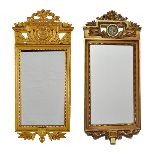
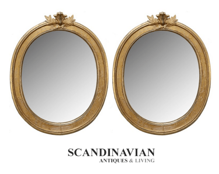 Exquisite pair of antique, Swedish late Gustavian giltwood mirrors. Lovely oval giltwood carved frames with carved oak leaves and cartouche atop each mirror.–Scandinavian Antiques & Living
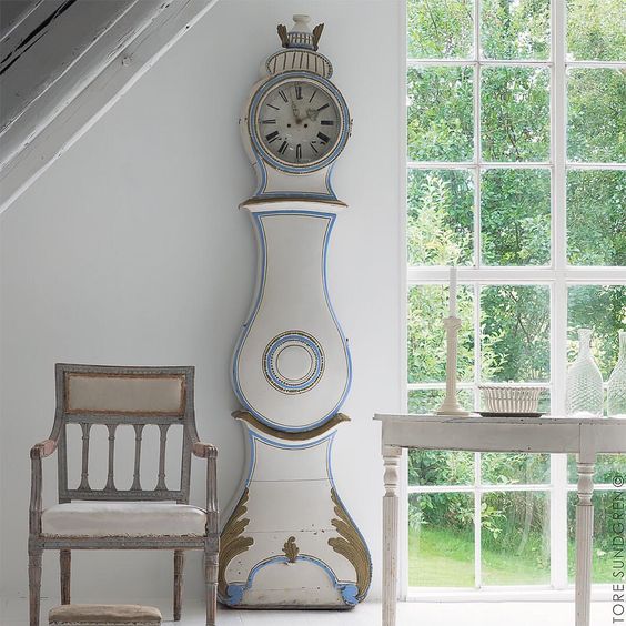
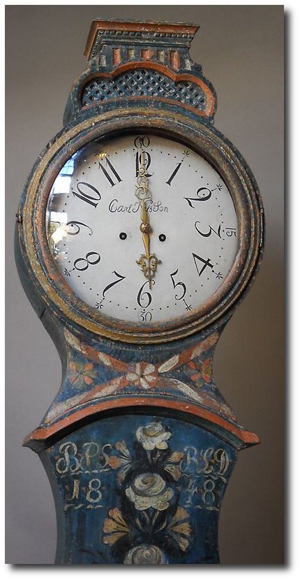
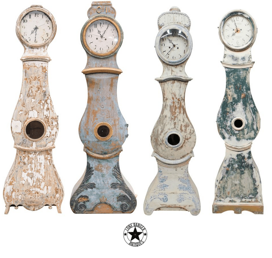 Antique Swedish Clocks From The Lone Ranger Antiques
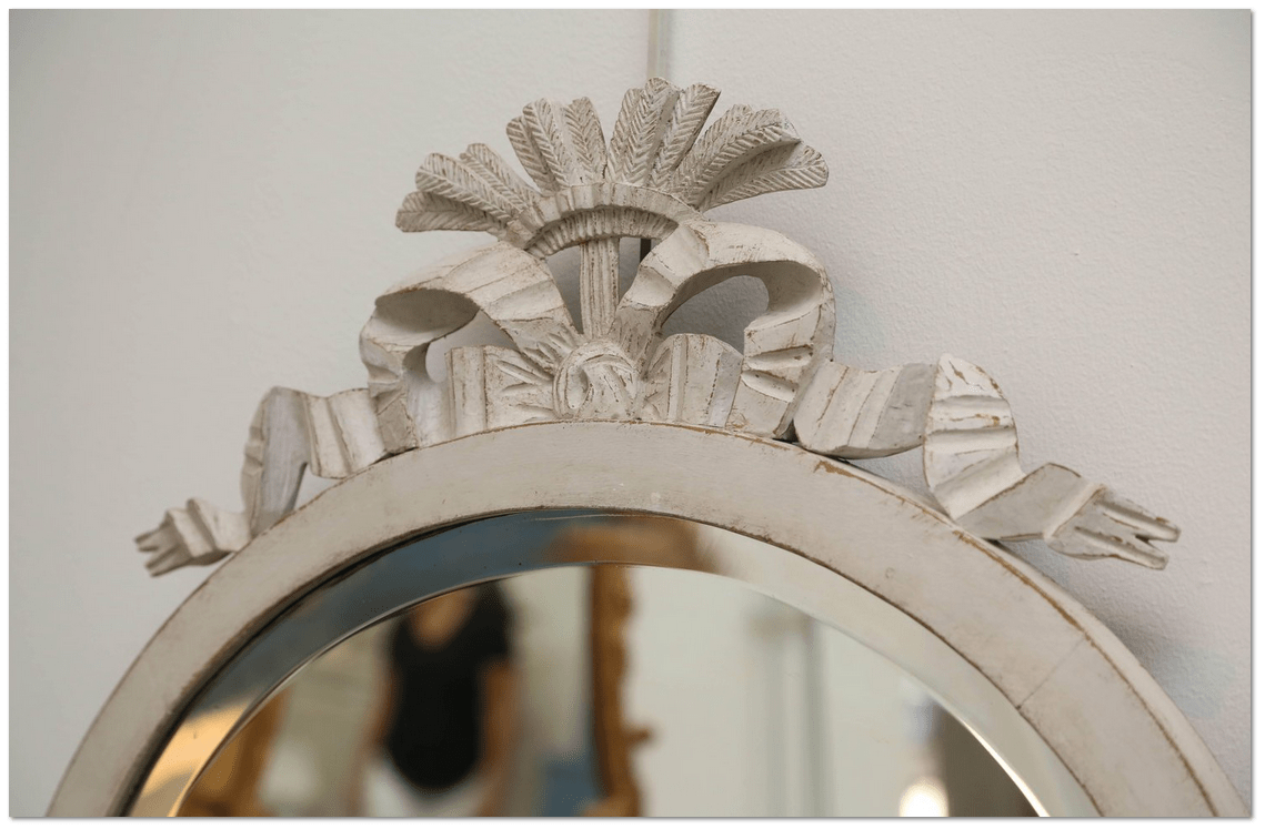 Antique Swedish Gustavian Style White Painted Oval Mirror, Mid-19th Century – Scandinavian Antiques & Living
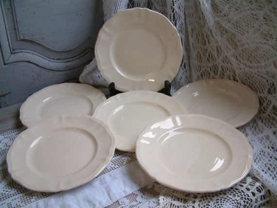 Set of 6 Antique french creamware ironstone plates –Chanteduc
 Nina Hartmann
 D.Larsson Interiör & Antikhandel
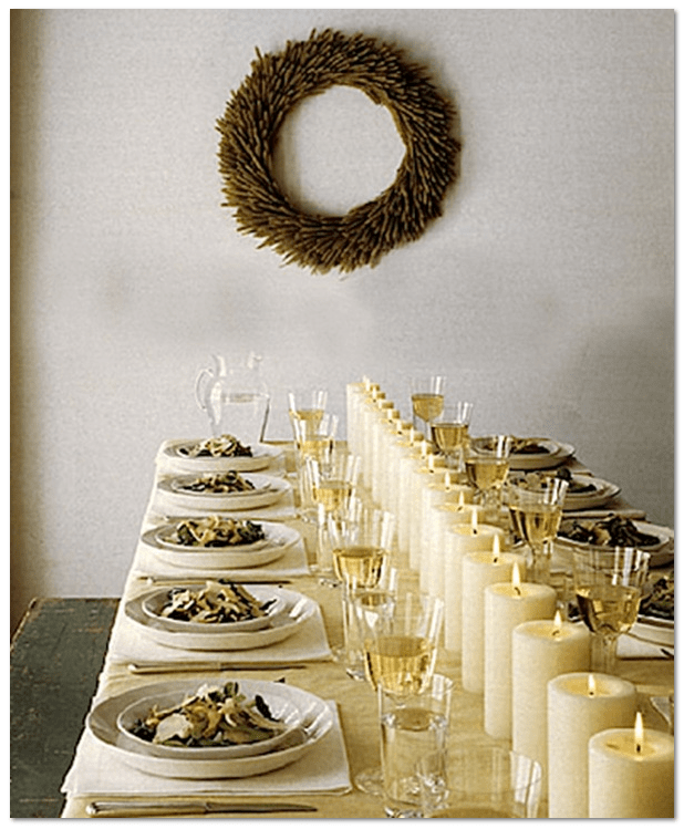 40 Thanksgiving Table Settings to Wow Your Guests – Martha Stewart
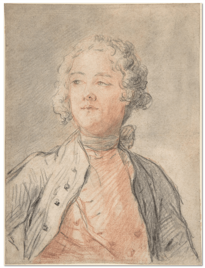 Attributed to Jean Marc Nattier
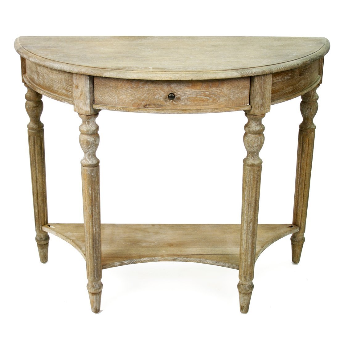 Natural Wood Table From Kathy Kuo
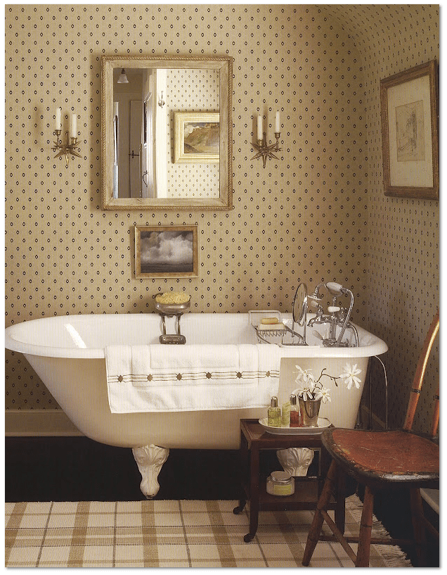 Old Clawfoot Tub – source: viendoraglass.com
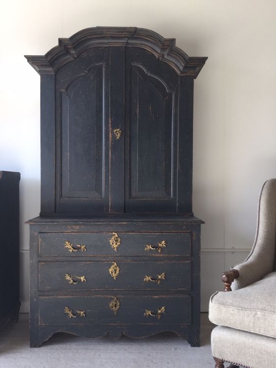 antonandk.co.uk
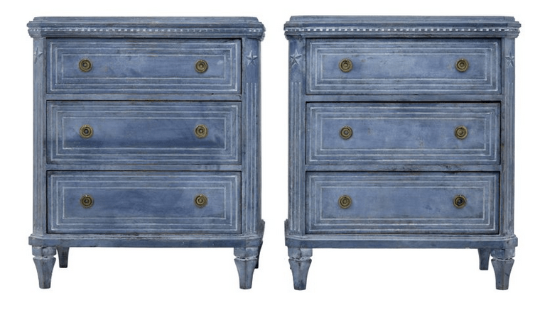 Pair of Small 19th Century Gustavian Influenced Commodes, Debenham Antiques
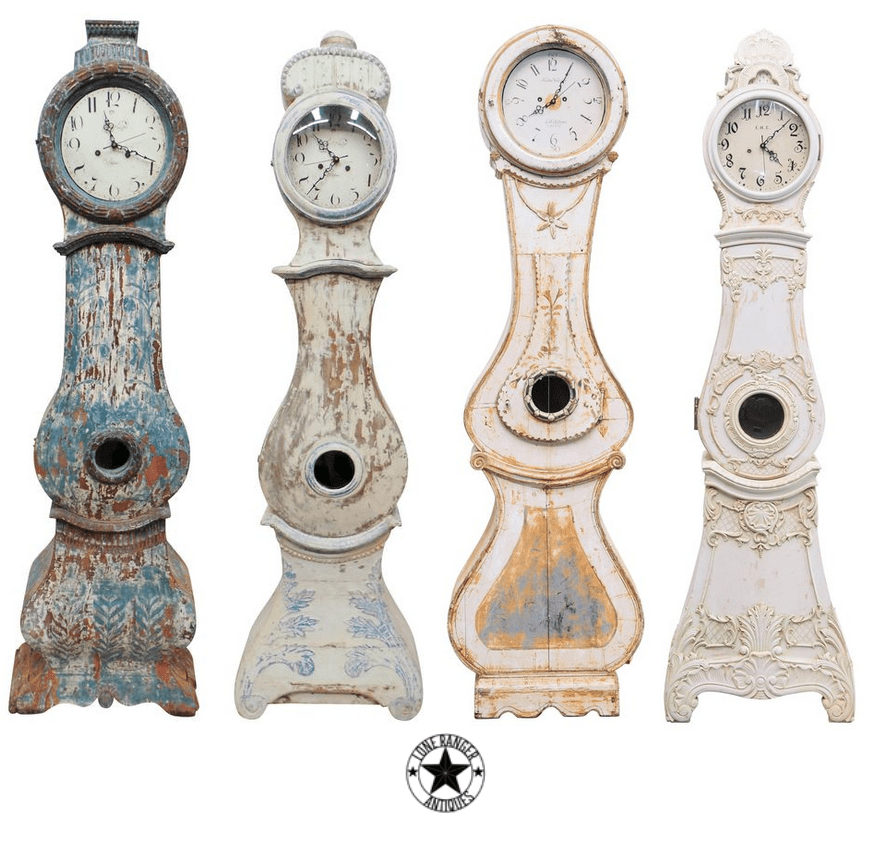 Antique Swedish Clocks From The Lone Ranger Antiques
 Habitually Chic® » Grey Day
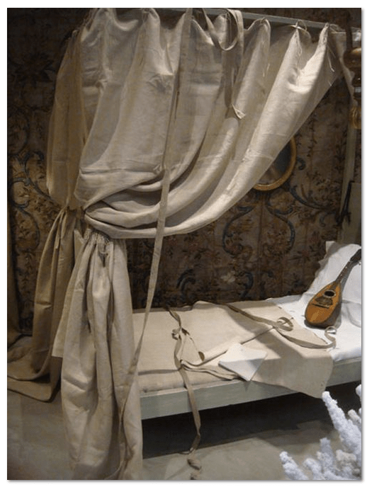 The Paper Mulberry
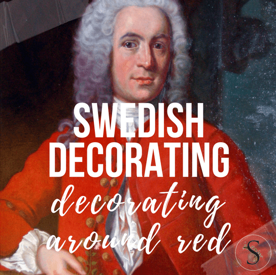
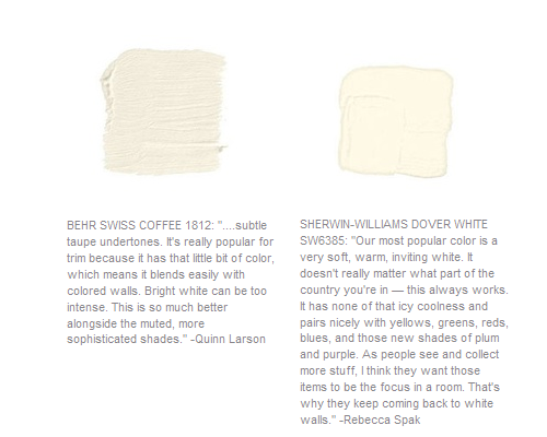
Decorating Around Red- Historical Interior Design Ideas
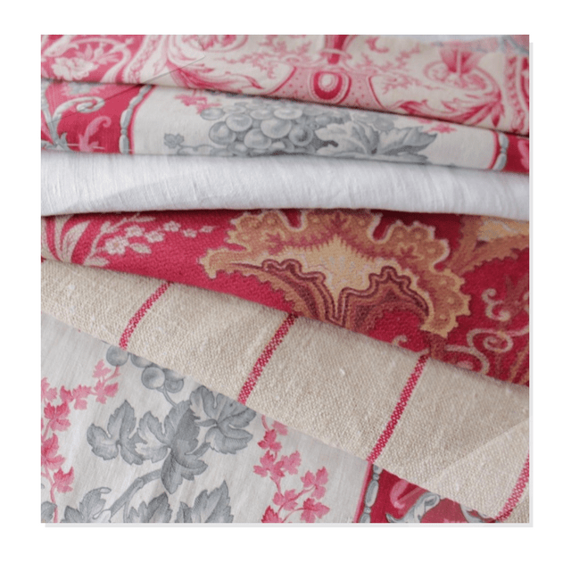
Antique Vintage European Textiles On Ebay
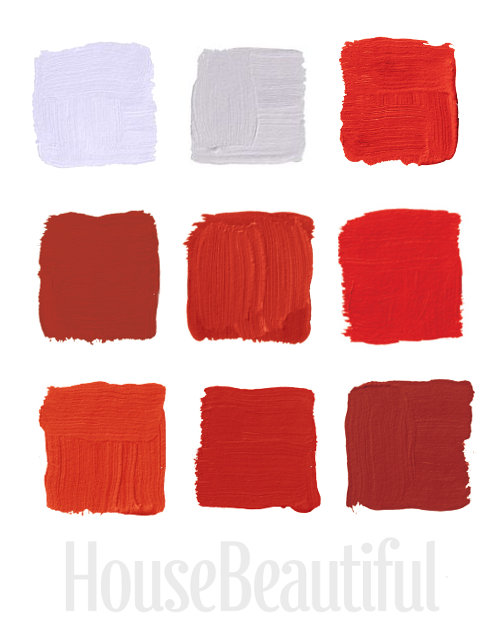
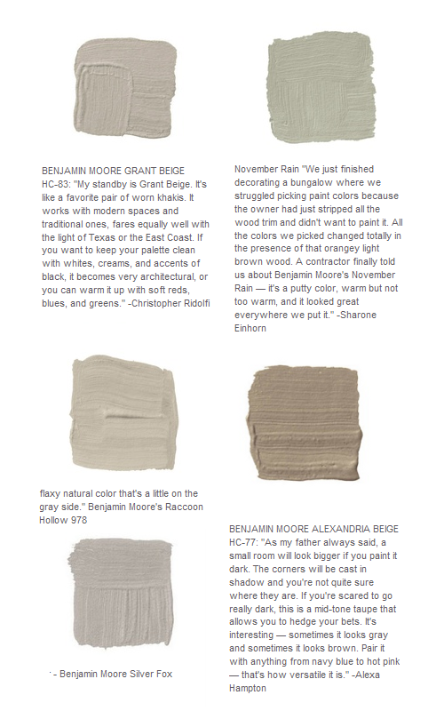
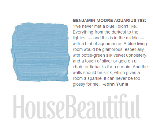
House Beautiful Magazine featured the top favorite red colors from the most famous interior designers. Here are my favorite 9 red shades of paint from their selection of 24
TOP ROW:
1.”This is a really deep coral, kind of like a cheerful Chinese red. Pinks and reds to me are synonymous with frozen drinks and relaxing.” –Richard Mishaan Pictured, Benjamin Moore‘s Chili Pepper 2004-20
2.”When I look for red, I want a pure, true red, like the color in the American flag. Ralph Lauren does absolutely the best. It’s the essence of red. It makes me think of boating or polo.” –Suzanne Kasler Pictured, Ralph Lauren Paint‘s Dressage Red TH41
3. “Red never goes out of style. It’s full of life — always fresh, always fun to wake up to. We go for reds with less blue in them and more orange because they’re happier to live with.” –William Diamond and Anthony Baratta Pictured, Ralph Lauren Paint‘s Lattice Red IB57
MIDDLE ROW:
4. “It’s a true, deep red. I like the temperature of it: it’s a bit cooler. But a little red goes a long way. It’s good in areas where you don’t spend much time or in boring areas that need a strong burst of color.” –Roderick Shade Pictured, Benjamin Moore‘s Million Dollar Red 2003-10
5. Benjamin Moore‘s Redstone was used in Eldon Wong’s cupboard.
6. “All my life I’ve pursued the perfect red. I can never get painters to mix it for me. It’s exactly as if I’d said “I want Rococo with a spot of Gothic in it and a bit of Buddhist temple” — they have no idea what I’m talking about.” –Diana Vreeland Pictured, Benjamin Moore‘s Red 2000-10
BOTTOM ROW:
7. “Red is the color of excitement, and I tend to go for corally orange reds. With red, you know you’ve arrived and you glance in the mirror and realize how great you look and breeze right in.” –Keith Irvine Pictured, Benjamin Moore‘s Salsa 2009-20
8.”I prefer the warm, vibrant reds to the historic reds, which are beautiful but sedate. This is a daring red, a real fire engine red. It has a playfulness that reminds me of a little red schoolhouse.” –Ruthie Sommers Pictured, Fine Paints of Europe‘s Dutchlac Brilliant Tulip Red W1001B-M
9.”Lately I’m on this anti-completely-neutral kick. You have to have some seasoning in your rooms. Sangria is good, universal-donor red — not too blue, not too orange, not too dark.” –Elissa Cullman Pictured, Benjamin Moore‘s Sangria 2006-20
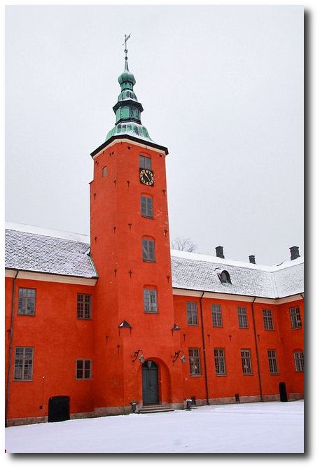
Frijsenborg Castle
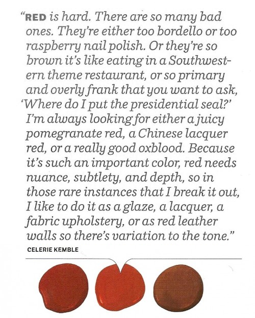 House Beautiful Color Celerie Kemble’s Advice
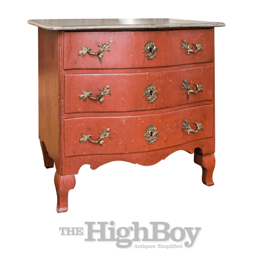 1760 Swedish Rococo Period Painted Commode thehighboy.com
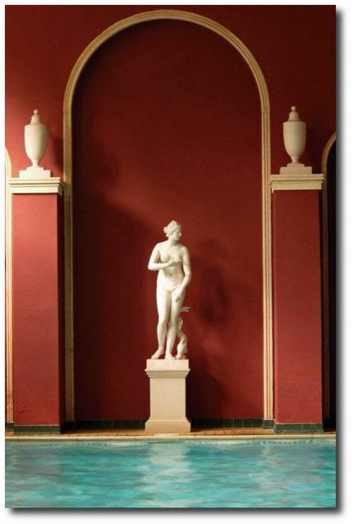
Unknown Library Painted In Red
Photography By Simon Upton

Favorite Red Paint Colors Seen In House Beautiful Magazine
Hartwell House in Aylesbury, Buckinghamshire
Halmstad Slott, Halland, Sweden- 2013-02-10 by Giåm on Flickr (cc)
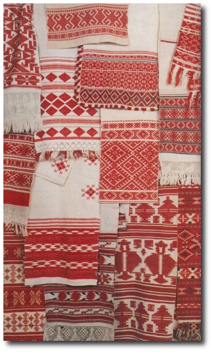
Beautiful Red Textiles Found on bohemianwornest.tumblr.com
Gustavian armchairs signed Jacob Malmsten ( master in handcraft Stockholm 1780- 1788) from Bukowskis Classical auction 26-27 of May godsochgardar.se
18th Century Swedish Gustavian Grandfather Clock from Stjernsund Castle. The clock face is signed by Daniel Frång from Stjernsund. The inside of the clock case has preserved newspaper articles from the auction at Stjernsund Castle as well as information about important Swedish antiques clocks.- Scandinavian Antiques
Rembrandt Paintings Seen On Habitually Chic Blog
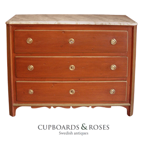 Early Gustavian chest of drawers, Sweden circa 1780, in secondary red paint. Chamfered corners, shaped bracket base, and faux marbled top. Cupboards & Roses
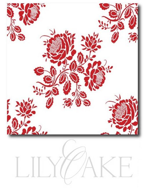 Gustavian Fabrics – Seen Pictured is Kristianstad Rose In Cranberry Red


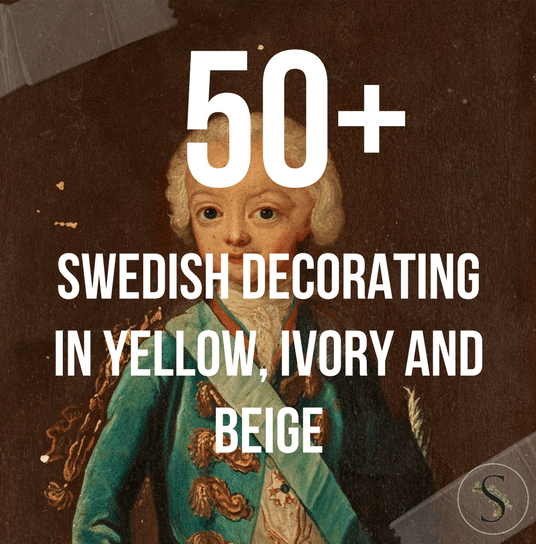
Swedish Decorating Inspirations In Yellow, Ivory And Beige- 50+ Pictures
Decorating in the Swedish Style: Light, Function, and Timeless Beauty
The Swedish style of decorating is defined by light, simplicity, and a sense of calm. For centuries, Nordic interiors have embraced pale colors and restrained design to create peaceful, livable homes. Light-painted walls, softly finished furniture, and bedding in whites or gentle pastels were not only aesthetic choices, but practical ones—designed to maximize brightness during Sweden’s long, dark winters. The result is an interior style that feels serene, welcoming, and enduring.
1. Light-Painted Walls Give You Greater Design Freedom
A Swedish-inspired interior often begins with light-colored walls. Soft gray, pale green, muted blue, or warm creamy white create a gentle backdrop that allows furnishings and accessories to shine. Neutral tones such as ivory, beige, or light gray offer flexibility, making it easy to layer in warmer accents like soft yellow or subtle gold.
For added character, consider decorative wall details such as stenciled ribbons, scrolls, or wheat motifs in soft pinks or deeper reds—elements historically seen in Gustavian interiors.
Floors should remain just as light and airy. Blonde woods, pale finishes, or lightly painted floors help reflect natural light and open up a space. For added charm, subtle stenciling or painted designs can bring interest without overwhelming the room.
Floor coverings also play an important role. Natural fiber rugs—such as jute, sisal, or berber—offer a neutral foundation that complements nearly any palette while adding warmth and texture.
Wallpaper is another beautiful option. Look for neoclassical patterns with soft colors on white backgrounds. Florals, swags, ribbons, and bows are common motifs, often accented with a touch of gold for elegance and refinement.
2. Add a Settee to One Side of the Dining Table
If space allows, a settee placed along one side of a dining table creates a relaxed, European feel. This seating style has deep roots in Swedish design. The traditional köksoffa, or kitchen sofa, dates back to the 1700s and was designed as a multifunctional piece—used for seating during the day and as a sleeping surface at night. Painted finishes and aged patina are common, reflecting both practicality and charm.
3. Rotate Collections Throughout the Year
Nordic interiors often lean toward minimalism, emphasizing thoughtful display over excess. Invest in furniture that doubles as storage, allowing you to tuck away everyday items while showcasing your favorite pieces.
Leave armoire doors open to display collections, and consider painting the interior a contrasting shade for visual interest. Cabinet interiors, drawers, and bookcases can also be painted in warm tones—buff, vanilla, apricot, or saffron—to add depth against creamy exteriors.
Rotate decorative objects seasonally, keeping displays fresh and intentional. Mount collections on the wall and use lighting to highlight special pieces. Edit frequently—keep only what you truly love and allow each item room to breathe.
Group decorative objects in pairs or curated collections. Use matching frames for artwork and keep images cohesive by working in black-and-white or sepia tones. Shelving, cabinets, and bookcases elevate collections when styled with restraint.
Storage boxes can also become part of the décor. Painted boxes, neatly stacked on shelves, add structure and sophistication while keeping clutter hidden.
4. Push Chairs and Side Tables Against the Walls
A classic Swedish layout places chairs and side tables along the walls, opening up the center of the room. This arrangement creates a sense of spaciousness and was common in historic Nordic homes. Position furniture in small groupings or allow a single chair to stand alone for a simple, balanced look.
5. Rethink Your Closet Space
Closets offer an opportunity to bring both beauty and order into everyday life. Adding painted wood shelving instantly elevates a space and makes storage feel intentional. Use wall space all the way up to the ceiling and consider incorporating double hanging rods to maximize functionality.
Organize clothing by color, and display special pieces rather than hiding them away. Closets can be both practical and visually pleasing when designed with care.
Closets can also be repurposed as display spaces. Painting the interior a darker shade, such as gray, allows collections—like tableware or glass—to stand out while remaining neatly contained.
6. Use Neoclassical Lamps and Wall Sconces
Lighting plays a crucial role in Swedish interiors. Wall sconces add romance and ambiance while freeing up table space. Candles mounted on walls create a warm glow and are often safer than tabletop arrangements.
Choose sconces that suit your style—simple or ornate—and place them in pairs on either side of mirrors or artwork for balance. Table lamps can be elevated by recovering plain shades with upholstery fabric that coordinates with accent chairs or slipcovers.
Chandeliers and lamps enhance the natural brightness of a room, while mirrors amplify light and create the illusion of more space. Finish the look with reflective accents such as blue-and-white china, silver, and glass for subtle shine and timeless elegance.
Picture Credits –
- D.Larsson Swedish Antiques
- French Wall Sconces On Ebay
- Huge Gustavian Hutch Desk , Sweden C. 1800 From Galerie Half
- Farrow & Ball Decorating with Colour- Buy This Book On Amazon
- A gorgeous tablescape. Photography by sandrafazzino.com, Planning by italyinstyletrave… & myspecialguest.co…,
- Floral & Event Design by foodartgroup.it
- 18th century Swedish Secretaire Appley Hoare
- Chelsea Textiles
- Eleish Van Breems Antiques
- Atelier de Campagne
- Augustus Brandt Antiques
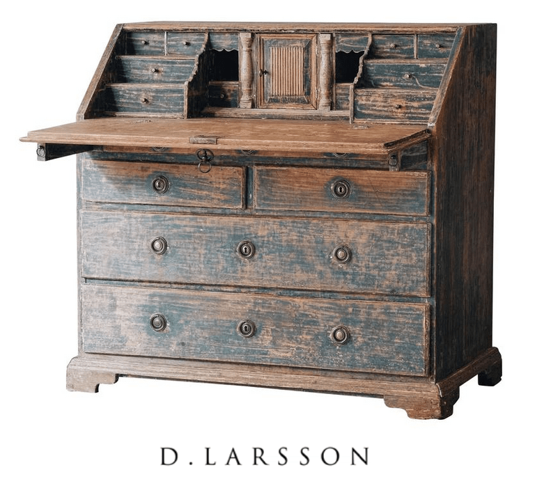
- Gustavian Secretary From Lief
- Gustavian Secretary From Lief
- Ironstone Molds Seen On Cote de Texas Blog
- Ralph Lauren Home 18th-century Swedish-Inspired Design
- Carol Raley Interiors
- Stadsauktion Auction Catalogue #59
- UK magazine Livingetc. From Auction Decorating Blog
- Vicki from French Essence
- 19th Century French Woman on Canvas
- Lars Sjoberg- The Style Saloniste
- Court Mantua Kensington Palace 1750-1760 From ArtFund
- Vintage Views Consigment is selling a very attractive pair of gilded bronze sconces
- Manor of Skogaholms- Stockholm Town Blog
- Kristinehovs Malmgård – Söder – Stockholm, Sweden- skarn.se
- Hoby-Kulle Manor, near Ronneby, Seen At En.konstantik.se
- Swedish Gustavian Swedish Decorating Ideas
- Collecting White Dinnerware Haute Design By Sarah Klassen
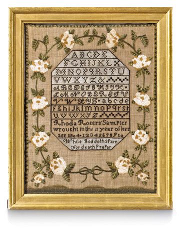 Sampler, 1804, Country Living.com
A Swedish Rococo Chest Rococo Period 1750-1775 A beautiful Rococo chest of drawers with amazing inlays and construction. All original hardware and locks, Laserow Antiques
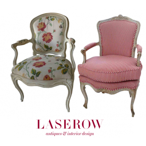 Swedish Rococo Armchair from the Rococo period 1750-1775 A Swedish Rococo armchair with cabriole legs and curved armrests and back. Laserow Antiques, Armchair Rococo period 1750-1775– A lovely armchair from the Rococo period with amazing carvings and curved shapes. Frieze and back splat is decorated with carved flowers and leaves. The scrolled legs and armrests are typical for the Rococo period featured at Laserow Antiques

Mora Clock, from Real Gustavian and the Creamy White Mora Clock with orange detailing is from The Nordic Place.
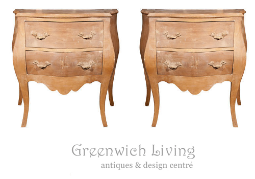 Pair of Bombe Swedish Commodes 102-4870 Greenwich Living Ebay
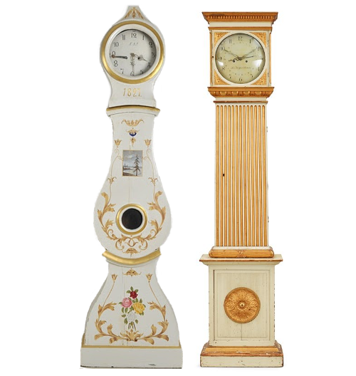
A Gustavian late 18th century longcase clock From Bukowskis, A Swedish Mora Clock From 1820-40, from Lauritz
Nordic Style Furniture Collections
Swedish Interior Seen On Inredningshjälpen Blog
Drink Cabinet $807.75 From Guild Master On Amazon
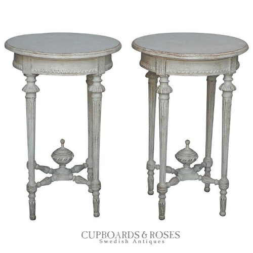 Pair Of Gustavian Side Tables- Cupboards & Roses Antiques
 The Best Designer Paint Suggestions Seen In House Beautiful Magazine
Antique Swedish canape – Augustus Brandt
Found on augustus-brandt-antiques.co.uk

A Passion for Collecting: Decorating with Your Favorite Objects- Caroline Clifton Mogg
We are all born collectors. In childhood we hoard all manner of knick-knacks-marbles, ribbons, toy soldiers-and experience an instinctive thrill in finding the next and even better one. This book explores the ways in which collectibles as diverse as antique maps, ceramics, and seashells can be used in interior design. With lavish illustrations of interiors that make wonderful decorative use of collections, A PASSION FOR COLLECTING reveals the secrets for display that can make an incredible visual impact on the décor of any collector’s home.
 Decorating With China and Glass By Caroline Clifton-Mogg
Caroline Clifton-Mogg is a writer and journalist who specializes in interior design and gardens. She is a contributing editor to both Harpers & Queen and Christie’s Magazine and also contributes regularly to magazines and newspapers such as House & Garden, Country Life, and The Financial Times. Her many books include Textile Style (Bulfinch, 2000), The Curtain Book (Bulfinch, 1998), Decorating with Antiques (Bulfinch, 1999), Passion For Collecting (Bulfinch, 2002) and The Bedroom Book (Bulfinch, 2003).


The Best Designer Paint Suggestions Seen In House Beautiful Magazine
Graham and Green’s Vienna Petite Four Drawer Chest, mango wood chest of drawers with brass accessories and a putty grey wash finish.
Graham and Green opened their first shop in Notting Hill in 1974, and since then Graham and Green has expanded from humble beginnings to a delightfully identifiable, British establishment. Today, Graham and Green have 2 beautiful shops, four catalogues each year and their online store.
 Pair of carved wood Swedish stools. Upholstered in Rubelli silk. Eighteenth Century.
An Old House in Whitechapel | Spitalfields Life
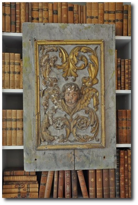 Swedish Panel – Giannetti Home Visit Providence lt Ddesign
61 Leather Bound Decorative Swedish Books, Debenham Antiques EBAY
70 Swedish Books, Debenham Antiques EBAY
Via Svenska Flicka (Swedish Girl)
Tussah Flower wallpaper from Zoffany

The Best Designer Paint Suggestions Seen In House Beautiful Magazine
Royal Palace, Stockholm. Chimneypiece graces the Blue cabinet in Queen Louisa Ulrika’s study.
The Best Designer Paint Suggestions Seen In House Beautiful Magazine
Swedish Medallion Seen In Veranda 2011
Gustavian Mirror, 1, 2 – Auction Catalogue From Live Auctioneers
More Pictures – Credits In The Article


Designer Martha Angus Loves Gustavian Style
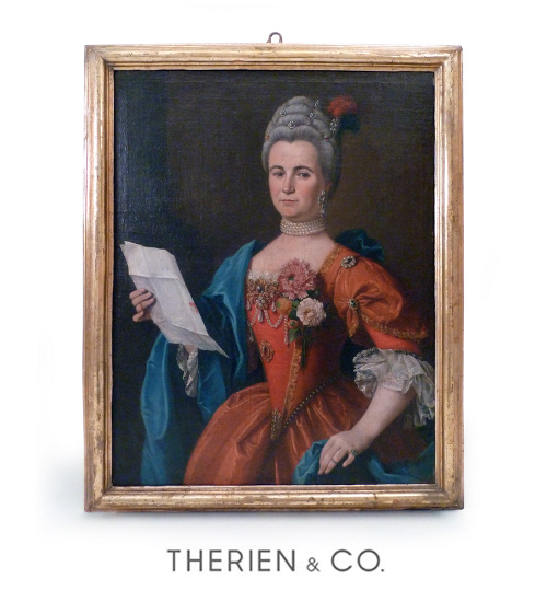 Swedish Portrait -the figure of noble women, in courtdress, within giltwood frame
The Style Saloniste posted an interview with designer Martha Angus, founder of the San Francisco-based firm, Martha Angus Inc. about her favorite style and paint colors. It turns out she loves the Gustavian Swedish styles, and gives out the paint colors she uses most often in her designs.
Q- Favorite design period?
Martha Angus: Gustavian. It’s late eighteenth-century, and feels like Louis XVI but not as grandiose. In addition, I love the painted finishes typical of the period, often in gray. Swedish design can offer a type of low-key opulence. During the Gustavian period, a light wash of paint in earth colors of light blue, gray, green and yellow was used instead of gilding. The prices of antiques vary, depending on the object. They’re now very collectible, so prices are rising fast. I’ve seen some fantastic examples at the Marche Paul-Bert at the Paris flea market, Clignancourt.
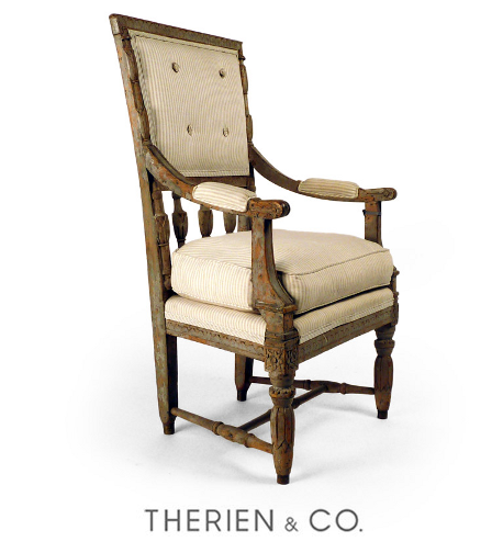
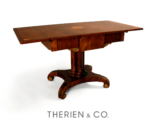
My favorite local source for Gustavian furniture is Therien & Company in Los Angeles (as well as the Therien & Co 20th-century collection at their gallery in San Francisco.)
Q: Your most versatile paint color?
Martha Angus: It’s Benjamin Moore and my special mix of half Decorator White mixed with half Linen. Works every time.
The finest paints are those designed by Donald Kaufman in New York. They are all elegant and multi-dimension and complex, so you could pick one with your eyes closed.
I’m a big fan of Farrow & Ball, colors: Parma Gray, Folly Green and Mouse’s Back are very individual and give rooms character.

Q: Which fabric could you use over and over?
MA: Heavy Belgian linen by Henry Calvin Fabrics, # 8793 “Mail Bag Linen” texture in natural. To the trade, Henry Calvin Fabrics, 151 Vermont Street, San Francisco, 415-565-1981. I often use antique textiles, tapestries, and pillows from Kathleen Taylor, The Lotus Collection, 445 Jackson Street, San Francisco, 415-398-8115.
Home Dit also features an interview with Martha Angus, where she reveals more of her love for French and Gustavian antiques.
Q: Tell us about the moment when you decided to follow a career in the field of interior design.
Martha Angus: I always felt like an artist growing up. I moved around constantly for my father’s career, so the whole idea of ‘home’, a place where you feel comfortable and can settle into, is the most important thing in the world to me. When I was a child, I absolutely fell in love with color, especially coloring books. I became so passionate about art and color, I thought “Oh, wow!” this is all I ever want to do, which led me to
eventually study painting at Carnegie Mellon and the Ecole des Beaux Arts de Paris.
When I came out of college the options for a female artist were quite limited yet art has always been a driving force in my career. As a young artist fresh out of school, I got my start as a fashion illustrator and textile designer in New York City. That eventually led to store design and high-end residential design. My work and interests are always evolving but I never abandoned my first love –painting and contemporary art. To this day, art is the most important feature in my designs. It’s usually the first thing I discuss when starting a new project.
Q:Where do you look for an obscure source of inspiration?
Martha Angus: I find inspiration in my usual trips to the Paris flea markets. I believe my ideal shop would include that sense of history, unstated elegance and fun that the French do so well. As in my projects, my ideal shop would include timeless and elegant items such a Gustavian settee or a weathered neoclassical zinc planter paired with a super chic custom designed plexi-glass bench upholstered in zebra silk-screen hide and bold Ellworth Kelly prints.
Q:What would be your recommendation for “what to do first” in a decorating project?
Martha Angus: Start with a good floor plan and remember that upholstery is the key. High quality upholstery can go a long way. Not only is it a good investment but it also brings a sense of tailoring and richness that other items can’t. Once the art and essential furniture items have been selected, accessorizing can do wonders. Scented candles and cashmere throws add a sense of luxury to a room without a significant investment. I always include small trays and boxes that bring the project down to a warm and livable level.
I always say that art is the most important aspect of a space, aside from the people collecting it. I live for bold, statement art. High art should not be treated as a mere decorative item that accessorizes a room, but almost a living element of the space – something with a very distinct personality.
Q: What’s your current paint color obsession?
Martha Angus: I believe in airy, fresh spaces that usually call for very subtle neutrals so that I can come in later and play with fun splashes of color in art, fabrics or accessories. When it comes to paint I find myself constantly going back to some Farrow and Ball colors precisely because they have that timeless elegance that relates so well with my philosophy. Some of my favorites are Middleton Pink and Arsenic.Throughout my career I have always recommended Benjamin Moore’s decorator’s white for its freshness and vibrancy. I have a life-long love affair with textiles of every kind. In fact my career started in New York City as a textile designer and fashion illustrator. I believe David Hicks style fabrics are classic and always so chic.
Q : What advice do you have for someone with a new house to decorate and perhaps a limited budget?
Martha Angus: Small changes can go a long way. I also advise my team to use color as envelopes for a room. Soft neutrals like French Gray or even Decorator’s White are great colors for walls, ceilings and trim because they can give an atmospheric look to a room and make it timeless, standing the test of time and whimsy trends. The one item I would recommend investing in is good upholstery pieces. The big items should also be covered in a neutral material that can stand the test of time. It will not only look good but will wear well for many years to come.
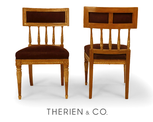
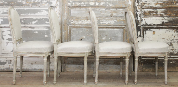
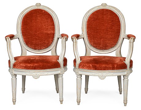
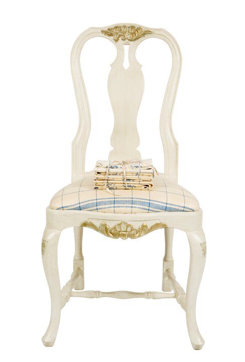
Pair of Swedish Late Gustavian Side Chairs- the rectangular upholstered crest rail within carved and moulded frame on foliate carved spindle supports, over upholstered seat with carved and moulded apron flanked by rosette filled blocks, raised on foliate carved round section tapering legs ending in toupee feet
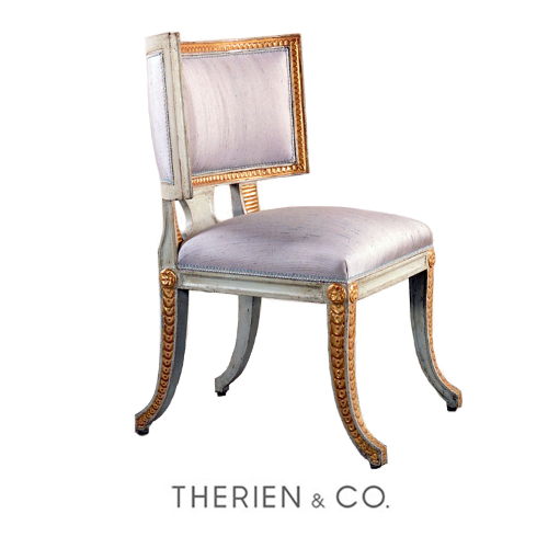 The Neoclassical period replaced the Rococo influences during the second half of the eighteenth century. Cabinet makers responded to the excavation of Herculaneum and Pompeii with great fervor, eliminating the robust naturalistic forms of the Rococo in favor of delicate colors and a less exaggerated line. The Klismos, the original antique form of this chair, was brought to light late in the Neoclassical period in Sweden as well as other countries. The Gustavian, another name for this chair, was developed during the reign of Gustavian III who seized power in 1771. This chair is believed to have been made for the marvelous pavilion at Haga, the summer home of Swedish royalty
Pair of Roman Neoclassic Painted And Parcel Gilt Armchairs with horseshoe shaped foliate carved back with downswept arms, joined to Greek key carved seat and raised on tapering fluted legs
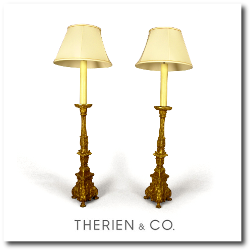
Pair Of Swedish Baroque Giltwood Candlesticks each of compound foliate and gadrooned tripartite form rising to flaring foliate sheathed bobeche, raised on conforming scrolling volute base, centering ribboned and foliate swagged cabochon medallion and ending in lion paw feet; now electrified and fitted with beeswax candle and calf skin shade
Swedish Neoclassic Painted Armchair- the upholstered back within conforming moulded and carved flaring frame, over urn shaped carved spindles joined by down swept supports to upholstered seat, raised on stylized foliate carved swelling round section legs ending in brass sabots and headed by rosette filled carved corner blocks; the whole retaining original paint
Swedish Karl Johan Mahogany Satinwood and Olivewood and Parcel Gilt Sofa Table- the rectangular top with satinwood stringing centering satinwood and olivewood inlaid central patera medallion and corresponding corners, with two drop leaves over breakfront apron incorporating single drawer, flanked by relief carved foliate volutes, on cluster columnar support in the early English taste, with molded socle and concave platform ending in foliate carved downward scrolling feet centering floral medallions


Decorating Secrets- 60 Quotes From The Best Experts In Design

Swedish winters are long, dark and dreary, so historically Swedes have always turned to lighter interiors. Swedish style isn’t all about the gray and the white interiors they are famous for, but many homes feature brighter, richer colors to decorate around.
There are so many shades and tones of paint, that it can be impossible to decide on one color. Buy sample-size colors to help you make the perfect selection. A color can look quite different at night than the day. We recently painted the outside of our home, and the color which looked to be a creamy yellow at night, turned green in the day. Be sure to try your selected colors on a few different walls to determine what suits which room. You’ll thank yourself for making this extra effort before spending $$$ on the wrong shade.
Don’t judge the room until the paint is in place, and accessories and furniture are placed. A color which may seem to bright can be toned down by wall accessories, coordinating drapes, and art work. Consider working with the off shades of the primary colors. Intead of purple, consider lilac, or a raspberry tint.
Consider whether you are a warm or cool person. I once was asked this by a hairdresser, looking to choose a shade of blonde. I never gave it much thought before, but knowing which color you lean towards can certainly make picking colors a lot easier. Earthy reds, dusty warm plums, and rusty golds are in the warm color range. Silver blues, mint, and lavenders are colors which are cooler.
Advice From Pros
“Design is not just what it looks like and feels like. Design is how it works” Steve Jobs
“Green pigment was expensive in the 18th century, making it a status symbol. So it would have been appropriate for the royal governor’s house. I’ve been a curator at Colonial Williamsburg for 20 years, and when my husband and I lived in a historic house, we had similar green woodwork. It worked with every fabric I wanted to use, and it’s a great mood enhancer—chlorophyll for the spirit!” —Liza Gusler
“People think that they need to use small furniture and light colors to make a small room look big, but that’s not the case at all. Dark colors and just a few pieces of large-scale furniture, with the appropriate lighting and accessories, can give a room a larger, more luxurious feel.” —Mona Hajj
“Everything else in my house is off-white and grey, and I just had to have a break from that. I was looking at my pond, which is this murky shade of acid green, and I thought, ‘I’ll do that in high gloss to make it even more watery and translucent.’ It’s strange, but I love it.” —Stephen Sills
“Luxury must be comfortable, otherwise it is not luxury.” – Coco Chanel
“While looking at one of my first New York apartments, David Hicks told me diplomatically,’Dear boy, if you’re going to paint the walls white, you need art.'” Peter Dunham
“The only time white curtain lining should be used is with white curtains- J Randall Powers
“Use the precious for everyday purposes. We’ll rummage through clients closets and find loads of precious hand-me-downs like porcelain vases and crystal that are a bit out of vogue. We’ll use them for completely ordinary purposes – a case becomes a chic pencil holder, a crystal bowl holds makeup brushes. Turn the ordinary into a special moment” Benjamin Dhong
“I learned that passion about objects and furnishings makes for fearless decorators—and that if you are comfortable in your home, everyone else will be too. That sense of authenticity is what gives a home its soul.”- Courtnay Daniels Haden
“The most elegant interiors are just slightly tatty.” – David Netto
“Playing it safe. Instead, put a large-scale printed fabric or wallpaper on the walls and even the ceiling. It’s easier, safer, and less expensive to be dramatic in a small space. You might get tired of a bold print in the main living area, but it can make a smaller, less-used room an exciting space to spend time.” —Victoria Neale
Louis Masreliez- The Designer Behind Gustav III’s Pavilion At Haga Park
Masreliez was born in Paris and began his education at Ritakademien, which was a drawing academy at the youthful age of 10. In 1769, Masreliez was given a study grant which allowed him the opportunity to travel to Paris and Bologna to study. When he left Bologna in 1773, he decided to stay in Paris for eight years,where he then returned to Sweden in 1782 to become a commissioner of the Royal Swedish Academy of Arts. He advanced the following year, when he was made a professor of art history. Then in 1805, he bacame the director of the Academy.
He was responsible for the interior of Gustav III’s Pavilion at Haga Park. In addition he also was responsible for the interior of Tullgarn Palace. Masreliez is remembered for its interior decorations at Haga, Drottningholm, Stockholm Palace in the classical Pompeian style. Masreliez was inspired by the excavations of Pompeii and Herculaneum, which could be seen in his interior design.
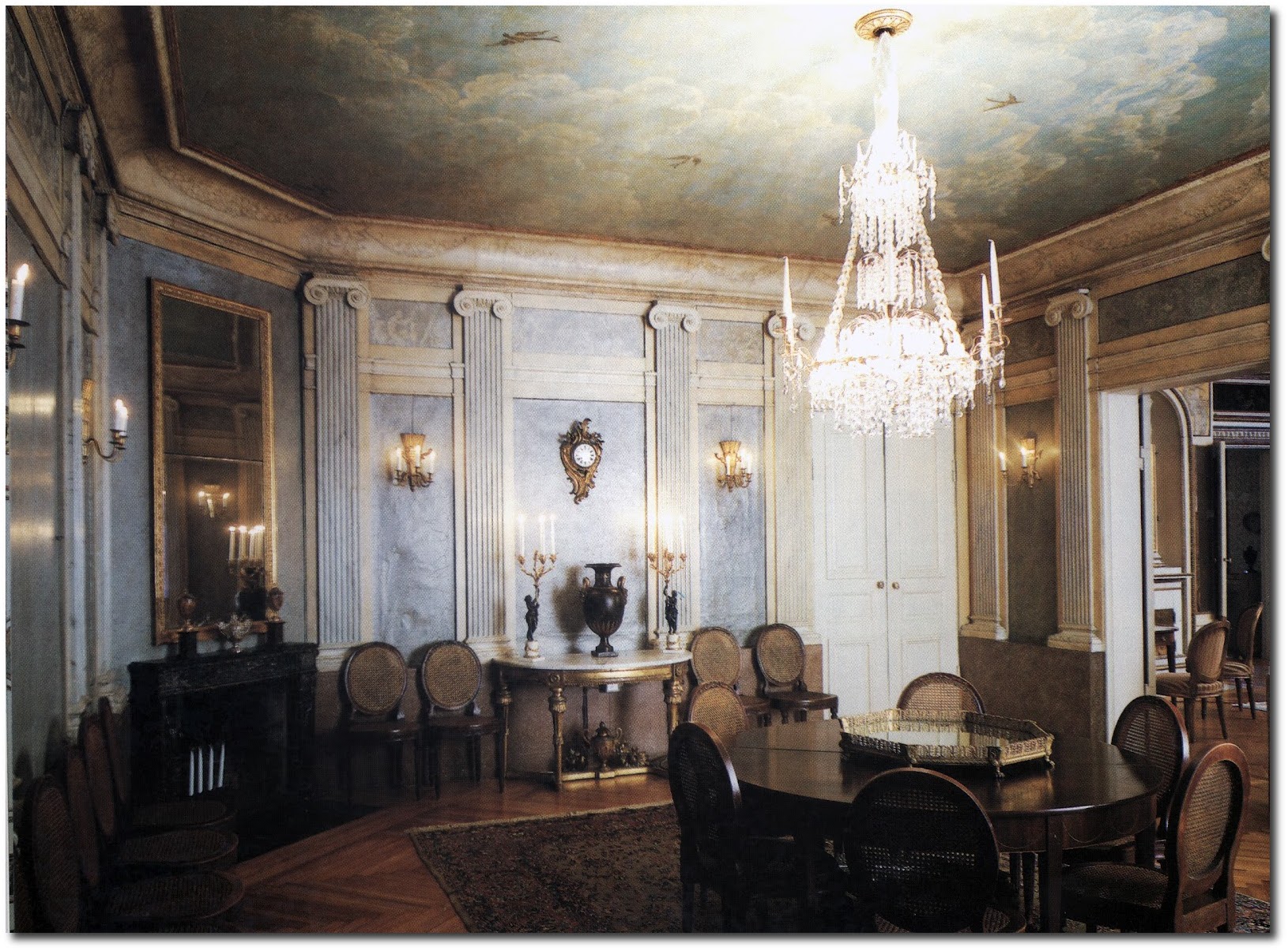
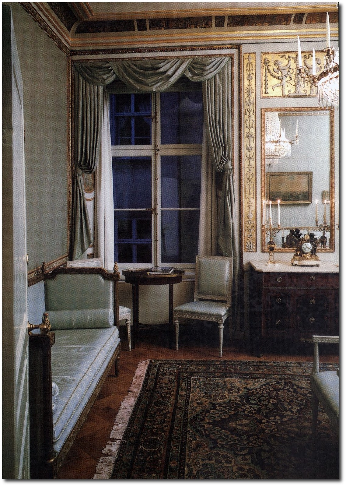
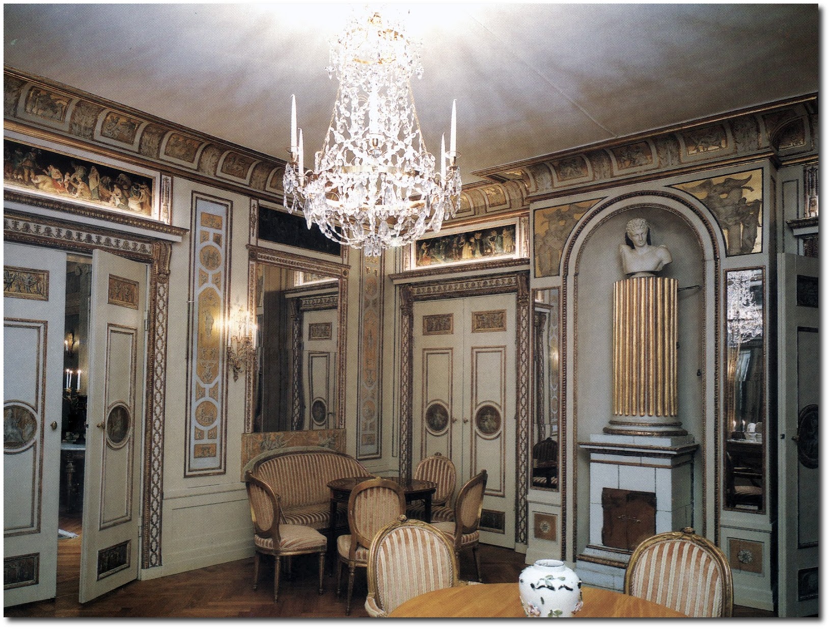
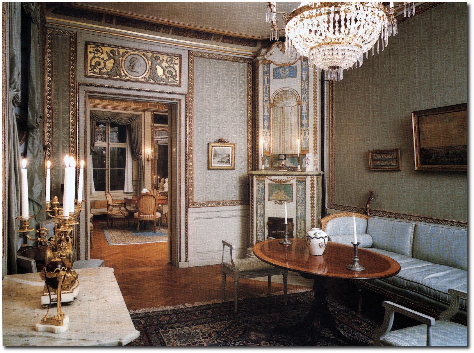
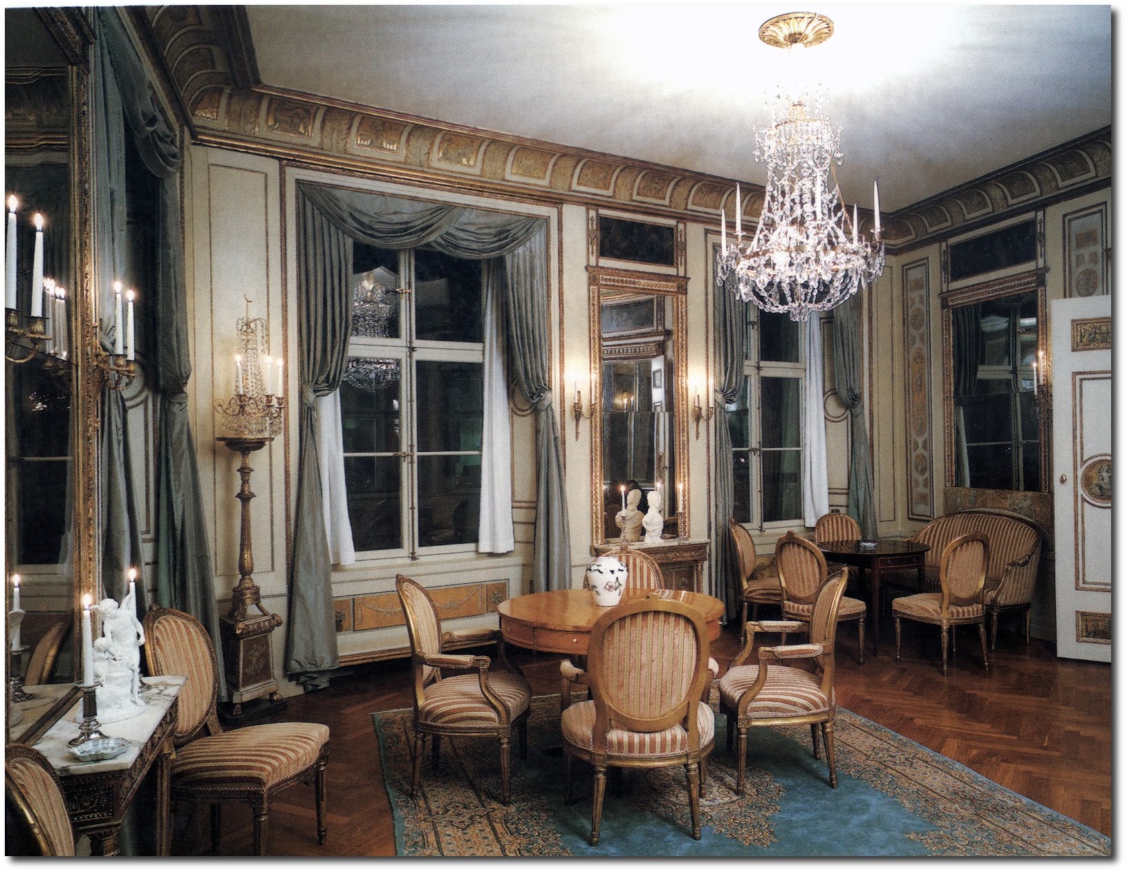
The pictures below in this post are located in Salviigränd, which is an alley in Gamla stan, old town in central Stockholm. On the second floor -Number 1, (the only building in that block not part of the Parliament administration), is a suite of rooms created by Louis Masreliez for the bachelor Wilhelm Schwardz in 1795. Dressed up in pastel, grey, and gold, the elegant Gustavian Classicism interiors features lighted candles, cut-glass chandeliers, taffeta curtains, and friezes and medallions.
A special thanks is to be given to A Connoisseurs Quest Blog for the pictures of Wilhelm Schwardz’s Home in Stockholm- See the entire post “A Peek at the Usually Hard to See House by The Gustavian Designer Masreliez in Gamla Stan, Stockholm”
One can see parallels between the Gamla Stan and Sturehov, particularly in the placement of furniture. Larger round tables serve as focus points in both the Gamla Stan and Sturehov. Both of the Kakelugnar stoves also have classical columns which make the base of the stove.
We are happy to discover this designer with you….!

Gustavian Style: Warm Or Cool Tones?

Swedish Gustavian Pine Benches
Gustavian style is all about painted surfaces, intricate wood carvings, distressed wood flooring, and beautiful family heirloom furniture. Gray painted furniture are commonly associated with Swedish interiors. Gray can be both a cold and warm color depending on the hue of the paint. When gray is mixed with yellow, it can take on a color that is more warm, where as mixed with purple, or blue, it can appear on the colder tones. Gray is a staple color in old world Swedish homes, and will work with any color palette. Here are a couple examples of cool and warm color tones:
Cool Tone Examples:
The cool color tones can be very attractive and fresh. Light blue can open up the home, and allow it to appear more spacious.
1. As you can see this home has light blue painted walls, and furniture which is painted in the exact same color tones. Furniture is accented in gold, and other pieces are painted in white.
2. This ad for Tara Shaw is based on the cool color tones. A very light blue floor, and a gray wall with undertones of blue are the perfect back drop for this antique piece of furniture painted in blue-gray. As you can see white washed pine furniture adds a touch of wood, and works with the color palette. See more of the furniture here
Some Tips For Cool Interiors :
– Use several glazes when washing your furniture. Look at the color depth with these chairs- Pair of 18th C. Rococo Gustavian side chairs in the original paint From Marston Luce Antiques. The color is very rich and dark, and would work perfectly with a room based in the lighter blue tones.
– Paint your walls a very light blue and accent with punchy shades of blue such as seen in the table cloth. Add in lots of white painted accent pieces.
– A blue painted wall can go a long way to create a cool interior. Here we see a combination of blue gray and white.
– Brighter whites are used in cooler tones, while beige color washes and upholstery are used for warmer palettes.
Warm Tone Examples:
Warmer tones tend to feature traces of yellow, and brown in the swatches. A warmer palette will make your home appear to be warmer in the winter than a room that is painted in a light shade of blue. Rich yellows work so beautifully with gold, and brass.
This ad for Horchow features an interior bathed in the warmer tones of brown. Wood is washed with brown or beige paint allowing the natural wood to show through.
–Olivier & Chantal’s French Home is a great example of a warm color palette. The walls are painted a dark gray, and red painted furniture give an opportunity for color to be apart of this room. Red is also a warm color, making it the perfect choice against the dark gray walls that appear in this room. Untreated wood breaks up the painted surfaces, and allow the eye some rest. Solid upholstery allows this home to remain uncluttered. Simplicity, and clean looks govern the Swedish style. See more of this home here
-This Campagne cover features a Gustavian room with lots of warm tones. Lots of beige is used with a combination of white. Looking closely at the furniture, painted finishes on the clock and the settee reveal exposed warm wood, with beautiful distressed white finishes. See more of this home here.
Some Tips For Warm Interiors:
1. Paint your walls yellow and combine beige and gray into the interior. Work with darker tones instead of light paint colors.
2. Incorporate stone and concrete into a warm interior. Display stone busts or urns on pedestals. Consider leaving the wood raw and untouched without any polishing or lacquer. Add in brass instead of silver.
3. Incorporate black painted furniture into a warm decorating scheme. Black painted furniture often looks terrific against tones of yellow.
4. Consider also working with the darker green color palette. Combine green upholstery with untouched pine frames, or gilt wood frames. Work with a country theme with lots of distressed furniture, or work with brighter Kelly greens such as the colors featured on Lars Scandinavian Design Book. As you can see the secondary color is always beige not white.


