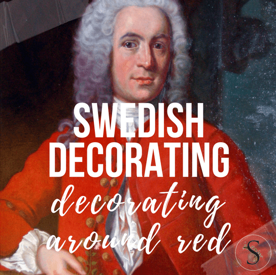
Decorating Around Red- Historical Interior Design Ideas
Antique Vintage European Textiles On Ebay
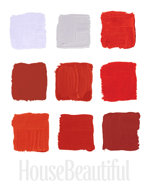
House Beautiful Magazine featured the top favorite red colors from the most famous interior designers. Here are my favorite 9 red shades of paint from their selection of 24
TOP ROW:
1.”This is a really deep coral, kind of like a cheerful Chinese red. Pinks and reds to me are synonymous with frozen drinks and relaxing.” –Richard Mishaan Pictured, Benjamin Moore‘s Chili Pepper 2004-20
2.”When I look for red, I want a pure, true red, like the color in the American flag. Ralph Lauren does absolutely the best. It’s the essence of red. It makes me think of boating or polo.” –Suzanne Kasler Pictured, Ralph Lauren Paint‘s Dressage Red TH41
3. “Red never goes out of style. It’s full of life — always fresh, always fun to wake up to. We go for reds with less blue in them and more orange because they’re happier to live with.” –William Diamond and Anthony Baratta Pictured, Ralph Lauren Paint‘s Lattice Red IB57
MIDDLE ROW:
4. “It’s a true, deep red. I like the temperature of it: it’s a bit cooler. But a little red goes a long way. It’s good in areas where you don’t spend much time or in boring areas that need a strong burst of color.” –Roderick Shade Pictured, Benjamin Moore‘s Million Dollar Red 2003-10
5. Benjamin Moore‘s Redstone was used in Eldon Wong’s cupboard.
6. “All my life I’ve pursued the perfect red. I can never get painters to mix it for me. It’s exactly as if I’d said “I want Rococo with a spot of Gothic in it and a bit of Buddhist temple” — they have no idea what I’m talking about.” –Diana Vreeland Pictured, Benjamin Moore‘s Red 2000-10
BOTTOM ROW:
7. “Red is the color of excitement, and I tend to go for corally orange reds. With red, you know you’ve arrived and you glance in the mirror and realize how great you look and breeze right in.” –Keith Irvine Pictured, Benjamin Moore‘s Salsa 2009-20
8.”I prefer the warm, vibrant reds to the historic reds, which are beautiful but sedate. This is a daring red, a real fire engine red. It has a playfulness that reminds me of a little red schoolhouse.” –Ruthie Sommers Pictured, Fine Paints of Europe‘s Dutchlac Brilliant Tulip Red W1001B-M
9.”Lately I’m on this anti-completely-neutral kick. You have to have some seasoning in your rooms. Sangria is good, universal-donor red — not too blue, not too orange, not too dark.” –Elissa Cullman Pictured, Benjamin Moore‘s Sangria 2006-20
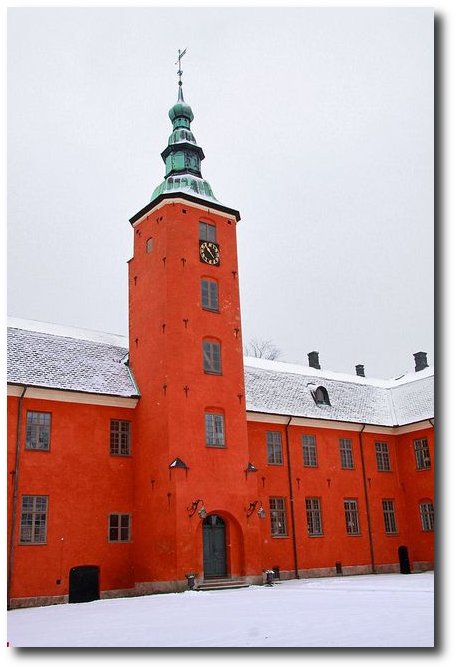
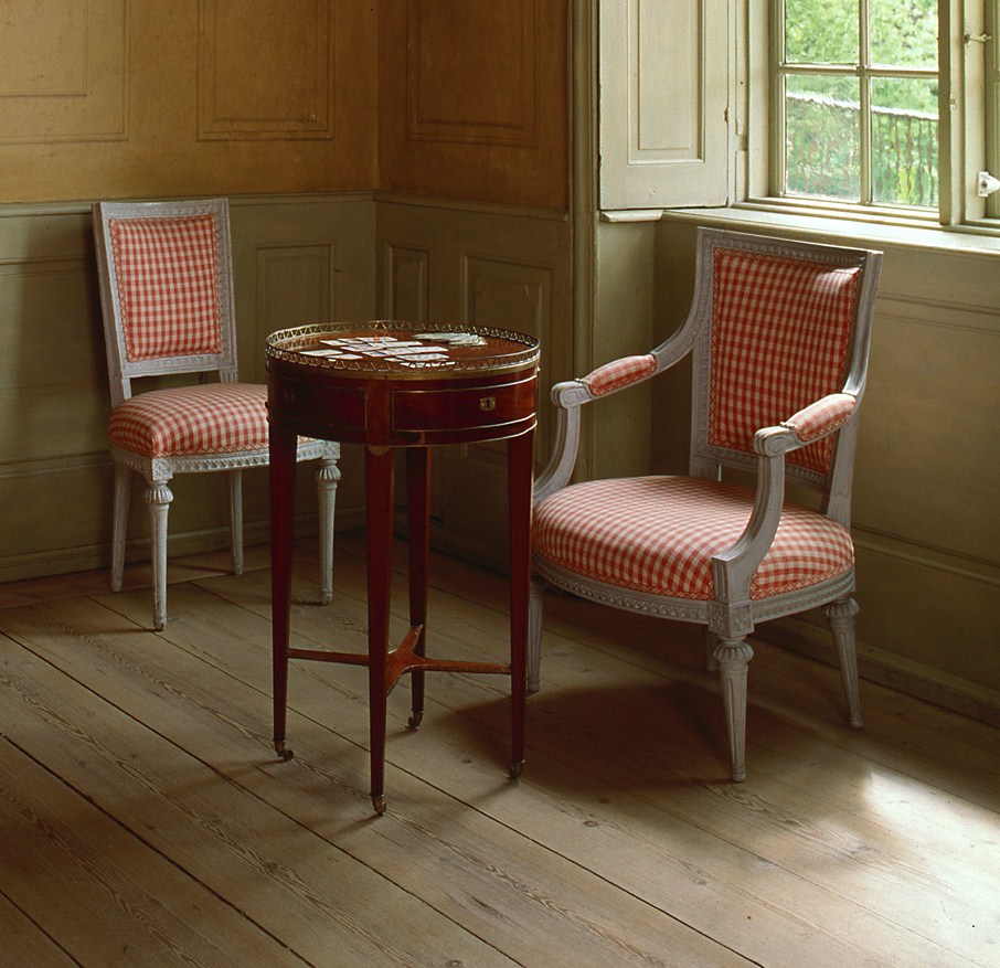
Frijsenborg Castle
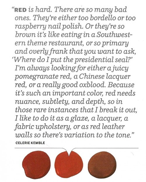 House Beautiful Color Celerie Kemble’s Advice
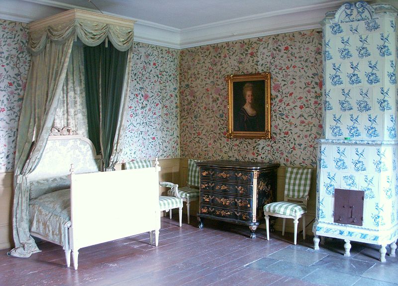
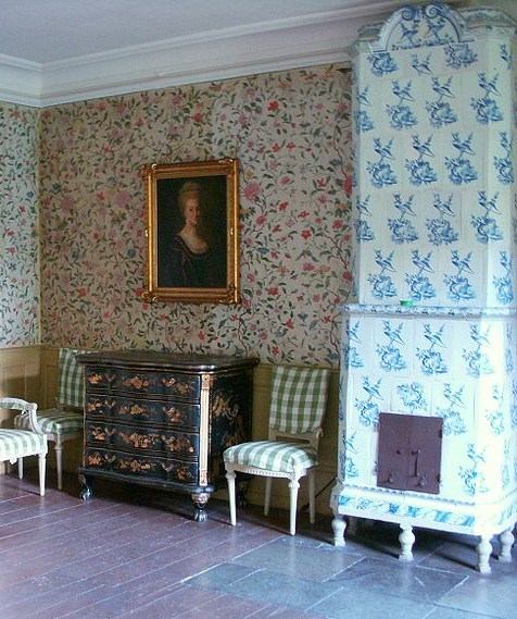
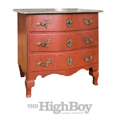 1760 Swedish Rococo Period Painted Commode thehighboy.com
Unknown Library Painted In Red
Photography By Simon Upton

Favorite Red Paint Colors Seen In House Beautiful Magazine
Hartwell House in Aylesbury, Buckinghamshire
Halmstad Slott, Halland, Sweden- 2013-02-10 by Giåm on Flickr (cc)
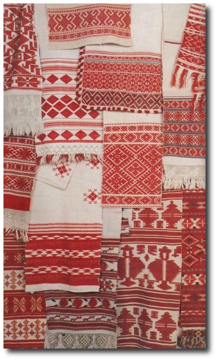
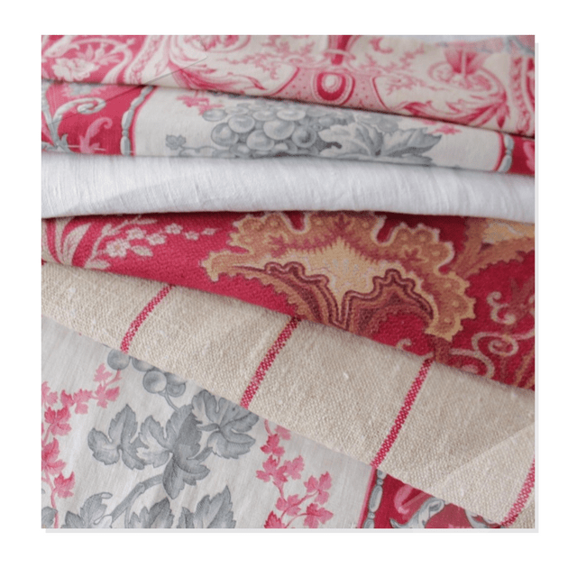
Beautiful Red Textiles Found on bohemianwornest.tumblr.com
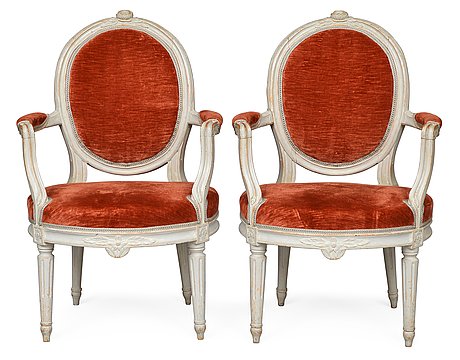
Gustavian armchairs signed Jacob Malmsten ( master in handcraft Stockholm 1780- 1788) from Bukowskis Classical auction 26-27 of May godsochgardar.se
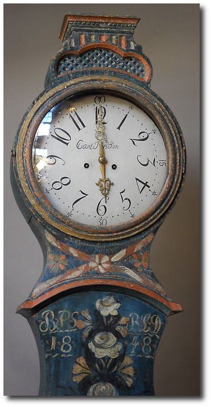
18th Century Swedish Gustavian Grandfather Clock from Stjernsund Castle. The clock face is signed by Daniel Frång from Stjernsund. The inside of the clock case has preserved newspaper articles from the auction at Stjernsund Castle as well as information about important Swedish antiques clocks.- Scandinavian Antiques
Rembrandt Paintings Seen On Habitually Chic Blog
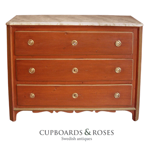 Early Gustavian chest of drawers, Sweden circa 1780, in secondary red paint. Chamfered corners, shaped bracket base, and faux marbled top. Cupboards & Roses
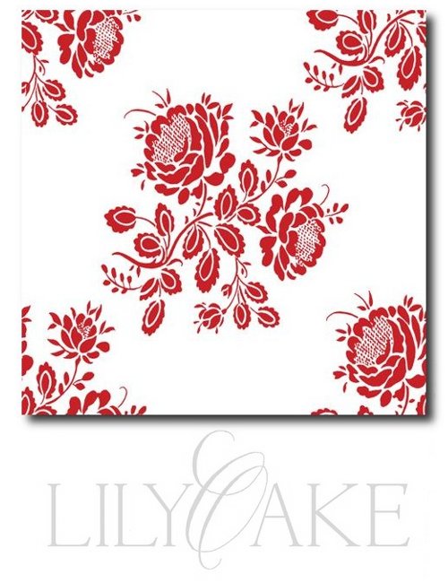 Gustavian Fabrics – Seen Pictured is Kristianstad Rose In Cranberry Red


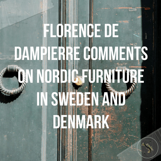
Florence De Dampierre Comments On Nordic Furniture In Sweden And Denmark
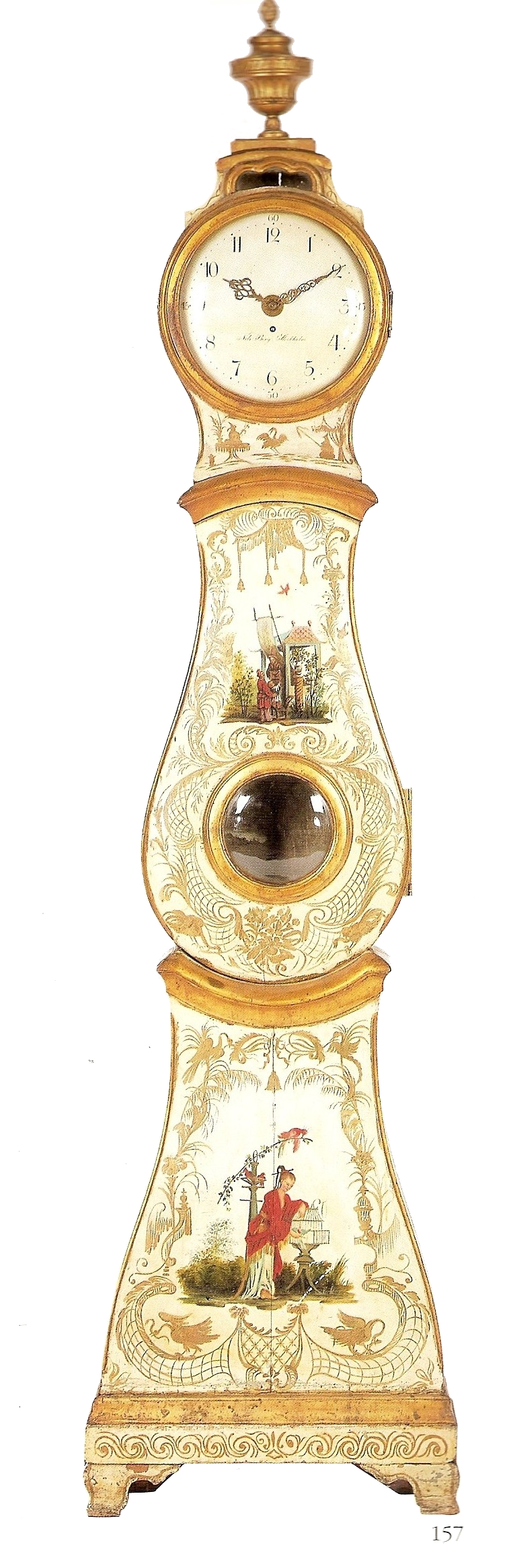
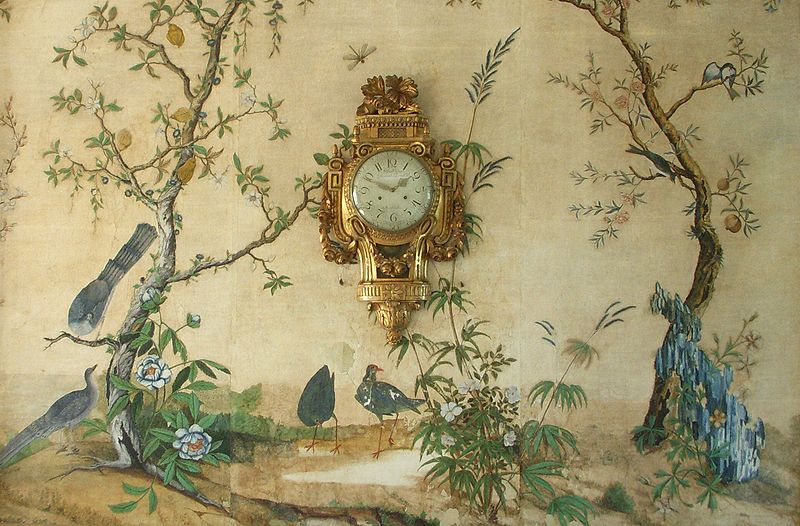
Chinoiserie found another outlet in the rare longcase clock at the right, made about 1765 by
Nils Berg, whose signature appears on the case.
The Best Of Painted Furniture By Florence De Dampierre, presents the tradition of painted furniture as it developed in Europe and the United States.
Dampierre, owns a New York gallery which features painted furniture, and specializes in tracing the art form in Italy, Spain, Portugal, England, Germany, Austria, Switzerland, Sweden, Denmark and America. She features French and Italian examples to simpler, more provincial American and northern European folk-art pieces. She talks about how art influenced furniture across Europe, as craftsmen adapted ideas and techniques. Various chapters discuss furniture embellishments and treatments from high art elegance to folk art simplicity.
Here are her comments on Sweden and Denmark:
Two important traditions of painted furniture developed in Sweden: the high-style aristocratic furniture that evolved from the international taste for oriental lacquer beginning in the seventeenth century- and the rural folk tradition, which grew up both in the manors of landowners (where it attempted to imitate its elegant counterpart) and in humble peasant dwellings. As late as the seventeenth century the great houses of Sweden were still closed fortresses—large rectangular structures furnished with imposing, simple chairs and tables. Tastes began to change by the end of the century when the architects Nicodemus Tessin and his son Nicodemus traveled to Italy, where they eagerly embraced the refined luxury of Italian and French styles. As the designers of Drottningholm Castle and the grand castle at Stockholm, the Tessins did much to spread the appreciation of sumptuous high Baroque decoration among the Swedish nobility.
Skane, the southern region of Sweden had painted furniture traditions of it own. Largely
derived from those of Denmark, since it was a Danish province until 1658. Southern pieces, primarily blanket chests and armoires, featured Rococo and Baroque decoration with rose bushes heavily laden with bloom. The Erik Eliasson style of painting spread from Dalecarlia to Skane at the end of the eighteenth century, intermingling with the
southern style.
Other regions invented their own designs. Painters from Delsbo or Jarvsd, in the Dellen Lake district, notably Gustavus Reuter, originated a version of Baroque style painting that was free of influence from other areas. In Jamtlancl (bordering Norway), the armoires, in typically Rococo style, were particularly interesting. In some areas along the seacoast, such as Blekinge, painted furniture was a rarity.
Florence de Dampierre | Facebook
Buy this book from Amazon for as little as $3.99
Picture Credits:
- Sköna hem Magazine
- Holiday Decorating in a Swedish Home Country Living Magazine
- Van Breems joins sons Lars and Martin in the kitchen for an afternoon of cookie-baking.
- Svindersvik, Stockholm, Sweden- Wikimedia.org
- Anders Zorn’s Studio in Mora
- Swedish Painted Trunk Seen At Country Gallery.com
- Country Painted Chest At Milord Antiques.com
- Överkalix Painting, See More At kurbits.nu
- Egeskov Castle In Denmark- www.skyscrapercity.com
- Swedish Painted Mora Clock- Swedish Decorating
- Close up faux painted detail of the clock
- Swedish Hand painted Cabinet Sold through Umbrella Home Decor
- The Best Of Painted Furniture By Florence De Dampierre
- A Swedish, Rococo Chest of Drawers Seller Dawn Hill Antiques
- This table-Liselund castle- made in 1795
- Stool in the neoclassical style seen at Liselund Castle
- The Best Of Painted Furniture By Florence De Dampierre
- Swedish Gustavian Console Table, C. 1810 , D.Larsson Swedish Antiques
- Gård & Torp Photo Karin Foberg
- “Story Time” (portrait of the artist’s father and daughter) by Knut Ekwall (1843 – 1912, Swedish)
- “Hårnäver” a headdress from Norra Ny in Värmland! (Sweden)Her hair is tied up in a red ribbon and she is wearing a hårnäver. This is a kind of diadem that is used as a hair band to keep the hair high up on the fore head. A hårnäver is made from two pieces of birch-bark that are sewn together with long stitches on the back. They are decoratively painted in red or reddish-brown. Matte paint is used to cover the hårnäver and patterns are painted on free-hand. Bark is collected from the birch trees – Found on folkthings.tumblr.com
- Furniture From Nordic Style
- Home of Lisa Larsson- Seen On jessimfine.se
- Svindersvik –Stockholms läns Museum
- Folk art trunk made by Stenström, from the south of Sweden, 1819. Bukowskis Market.com
- Swedish wedding chest with domed top dated 1809 Liveauctioneers
- Blue and White Porcelain Room
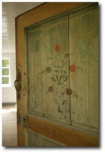
- Swedish Door Detail – KML Design.dk
- Mora clock – this is the rare Ångermanland Bride! The cases were made by local carpenters around 1820-1840. – Found on epokantik.com
- Egeskov Castle In Denmark- www.skyscrapercity.com
- Quenselska gården, Åbo, Finland. At that time Finland still was a part of the kingdom of Sweden. Found on sphotos-e.ak.fbcdn.net
- Ornak, A Folk Art Style Villa – See more of this property at Archdeco.org
- Original Painted Swedish Trunk, Dated 1843 Scandinavian Antiques
- Mora Grandfather Clock, circa 1842 Scandinavian Antiques
- Louis XVI Style Carved & Painted Cane Fauteuils Seen On Quality Is Key On Ebay
Swedish Mora Clock From Cupboards And Roses
Found on cupboardsandroses.com
Sköna hem Magazine
Light Green Painted Swedish Mora Clock Cote Jardin Antiques
Decorated Farmhouses of Hälsingland – Life Beyond Tourism
Fjällbacka, Sweden


12 Designers Pick Their Favorite Paint Colors – House Beautiful


House Beautiful often features the best designers with their favorite go-to paint colors. Sometimes having the just-right color can make a tremendous difference in a room, or on a piece of furniture. Here are some of my favorites that work with the classic Gustavian/ Swedish interior design themes.
Ann Wisniewski – Sherwin-Williams Emerald Fawn Brindle SW 7640,
Cathy Kincaid – Farrow & Ball Estate Emulsion Pale Powder 204
Kerry Joyce – Benjamin Moore Natura St. Johns Bay 58
Lisa McDennon – Sherwin-Williams Harmony Conservative Gray SW 6183
Whitney Stewart – C2 LUXE Seedling C2-188
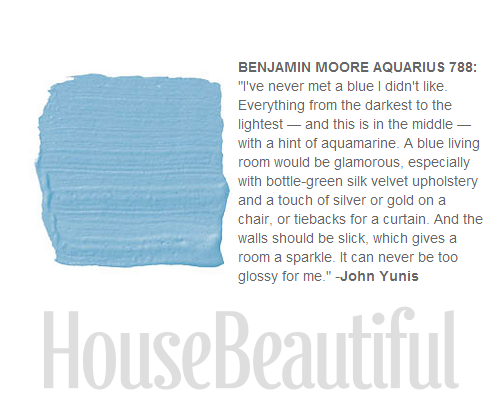
Allison Caccoma – Benjamin Moore Regal Harbor Haze 2136-60
Paul Corrie – Benjamin Moore Regal Select Blue Lace 1625
Ashley Whittaker – Farrow & Ball Estate Eggshell Pink Ground 202
Mara Miller – Ralph Lauren Paint Willow RLVM270
Kevin Isbell – Benjamin Moore Aura Buttered Yam AF-230
Lynn Morgan – Benjamin Moore Advance Nosegay 1401
Deborah Walker Sherwin-Williams Duration Gray Screen SW 7071
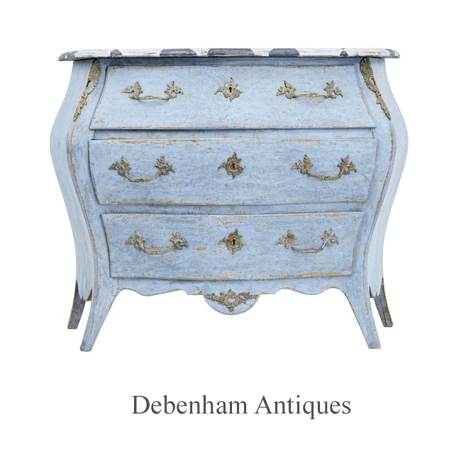
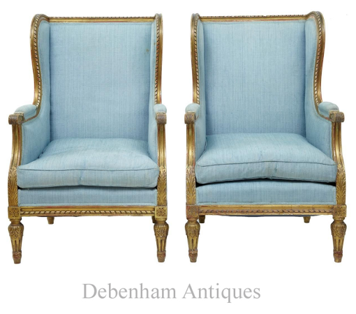
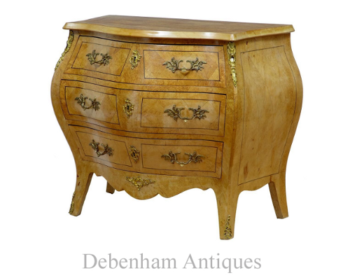
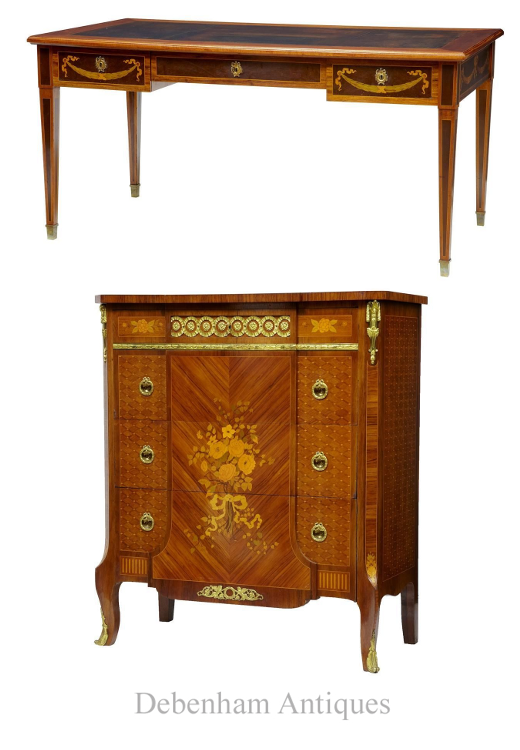
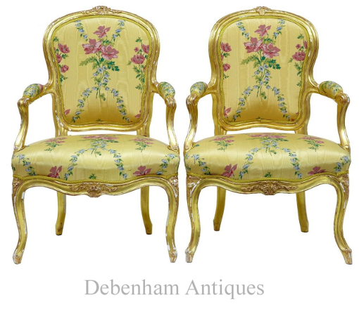
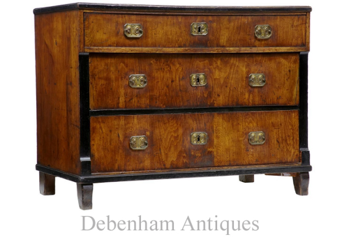
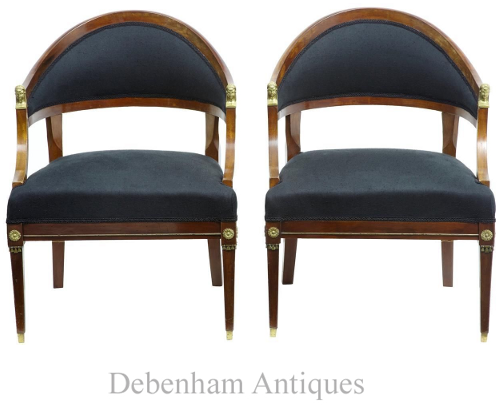
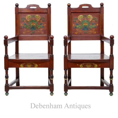
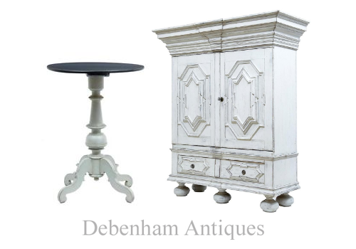
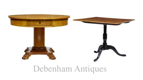
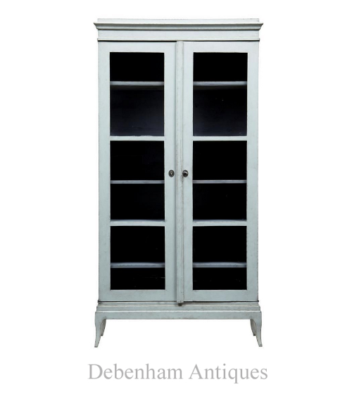
Swedish Antiques From Debenham Antiques

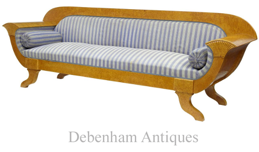
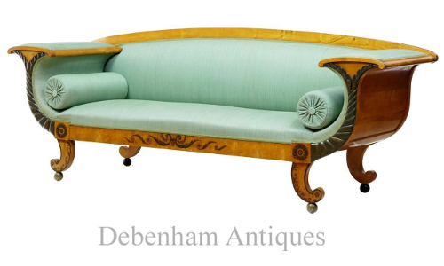 19th Century Swedish Birch Neo Classical Sofa US $5,540.37 On Ebay
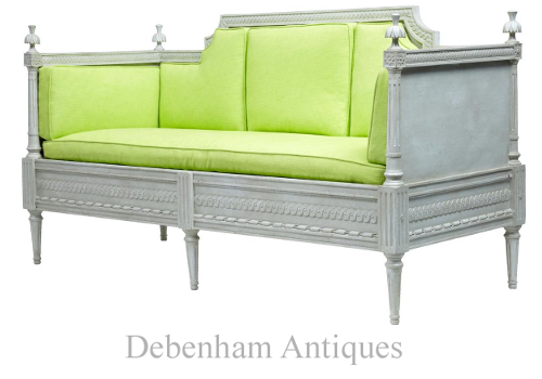
Early 19th Century Painted Gustavian Sofa -US $4,477.83 Beautifully carved, re-upholstered with fitted cushions- On Ebay
 Pair of 19th Century Carved wood French Armchairs US $3,718.88 On Ebay
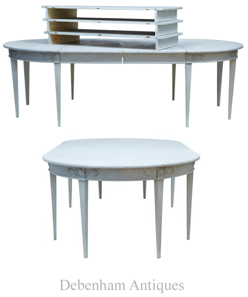
19th Century Massive Extending Swedish Painted Dining Table US $12,702.51 On Ebay
This table has been adapted to form many scenarios of use and size. Can be used as a round dining table, and comes complete with varying bearers to allow housing of 5 leaves. Fully extended at 167″ in length which is just short of 14FT. Could also be used as a pair of demi lune side tables when not in use for dining.
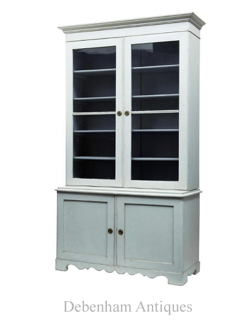 19th Century Painted Pine Bookcase Cabinet US $6,151.53 On Ebay
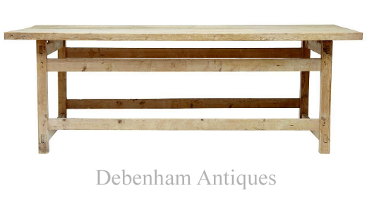
Circa 1880. Fine piece of Swedish rustic furniture which could lend itself to many uses such as a desk, kitchen table or dining table
Rustic 19th Century Pine Table From Debenham Antiques US $1,510.32 On Ebay
Early 20th Century Birch Root Swedish Bombe Chest Of Drawers- US $2,796.15 On Ebay
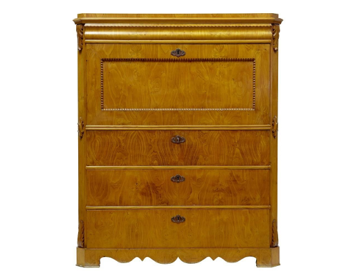
19th Century Swedish Elm Secretaire Chest Of Drawers- US $2,504.55 On Ebay
Massive 19th Century Biedermeier Birch Sofa Settee, US $5,236.79 -Length: 108 3/4″, On Ebay
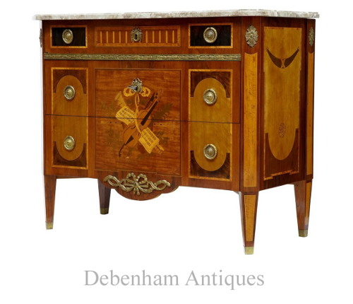
19th Century Inlaid Swedish Kingwood Commode US $2,959.92 On Ebay
Profusely inlaid and decorated with various woods such as satinwood and walnut. Detachable marble top with ormolu handles and decoration. 3 drawers which open on the key- circa 1870
 19th Century Mahogany and Satinwood Inlaid Desk $4,477.83 On Ebay
Early 20th Century Mahogany Inlaid Commode- US $3,718.88 On Ebay
 Pair of 18th Century Louis XV French Gilt Fauteuil Armchairs By Michard US $7,513.65 On Ebay
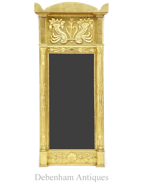
19th Century Antique Swedish Carved Wood Gilt Pier Mirror -US $3,718.88 On Ebay
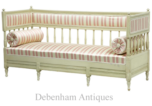
19th Century Painted Swedish Day Bed Sofa, US $3,263.51- On Ebay
19th Century Antique Biedermeier Birch Commode Chest of Drawers -US $2,504.55, On Ebay
 Pair of 19th Century French Empire Mahogany Armchairs US $3,718.88 On Ebay
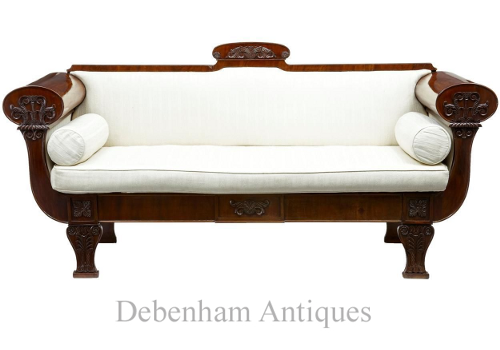
Early 19th Century Antique Carved Scandinavian Mahogany Sofa US $3,415.30 On Ebay
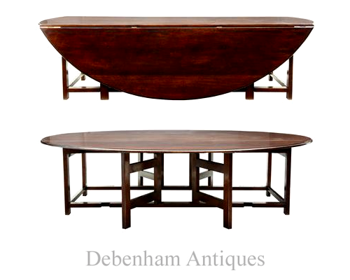
Massive Mahogany Cherrywood Gateleg Table Seats 16- Can be made up to 18 feet, 9FT 6INCH X 8 FT On Ebay
Pair of 19th Century Painted Pine Swedish Armchairs- US $1,510.32, On Ebay
Swedish arts and crafts influenced. Made from pine, painted with floral decoration to the back, gold lining to the seat, continued with painted elements to the freize and turned legs
 Early 19th Century Swedish Occasional Side Table US $1,176.38 On Ebay
Early 19th Century Biedermeirer Birch Drum Table US $4,326.04, On Ebay
19th Century Swedish Birch Square Tilt Top Table – US $1,897.39 On Ebay
19th Century Painted Gothic Swedish Cabinet US $6,311.31 On Ebay
 19TH Century Swedish Painted Pine Bookcase- US $3,507.17 On Ebay
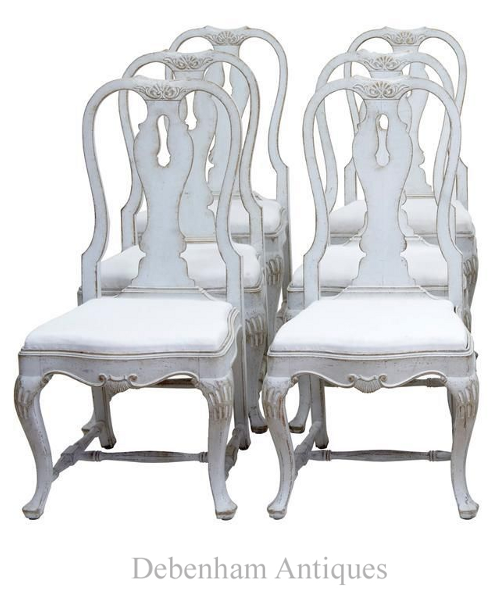 Rare set of 12 -19TH Century Queen Anne Influenced Painted Swedish Dining Chairs US $12,702.51 On Ebay
5 Faux Wall Painting Techniques That Are Easier Than You Think
If you are wanting depth to your walls, here are some of the very simple faux finishes you can do yourself.
Start by selecting a color theme for your room. In this post you will see a variety of color examples from pale blue, to lighter warm yellows and lighter greens.
Working with glaze, crackle finishes, and distressing techniques can make your furniture appear older than it is. Likewise, layering paint on your walls will also create depth and give you that old world look we all have fallen in love with. Here is how to do it…..
1. Ragged Finishes
Color washes are finishes that are produced with rags and paint.
Color washing is usually is achieved by a using rags which attach to a roller.
The trick to achieving this finish is to work with translucent glaze. Don’t attempt this finish with solid paint. Using a glaze mixture of (half glaze, half paint), paint is applied over a previously painted wall. The effect it produces a subtle textured finish.
A Primitive Effect Using Green, seen on www.ralphlaurenhome.com
Notice the whole wall isn’t ragged, just a small portion of it. Also painted furniture in the same tones are paired in this room to join together the various looks.
Keep All Tones In The Same Color Family
- One tip that I have learned through ragging finishes is to have the glaze mixture matched to be a few shades darker or lighter than the wall color. If you decide to do three colors, keep the tones quite close in color. The overall effect will be soft, and subtle.
Glaze + Paint For A Final Top Coat
- Another trick I have learned is to go over your entire project with a layer or two of glaze mixed in with a small amount of paint. The entire effect of the tinted glaze dulls the look slightly, and hides the roller effects. The idea behind this is to make your work appear subtle. You want to keep people guessing as to what you used to complete the finish.
2. Dry Brushing
Brushed finishes, is an effect which is achieved by dipping your brush into paint, and then removing most of the paint, on a rag. The small amount of paint allows you to add a very soft effect over a previous layer of paint.
The effect depends much on the brush you use. If you use a badger softening brush which tends to be very large and soft, it will produces a soft effect with paint.
I have used this effect with an old broom handle. The bristles are thicker, and harder, and produces lines than a soft shading.
Again, mixing together paint + glaze will allow you to get the look of an additional layer with a faux effect, and you may not have to wipe off the excess paint.
- In this picture, this effect can be achieved by using a dark brown artists oil paint. Most of the paint must be removed from your brush to achieve this look. This look can be achieved using brown artists oil paint over a muted orange base coat, slightly brushing the which highlights some of the raised details.
- Achieve depth to your furniture by applying a lighter coat over top of a painted finish. As you can see with this look, a lighter shade of green-gray is applied over a darker shade of green. This look could be achieved by dry brushing.
3. Sponge Finishes
Sponged faux finishes are those which a paint mixture is applied with a sea sponge.
Sponge painting is still the best and most frequently used mediums when it comes to classic faux finish painting.
Using a sponge, you can use multiple glazes layered over solid paint which gives the illusion of great depth.
Ideally, like most finishes, you want to start with a base coat, and build on it using a glaze mixture. The overall effect should be soft and serene.
Sponging can also be used on furniture to give an old world Swedish look.
In the past, I would use a base coat of brown, and then after it was dry, I would apply a base of oil paint in butter yellow and use a rag, or a textured paper towel to remove the paint. Within just a few minutes of applying the paint, I would remove it, and the oil paint which was wiped off on the rag I would then slightly dab here and there, on the furniture to create a very soft effect, making it seem as there was more layers to the paint finish. After it was dry, dry brushing with the same oil paint was used to blend in the textured effects.
4. Faux Leather
Terrific faux effects can be produced using a very heavy garage bag. Again working with a wall that has been painted, apply a layer of a glaze mixture on the wall. More than half glaze to paint.
Tape the wall in rectangular sections and apply the glaze in the taped area.
Next apply a heavy weight garbage bag to the wall allowing the folds to be pressed into the wall using your arms and hands.
Take the garbage bag off, and the folds of the bag produces a beautiful faux finish.
This is a very easy way to create a classy effect on the walls.
– Great Article- How To Faux Paint
5. Stenciling
Stenciling can be very powerful if it is done right.
Create your own stencils using a stencil cutter which is a fine heated tip that cuts through the plastic blank stencils with precision. Lay a piece of glass in between the stencil and the pattern, and cut away.
17th and 18th Century stenciling has always been the very best model of inspiration.
Here are a few very well done Swedish stenciled homes:
– Book Review: Jocasta Innes Scandinavian Painted Furniture
–Ted and Lillian Williams chateau in Normandy, France
-Neoclassical White Stenciled Walls-Petit Trianon
-Antique Original Red Hand Painted Trunk with Rosemaling Floral Motif
-This photo shows a great example of wall framing simply made by stencils and paint
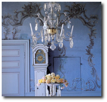
-Here we see a stunning Rococo design stenciled, or hand painted on the walls for a distinct Swedish look.
6. Complicated Faux Finishes – Marble, Tortoise Shell, Walnut Woods
Not all faux finishes are easy. Some of the advanced finishes are rather difficult. To get an idea of a master faux finisher, check out Pierre Finkelstein. He is the author of The Art of Faux– The Very Best Book for advanced faux finishes. He focuses on the advanced finishes such as Marble, Granite, lapis and malachite, and everything in between.
Marble and any stone for that matter can be painted to produce the high end looks that are often seen in expensive mansions and castles. Faux marble can be painted on to columns, trim, doors, crown molding, and fireplaces.
Anyone can learn these finishes with practice and the right guidance.
Check out my inspirational “faux” gallery in the Swedish and French Decorating Group.
Book Friday: Scandinavian Design On Martha Stewart
Magnus Anesund | Söderberg Agentur
Lars Bolander’s Scandinavian Design
Lars Bolander’s Scandinavian Design Found on US Interior Designs Blog
Faux Marble Bombe Chest- Ebay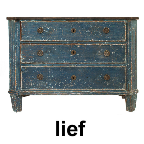 Three drawer Gustavian Chest in a worn black and blue patina- Lief
Lars Bolander’s Scandinavian Design Found on The Essence Of The Good Life Blog
Swedish Interiors- Judith Miller
Antique Swedish canape – Augustus Brandt
Swedish Interiors- Judith Miller
La Cuisine… Before And After,Two Maisons.com
“Dishes are stored in an 18th century armoire from Uzes, very simple, sober lines. It’s a brownish purpley color that I also have in some of the pottery scattered around from the Alsace region of France. (The purpley brown glaze was created using magnesium.) Antique Swedish chairs and French Directoire table that we can extend to feed a crowd.”
La Cuisine… Before And After,Two Maisons.com
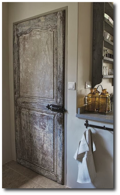
“I scraped the paint off of an 18th century door to use on the pantry, inch by tiny little inch.”
Swedish Design – Seen On lamaisonfou.blogspot.com/
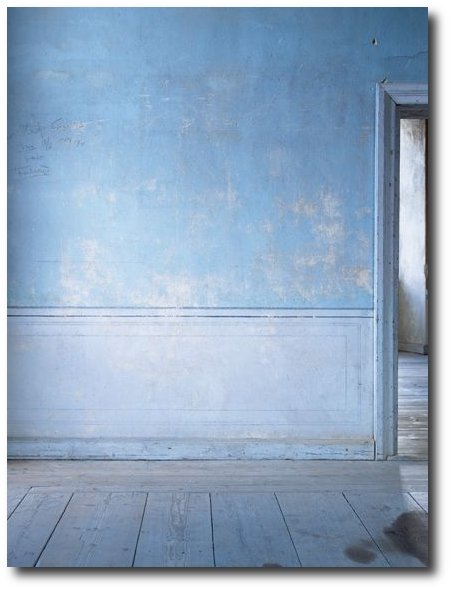
Swedish Gustavian Decorating Ideas- Primitive Faux Wall Painting
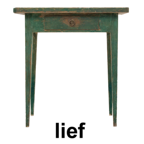
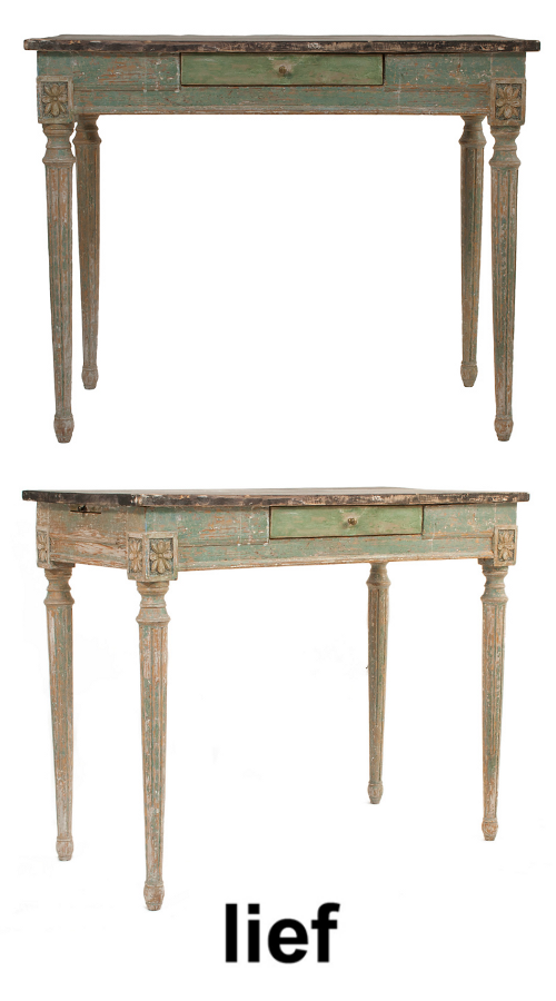 Small Gustavian Desk in a worn green and black patina – Lief
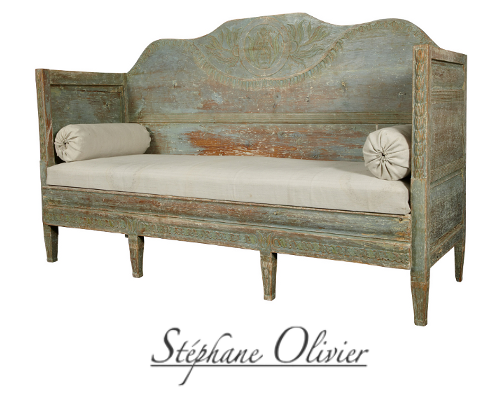 Gustavian Pale Green Swedish Sofa With Tall Back Stephane Olivier
The Houses of Veranda – ALL the Best Houses Featured in Veranda Magazine $37
The Houses of Veranda – ALL the Best Houses Featured in Veranda Magazine $37
Architectural Digest, Southern Accents, Veranda and others all regularly feature homes that have faux finishes on everything from walls to furniture. Paint finishes have evolved since the 80’s when faux finishing was given a bad rap. With many interior magazines featuring upscale 17th and 18th century European homes with extravagant antiques there has been even more of a push towards painted faux finishes to achieve the same look for less.
Faux finishes can be applied to almost any surface. Paint has been used since the earliest of times to transform walls, ceilings and furniture, and today it is being used on cabinetry, floors, ceilings, walls and all types of solid furniture.
The most popular decorative finish techniques include sponging, ragging and to the harder techniques such as marbling and wood graining. The above finish was likely paint rubbed into raw wood. Multiple layers of blue which are then sanded down to produce the effect above.
Swedish Paint Finishes Lars Sjoberg
 Gustavian Side Table with one drawer in a worn green and black patina
A very soft faux finish using two colors
Lindsay McCrum’s Chicks with Guns on Juxtapoz.com
Bunny Mellon’s Garden At Her Oak Spring Estate in Upperville, Virginia
Bunny Mellon’s Garden At Her Oak Spring Estate in Upperville, Virginia
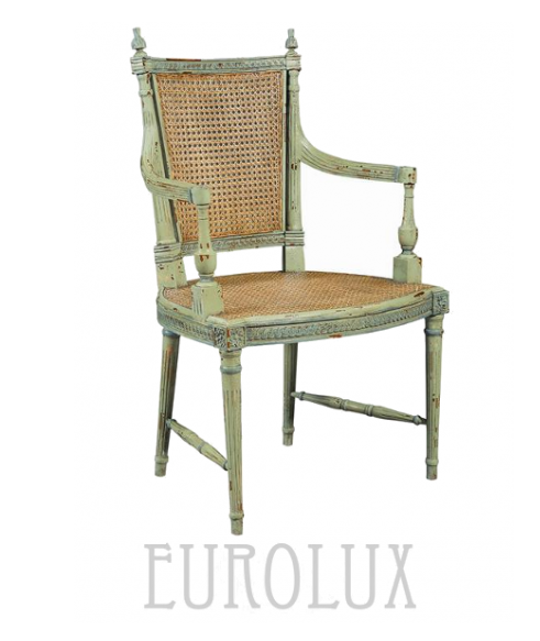 Chair From Eurolux Antiques $1,001.00
Vreta Uppsala Sweden Taken By Eric Boralv’s Flicker
Scandinavian Bedroom Featured on Decorology Blog Originally Seen on Scandinavian Chic
I ran across Pbc Style Blog featuring larger pictures of this estate I was excited to find out more about this home. The Mount is classical revival in style, complete with formal gardens. Wharton designed it herself, based on the ideas she outlined in The Decoration of Houses. The house is located in the Berkshires, more specifically, Lenox, Massachusetts, and Wharton drew inspiration for its design from Belton House, a 17th century Palladian-style English country house.
Borrow this look by painting molding in a color that stands out. Here we can see that molding can really speak volumes and add so much personality into a room
Layer two greens to get the look of this headboard. Dry brush a lighter green to produce a layered effect.
Decorating Using Green From World Of Interiors Featured on Trouvais Blog
Outstanding Mural Finishes, obviously completed by a very talented painter.
Photographs from Will Pryce – photographer based in London Will Pryce Photos
Louis XVI Style Square Table with Marble Top Bella Cottage
Hand-Painting Faux Marble Photography by Pieter Estersohn


Decorating Secrets- 60 Quotes From The Best Experts In Design

Swedish winters are long, dark and dreary, so historically Swedes have always turned to lighter interiors. Swedish style isn’t all about the gray and the white interiors they are famous for, but many homes feature brighter, richer colors to decorate around.
There are so many shades and tones of paint, that it can be impossible to decide on one color. Buy sample-size colors to help you make the perfect selection. A color can look quite different at night than the day. We recently painted the outside of our home, and the color which looked to be a creamy yellow at night, turned green in the day. Be sure to try your selected colors on a few different walls to determine what suits which room. You’ll thank yourself for making this extra effort before spending $$$ on the wrong shade.
Don’t judge the room until the paint is in place, and accessories and furniture are placed. A color which may seem to bright can be toned down by wall accessories, coordinating drapes, and art work. Consider working with the off shades of the primary colors. Intead of purple, consider lilac, or a raspberry tint.
Consider whether you are a warm or cool person. I once was asked this by a hairdresser, looking to choose a shade of blonde. I never gave it much thought before, but knowing which color you lean towards can certainly make picking colors a lot easier. Earthy reds, dusty warm plums, and rusty golds are in the warm color range. Silver blues, mint, and lavenders are colors which are cooler.
Advice From Pros
“Design is not just what it looks like and feels like. Design is how it works” Steve Jobs
“Green pigment was expensive in the 18th century, making it a status symbol. So it would have been appropriate for the royal governor’s house. I’ve been a curator at Colonial Williamsburg for 20 years, and when my husband and I lived in a historic house, we had similar green woodwork. It worked with every fabric I wanted to use, and it’s a great mood enhancer—chlorophyll for the spirit!” —Liza Gusler
“People think that they need to use small furniture and light colors to make a small room look big, but that’s not the case at all. Dark colors and just a few pieces of large-scale furniture, with the appropriate lighting and accessories, can give a room a larger, more luxurious feel.” —Mona Hajj
“Everything else in my house is off-white and grey, and I just had to have a break from that. I was looking at my pond, which is this murky shade of acid green, and I thought, ‘I’ll do that in high gloss to make it even more watery and translucent.’ It’s strange, but I love it.” —Stephen Sills
“Luxury must be comfortable, otherwise it is not luxury.” – Coco Chanel
“While looking at one of my first New York apartments, David Hicks told me diplomatically,’Dear boy, if you’re going to paint the walls white, you need art.'” Peter Dunham
“The only time white curtain lining should be used is with white curtains- J Randall Powers
“Use the precious for everyday purposes. We’ll rummage through clients closets and find loads of precious hand-me-downs like porcelain vases and crystal that are a bit out of vogue. We’ll use them for completely ordinary purposes – a case becomes a chic pencil holder, a crystal bowl holds makeup brushes. Turn the ordinary into a special moment” Benjamin Dhong
“I learned that passion about objects and furnishings makes for fearless decorators—and that if you are comfortable in your home, everyone else will be too. That sense of authenticity is what gives a home its soul.”- Courtnay Daniels Haden
“The most elegant interiors are just slightly tatty.” – David Netto
“Playing it safe. Instead, put a large-scale printed fabric or wallpaper on the walls and even the ceiling. It’s easier, safer, and less expensive to be dramatic in a small space. You might get tired of a bold print in the main living area, but it can make a smaller, less-used room an exciting space to spend time.” —Victoria Neale
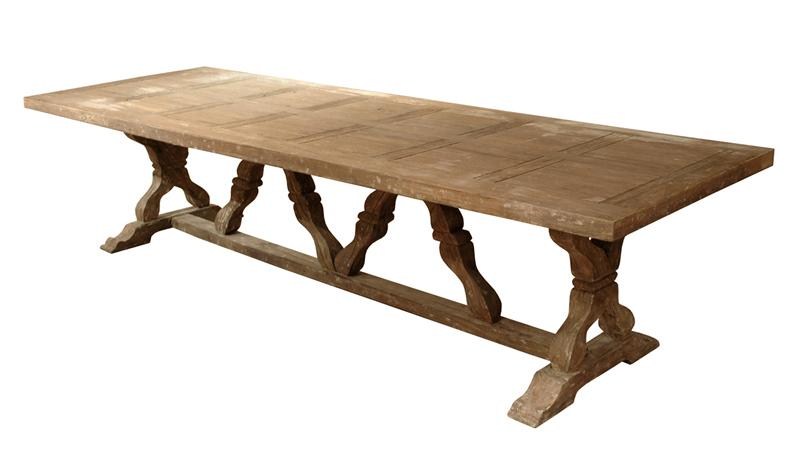
Breathtaking Weathered Dining Tables You Can Buy Online
French Louis XVI Directoire Provincial Walnut Dining Table- Quality Is Key On Ebay $765
French Louis XVI Style Drape & Bow Carved Painted Dining Chairs $1436 Quality Is Key On Ebay
Consider this stunning Maison table available from World Bazaar Exotics on ebay, listed at $1,188 for your Swedish Gustavian styled home.
Dimensions: 48″ Version: 48W X 47D X 31H, 68W with leaf, 72″ Version: 72W X 47D X 31H, 92W with leaf
This outstanding table with timeless 18th century style is crafted out of solid oak with aged finishing techniques that will surely impress you and all your guests. This deep grey finish will work quite perfectly in a Gustavian styled home. This table includes one 20″ drop-in leaf extension.
Restoration Hardware also sold a very comparable table inspired by 19th-century French Empire design. RH’s table is also built from solid oak, and had a full skirt and slender tapered fluted legs. A weathered finish also lends itself to a look that has been aged for years. RH’s price ranges from $695 – $1495
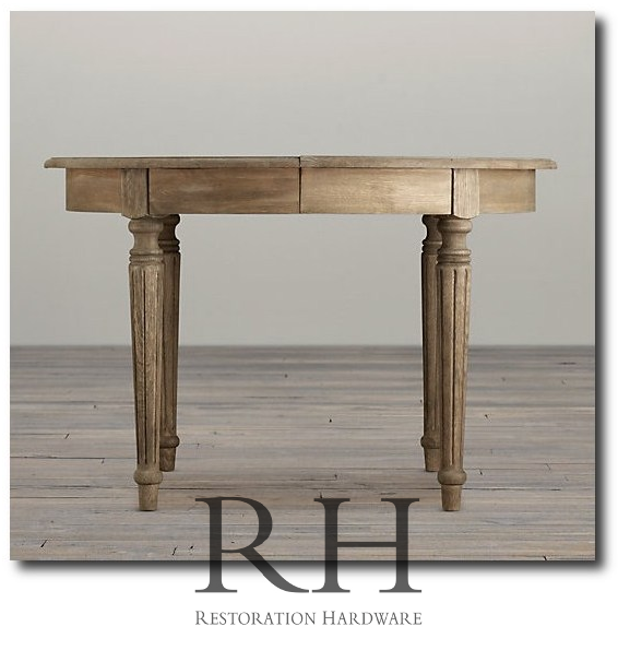
Restoration Hardware’s French Oval Table

Gustavian Oval Gate Leg Table
Gustavian furnishings have an uncanny ability to express serious sophistication without ever veering into the indulgent, foo-foo, or precious. This oval dining room table is a classic example of serious form following the functionality that only a drop leaf surface can provide. Whether placed in a loft of cottage, city apartment or large estate, this piece just works. 31 inches high x 63 inches wide x 77.5 inches long

Swedish Dining From Traditional Home, April 2007

French Country Louis Dining Table $3,348
A graceful 18th century style piece reminiscent of the French country aesthetic, this generous dining table will please those devoted to beauty and simplicity. Fashioned from solid oak and elm, the rounded edges and legs create a gentle, rustic effect.

Beautiful White Rent Table – Seen In The Home of Shannon Bowers
Carl Larsson Table From The Gustavian Collection
Louis Extension Dining Table French White Solid Hardwood- Buy it on Ebay
The Napoleon collection faithfully captures the romantic feel of vintage, painted furniture from the French countryside. Featuring gently curved frames made of solid hardwood, brightly colored then rubbed down on the edges. Adds a soft splash of vibrance to any setting. $2,200.00 71″ to 91″ x 43″ x 30″, (91″ fully extended ) Oak wood

Harlequin Set of Twelve French Dining Chairs in Grey Linen Antony Tood
Linley Heavy Distress Farm House 14 Person Trestle Dining Table $3,938.00
The Perfectly Imperfect Home: How to Decorate and Live Well
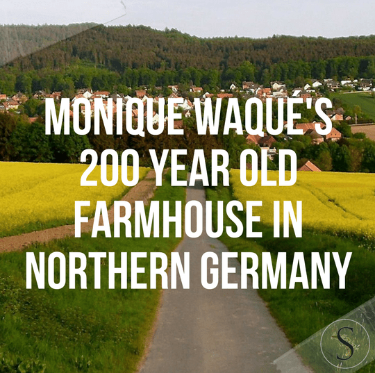
Monique Waqué’s 200 Year Old Farmhouse In Northern Germany
 Photography by Andreas Von Einsiedel Picture Credit
Owner Monique Waqué discovered this 200 year old farmhouse located in northern Germany, and turned it into her dream home. The house is decorated with Gustavian furniture in a Swedish country look. You can get her style too with a few key furniture pieces.
There are a number of Swedish dealers on 1st dibs that sell authentic Swedish Gustavian chairs just like what Monique Waqué has in her home. Buying antiques from Sweden allows you to get genuine pieces that have been loved for years. As you can see Monique Waqué has Gustavian country chairs at her dining table in a pale yellow.
This home certainly has a country flare. All the choices are rustic, painted with country Swedish colors. An oval tray sits on the coffee table. Consider turning to a hand painted tole tray in the color scheme that you are basing everything around. My favorites are the floral tole trays which have an elegant feminine country appeal. Collect a color and consider painting your walls to match the tole trays. The floral hand-painting gives a very distinct country look.
Getting this look doesn’t have to cost you a fortune either. There are a number of chairs that have this same look for less.
Check out this post for lovely Linen Sofas– I have collected several pages of lovely linen sofas available on amazon. (Located under the Skona Mag Picture- It takes 2 minutes to load the widget)
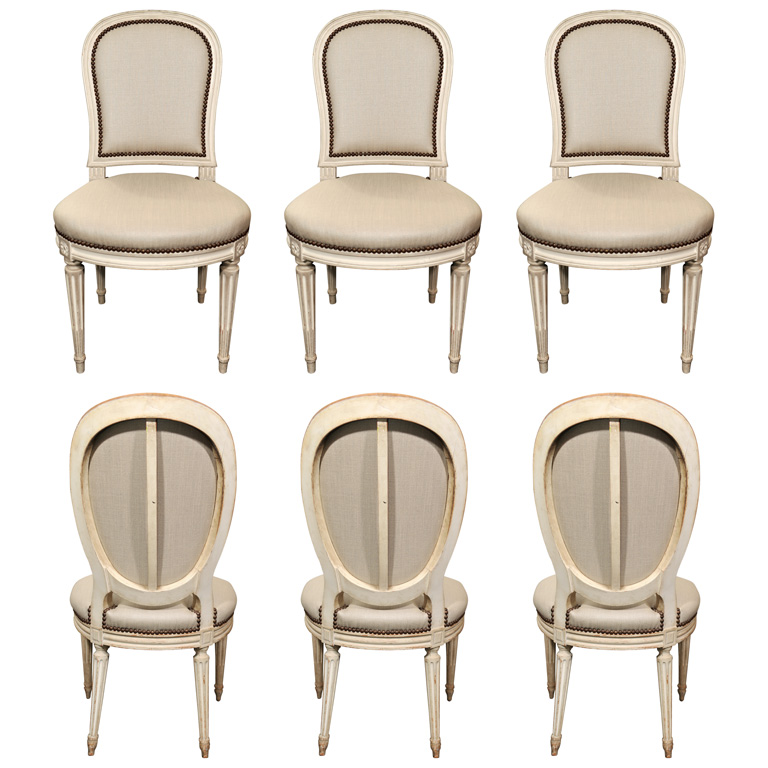
Set of six, 18th Century style, Gustavian chairs. Beautiful scraped patina. Strong construction. Perfect set for dining chairs –the GARTEN Antiques and Garden Elements
- The Chestnut Hudson Dining Chair $199
- 5-Piece Shaker Dining Set, Black $299 Why not sell the table and keep the chairs?
- Tapered Leg Table One that Could Be White Washed $270
- Small Tapered Leg Table- Could be One in Front Of The Sofa Or an End Table $99
- Perfect Bench For A Hallway or Dining Table, or Even As Patio Furniture $106
- Lovely Tapered Leg Console Table $121.
- Low Bowl Urn with Handles $29 Celery Green
- Petricia Thompson Antiquites d’ Europe
- Cote Jardin Antiques
- www.georgialacey.co.uk
- lizalaserow.wordpress.com
- brownrigg-interiors.co.uk
- Talisman
- Galerie Half
- A Tyner Antiques
- Laserow Antiques
 Monique Waqué’s Bedroom

Hooker Melange Sofia Writing Desk sold by Hooker Furniture is an antique reproduction of the classic Louis XVI desk.


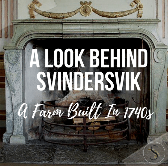
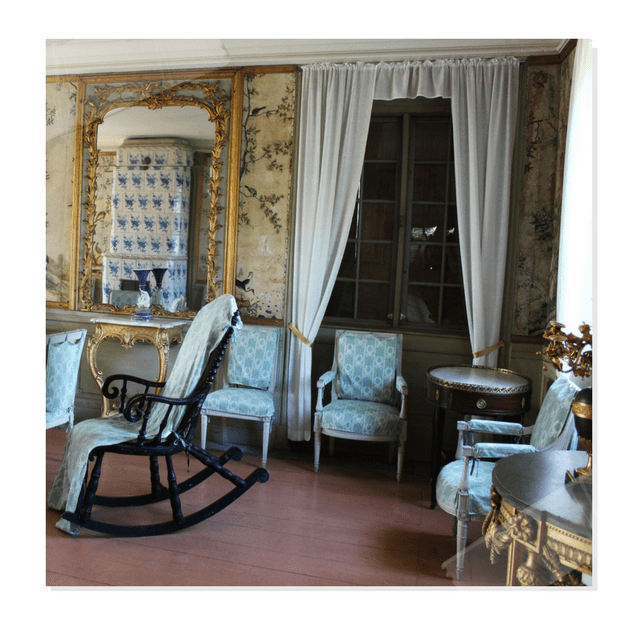
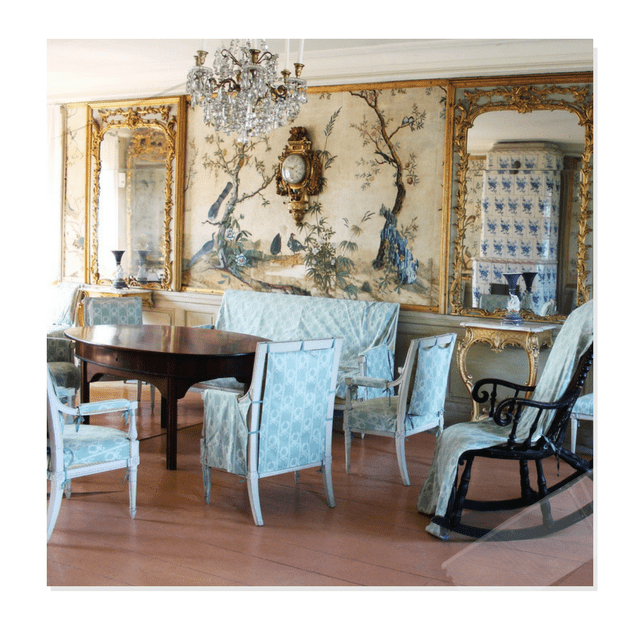
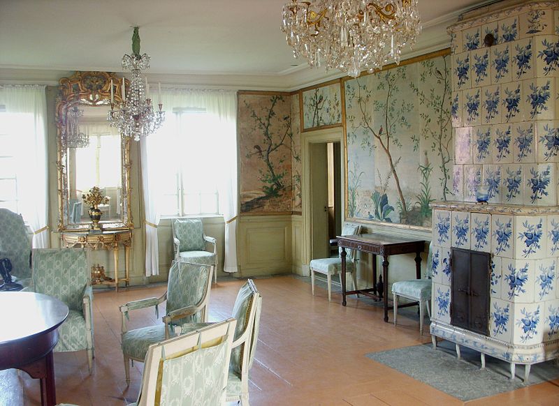
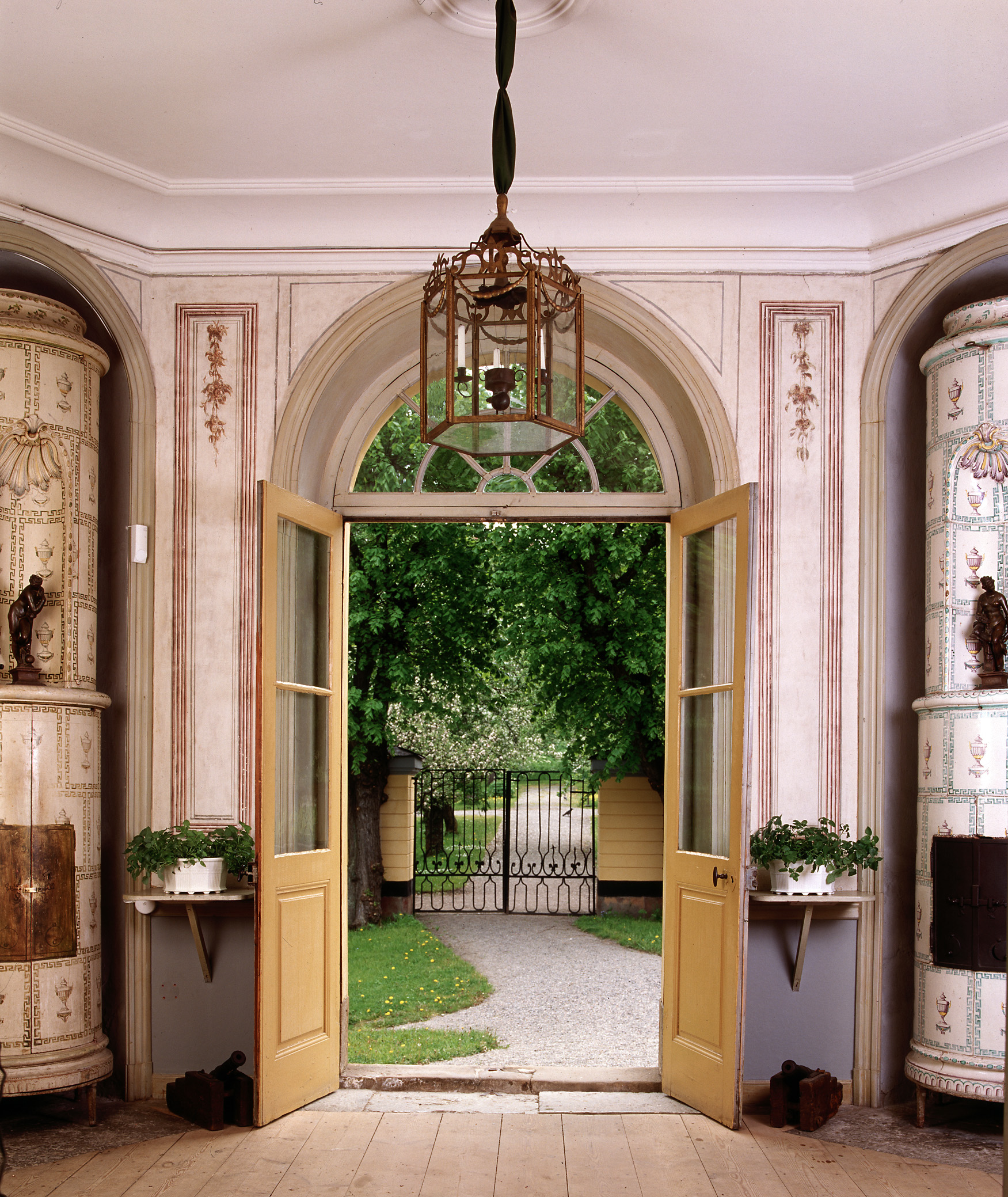
A Look Behind Svindersvik, A Farm Built In 1740s
Svindersvik is a well-preserved summer residence from the mid-1700s. Svindersvik is located at Swine Flinders Bay south shore in Nacka , designed by architect Carl Harleman for merchant Claes Grill.
The farm was built in the 1740s as a summer residence for the merchant Claes Grill and his family. Carl Harleman managed to combine a mansion and a cottage in the same building. He had been inspired by French rococo,but adapted it to Swedish conditions.
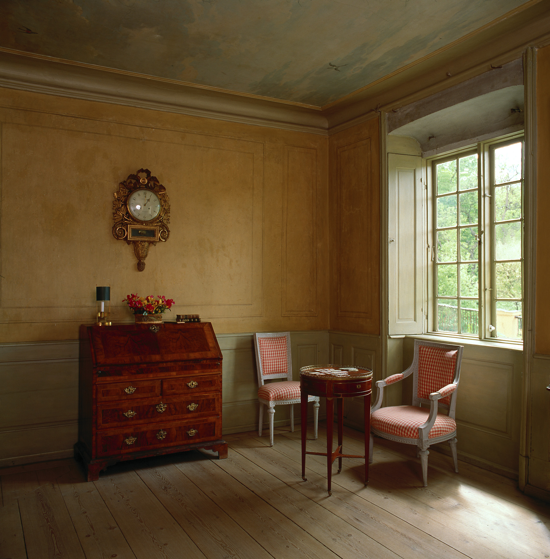
Svindersvik consists of a small main building on two floors. The building is strictly symmetrical form given, with a central axis through the entrance, dining room and balcony. To the left of this central axis is a big place, the right two smaller rooms, including one bedroom. The rooms are tiled and silk upholstered seating. The ground floor is a hallway with an oval ceiling opening through which the daylight from the top floor looking down. The upper floor dominates a large billiard room with pool table from the 1700s, which is well preserved.
Besides the main house is the kitchen wing, which is slightly younger than the main building. The kitchen wing is on an older foundation, probably from the 1500s. The kitchen was for the time very modern, with built-in cabinets, marble countertops and sink.
Most of the furniture in Svindersvik has stood there since the late 1700s. After the Grill family, the property had several different owners, until Knut Almgren , founder of KA Almgren Silk Weaving Mill, acquired the property in 1863. Svindersvik stayed in Almgren’s possession until 1949 when the Nordic Museum took over. Information and Pictures From Wikipedia, and Nordiska Museet
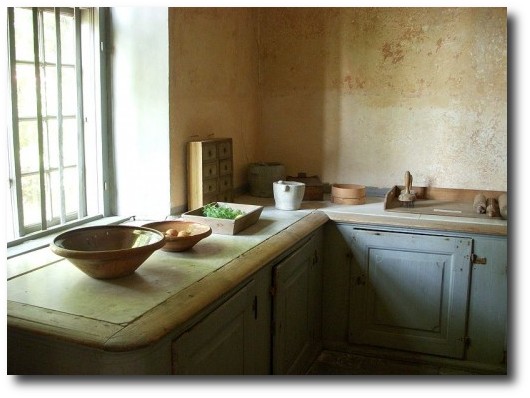
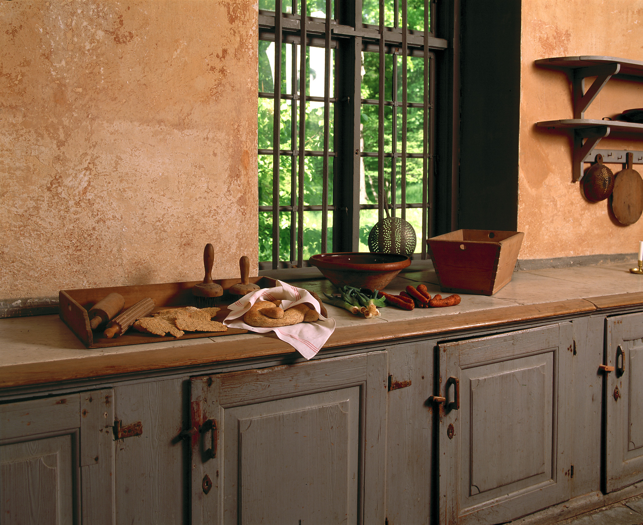
Check out the primitive wall shelves in the kitchen of Svindersvik . The corners are rounded, and pots and kitchen utensils hang below. If you like this look, consider the rack built by Shaker furniture. They have adapted our Shaker Peg Shelf for use as a hanging quilt rack. Although it is designed for quilts, it can be used to hang utensils, or pots from like the picture above.

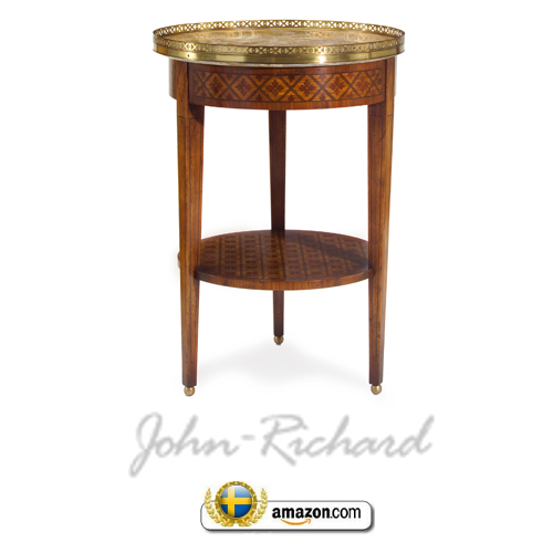
If you are looking for more of a genuine French Louis XVI antique like the table in Svindersvik, look at John Richard’s table in marquetry. This table features the tapered table legs, and a marquetry finish applied by experts. The top has brass details which make this table shine like the jewel it is.


Swedish Gustavian Furniture 18th Century Swedish Decorating


A CLOSE UP LOOK OF THIS Gustavian Setting- Swedish Gustavian Furniture 18th Century Swedish Decorating
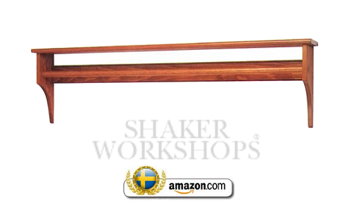
Primitive Rack With Dowel Kit
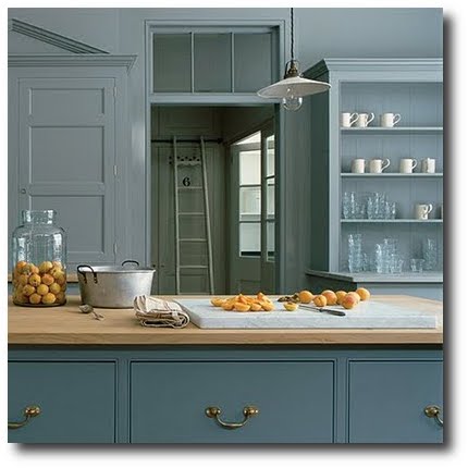
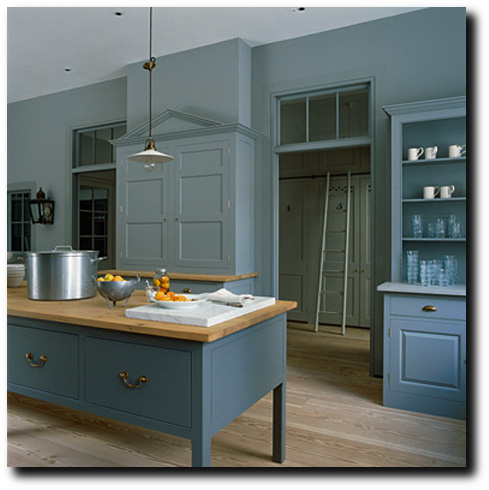
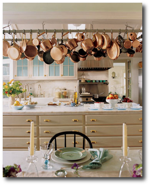
Stunning European Paint Colors For Painted Kitchen Cabinets
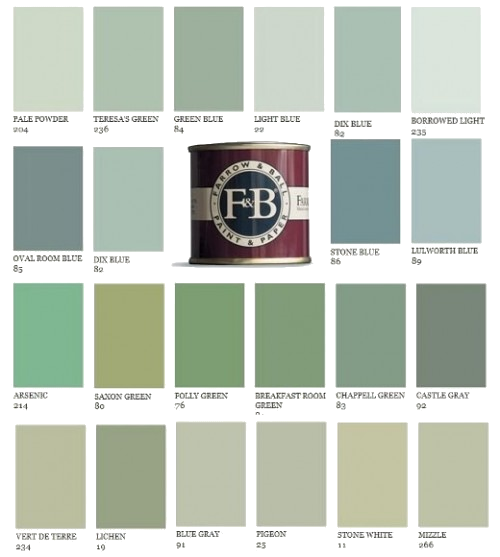
The Beautiful colors found in the Farrow and Ball Paint Line
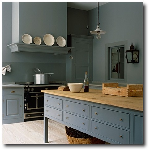
Plain English Kitchen Designs in the UK shows some beautiful kitchens painted in various blues. The kitchen featured lovely English styled cabinetry with recessed cabinet doors. Recessed doors allows the door to be painted as well as the capability to match wall colors because the cabinet face blends seamlessly with the overall cabinet design.
Consider painting your walls a shade darker or lighter than your kitchen cabinets. In the pictures you can see out into another room which is within the same color groups. The natural wood floors breaks up the use of blue in these rooms. The color yellow is also very Swedish and plays off the blue quite nicely. The brass hardware is a nice pop compared to silver which would blend into the blue tones.
Cover Stain in Oil has been my go-to-paint for several years now. It is one of the best discoveries when I used to paint furniture as my full time hobby. Coverstain IS NOT your typical oil paint. It goes on smoothly, than most other oil brands. If the mixture is a bit thick, add a small amount of paint thinner to the paint. The overall finish is levels out when it dries, and it dries to a flat finish which is incredibly unusual for a oil paint.
The best thing about this paint is you can get it tinted almost any lighter color. I have been purchasing my paints at Ace Hardware as we live in a smaller town, and they have been able to tint the paint vibrant colors, and darker shades. If I want something darker, I simply buy a quart size of satin oil paint at my local Sherwin & Williams and mix it in to darken it up.
In addition to the unusual features of this paint, it can be sanded down when it fully dries. The paint dries to the touch within about 3 hours, but I wouldn’t suggest sanding it down. I usually sand my furniture after day 3. The next day you can sand it down, but I find I run through sand paper quickly because the paint is still not fully cured. Because this paint dries flat, you can add any color over top of it, and it doesn’t have to be oil based. What I would suggest is have Cover Stain tinted the color that is close to your ideal choice, and add your ideal color over top. If you do choose to spray this paint on to your cabinetry, PLEASE buy an industrial heavy mask with air filters. I cannot stress that point more.
Plain English Kitchen Designs in the UK
Plain English Kitchen Designs in the UK
Plain English Kitchen Designs in the UK
Plain English Kitchen Designs in the UK
Plain English Kitchen Designs in the UK www.remodelista.com
Plain English Kitchen Designs in the UK
Plain English Kitchen Designs in the UK www.remodelista.com
Butler sells a terrific butter yellow console table that gives a unique Swedish impression. The first time I saw this table, I got so excited as the color and style are so close to Swedish styled furnitre. The soft blue floral set on the butter yellow are both typical Swedish cloors. The Artist’s Originals line is sold through Butler and is a collection of highly desired fine furniture hand-painted by accomplished artists. This stunning table is made from wood construction and features a single drawer. This table is entirely hand painted, and measures 32” H x 35” W x 16” D.
The console table would fit right into the Martha Stewart’s home in Connecticut. The butter yellow is very simular to historical paint colors.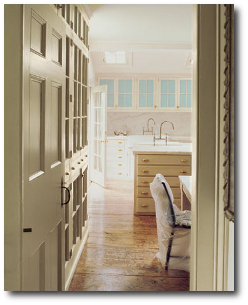
Martha Stewart’s Previous Home In Connecticut , Turkey Hill
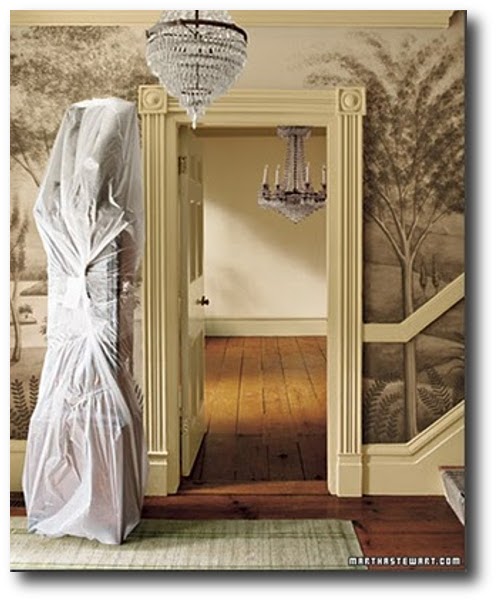 Martha Stewart’s Previous Home In Connecticut , Turkey Hill
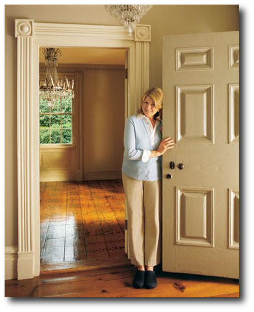
Martha Stewart’s Previous Home In Connecticut , Turkey Hill
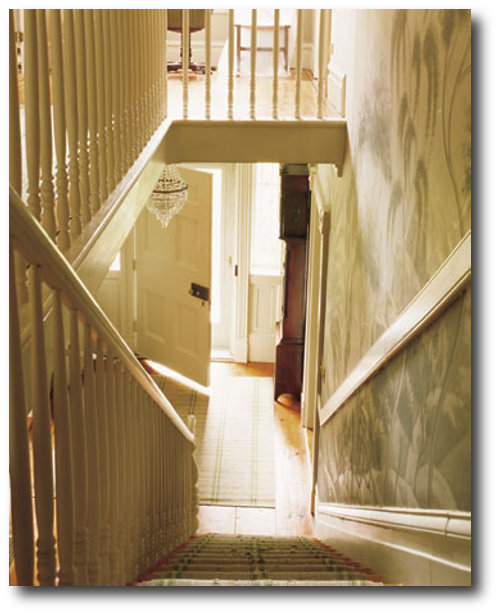
Martha Stewart’s Previous Home In Connecticut , Turkey Hill


