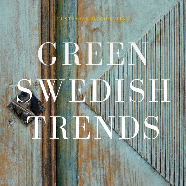
400 Professional Designers Picked Green As The New Color To Watch
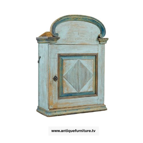
19TH Century Painted Pine Wall Cupboard – www.antiquefurniture.tv
HomeGoods Style Expert Beth Diana Smith predicts that, in 2022, many will go green by decorating around green-hued decor.
“Green [is] definitely the color of 2022!”
the owner and principal designer of Beth Diana Smith Interior Design tells SheKnows. “Six paint brands opted to choose green for their color of the year inspired by the latest fashion and home trends. Additionally, green has been trending in wellness as greens are associated with self-care, nourishment and zen energy. So, as consumers continue to prioritize mental health, we’ll continue to see green throughout our spaces as we look to infuse calming colors.”
Look at this:
A recent survey from Sherwin-Williams, which included more than 400 professional designers, found that emerald green was the top prediction for the most on-trend color in 2022.
Interiors decorated around the color of green. Do you see anything here you love?
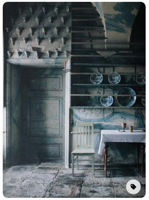
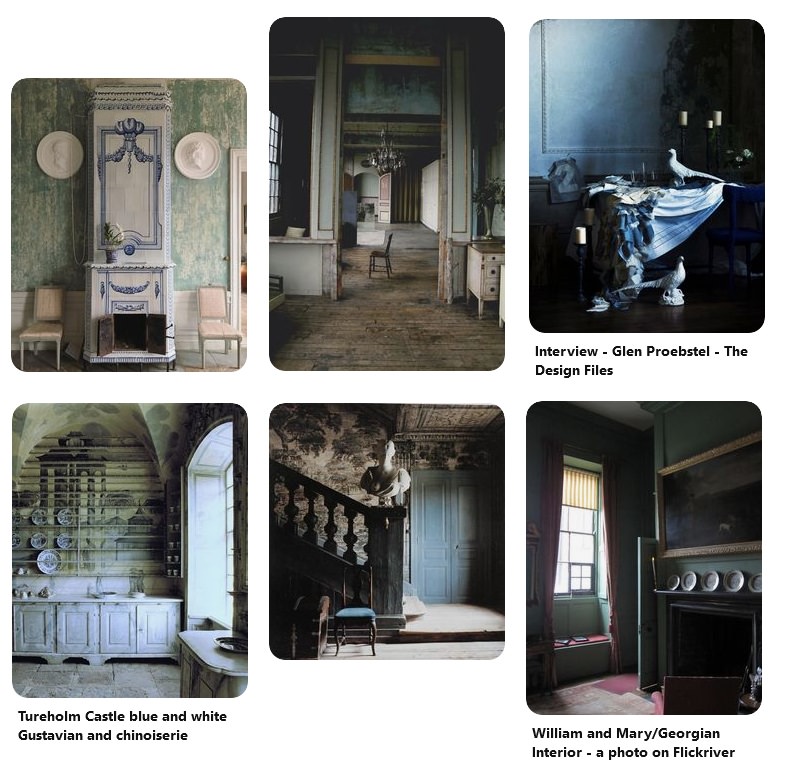 Darker Green Inspired Interiors
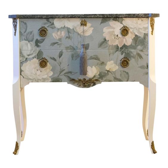 Gustavian Chest –chairish.com
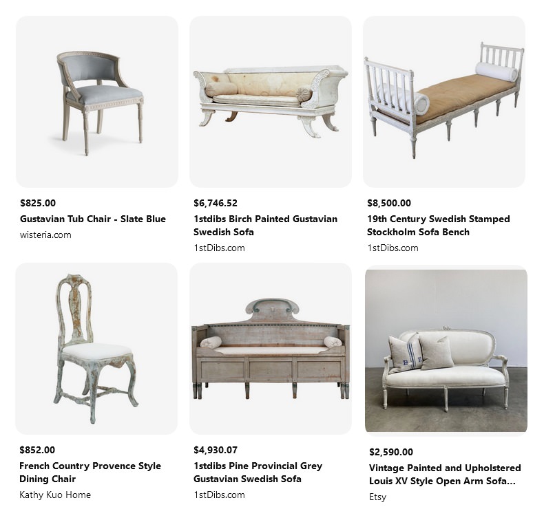
Swedish Inspired Furniture
Swedish Inspired Furniture
Swedish Inspired Furniture
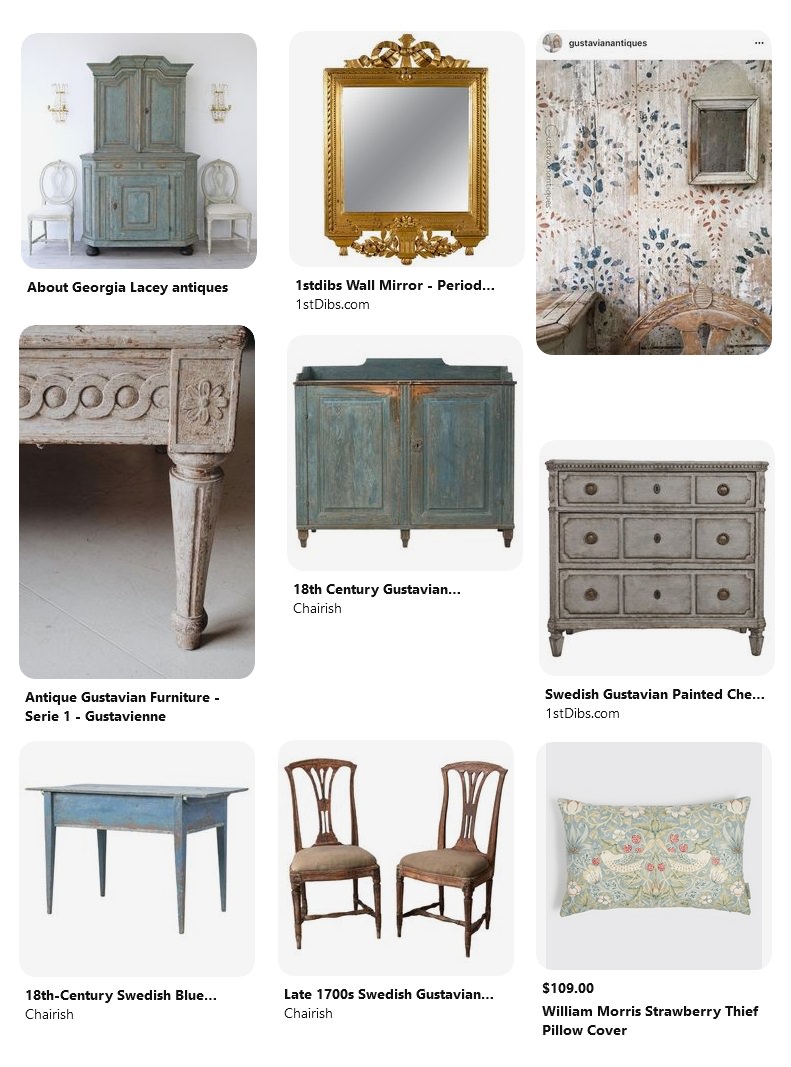
 gustavienne.com
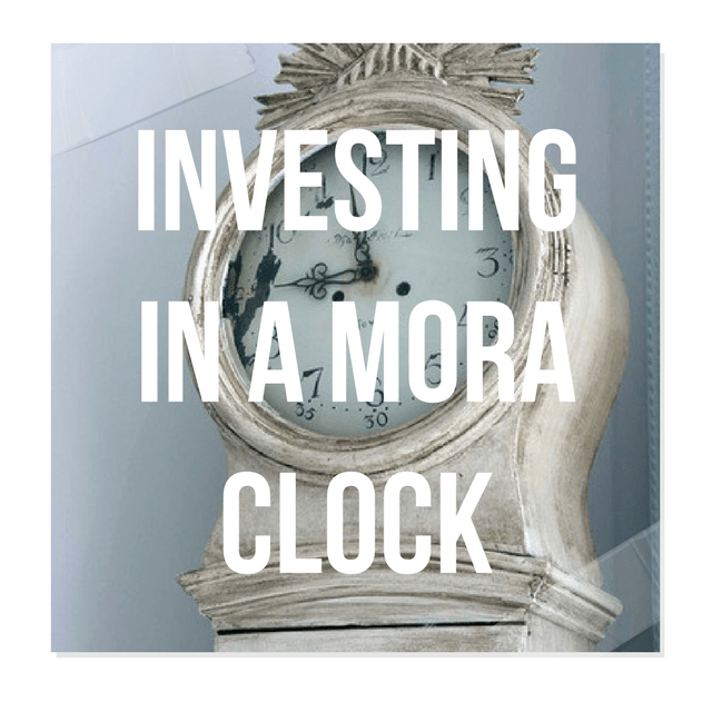
Investing In Mora Clocks – Expert Advice From Jo From Swedish Interior Design
Swedishinteriordesign.co.uk specializes in Swedish Antique Gustavian, Biedermeier, Rococo and Country Painted, Veneer and Natural Wood Furniture.
In the Homes and Antiques April 2014 Issue, Swedish Interior Design was asked to spill about Mora Clocks. Here is what they had to say:
A grandfather clock by another name?
A Mora clock is specifically a longcase clock made in the town of Mora in central Sweden during the l8th and 19th centuries.
Why there and and why then?
Bad harvests in the 1700s meant that the farmers of Mora, which was a largely rural community,
had to come up with a way to supplement their income. The pendulum clock had been invented by Dutch scientist Christian Muygens in 1656 using the sketches of Galileo so there was already something of a tradition for making clocks of this sort in Scandinavia and the cottage industry quickly developed. Each family in Mora look responsibility for making a certain part: the pendulums, the faces, the brass mechanics and so on.
Tell us about the clock’s defining features…
They are known (or their curvaceous hourglass shapes and are more often than not painted in pale greys, whites or blues as these colours reflected candlelight better on long dark evenings. Sometimes they will have ‘kurbits’ folk art designs – a form of bold, painterly decoration most
recognizable from wooden Dala horses that originate from Dalarnia, the same region that
Mora clocks come from.
How easy are they to come by?
Oddly the largest collection of Mora clocks is here in the UK. It is owned by Jo and Madeleine
Lee who run Swedish Intorior Design and have just moved their business to an old granary near Shoreham where you can find over 50 of the clocks in stock. Look out for ones marked ‘AAS’. They may well be made by the first Mora clockmaker Krang Anders Andersson whose oldest known clock dates to 1792. Be wary though, the moniker has been copied onto later clocks so check for documentary evidence of his craftsmanship.
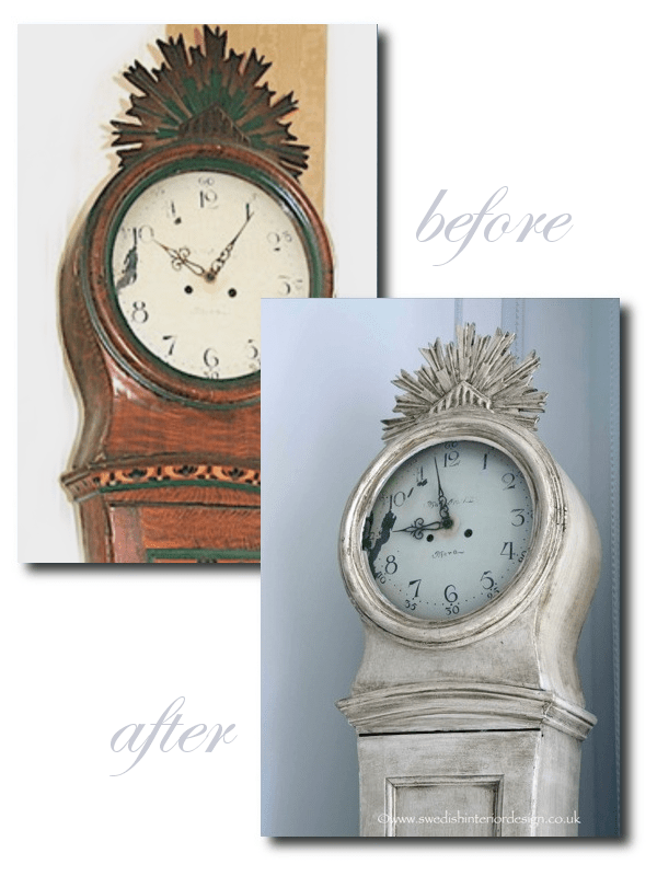
Jo spills some of his secrets of how he goes about refreshing Swedish antiques that need a facelift.
He discovered this Mora clock about many years ago, and it was one of the first pieces he found in Sweden. He loved the clock but wanted the overall look to fit into their 1886 apartment which was decorated around whites and greys.
The clock was found painted in a “Kirbits Folk Art Style…..
“It was statuesque, superbly proportioned, elegant and painted in reproduction Kurbits Folk Art style. The repaint was probably done in the early 1900s and the colours they had used and the painting style were rather garish. The original Kurbits Folk Art Style was prominent in Sweden in the early part of the 1800s and was a freehand style using feather shapes, swirls and subtle earth tome colors (reds, ochres, yellows, oranges) to create a visually sumptuous but definitely country style. You can see examples of the kurbits painting from the early 1800s by looking at the 360 degree view of the Swedish Interior Design Kitchen where we have freestanding cabinets from 1799, 1803 and so on with the original Kurbits paint.”
Jo tells us how he made this clock look antique with paint:
Step 1 – “Key the entire clock with medium sandpaper (180 grit) to allow the paint to grip and look it over to decide whether there were any bits that needed gluing or fixing. Generally I prefer to leave pieces ‘as is’ if possible rather than fix them up to much as the life they have undergone is part of their character and makes them real”
Step 2 – “Prepare The Tools In this case a variety of brushes of different sizes to allow me to get a fine coat on to the clock without filling up the wonderful crenulations and shapes on the body with excess paint. You can get very carried away with special brushes but actually we generally use pretty standard ones – my brush heads don’t have to include virgin yak tails from Mongolia! In this case I used a Craig and Rose acrylic paint (I used Regency White in the Chalky Emulsion finish), which dries nice and quick and that goes on very smoothly with a nice chalky texture. I didn’t use a primer in this case but you can if you want. Alternatively, any chalk-like paint such as Farrow and Ball’s Estate Emulsion, Chalk or Milk Paint could be used. With Chalk and Milk Paint, you would have to wax the piece and not glaze it as I did, which I will talk about a bit later.”
Step 3 – Base Coat “A nice smooth stroke with a larger headed brush to keep an even spread and smaller headed brushes or ones where I’ve cut them to an angle for getting in and under things! Always be careful not to let the paint pool or drip and consider it from several angles to make sure the coverage is good. Once I’d built up the base coat, I added 2 further coats at a slightly watered down consistency until I liked the visual texture“
Step 4 Sand “Light sand to matte the paint down a bit with 320 sandpaper and then some judicious distressing either in the right places where you would naturally get a lot of use (like the handle in the pendulum door) or for effect (to highlight a special feature). I also use a razor blade too sometimes for a different look”
Step 5 Antiquing. “Now that I like the basic color and the level of distress, I decide how and if I should antique it. When well done, antiquing really adds to the feel of a piece and can highlight its decorative mouldings, giving them a 3D effect. But if overdone or clumsily applied..awful! Many people like to use wax but I prefer to make up my own antiquing fluid using an acrylic glaze as a base. I mix the acrylic glaze with a dark brown, grey, red or yellow paint so I can create an antiquing color that matches the color tones I want to effect and it still looks like the real ‘dirt of ages’. So sometimes it’s greyer, browner, more yellow, ochre or red – whatever you need for a special job. The key is “think” where naturally dirt would accumulate and build it up in layers and once that’s done to see if you want to use it as a special effect to highlight any feature. Another light dusting with 320 sandpaper in places and then stand back and admire the handiwork”
You can see their unique collection of antique mora clocks, and other Swedish furniture by viewing by private appointment 7 days a week.
Call +44 1273734371 or visit the website at www.swedishinteriordesign.co.uk
Also, look up at Swedish Interior Design blog for more tips of how to decorate with Swedish furniture.
Follow Jo on Facebook, follow his wife’s blog Madeleine Lee.com
- Madeleine In their Swedish Home
- Picture Credit- Swedish Interior Design
- Beautiful creamy whites and golds seen in their home
- Pictures taken in their home for a fashion editorial in Coco Indie Magazine, see more at bellakotakphotography.com
- Swedish Interior Design
- Clock 1: Unique Early 1800s antique Swedish mora clock with an incredible original trompe l’oieil wreath motif and a very unusual larger head with stunning roman numeral clock face
- Clock 2: Early 1800s antique Swedish mora clock in original white paint.The mora clock is in good condition and features the makers name ‘Roth of Norkoping’ and elaborate beautiful handpanted gold curlicue designs.
- Clock 3: Very early 1800s Swedish mora clock in original paint. Incredible ribbed crown motif on the hood and very distressed but structurally sound.
- Mora Clocks From Swedish Interior Design


Martha Stewart’s Creative Director- Erik Pike’s Gustavian Townhouse In New York Part 1

MARTHA MOMENTS: Eric Pike Leaving MSL
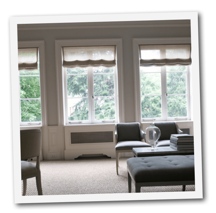
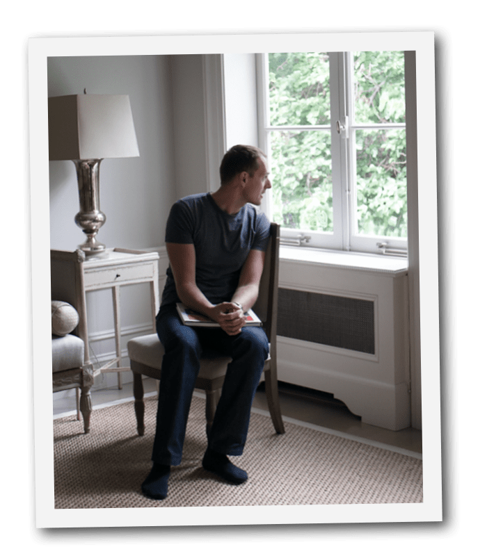
Eric Pike is Creative Director of Martha Stewart Living. Stefan Steil is an interior designer and founder of Stelish. Some of his design work can be found at Stefan Steil. Portraits taken at their townhouse in Manhattan.

There are very few Gustavian styled homes photographed that are truly ALL Swedish inspired. After looking at thousands of photographs, I KNOW it is rare to come across a home that is decorated or renovated all around the Swedish styles. Even if a home isn’t decorated to look centuries old, I find it rare to come across a person passionate for a particular period design that is pigeon-holed into a particular category. It is thrilling to say the least to see a home that is based entirely around a theme, such as Georgian, Egyptian, Early American, or my favorite Gustavian. When a designer sticks to a particular style of antiques, and thinks through the architectural elements and paint colors carefully, a story emerges that allows you to walk back in time.
Not everyone has thousands of dollars to spend on antiques, or money to change the architecture, flooring, cabinetry or fixtures, so many of us have to start somewhere with one bench here, and a chair there. Building up a home that is entirely from one period and time frame can be incredibly exhilarating, and also quite expensive, but it doesn’t have to be. You don’t need to have ALL genuine antiques to get the Gustavian appearance in your home. In this blog, I have put together dozens of posts with decor and furniture that look Swedish and aren’t. Some are costly, and others aren’t. My own home is filled with a ton of vintage furniture that is made over to look Gustavian. Incorporating a few genuine pieces sure help! Your home should be what makes you happy, and not what a blog or a magazine tells you it should be.
It is truly rare to come across a home that is based entirely around the Gustavian look, and not exist in Sweden, and that is the case with Martha Stewart’s creative director Eric Pike. His townhouse in downtown NYC is one of these rare homes where the entire house is designed around a Gustavian palette.

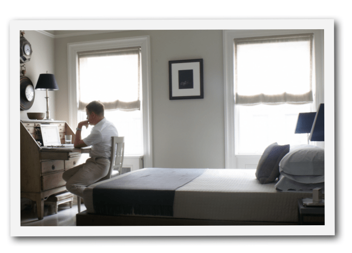
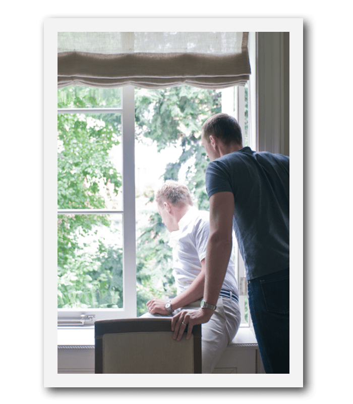
Eric Pike And Stefan Steil’s New York Gustavian Styled Townhouse- Photo Credit An Afternoon With Blog
Eric Pike And Stefan Steil’s New York Gustavian Styled Townhouse

Eric Pike And Stefan Steil’s New York Gustavian Styled Townhouse
The Blog,….. An Afternoon With posted some incredible pictures of the home giving you extra ordinary angles that allowed you a better glimpse into the rooms.
In one of the pictures a stunning oil painting hangs in the bedroom of Daniel Webster, a Massachusetts senator in the mid-1800s and an ancestor of Eric’s.
While the whole townhouse looks like it is within one color, several tones are used. In the bedroom, and the office, the ceiling is a light blue. A light beige is used in the office with storage in a coordinating color. Vibrant colors are used in the closets, keeping the overall palette neutral.

Martha Stewart’s Creative Director- Erik Pike’s Gustavian Townhouse In New York Part 1
Pike tells Martha Stewart Magazine that he faced a challenge that we all face: the need to maximize storage. He sacrificed a few feet in every room to allow for deep doorways that contain hidden, paneled closets, each devoted to specific belongings. “I’ve been collecting for years, and I’ve made everything work in this space,” he says.
Many Gustavian styled homes aren’t cluttered, and here you will see an excellent example of a paired down look. Collectibles are grouped together much like the closet featuring Pikes tableware and silver urns, or grouped on side tables. The look is very much clean and organized.
Look at the impressive storage in the above three photos. Boxes are used in closets for odds and ends keeping everything in place. In any home, there needs to be a lot of attention paid to storage if you want an uncluttered appearance. This is especially true for smaller sized apartments. For my own home, I have used the over-sized boxes that come with Crate and Barrel for my blankets which sit in the closet. When I go into my closets, they look clean and organized even if they are in boxes.
In this post I show where you can buy large boxes with lids for as little as $3 Paint the boxes with flat paint, and customize your closets by painting the interior and the boxes so both match. If you have a home that is based around gray, white or beige, consider doing something extra special for the closets. In my storage room in my garage, I am going with a Alpine green with boxes to match. Why not! Consider a bold blue or even a baby blue for your closets. Pantry and linen closets can be one of the most creative areas to experiment with color.