The Shocking History Behind “Emerald Green” Paint
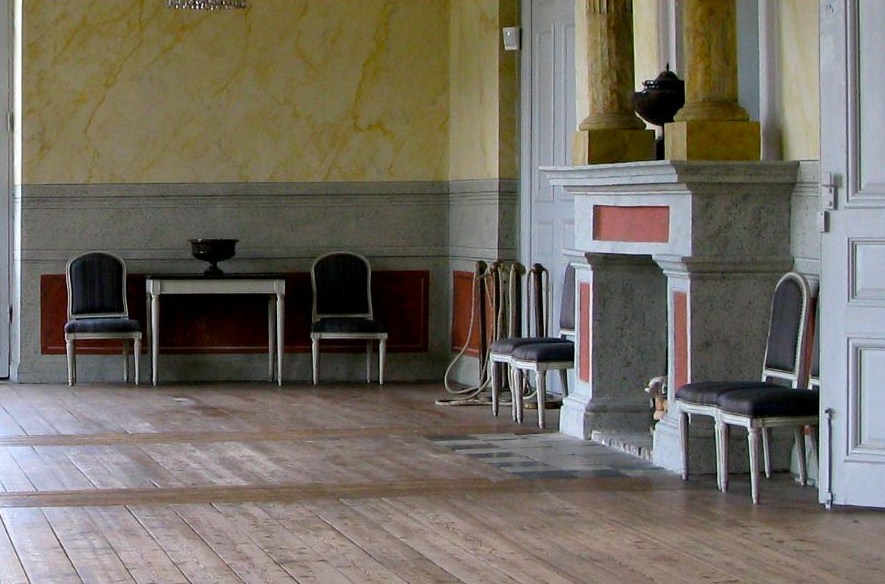
 Seglora Church -Relocated From Western Sweden
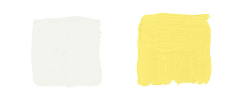
*Disclaimer*-The pictures contained in this post are to illustrate the BEAUTY of yellow and green paint used in 18th century interiors. We have no knowledge what so ever of the paint used in the rooms or furniture. Emerald Green and Yellow colors are absolutely stunning colors to decorate a home around.
The History Behind Emerald Green
Emerald Green, is the color of the year for 2013, yet what many people don’t know is the color “Emerald Green” at one time, killed people.
This brilliant blue-green color was extremely popular in the mid- 1800s, because emerald green paint was cheap to manufacture, and it had such a great depth of color.
In 1814 in Schweinfurt, Germany, two men named Russ and Sattler tried to improve on Scheele’s green, and made a paint made with copper arsenite. The result was a highly toxic pigment called “emerald green”. This paint was made with arsenic and verdigris and the bright green color became an instant hit within the design community.
The vibrant color was not only used as artist paint, but as well as household paint amongst other things. Many people at that time didn’t know the paint was made with poisonous arsonic, and who is to blame them when we don’t know ourselves what kind of unhealthy additives are contained in our foods. As soon as the color was produced, it was picked up by many companies far and wide. The emerald green dye wasn’t only used for paint, but wallpaper and as liquid dyes.
In particular, in damp rooms where mold grew, the arsonic in the wallpaper paste would be turned into a toxic gas which would be deadly for anyone living in the room. By 1830, wallpaper production had risen to 1 million rolls a year in the UK, and by 30 million in 1870. Tests later revealed that four out of five wallpapers contained arsenic.
Leopold Gmelin (1788-1853), a German chemist, suspected in 1815 that wallpaper could poison the atmosphere, that he made several efforts to warn the people in his day to strip their rooms of the paper, and advocated banning Scheele’s green. He noticed that the substance gave off a garlic-like odor when the paper was slightly damp. Experiments at the end of the 19th century proved that arsenic pigments in damp or rotting wallpaper were lethal. If only they listened to Leopold Gmelin’s warnings!
The color “Emerald Green” became so popular and widely used in the cotton industry which used the chemical in pigments and dyes. It was also used by other industries such as glass manufactures as a de-colouriser, and in the production of leather tanning, soaps, lampshades, pharmaceuticals, agriculture for sheep dips, children’s toys, and candles.
Emerald green was also used to color cake decorations. In a few recorded instances, this dye was used to color icing, much like we do today. In one case, the industry making the dyes employed hundreds of young girls, who later died from chronic arsenic poisoning. At a banquet held by the Irish Regiment in London in the 1850’s, sugar leaves that were dyed with the Emerald Green, and used as table decorations. Many of the guests took the decorations home to give to their children to eat as a treat, whom later died. Another dinner in 1860, a chef produced a spectacular green sugar dessert, used Scheele’s green and later, three of the diners later died. If this is shocking, read this up on our modern day Aspartame. It has been proven that this popular sweetener used in coffee is toxic to your brain. In fact, they say that when aspartame is added to hot waters, exceeding 86 degrees F. the Aspartame converts to Formaldehyde, and then to Formic Acid, which damages the brain….. yet this substance isn’t pulled off the market.
Emerald green was also called Schweinfurt green, Paris green, and Vienna green. The toxicity of emerald green was not initially recognized, until the recipe was published in 1822. Napoleon’s death in exile on St Helena was possibly a result by his exposure to the Emerald green wallpaper in his favorite room. The French painter Cezanne had an attraction for using paris green, and later it was known he suffered from severe diabetes. Later, the use of this pigment was abandoned when it became general knowledge that people who wore clothes dyed with this green tended to die early.
Here is the sad part- Even though they knew all the scientific evidence of its highly toxic nature, production of emerald green paint was not banned until the 1960’s.
See: 10 Tips for Buying Used Furniture Online- Painted Furniture Online
The History Cinnabar Red
One of the most difficult to use and costly pigments on the market. Cinnabar red is obtained from a mineral (the principle ore of mercury). The Romans obtained it from the Almaden mines in Spain, which is still today an important locational source of mercury. In order for it to be used as a pigment, the mineral had to be purified, then synthesized and then ground to the correct fineness. If improperly handled, it could turn black.
“Red’s hard. There are so many bad ones. They’re either too bordello or too raspberry nail polish. Or they’re so brown it’s like eating in a Southwestern theme restaurant, or so primary and overly frank that you want to ask, ‘Where do I put the presidential seal?’ I’m always looking for either a juicy pomegranate red, a Chinese lacquer red, or a really good oxblood. Because it’s such an important color, red needs nuance, subtlety, and depth, so in those rare instances that I break it out, I like to do it as a glaze, a lacquer, a fabric upholstery, or as red leather walls so there’s variation to the tone.” —CELERIE KEMBLE
See: The Top Shades Of Red Paint By The Most Famous Designers- The Painted Furniture
The History Behind Lead White
The poisonous qualities of Lead White have been noted since Ancient Rome, when the color was made in Rhodes (Greece ) where workers would put shavings of thin lead over a bowl filled with vinegar. The acid on the thin metal would cause a chemical reaction and leave a white deposit of lead carbonate which was then powdered, flattened and left to dry in the sun. The small amount of lead white still manufactured today follows this same formula.
The History Behind Naples Yellow
The 18th and 19th century saw the discovery and manufacture of synthetic pigments and dyes, which quickly replaced the traditional yellows made from arsenic, cow urine, and other substances. Naples Yellow is one of the oldest synthetic pigments. Naples yellow was essential to the landscape tradition because it has a quality of appearing to recede, making it perfect for capturing the essence of the sun. The genuine pigment is toxic, and it is believed that Vincent van Gogh’s mental illness and suicide was a result of his frequent use of true Naples yellow.
Have scientists finally discovered why Van Gogh’s paintings are turning brown? Mail Online
Hope For Today
Today we have a wide variety of organic paints available within reach. More than ever paint manufacturers are producing low VOC paints as people are looking at safer brands for their homes and health. Olympic Premium and Benjamin Moore Aura have shown to have lower VOC levels than other tested paints and did a good job in this hiding test, according to Consumer Reports. VOC levels have been toughened because VOCs are linked to respiratory illnesses and memory impairment.
The top paints in the Consumer Report Ratings had among the highest claimed VOC levels, including Behr Premium Plus Enamel low-luster and flat and Benjamin Moore Regal semigloss. They reveal that lowering the VOC levels can affect performance. “When you take out VOCs, you still need strong performance properties, but you have to find other ways to achieve them,” says Carl Minchew, product-development director at Benjamin Moore. Still, some no- and low-VOC paints did well in performance revealed in the Consumer Report Ratings. Posted in the Consumer Reports Magazine issue: March 2009
See: Green Dreams: Environmentally Friendly Restoration Furniture– The Painted Furniture
This information below comes from www.wetcanvas.com
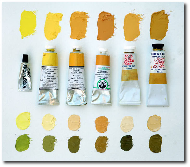
“PY41 is genuine Naples Yellow (Lead Antimonate), tubed paints come in two yellow versions, Light and Dark (sometimes available in a “red” pigment as well). Available from Vasari, Michael Harding and Robert Doak. Genuine Naples offer a smooth blending mild tinting yellow that works in more delicate situations, like portraiture. Here is a comparison of both Michael Harding genuine Naples Yellows along with others similar colors, including OH’s PBr24 imitation Naples Yellow Extra. The lower mixes show the colors tinted with white above, and black below.”

Green Paint Colors Featured On Martha Stewart
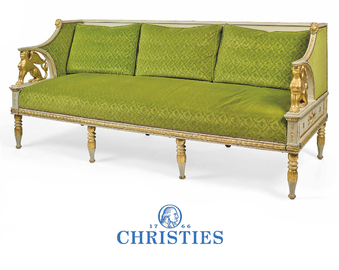
A Swedish Parcel Gilt and Gray Painted Sofa
The Brian Juhos Collection From a Domaine in Southern France- Christies
Picture Credit To Bellis Vintage Blog
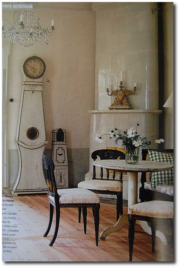
The Elegance Of Scandinavian Old World Interiors
Michael Eastman Cuba Mercedes Living Room

 Green paint Colors Featured on House Beautiful
Goethe’s house who was one of the first color theorist of the 18th century.- Emerald Green Interiors Blog
 was a Swedish portrait painter.")
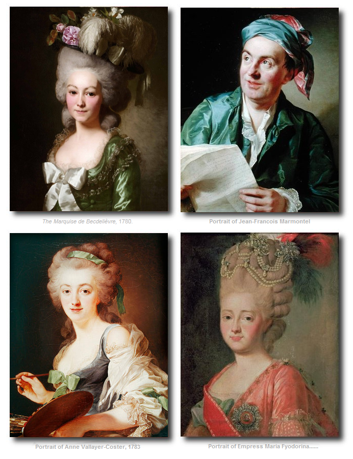
Alexander Roslin (July 15, 1718 – July 5, 1793) was a Swedish portrait painter. Many of the colors he used were Carbon Black, Burnt Sienna, Burnt Umber, Venetian Red, Yellow Ochre, Lead Tin Yellow, Naples Yellow, Vermilion, Lake, Lead White
Get reproduction paintings of Alexander Roslins work here
Alexander Roslins Paintings
Picture Credit To Bellis Vintage Blog
The Elegance Of Scandinavian Old World Interiors
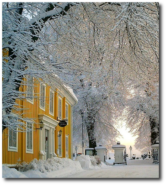
Norway, Sweden, Denmark- Winters In Scandinavia

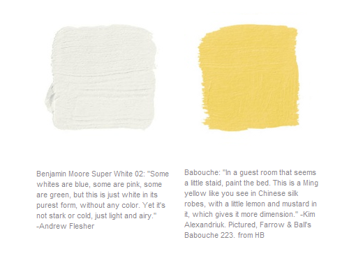
Paint Colors Featured in Home Beautiful Magazine

Paint Colors Featured in Home Beautiful Magazine-
Pictured, Super White Interior Room and Little Angel 318 both by Benjamin Moore.
Swedish Architecture Yellow-www.tumblr.com
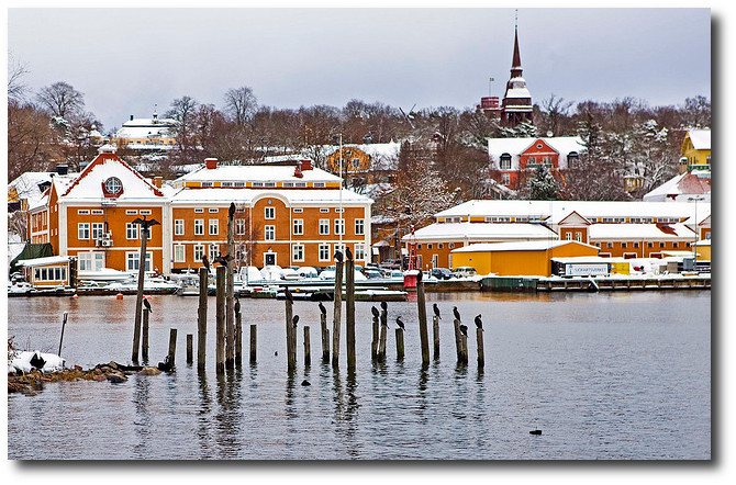
Mergansers on Djurgarden in the Swedish Maritime Administration in Stockholm
Picture Credit Flicker
Fired Earth’s Anniversary Paint Collection

These beautiful paints are the result of a recent collaboration between Fired Earth and the National Trust.
Founded in 1983 , Fired Earth began as a Terracotta supplier, and later expanded to offer bathroom and kitchen cabinetry, and hardware. Although Fired Earth has a wide selection of house products, they are best known for their beautiful paints.
With their 30th Anniversary, they launched archive colours from their extensive library of paint pigments and featured six new colours named Delias Secret, Mad King George, Jazz Cafe, Hansel and Gretel, Eton Mess and Terracotta Warrior.
Fired Earth has also worked in collaboration with Kevin McCloud, a well known British designer and author and leading authority on colour. Together, they created color formulas from carefully selected pigments, minerals and resins, chosen for their qualities of opacity, density, light fastness and durability. The paint was developed with minimal and low VOC’s. These water-based paints are available in 120 colours in matte and eggshell finishes.
Kevin McCloud is best known in the UK as the color go to guy with a knowledge on every design style from historical to modern. The Telegraph had an interesting article titled “Are Posh Paints Really Worth It?” they ask the question – Why spend the money, when you can get your local paint store to match the shade, and spend less? Here are a few interesting points from the Telegraph interview…..
“McCloud, a self-confessed paint “anorak”, is unequivocal in his defence of posh paints. “Having used many, many different brands over the years, it is very clear to me that the more you pay, the better the paint,” he says. “Cheap paint has more water in it, less pigment and less binder.” Thus, as a rule, the more expensive paint covers better and lasts longer. It is also more environment-friendly, being lower in “Volatile Organic Compounds“.
“There is a place for cheap paint, and McCloud concedes he has painted his own kitchen in “bog ordinary trade white emulsion”, but the cheaper paints are made with synthetic pigments. And pigment, he explains, is what gives paint its quality and depth of colour. – “Traditional pigments tend to be made of rocks and minerals, earth and clay,” he says. “And consequently they are impure, and rather complex. The more complex the pigmentation, the more interesting the colour. It gives redolence and depth, and you get undertones – colours which subtly change in different lights.”
“One can say that this was a colour used in this particular house, on a certain day in, say, 1818, but the colour has probably faded, or gone darker, or yellowed. It’s very difficult to ascribe a particular nuance
of colour to a room for a particular date.”
Kevin McCloud’s Books
Choosing Colors: An Expert Choice of the Best Colors to Use in Your Home by Kevin McCloud– Amazon
In this stunningly produced guide, internationally renowned interior designer Kevin McCloud puts together over 1,000 color chips arranged in over 80 palettes. Each palette—which includes anywhere from 6 to 16
color swatches—forms a blueprint for a unique decorative scheme. A palette based on old Chinese silk, for example, is seen reinterpreted in a contemporary New York apartment. Each palette features gorgeous photographs that bring the color scheme to life, along with invaluable advice and tips for using the colors to transform a room. This book provides manufacturers’ paint references and numbers, lists of suppliers, and much more.
Kevin McClouds Complete Book of Paint and Decorative Techniques by Kevin Mccloud- Amazon
From the earthy hues of Italian farmhouses to the cool elegance of Scandinavian interiors, color has always played a crucial role in decorative schemes. In the first section of the book a unique cut-out color selector illustrates the eight essential earth colors on the decorator’s palette and shows how to create and combine them successfully by clever intermixing of pigments. These essential colors, together with five secondary colors, are then used in the techniques throughout the book, so that all the stunning decorative effects can be easily recreated.
The techniques section that follows contains instructions and step-by-step photographs for more than 35 glorious decorative effects, plus countless variations. Each technique contains a list of essential ingredients, step-by-step photographs and a close-up of the finished surface or object.
Decorative Style: The Most Original and Comprehensive Sourcebook of Styles, Treatments, Techniques by Kevin Mccloud- Amazon
Using innovative, easy-to-master techniques and surprisingly inexpensive materials, Kevin McCloud — a brilliant young set designer turned interior decorator — shows you everything you need to know to design and create your own stunning adaptations of today’s most popular decorating styles.
There are forty styles in all — from Santa Fe, Shaker, Miami Deco, and Caribbean to Bauhaus, Biedermeier, Mackintosh, and French Country (to name just a few) — each designed and created especially by the author and stunningly photographed, with literally hundreds of styling options and color variations to choose from.
The decorative effects and other components of each style are analyzed, rephotographed with a full range of imaginative alternatives, and cross-referenced to all the techniques, tools, and materials needed to create each unique effect.
Kevin Mccloud’s Colour Now by Kevin McCloud- Amazon
Love blue but don’t know which shade to choose? In this dazzling new book, Grand Designs presenter Kevin McCloud has taken over 120 particular colours into 70 tried-and-tested palettes that are guaranteed to transform your home. A short introduction describes the history of colour and its replication, colour theory, how to combine colours into a palette and advice on how to use the book. Thereafter the bulk of the book is devoted to the colour palettes themselves – each made up of a collection of between 3 and 8 colour swatches and featuring an inspirational photograph demonstrating its possible use. Every palette is also introduced by a short piece of text describing its influences, potential and variety.
Choosing Colors: An Expert Choice Of The Best Colors To Use In Your Home by Kevin McCloud– Amazon
This decorating guide explains techniques ranging from craquelure to marbling, colourwashing to liming wood, and provides information on tools and materials. The step-by-step photographs show exactly what to do, while the life-size details show the effect being aimed for.
Kevin McCloud’s Complete Decorator by Kevin McCloud- Amazon
This lovely 272 page book is filled with dozens of color photos showing many different decorating styles. It includes a unique cut-out graduated colour section, step-by-step instructions for a vast range of paint
techniques, easy colour mixing, working with different surfaces and objects and so much more.
Techniques of Decorating (Dk Living) by Kevin McCloud– Amazon
Kevin McCloud is a leading influence in interior design. His unique and refreshing approach stems from a background in art history and the theatre. Using a repertoire of techniques ranging from the traditional to the self-invented, he offers an unsurpassed array of rich effects and a sure guide to effective styling. Each of the more than 30 creative effects – including gilding, verdigris, clair bois, stained glass and woodgrain – is explained in detail, while close-up, step-by-step photographs show exactly how to achieve it. A comprehensive section at the back of the book provides details of tools and materials needed and lists the addresses of suppliers.
‘Blue-ish greys are military and came into their own as World War I battleship camouflage. The really interesting greys, however, are those made with purple. They have a warm, brownish cast that flatters flesh tones and brings natural woodsy materials to life. They’re not popular, but they should be.’
‘Often the most stimulating colour combinations come from strong cultural influences – from the environment, from food or from nature. Here’s a pretty worldly palette: one of stone and sea and earth and sky.’
Principles Of Home by Kevin McCloud– Amazon

‘On my list marked ‘fastidious obsessions’, getting the right fine old French grey comes pretty high on the list. If you were a colour expert, you could take some chalk-white casein distemper, add raw umber and a little raw siena and you’d be there. Note I didn’t mention black there – when you mix black and white the resulting colour is so cold you might as well call it blue. No, for a good grey, go greenish and go with earth colours. Fine complex colours are the tinctorial equivalent of a fine old French wine.’
“The hardest colours to get right are the four optical primaries: red, blue, yellow and green. The colours that will make your life a positive misery are tints of those colours. Most modern paints are coloured with a limited range of powerful synthetic dyes. The most interesting colours are those made with muddy, traditional earth pigments or complex arrangements of colourants.”
“The best pinks – those that change colour under different lighting conditions – are those on the cusp of red and purple, made with red oxide pigments. The best yellows or creams – those that can withstand bluish northern light and never look green – are made with yellow ochre.”
Painting Swedish Looking Furniture – 3 Tips / Part 3
 Picture Credit Habitania Work Rooms
As we discussed in Part 2, Accent furniture, such as Gustavian chairs, smaller tables, drop leaf tables, stools, and benches can be brought into the home, and used instead of the larger scaled furniture that we are used to today to achieve that Swedish Gustavian look.
Another element that draws people to the historical Swedish look is the painted furniture. There is an art to getting the rich patina that is seen on true antique furniture found in Sweden. Almost anyone can find vintage French furniture in their area which can be distressed using a number of techniques to give it a historical appeal.
In this early post I wrote, I describe some of the paint techniques I have used to achieve great white painted furniture.
Here are some of my best tips to getting realistic Swedish painted finishes……
1. Work with colors that are muted. If you have ever mixed paint before, think about the colors that are produced when black or white paint has been added to a color. In the 17th and 18th century, there was a limited color palette available, so black and white paint was added to an existing color to produce a shade that was darker or lighter. On one of my pinterest boards, I compile some colors that will give you ideas of ranges of hues that are very appropriate. Annie Sloan has a wonderful range of colors which all are muted, yet vibrant paint shades which I suspect were based off the French style that she is so attracted to. She has put together a fabulous palette of colors which would work in any French or Swedish styled home.
Don’t ever work with colors with really bright pigments. I cannot blame anyone for being confused as there are thousands of shades of paint to pick from. The furniture should look aged, and color appropriate for the century you are after. I guarantee you, getting a really nice finish on a piece of furniture doesn’t have to be complicated.
2. Strip Or Sand To Get Down To Bare Wood.
A raw wood piece of furniture is always the best to work with. Although finding a piece of furniture that is untouched with paint rarely happens. Starting off with a piece of furniture that is not painted is ideal, but if it does have paint, consider comparing the the color you have picked out to the color the furniture is painted in currently.
Would you mind having the original color showing through?
If not, consider spending the time stripping off the paint. A perfect strip job isn’t necessarily if you plan on re-painting it, but enough of the paint removed will give you a new wood surface to work off of.
I have seen black painted furniture with distressing showing white beneath, and it doesn’t look great. A base color of red looks terrific with black painted furniture, or just plain wood. If you don’t want to strip the furniture, (as it is a lot of work) consider giving a good deep sanding to the furniture, especially to the areas you plan on distressing.
Often times if stripping the furniture is something I don’t wish to do, I sand the furniture quite well as a first step, paint it in the color I plan on working with, and then sanding it again as a third step. This allows me to touch up the original paint color that shows through, while leaving some of the distressed areas that show off the wood. It is a lazy way of getting the finish, but the results are quite nice.
If you plan on doing multiple shades such as the chest below, consider colors that work really nicely together. White works nicely as a top color.

Swedish Distressed Chest From Atelier September
Distressing gives your piece of furniture a depth, which is often seen in Swedish antiques. I am not afraid of roughing up my furniture, and I am not afraid of altering an antique. Many antique dealers caution people from painting furniture, because it does loose the natural patina, and because of that, it often looses the value. This is a wise piece of advice to those people who are looking to “invest” in heirlooms for the value.
If you always wanted a white distressed cabinet, paint it, and don’t be afraid to do so. My motto is that you have to first love the piece, because after all, it is in YOUR home. Your children may have a totally different style in mind for their own home, so do what makes you happy, rather than looking at furniture as items to pass down to family.
I used to sell used furniture for a hobby, and always ran into the problems with paint sticking properly. Either you tore off your arm by sanding the heck out of every piece, or you ran the risk of the paint peeling later on, which lead me to use oil paint. Not every oil paint brand is the same. Some brands are so hard to work with, that they will make you pull your hair out. It is almost impossible to find oil paint in a finish that is either flat or eggshell. You won’t find glossy Swedish antique furniture, so don’t use it on your furniture. The look should either be eggshell, or satin.
Cover Stain By Zinsser is a fantastic oil primer which I discovered by accident, and almost was beside myself when I discovered how well it performs. You can buy this at Home Depot and almost every Hardware Store, and the best part of this paint is that it is TINTABLE in almost all the lighter shades of paint samples such as Behr, Martha Stewart, and so forth.
High Hide Odorless Oil Primer without Sanding – Odorless Primer
I bought the paint, because I couldn’t send out a piece of furniture which would later peel. I wanted a paint that could stick to anything and not scratch. Oil based paints are not environmentally friendly. The trade off with this paint is that it has a heavy smell which disappears after it has dried. You will need to use a paint respirator, and I emphasize that recommendation.
The most surprising aspect to Zinsser’s Coverstain Primer is that it is not a thick paint. It is rather thin, and goes on like spreadable butter. You rarely need an additional layer of paint, because it is oil after all, and isn’t like water based paints. Oil paints tend to self level as they dry, leaving almost no brush marks. Oil paints do cover well, and hold up wonderful. Unlike other oil paints, which can take up to a week to cure, this Coverstain dries to the touch in 3 hours, and cures over night.
The other reason why I recommend this product, is that it is sand-able. Almost every other oil paint brand I have tried doesn’t sand very well, and often leaves the finish needing an extra coat. Because Zinsser’s Coverstain dries flat (matte) sanding blends in rather nicely. In the past, I often added two coats of the tinted primer, and then sealed it with a Polycrylic water-based sealer.
Polycrylic is one of the best finishes to use on white based furniture, because it doesn’t yellow over time, like polyurethane does. With the polycrylic, I would apply it with a brush, and then with a damp white cotton wash rag, I would just wash it off. This would give me a seal to the paint color, while at the same time, maintain the flat, or eggshell finish that I enjoyed.
Another tip I would recommend is to buy a good quality angle paint brush for water based paints. I have used these with my oil paints, and my brush sits in paint thinner for weeks, and it is still not damaged. Regular chip brushes are ok, and inexpensive enough to throw out, but a good quality brush won’t leave paint strokes. Someone suggested to me to invest in an expensive brush, and I pass on those words of wisdom.

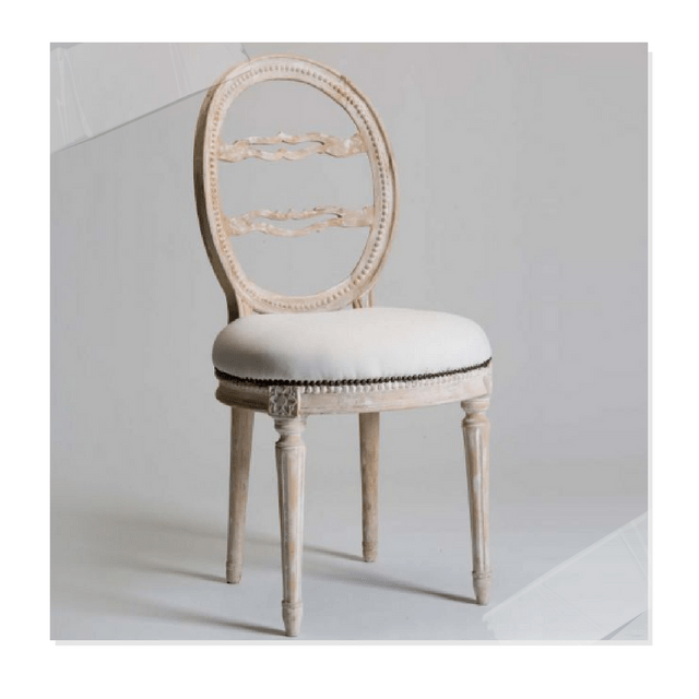
Swedish Accent Chair With A Fabulous Paint Finish $506
18th Century Buffet, circa 1760 Jane Moore Interiors in Houston
Picture Originally Featured on Indulge Decor Blog

Stunning Swedish Styled White Painted Accent Chair
Neoclassical Swedish Styled Accent Chairs Sold In Pairs $983
3. Glaze Your Furniture With Brown Glaze…..
Glazing is so easy, it takes minutes. If you can wipe your table after dinner, you have the skills to glaze! It is that easy. A glaze is a translucent binder which paint pigment is added to the mixture to produce a translucent color. You can buy glaze mixed together at your local hardware much like ordering paint, or you can buy glaze alone and mix in paint yourself.
Buying brown glaze already mixed will go a far way if you paint furniture for a living. I used it on all my painted pieces, including my white furniture.
Blend & Glaze Decorative Painting Liquid
Ralph Lauren Faux Technique Glaze
I have discovered that glaze can be applied in two ways. You can apply it with a paint brush, let it stand for 3 minutes, and take it off with a slightly damp rag. With white furniture, even though you may feel you removed a lot of the glaze, the little bit that is left gives your furniture that slight change in color.
With flat finished white furniture, I give some wise words of wisdom. Add a coat of polycrlic before you glaze. You could even dilute the polycrylic with a slight bit of water, OR, just brush on a very small amount on to your furniture, such as dry brushing techniques. The reason for this, is that your furniture can turn a shade of brown, which is not what you are after. White furniture will have a hue of brown, but you don’t want the glaze to STAIN the paint.
Another trick is to work with a creamy white, not a bright modern white. Your whites should always have undertones of brown or green in them. When glazing white furniture, if the finish is flat or eggshell, you will need to work fast in pulling off that glaze. If the finish is satin, you will have a bit more time.
For painted furniture such as blue, or darker paint colors, glaze can be added, and it makes a world of difference. Often times I just paint on the glaze, such as you would just dry brushing the furniture. I use the term “dry brushing” as your paint brush isn’t loaded with paint. A small amount is necessary to make a dramatic difference. A brighter colored blue, will be muted when brown glaze is added, so experiment with brighter paint shades with brown glaze, you might be surprised what beautiful finishes can be achieved.
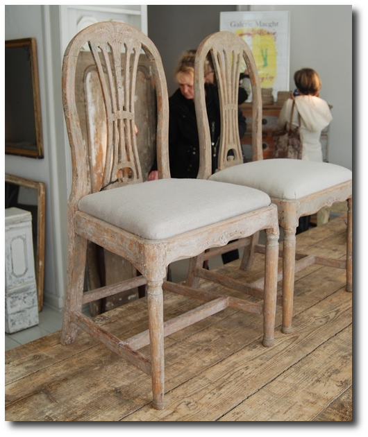
These Swedish chairs were likely scraped down to the original paint
Look how nice white upholstery looks with gray paint.
Originally featured on Romantiskahem.blog
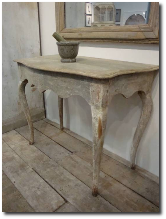
This beautiful console table featured on The Paper Mulberry Blog, originally from Appley Hoare Antiques

Tara Shaw Swedish Chest- Coach Barn Now Sells Tara Shaw’s Collection

Reproduction Swedish Tub Chairs From Amazon $775

Swedish Distressed Chest From Atelier September
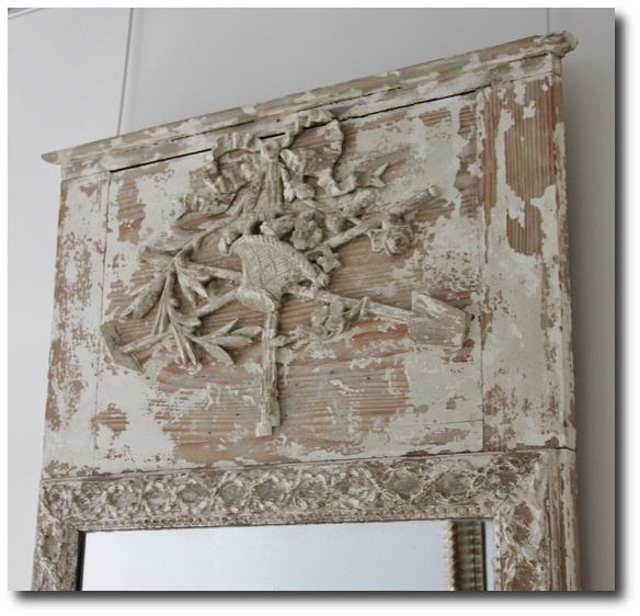
A Stunning Trumeau Mirror From Tone on Tone Antiques,
Featured on Henhurst Interior Blog

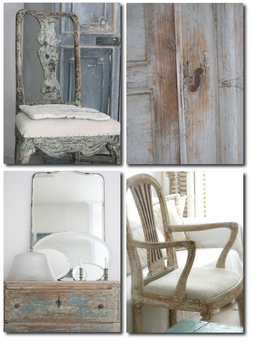
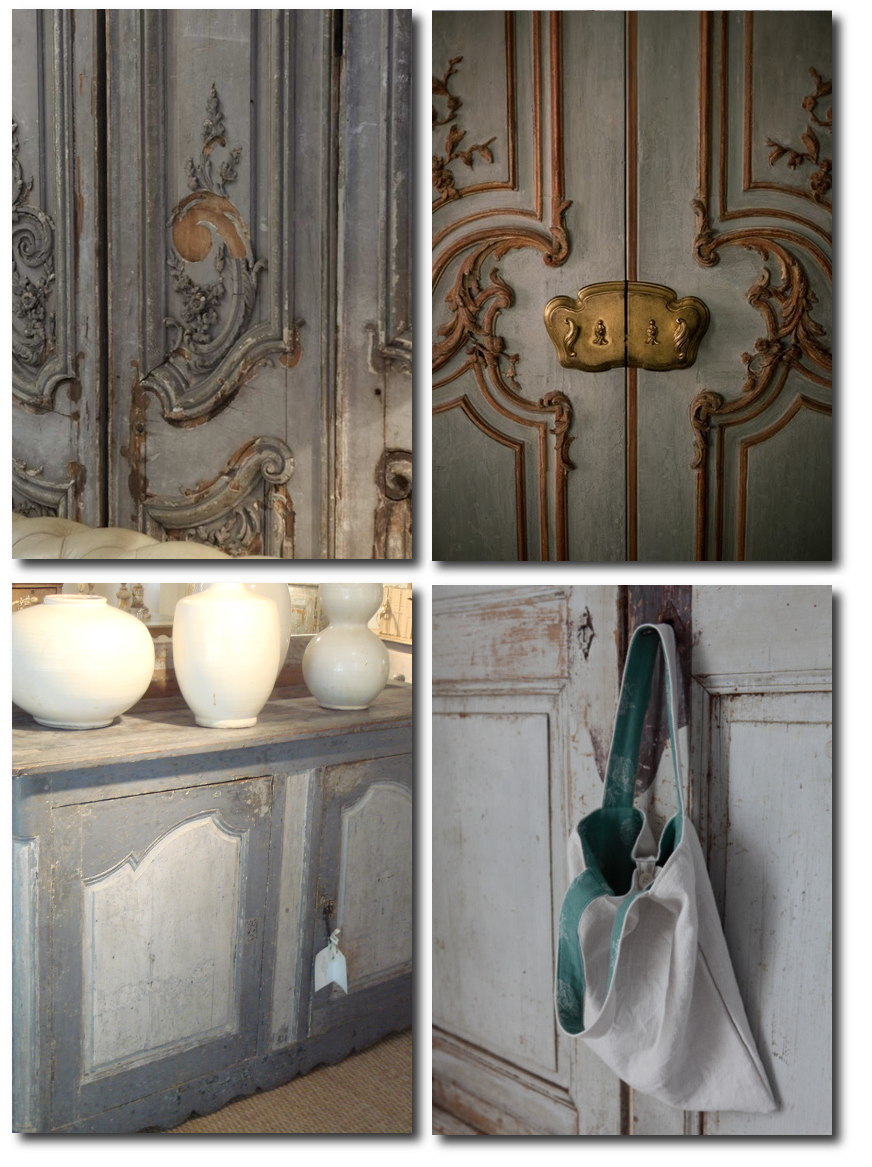
Swedish Aged Paint Finishes From Antiqbr Blog

An extravagant painted sofa in terrific blue gray paint with painted ormolu
From Tone on Tone Antiques Featured on Featured on Henhurst Interior Blog
Swedish Aged Paint Finishes From Antiqbr Blog
A Few Previous Articles Of Interest
- – White Painted French Furniture– The French Provincial Furniture
- –25 Ideas Of How To Incorporate Orange, Pink and Coral Into Your Home- The French Provincial Furniture
- – Ideas For Embellishing Painted Furniture– The French Provincial Furniture
- –French Provence Red Check Textiles– The French Provincial Furniture
- –Distressing Painted French Provincial Furniture

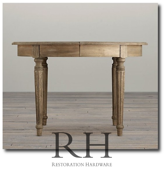
Breathtaking Weathered Dining Tables You Can Buy Online
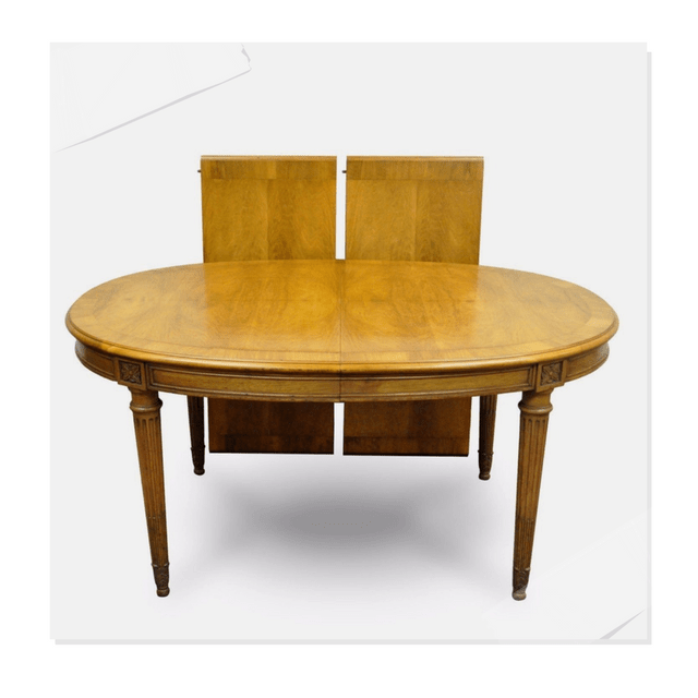
French Louis XVI Directoire Provincial Walnut Dining Table- Quality Is Key On Ebay $765
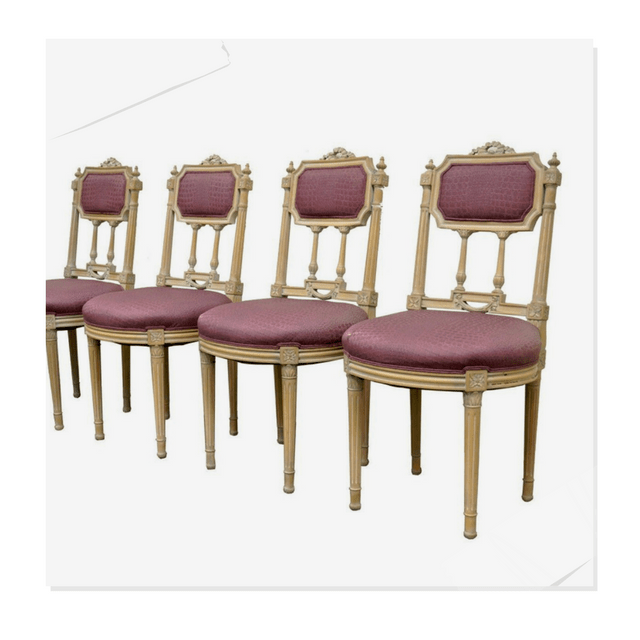
French Louis XVI Style Drape & Bow Carved Painted Dining Chairs $1436 Quality Is Key On Ebay
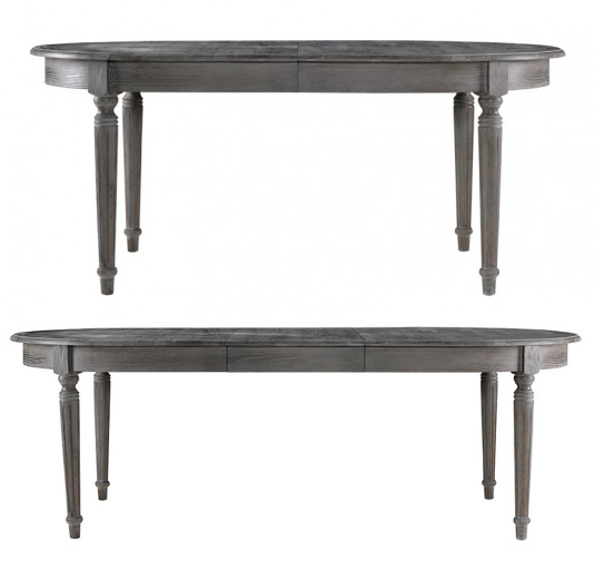
Consider this stunning Maison table available from World Bazaar Exotics on ebay, listed at $1,188 for your Swedish Gustavian styled home.
Dimensions: 48″ Version: 48W X 47D X 31H, 68W with leaf, 72″ Version: 72W X 47D X 31H, 92W with leaf
This outstanding table with timeless 18th century style is crafted out of solid oak with aged finishing techniques that will surely impress you and all your guests. This deep grey finish will work quite perfectly in a Gustavian styled home. This table includes one 20″ drop-in leaf extension.
Restoration Hardware also sold a very comparable table inspired by 19th-century French Empire design. RH’s table is also built from solid oak, and had a full skirt and slender tapered fluted legs. A weathered finish also lends itself to a look that has been aged for years. RH’s price ranges from $695 – $1495
Restoration Hardware’s French Oval Table

Gustavian Oval Gate Leg Table
Gustavian furnishings have an uncanny ability to express serious sophistication without ever veering into the indulgent, foo-foo, or precious. This oval dining room table is a classic example of serious form following the functionality that only a drop leaf surface can provide. Whether placed in a loft of cottage, city apartment or large estate, this piece just works. 31 inches high x 63 inches wide x 77.5 inches long

Swedish Dining From Traditional Home, April 2007

French Country Louis Dining Table $3,348
A graceful 18th century style piece reminiscent of the French country aesthetic, this generous dining table will please those devoted to beauty and simplicity. Fashioned from solid oak and elm, the rounded edges and legs create a gentle, rustic effect.

Beautiful White Rent Table – Seen In The Home of Shannon Bowers
Carl Larsson Table From The Gustavian Collection
Louis Extension Dining Table French White Solid Hardwood- Buy it on Ebay
The Napoleon collection faithfully captures the romantic feel of vintage, painted furniture from the French countryside. Featuring gently curved frames made of solid hardwood, brightly colored then rubbed down on the edges. Adds a soft splash of vibrance to any setting. $2,200.00 71″ to 91″ x 43″ x 30″, (91″ fully extended ) Oak wood

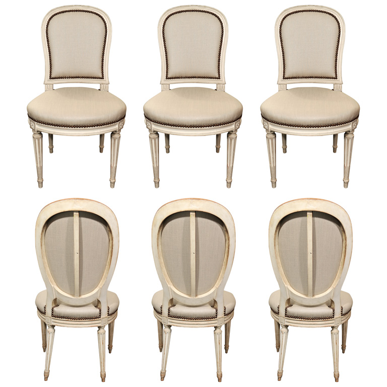
Harlequin Set of Twelve French Dining Chairs in Grey Linen Antony Tood
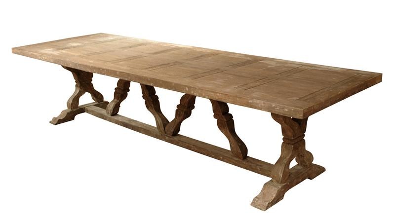
Linley Heavy Distress Farm House 14 Person Trestle Dining Table $3,938.00
The Perfectly Imperfect Home: How to Decorate and Live Well
Designers Pick The Best Milk Paint Color For Furniture
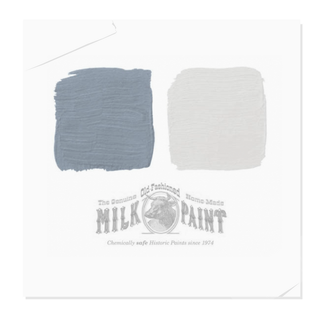
Pictured, Slate Blue and Oyster White , both by Old Fashioned Milk Paint Co.
In House Beautiful’s “Add a Pop of Color to Your Furniture” key designers revealed their best paint colors for furniture. Brian McCarthy’s reveals his favorite colors from The Old Fashioned Milk Paint line.
“Find a piece that has good lines and trick it up. I’ve taken a plain pine chest of drawers from a junk shop and done a simple, cottagey finish with milk paint. Start with a base in Swedish blue-gray and lightly brush over it with white, pulling back with steel wool in spots to reveal more color.” -Brian McCarthy
The gray Donald Kaufman color swatch that Carey Maloney suggested would look fantastic on any piece of furniture, and would be a great color that you could base your entire Swedish home around. The Blueberry Myrtille would look fantastic on a dresser chest with tons of distressing. This color was chosen by designer Christopher Maya. Ruthie Summers suggests Ralph Lauren Paint’s Relay Red , while Thomas Burak suggests Benjamin Moore’s Heritage Red Exterior Roo, both would look terrific on a Swedish accent chair.
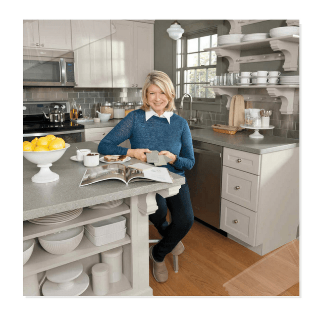
Paint Your Cabinetry Gray Like Martha Stewart’s Kitchen
Tour Martha Stewart’s Home-Between Naps on The Porch
6 Bright Kitchen Lighting Ideas- Martha Stewart
Martha’s Bedford Farmhouse Kitchen – Martha Stewart
Remodelista snapped some incredible shots of the set of the Martha Stewart Show showing a fabulous kitchen modeled after her her very own kitchen in Bedford, New York.
Open shelving displays an amazing collection of all white tableware. If you look closely, in the back of the cabinets, risers were painted and hide lighting that illuminates the collection of plates and teacups. Vintage pitchers are used for utensil storage and grouped in a set of three. Look how she seperates the wood from the metal. Look at the additional picture Remodelista shows for how Martha displays her vintage rolling pins as decor on the wall.
The cabinet paint is Mourning Dove Gray (MS 151) and the wall paint is Evening Moth (MS 173), both from the Martha Stewart Colors line. Brass is commonly used by Martha on gray cabinetry, which dresses up the cabinets quite nicely. Marble countertops also give the kitchen an upscale elegance.

Martha Stewart Kitchen’s Set On Her Show
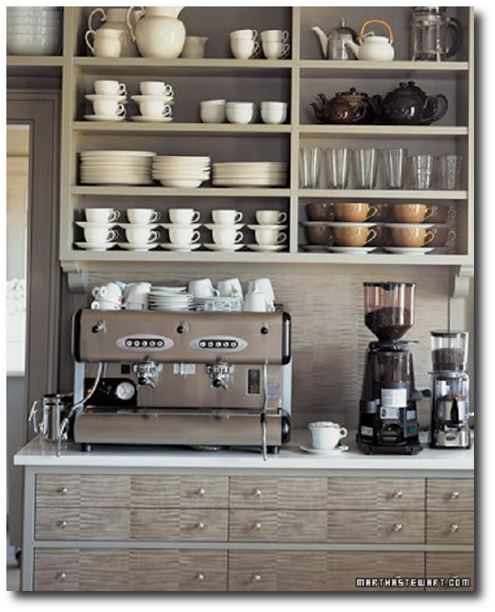
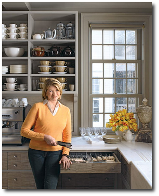
Martha Stewart’s Grey Kitchen Showing Off Her Espresso Maker

Gray Painted Cabinets With White Dinnerware Displayed
Furniture Painting, Distressing & Glazing
1. Milk /Chalk paints have a saturated color making them an industry favorite. Their chalk like appearance along with being very easy to distress make the paints a favorite amongst painters.
Simply paint your piece and let it dry. As usual, distress your piece of furniture, and apply a tinted wax to the surface of your furniture giving it an aged effect.
2. Using Regular Paints:
Any typical paint will work with this finish. Ideally, starting with a brighter paint is always better. The reason for this is, as additional layers of paint are added, the final paint finish will still have lots of pigment to the overall appearance even though additional dark glazes were added on top of the original color.
Consider using a brighter blue or green in the pastel range in a flat finish for your project french chairs.
Flat sheens allow you to work with the additional glazes much easier. Flat or eggshell work very well, so either one can be used. A satin or semi gloss tend to not eat up the glaze as well as an eggshell finish.
Lets get started:
Paint your entire frame and let it dry. Once it is dry, distress the frame using a sponge sander.
Sponge sanders are great because they can give a natural distressed look compared to belt or electric hand sanders. Norton has a 6 pack for $5 which is the price of two sanders in most stores. The next step is to add the decorative finishes.
There are several ways of going about this.
A) Dry Brushing: Is basically the effect of using a small amount of paint feathered on to a piece of furniture. The overall look is subtle. Much like applying blush to your cheeks over foundation. The effect is light, and not rustic what so ever.
For example if you are working with a bright mint color, consider dry brushing 2 or 3 shades of the same hue (darker or lighter ) on to your furniture.
This is simply done by having a very small amount of paint on your brush, and wiping the excess off on a cloth and lightly going over your furniture. If you are finding streaks or lines with the paint brush, you have too much paint on your brush.
The overall effect should show no indication of what medium you used to create the effect.
An oversized badger brush is ideal for this.
B: Painting On – Wiping Off
This is one of the easiest techniques around, and one I am very comfortable using. Not only is it easier than dry brushing, but it allows you to not over think the process.
This effect looks terrific on distressed furniture, so distress the heck out of your piece!
Again, mix up some paint a couple shades darker or lighter than your base color. This doesn’t have to be complicated, add black or white in your original paint color.
This technique is simply achieved by brushing it on and wiping it off with a rag. Working with a damp but dry rag works the best for me.
If you are working with a fairly large piece, consider working with glaze. Glaze gives you additional time to get the paint off the furniture, compared to regular satin paint.
Going back a few steps……
At first, I recommended a flat finish as your base coat, and the reason for that is flat paint covers well. It sands very easily, and it takes less coats to cover evenly. Additionally it allows the glaze to stick well, and move around easier than a semi gloss base coat.
Glazing on the other hand- When it comes to using paint (not glaze) to dull your furniture down, a satin finish will give your piece a bit of a shine, and also allow you to move around the paint easier with a cloth. The product “glaze” purchased in a store will give your piece a bit of shine as well.
Working with glaze gives you extra time to move around your paint. If you plan on working with paint only as your dulling medium, you have to work extra fast. It takes some practice, especially on larger furniture. Glaze is always easier on bigger pieces, and smaller pieces alike.
Ideally if you start off using a very bright color, dull it down with a couple shades lighter than the base color (see the color chart above) and then finish it off using a very thin coat of brown or olive glaze. I buy my glaze UNTINTED, and tint the paint myself as I go along, because I have a variety of painted projects that I use with glaze.
Glaze is usually mixed half paint to half glaze. Again, eye ball it, you don’t have to measure it.
I find sometimes the nicest finishes are those which I paint on a very light coat of brown glaze. Instead of the other finishes which I take off with a damp rag, this finish is just a thin layer of glaze. The overall effect just dulls down the overall color. Brown glaze can make a huge difference with colored paints. It also makes a impact on white paint as well.
When painting with white, consider a creamy paint, not stark white as your base paint. When glazing over white, paint on the brown glaze, and take it off very very quickly. This is especially so using flat paint. The flat paint will soak up the brown pigments so don’t leave your glaze on too long. In fact, I would suggest using more glaze to paint ratio when glazing white furniture. Experiment for yourself to get the timing right.
C)The best method I have used is oil paint to create surface glazes. I love working with oils because they produce an effect like nothing else. I do the first two steps the same as above….1 (base coat), 2 (distressing) but when it comes to adding a glaze, I tend to work with a satin oil paint from my local Sherwin & Williams. You can get custom colors mixed, and I tend to work with a yellow that is between the top two colors in the color chart above. The yellow works over almost every color I paint with. Over brown it produces the gray you see in this photograph. Here is another dresser which I used the color. You can see remnants of the paint in the details. With oil, you have to work pretty quick, because it can get very thick quickly, making it more difficult to create a nice even finish.

CAST IRON URN Terra Finish From Desgin Studio D
(This is as close as I can describe what a finish looks like using oil paint. Oil paint allows you to move the paint around the piece with a damp cloth leaving a textured finish behind. You can see that in some areas the paint was removed more than others)
For dressers I work in very small sections. Smaller pieces of furniture I quickly apply paint to the entire piece and work like mad to get it off.
I simply paint on the oil paint, over the entire piece (or small sections if it is a big piece of furniture) and use an old facecloth to take off the paint.
If you do more pieces at the same time, I find my cloth gets saturated with oil, (which dries) and makes my later pieces much better.
I have used a muted dulled yellow over blue, and green, and the effect is terrific! Nothing comes close to oil paint. Painting can be fun, experiment, and make the pieces your own.
Painted Antique Furniture Using Pastel Greens – Picture Credited to Cote De Texas
An Interview With Tara Shaw About Her Swedish Furniture Line

(These pieces are no longer on Amazon…sorry)
A few select pieces from Tara Shaw are now being sold through Horchow.
Reminiscent of favorite antiques imported from Europe, Tara Shaw Maison offers reproduction furnishings and decor for the home that will become your new classics. Simple yet elegant, this handcrafted birch Swedish side chair is hand carved of birch wood with a hand-painted finish. 19″W x 13.5″D x 38″T. This terrific chair sells for $1499 from Horchow.
Horchow had an interview with Tara Shaw that was very inspiring:
HORCHOW: What inspired your furniture collection?
TARA SHAW: “Guerrilla antiquing” for 15 years in Europe. II was so difficult, finding one-of-a-kind items and knowing only one person could buy it and enjoy it. I couldn’t find these finishes and styles in a reproduction line – that inspired me to create the pieces I wanted.
HORCHOW: As an interior designer, what are your go-to’s?
TARA SHAW: For fabrics, Dedar; I used their acanthus print in gray and cream for a showhouse bedroom. For paint, Benjamin Moore #925. an ivory that works with
whites or colors; tor high-gloss. “Possibly Pink” from Fine Paints of Europe. For wallpaper, I just launched my own “Grisailles”, based on the grisailles panels in
Tara Shaw Maison.
HORCHOW: Which design era is most inspiring to you?
TARA SHAW: Louis XV! in France and King Gustav II in Sweden. Louis was the father of the straight leg. and both are known for clean lines, pale painted finishes gilded to perfection.
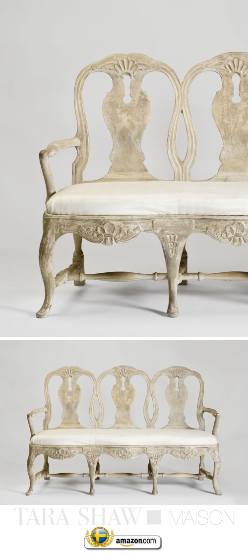
Three distinct chair backs, each featuring elegant curves, intertwine to form the back of this breathtaking Swedish-Rococo-style bench. Reproduced from a European original, it offers a unique seating option formal enough for grand dining rooms yet casual enough for entryways, bedrooms, or other areas.
- Hand carved of birch; no two are exactly alike.
- Seat upholstered in poly/cotton.
- Hand-painted finish.
- 64″W x 20″D x 42″T; seat height, 20″T.
- Imported.

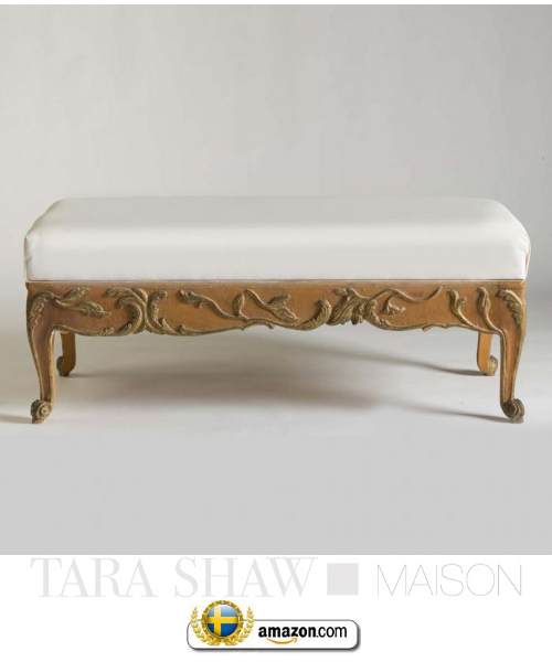
Inspired by a European original, this stately bench features ornate carvings on the apron and legs for Old World charm and antique appeal. From Tara Shaw.
- Frame is hand-carved birch with a hand-painted finish.
- Upholstery is polyester/cotton blend.
- 52″W x 22.5″D x 21″T.
- Imported.
How To Decorate With Yellow For A Historical Look
- Swedish Decorating Colors- Blue, Yellow, Navy And Gray- Painting of King Gustav III
- Antique Yellow Rococo Chest- Scandinavian Antiques 1st Dibs
Yellow along side blue and white are colors that are known to be distinctively Swedish, so when it comes to picking a color for a room around, yellow is a fantastic choice. If you have ever based your home around the darker colors such as red, or black, over time it can be very overwhelming, and just gloomy. Yellow produces the opposite effect. It is enlightening, encouraging, and uplifting.
The color yellow can apply to so many decorating styles, so when considering a period look that is Swedish, here are three tips to keep in mind to make it uniquely Gustavian.
1. Pick the Right Hue– Yellows such as pale yellow or ocher yellow are more historical than high-voltage tones. Brighter tones of yellow can be very fluorescent, which are not at all what you want for a period room. Choose yellows that have a rich brown or slight reddish undertone for the best period looks. Take an ochre yellow and go a few shades darker or lighter on the scale for a perfect tone.
2. Don’t rely on the Paint Chip- A hue that appears just right on the paint chip will usually intensify once it’s on your walls.
In our small town we don’t have a paint store close to us which can match customized colors, so I experienced this very thing when I went to our local hardware store last week for yellow paint. Our local paint store cannot custom match pre-mixed colors, so I had to pick from the selection that was available for sale. The color which was almost right in the store turned out to be very bright on my outdoor table. I added in every can of yellow paint that I had left in my home, and a gallon of dark ochre, and it happened to work out to be the perfect shade for the project I was painting. The shade of ochre works every time I find when I am customizing colors.
With that being said, consider getting a couple samples of paint which cost only 2 or 3 dollars than getting a whole gallon of the shade you think is right. Consider the color you think is right, and try a shade a few shades lighter.
3. Combining 2 different tones of yellows can be quite stunning.
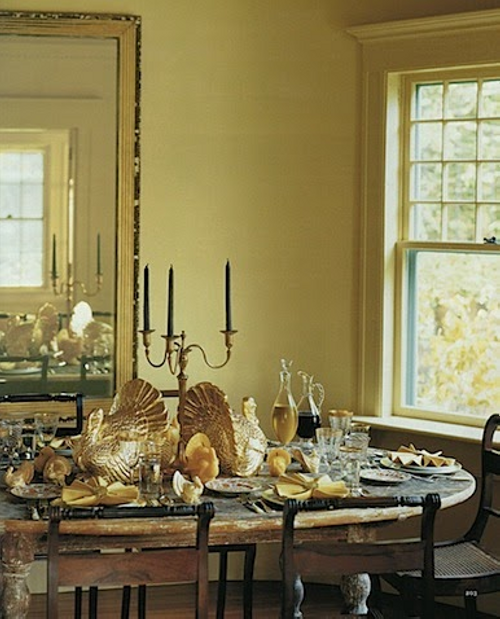
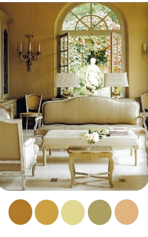
This classic Gustavian room that appeared in “Classic Swedish Interiors,” by Lars Sjoberg, featured on Mentar Mentar Blog shows classic painted paneling. The paneling is a saturated tone of yellow, which is very rich in color. The walls are painted yellow, which appears to be a duled down yellow. The combination is absolute perfection. You can see in this photo, they dressed up this room with a white painted Swedish Mora clock and a black painted french styled desk with a brown leather desk chair. The three tones are perfect color combinations for a Gustavian effect in this yellow based room.
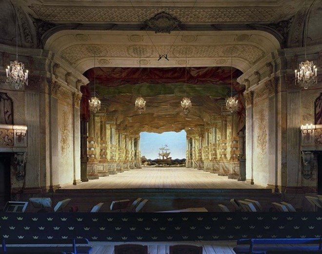
Again the same tones appear in this photograph of the Drottningholm Theatre. Like the leather desk chair in the above picture, you see the same tone of burnt umber on the doors and window frames. White is the second dominant color in this photograph. You can also take tones of the gray marble from the base of the marble statue. The light blue sky is a beautiful accent color.
You cannot go wrong with adding in a couple different shades of yellows. Choose your dominant color of yellow, and add in a few more shades of yellow in the accessories. Neoclassical lamps often feature a pedestal of some sort and a fluted section which can be painted in three tones. Pick a shade of yellow, and combine it with black and gold, or yellow, gray and gold. Paintings also allow you to add in several rich tones of the Gustavian palette. Painted furniture is another way of adding in the just right tone into a scheme.
5. Picking out the right upholstery fabric and throw pillows can go a long way in making your room more period in style. Gustavian decorating often features fabrics that are based on white backgrounds. Picking a fabric that is floral, check or stripe will give you that period style you are looking for. Finding the right fabric can be a true battle, but remember you have so many other elements that can work in your favor to create the Swedish effect.
Picking the right paint tone, along with the right tones for your accent colors will go a long way in recreating a Gustavian home.
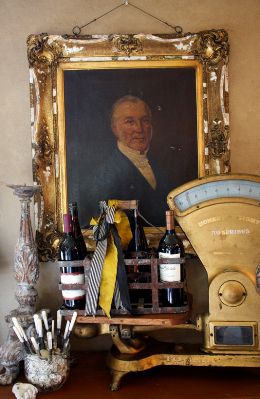
You can see in this photograph a slight yellow tone on the wall, which may be from the camera flash. If you can imagine the wall painted a yellow tone, with layers of gold paintings on the wall, and gold brass accents. The weigh scale has a slightly brown tray holding black bottles, with a very bright yellow ribbon. The various tones of black, yellow, red ( the bottom of the photograph) and navy, seen in the scale itself is the perfect color palette for Gustavian styled decorating.
“I like a buoyant, light-filled house, so I usually use all warm or yellow-based colors. This ocher is really a contemporary yellow shade with an antique resonance. It doesn’t draw attention to itself as, say, bold yellow or even white would. The ocher walls provide support for the exceptional paintings and furniture. Bright-colored walls would visually compete. This shade flatters everyone — it complements every skin tone.” – designer Thomas Jayne
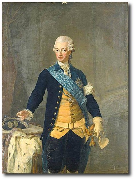
You can see in this photograph of Gustav IV Adolf of Sweden his suit is a brighter yellow against a backdrop of yellow ochre. You can see the painting has a stunning blue sash, and a darker blue jacket, that isn’t quite navy. The brighter yellow, and the peach tones such as the colors in his face would be a great color scheme for a yellow room.
Take some inspiration from the brighter yellow interiors found in the Swedish Chinese Pavilion. The interior featured brighter yellows and bold fabrics on upholstered Swedish chairs.
Here we find a combination of yellow and orange at the Chinese Pavilion. The walls are lined with a light blue paint.
In this picture we find a combination of greens, lighter greens and pastel tones with brighter colored yellow ribbons. Consider a scheme of pastel greens and yellows.
Designer Mary Douglas Drysdale uses brighter tones of yellow in her neoclassical room with Federal antiques. She combines a brighter yellow check pattern in the upholstery and for the window drapes
This ravishing yellow silk gown from 1760 gives off the perfect tone of yellow.
This 17th Century styled room features tones of beige, gray, and natural wood herringbone wood floors and a brightly colored yellow fabric cover. Consider using yellow as your pop of color, such as they did in this room.


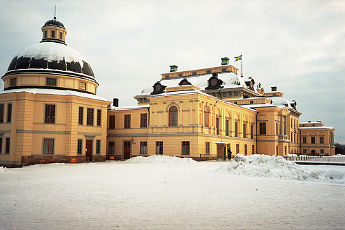
Tour Through Drottningholm Palace, And Drottningholm Theatre
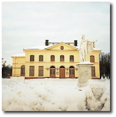
Drottningholm Palace also has a theatre that sits directly beside the palace. The Drottningholm Palace Theatre, or in Swedish called “Drottningholms Slottsteater” is an opera house from 1766. Today it is run by a private foundation, but still functions as a real theatre! The theatre was built for Gustav III by his mother in 1766. Gustav III loved the theatre so much and was often known as the theatre King. In 1792 when he was assassinated, his mother Louisa Ulrika of Prussia decided to close up the theatre at Drottningholm. Then in the 1920s it was rediscovered, and because the theatre had not been used or touched in so many years, almost all the original equipment is still there.
This wonderful group of pictures came from TC4711 on Flicker, and Sim 1 Travels
I am so thankful to people like Hansn’s Flicker who have taken pictures for us to view. King Gustaf III had this lobby made as an addition to the Court Theatre in 1791. It was also used for having breakfast. Musicians then sat on the upper floor making the music sound like coming from the heaven painted on the ceiling! When the King was murdered one year later the theatre was closed and it stayed closed for 130 years. Check out the marble finish on the walls. There are so many colors of faux marble wallpaper that you can put up to give the look of a high end interior marble. Add a tinted glaze over top of the wallpaper to mute the overall look so it doesn’t appear to be wallpaper. There are also many free videos on You tube today with Master Painters who show How to achieve these looks. If you are willing to learn, it just takes some practice.
Inside Drottningholm Palace
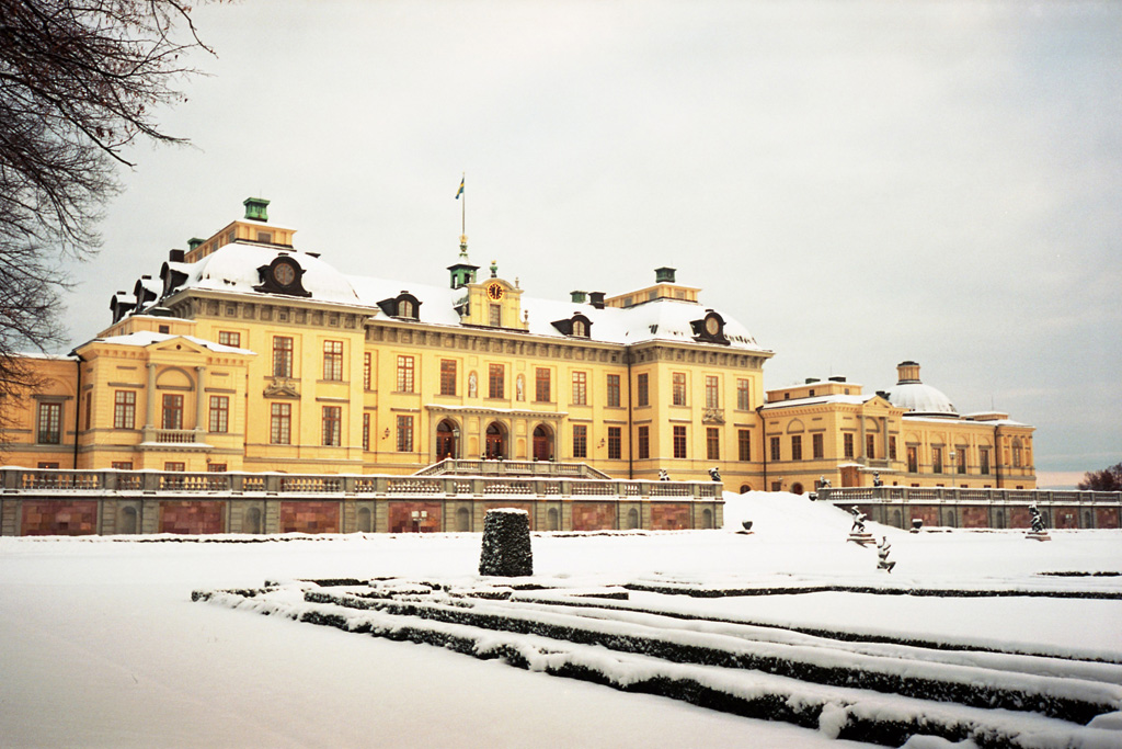
The name “Drottningholm” means “Queens Inlet”, a well chosen name as the palace was built for Queen Hedvig Eleonora and it is located on an inlet of Lake Mälaren. It was built in 1662, after the previous palace on this site was burned down to the ground. Drottningholm is often called the “Versailles of the North” because it compares to the famous palace in France. The Swedish royal palace was constructed in the same time as Versailles, and is built in French Baroque style. The architect Nicodemus Tessin the Elder (and later Nicodemus Tessin the Younger, who completed the work) was clearly inspired by the famous French palace. The palace is smaller than Versailles but equally distinguished in style.
Although there are some differences between Versailles and Drottningholm. Many claim that as beautiful as Drottningholm is, it pales in comparison to the grandeur of Versailles.
Spectators say the gardens and the interiors are nothing in comparison to Versailles when it comes to decorations and details. The Swedish interpretation of the glitzy French style during this time was more natural that showy.
Many people who adore French decorating tend to over time love the Swedish styles so much more. The Swedish interpretation of Versailles was muted rather than being showy. Where France used silk brocade fabric, Sweden used natural linen, where patterned wallpapers were common in France, painted walls were just as rich but more natural.
Modestine Blog takes a tour of the Palace and states………”It has been compared to Versailles, a beautiful royal residence away from the bustle of the Capital. Delightful as it is though, it lacks the grandeur of the French palace. The rooms are quite small and the interiors are wood, painted to resemble marble. Trompe l’oeil painting has also been used to excellent effect on the main staircase to give the impression of carvings and bas-relief sculptures, and again within the rooms to create the impression of spaciousness by painting false doors on the walls! There are allegorical paintings, too complicated to understand, tracing the history of the 18th century Swedish rulers. Of particular note is the rococo library room, built by Queen Lovisa Ulrika in the mid 18th century. We have no photos, cameras being forbidden inside the buildings”
The guards outside Drottningholm Palace – Picture Credit Jeremiah Blatz
Unfortunately, photography is NOT allowed inside the palace. Kina Slott is a very colourful place. Many people are amazed by the abundance of colours and how they in a remarkable way blended so well with each other. Bright yellow, orange and greens and pinks are all used in this palace. Inside most tours, you can see the exuberantly decorated bed room of queen Hedwig Eleonora, which took 15 years to complete, a militaristic gallery in baroque style and the impressive library of queen Lovisa Ulrika.
As you approach Drottningholm Palace — the private residence of the Swedish royal family — via boat from Stockholm, you first see the Royal Bath House Picture Credit
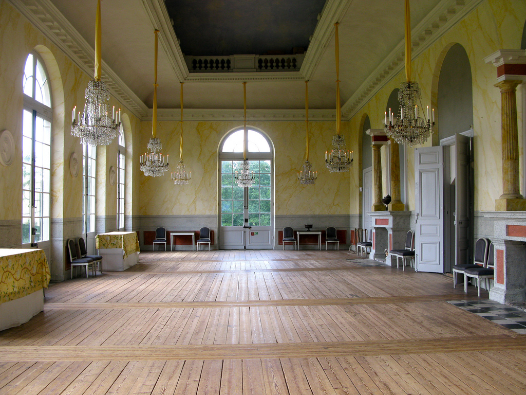
The interior of the palace is in early Baroque style of the 1660s and 1670s.
Rooms not to be missed are the beautiful staircase,the Ehrenstrahl Drawing Room and the Hedvig Eleonora’s State Bedchamber.
The library is the creation of Princess Lovisa Ulrika of Prussia. Lovisa Ulrika had quite a few interesting collections, which made Drottningholm a popular spot for leading scientists of that time to visit.
From the windows at the top of the stairs you have a good view over the formal gardens of Drottningholm. The view over the garden is actually the only place where you are allowed to take photos inside Drottningholm.
The formal gardens are the oldest of three garden styles at the palace, and date back to the 17th century and were laid out here by Queen Hedvig Eleonora (who also had the palace built). The garden has very strict lines, dominated by box-hedges and stripes of crushed brick of black granite. There are no flowers in sight though! Lawns, hedges, statues, fountains and ‘manicured’ trees.
The good news is that the gardens are for free! So if you live in Sweden, you can easily pack a picnic basket and a book and enjoy the gardens.
Drottningholm Palace Library
Workshop of King Gustav III.- Picture Credit Check out the color on those walls!
The Billiard Room at Kina Slott, which is also a seperate building. The billiard room is similar in style as the main building and was completed at the end of the the 1760’s. This room was originally used for playing billiards. Today the room gives an impression of how the workshop of King Adolf Fredrik used to look like. It is interesting to know that turning a lathe was a recreation for the royals and the nobility of Europe. And not only Kings would do some handiwork, even the Queen used to work on the lathe! In this room you can see tools and a carpenters bench used in those days. This information and picture was found on Virtual Tourist
Kina Slott consists of more then one building, actually there are quite a few of them. Of course you have to visit the main building, which is by far the most impressive, but you shouldn’t forget to take a quick peek inside the Confidence as well.
The Confidence is a dining room, but not your usual one! The Royal Family could use this private dining room if they wanted to take their meals privately “en confidence” without any servants present. To be able to do this the Confidence was build with a clever mechanism. An ingenious system made it possible to lift a ready-laid table up through the dining rooms floor. Beside the main dining table there are also four side tables, having a similar lifting system.
When the Royal Family was ready to dine, all they needed to do was to pull a handle in the dining room. A bell would ring in the serving region below and the lifting system would bring in the food.
The Guards Tent located in the garden at the Drottningholm Palace (or better known in Swedish the Kina Slott) is a wonderful blue and white striped tent. The tent was built to imitate fabric and yarn tassels. The wonderful tent used to be the quarters for the solders of Gustav III. It was built in 1781 and designed by C.F. Adelcrantz. The idea behind the architecture was to resemble a tent in a Turkish army camp. The tent building certainly has a dramatic and theatrical look that fits into Gustav III’s love for the theatre. The Chateau de Groussay in France was inspired after the 18-century Cooper tents at Hagaparken in Sweden. Both tents almost look identical. Check out this wonderful post by Architectural Watercolors Blog which features 18th century garden tents.
Check out some of the most beautiful pictures from Chasmiller and his travels in Sweden. The architecture is amazing. The pictures of the Gurards Tent are from his website.
From Wikipedia- Hagaparken (“Haga Park”), or simply Haga in Solna Municipality just north of Stockholm, Sweden is a vast and popular nature area, with large parks, lakes, woods and gardens. Within the park is Haga Palace, King Gustav III’s Pavilion, the Chinese Pavilion, the Echo Temple, an older castle ruin (which is not really a ruin as it is the remains of a castle never finished) and several other interesting buildings on the grounds (as the peculiar Copper Tents and also the Butterfly House). Included in the Haga Park is also the Royal Burial Ground of the Swedish Royal family (since 1922), where several members and ancestors of the present Swedish royal Bernadotte family rest. Hagaparken has historically been favoured by Swedish royalty, especially Gustav III who founded it and developed it 1780-1797, and by the famous troubadour Carl Michael Bellman, a contemporary of Gustav III, who is much associated with Haga due to the lyrics of his compositions, poems and his writings. The song Fjäriln vingad is entirely dedicated to the park.
The Sultan’s Copper Tents, originally three buildings for the palace guard, designed by the painter Louis Jean Desprez and built during 1787 to 1790. Desprez proposed that all the façades of the buildings should be designed as three Turkish tents, clad in decoratively painted copper plate. However, tent façades were only built on the side facing the main lawns, which still gives the desired illusion of a sultan’s encampment on the edge of the forest.
The middle tent was destroyed completely by fire in 1953. The front of the tent was rebuilt during 1962 to 1964 under the leadership of palace architect Ragnar Hjorth. The buildings behind the tent facades were rebuilt in 1977-1978, following plans by palace architect Torbjörn Olsson. He turned the stable yard, formerly open, into a tent room with a ceiling. Today the middle copper tent is home to the Haga Park Museum. The tent to the east houses a restaurant and the one on the western side is accommodation. The copper tents are a national monument and protected under law.
Peak of Chic posted this stunning picture of Tented Room at Charlottenhof. Take some inspiration from this room and create a Swedish themed room with blue and white striped walls, and drape your fabric to look like these classic old world tents
A person could spend weeks looking through the many beautiful pictures on Ye Olde Fashion. If you enjoy sewing, and the history of fashion, this site is definitely for you. It details just the best fashion from many centuries. If you are good at sewing and want to be inspired for some new patterns, look at this site, as she has a really great eye for spotting only the best fashion through the decades and centuries.
Stripes were more or less absent from early-18th century fashion which trended heavily towards anything large and flowery. The floral trend eventually transitioned to vines which simplified to a mix of wavy stripes and flowers by mid-century, as seen in this 1760s robe à la française