5+ Nordic Homes Decorated Around White
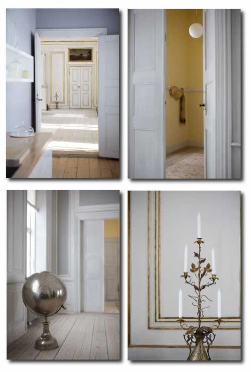
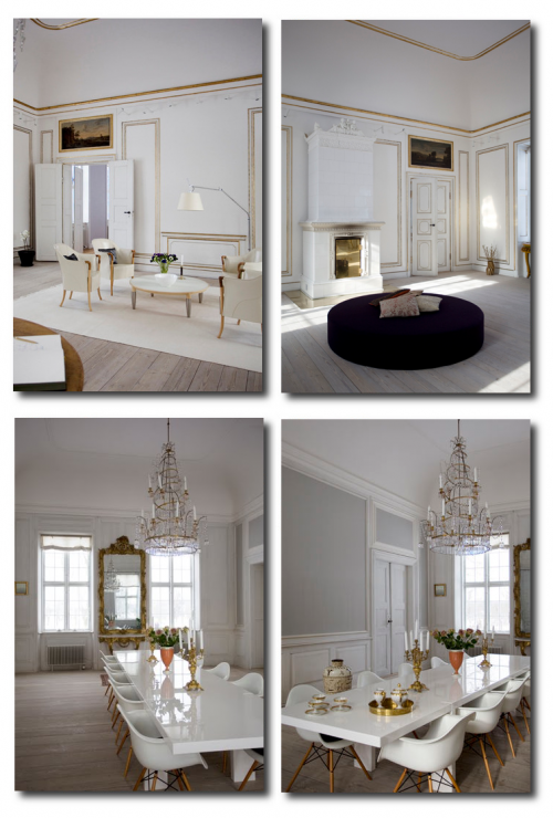
The Swedish interior decoration magazine Skona Hem had a wonderful write up on an English family who transformed their home into that of a Gustavian period style.
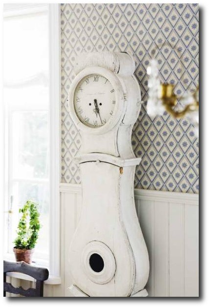
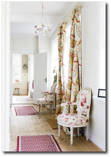
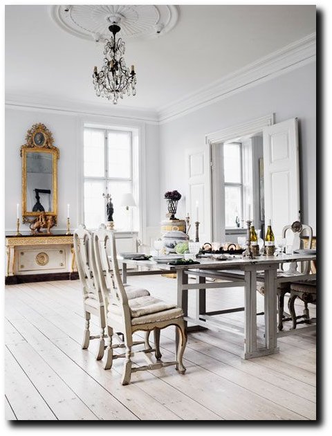
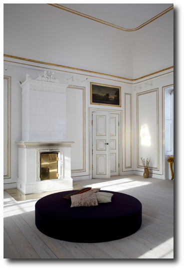
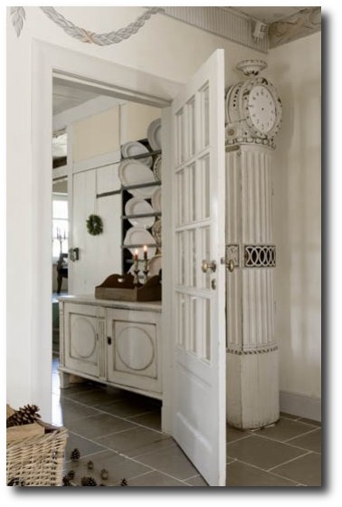
The home is largely based around a white palette, anchored by distressed wood floors which create a down to earth family feel. While many of us wouldn’t have access to an authentic Swedish tiled stove, we can incorporate the lines of the furniture that were seen through this time frame.
What To Look For….
– Straight Or Curvy Lines– Look for Rococo, Louis XVI furniture that has straight lines. Look for straight chests which you can add round ornate pulls, and round keyholes to. Victorian furniture also can be painted and re-upholstered to achieve that Swedish appeal.
– Mix And Match Styles– Don’t be afraid of mixing in a variety of country and formal styled furniture. You can see in this home, mixing and matching is very appealing.
– Go Authentic With Patterns- Work with country throws, and rugs to bring in the authentic patterns of Sweden.
– Wallpaper Is A Great Investment– Wallpaper can really transform a room, as seen in this home. Go for white based wallpaper with a geometrical or floral based patterns.
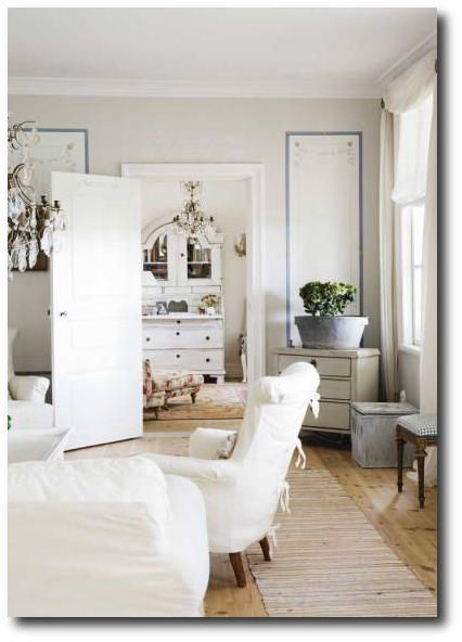
-Lighter Everything– Work with lighter colored fabrics, with an airy feel. Go for thinner fabrics for the summer, and collect natural based thicker wools for the winter time.
– Faux Painting and Stenciling- Create faux molding with paint. Here we frames on the walls, used in combination with stencils to give a whimsical, feminine look to the walls. As you can see, they pick a very light blue for the frames, and all the stenciling is done in a couple shades lighter and darker than the base wall colors. This look is very easy on the eyes.
– Crystal Chandeliers Everywhere– Chandeliers can really make a difference. In this home, almost every room has a crystal chandelier. Get the Swedish look by changing out your light fixtures to something more classic. It will instantly change the space.
Related Articles: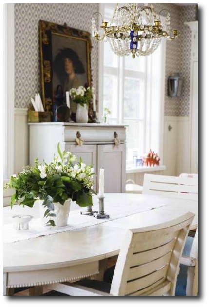
Carolina Rediviva Building, Uppsala University Library (Uppsala, Sweden)
Swedish in Connecticut via Robert Couturier
Gelskov Gods, a manor house on the island of Funen in Denmark
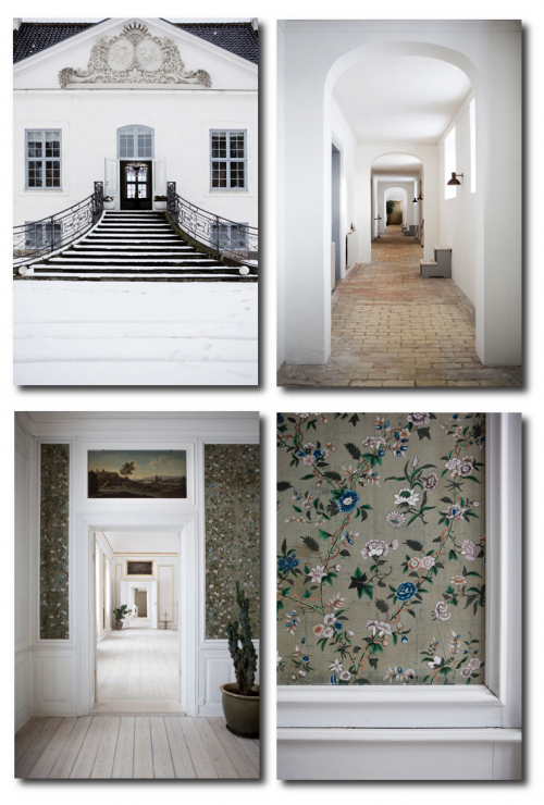
ELLE Russia Decoration July-Aug issue featured a manor house, Gelskov Gods, on the island of Funen in Denmark. The house featured a classic nordic style home with a stripped down, very moderate decorating scheme. The home featured a masterful mixture of baroque, rococo furniture in a clean white and gray based interior.
Anette and Heine Robert Dahl used to live in Copenhagen, but in the spring of 2009 they moved to Gelskov, in this Manor on Funen where they also hold exhibitions, display antiques and flea market finds which they offer for sale. The home also functions as a bed & breakfast.
Gelskov Gods
Gelskovvej 10
Hillerslev
5750 Ringe
Tel.+45 26638094
Get The Look Of Their House…….
-Layer Shades Of Gray – Go for a shade of gray on the walls, and add architectural accents in a painted shade that is a couple shades lighter than the walls. Create straight lines near the ceiling that mimic architectural molding.
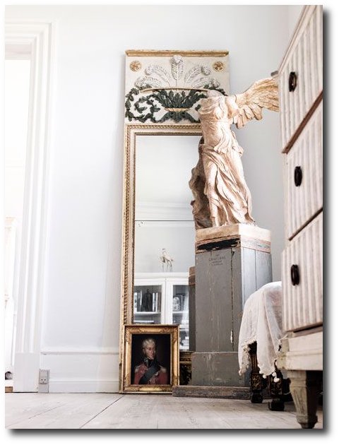
– Black Works As An Accent In A White/ Gray Toned Home- In a color scheme like this, black can really give that pop that you need. If your not crazy about black, go with charcoal, or a really saturated tone of gray. Colors like rusty orange, gold, gilt finishes really work in the opposite color spectrums. Add gilt wood mirrors on the walls, decorate with rusty metal accents. Go for an additional color for a pop here and there through your room.
– Keep Your Collections In One Area– In the picture below you can see a bookcase, or shelf holding a variety of white tableware. Collections can look interesting, and when they are paired or displayed in one area, it can give your house an organized look, without it being overwhelming. Here you can see the house has a lot of contents, but they choose to house the collections.
– Add A Variation Of Color In A Different Tone– In one of the hallway’s open areas, you can see a shade of lighter colored pink on the walls, which brings life to the area. If you choose to have a home based around the gray tones, add some subtle colors here or there to warm it up. You can see they do that with the color green on the trumeau mirror in the hallway. It goes with gray, but it isn’t black, black, black. A hint of blue, green or red in the undertones can make a difference in a theme that is based around the same color; in this case gray.
Gelskov Gods, a manor house on the island of Funen in Denmark
Gelskov Gods, a manor house on the island of Funen in Denmark
Gelskov Gods, a manor house on the island of Funen in Denmark
Gelskov Gods, a manor house on the island of Funen in Denmark
Gelskov Gods, a manor house on the island of Funen in Denmark
Gelskov Gods, a manor house on the island of Funen in Denmark
Gelskov Gods, a manor house on the island of Funen in Denmark
Gelskov Gods, a manor house on the island of Funen in Denmark
It is always fun discovering blogs from around the world. The Norwegian Interiors & Inspiration Blog posted some wonderful pictures of a Swedish villa strongly inspired by the typical Swedish Gustavian style. The pictures are taken by the Danish photographer Mikkel Adsbol. It seems as though there are a variety of pictures taken on this home which shed a light on the various rooms throughout the house. A Bit of Everything Sometimes Blog also featured some wonderful pictures. Of the rooms, the washed wood floors, and various Swedish furniture reflect a Gustavian direction in this residence. The bedroom has a slight hue of lilac, as well as the child’s bedroom which seems to have Swedish motifs painted on the walls.
Living Inside also features some lovely pictures of this home.
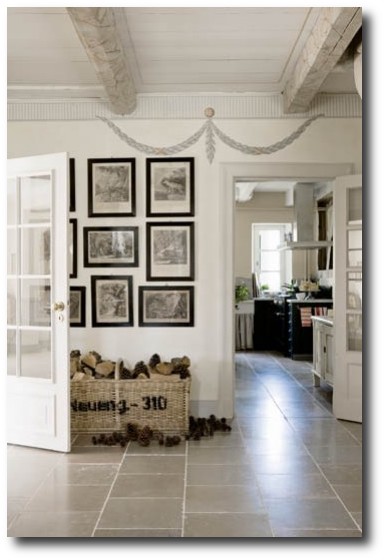
A Renovated Log House Decorated Around White- Seen On expressen
Modern Furniture In A Castle In Denmark –DH Design & Co
 Modern Furniture In A Castle In Denmark –DH Design & Co
Modern Furniture In A Castle In Denmark –DH Design & Co
Modern Furniture In A Castle In Denmark –DH Design & Co
The Norwegian Blog Ernashus posted some striking pictures from Swedish Wlfsta Goods of a Swedish styled interior with some unexpected rustic elements you normally don’t find in the blue and white typical Swedish room that is often shown. In fact, the Swedish style isn’t one that fits in a box, there are so many diverse ways to Swedish decorating, that there are no general rules. Although I am enlighted to see some new variations on the style.
There isn’t too much about this home. This 19th century Swedish home was once neglected, and brought back to life. The brick home with it’s characteristic sloping roof and eaves gives off a very unique impression. The expansive lawn and gardens are accented with a matching gazebo.
Borrow Looks From This Home
There isn’t much on this home. The original article was featured on weranda.pl/…..
This home is spectacular. A great home to borrow ideas from for a white based interior.
Borrow Elements From This Home:
– Have You Ever Seen One Canopy Tying To Beds Together? – Why not? We often see traditional canopies above a single bed. In this case, the home owners decide to use one canopy over two beds. Decide if you like the look. Look at avidekiotthon.hu, ahouseromance.blogspot.com for additional pictures.
– Hire A Faux Artist For A Mural– A mural can really bring the flavor of 18th century living into your home. Hire someone who paints for a living to get it just right, and you will find yourself looking at it for years to come.
– Go For A Pop Of Color- Red is a color to use in moderation, and this home uses it right. We see a classic French chair upholstered in red, with a few throws in this saturated tone.
– Go For A Shade That Is Off White– Pure white can often be too bright, but mix it with a bit of yellow, red, or blue, and it can take on a totally different life. In this home, a warmer look is achieved by mixing in yellow undertones. For cooler tones, work with purples and blues. They add in green grays, and muddy reds to the mix which also work with the warmer color palette.
– Invest in Art Work That Speaks To You– Maybe you love botanicals, or framed embroidery….what ever it is, hang it up and draw attention to it.
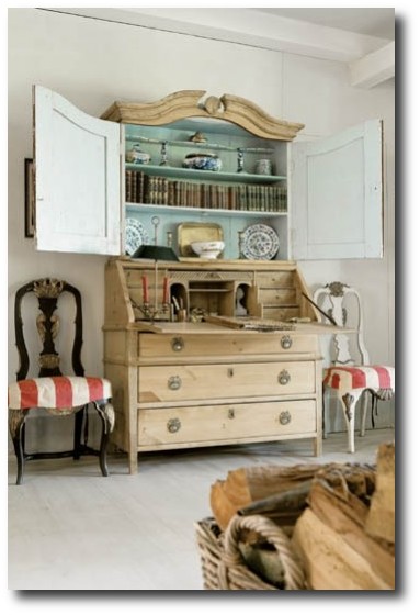
– Open Up Your Hutch– Let people see your collections. If you have a bookcase or armoire with doors, open them up. These pieces can really be centerpieces in a room.
– Leave Some Pieces In Their Raw Wood State- If you plan on decorating around white, leave a few pieces in their raw wood. Strip off the existing paint, and work with the plain wood- all natural. Go for an accent chair, or a couple accessories in plain wood. You will see it will go a long way in a home based around white.
 More Photos:


Paint It White He Says…. Washington Interior Designer Darryl Carter – Swedish Decorating

Washington, D.C., interior designer Darryl Carter certainly has made a memorable mark on the color white. Fifteen years ago he had a busy career as a lawyer when he decided to change course and open his own interior-design firm. He made a name for himself by transforming rooms that were grounded in a neutral palettes with an appreciation for showcasing art and antiques. Swedish interiors have always been known for their white based interiors. In an interview by Veranda, designer Darryl Carter gives his best tips for using the color white in your home.
1. Pick Your Paint First
“It’s not a cop out,” he insists. “It’s a way to harmonize a house in its entirety.” Once you’ve chosen your paint, select textiles next—preferably a hue that closely matches the walls. “Navigate the drapery into the wall color so that you are not so aware of the window treatment,” he suggests.
2. Paint Your Architecture In White
He says that architecture looks best in white. He gives an example pointing to a bookshelf cabinet in a Virginia townhouse which was painted to blend into the walls. The coffered ceiling was also painted the same color, which added a subtle architectural element to the space.
3. Don’t Shy Away From White Or Cream Around Kids
He tells Veranda, that you don’t have to sacrifice style and serenity because there’s a toddler in the house. “There is a presumption that neutral cannot be kid-friendly,” says Carter.
“Instead of shying away from softer shades, he suggests changing the materials. Try enamel finishes and high-gloss paint in high-traffic areas, as well as durable faux leather and outdoor fabrics for upholstered pieces that withstand the wear and tear of young children”
4. Unite Your Kids Rooms Into The Rest Of The House
Carter encourages parents to integrate their child’s room into the larger experience of the home.
“You don’t want to open the door and suddenly wonder where you’ve landed,” he says.
In one family home, Carter created a space in the child’s room which matched the overall modern style of the family’s home. Over time, parents can adjust the space with different pillows and textiles as the child matures.
5. A White Backdrop Makes Antiques Feel Modern.
I love a monumental secretary in a white space,” says Carter. Despite its size, he says, the piece could easily be lost in a wallpapered room.
“People often tell me that my rooms are very modern,” he says, “but generally they are populated with a lot of antiques.”
6. Experiment With Finishes.
“A material change in the same color can be a very subtle way to articulate the architecture of a space,” he says.
In one space, the cabinets are lacquered, the walls were matte, and the floors are reclaimed barn flooring, all washed in the same shade.
7. Revamp Old Pieces With A Coat Of Paint.
“I have redefined so many things in my house with a coat of paint,” says Carter. In the breakfast room of his D.C. home, the apothecary is now black. His latest temptation? Sepia paint, to give the Gustavian dining chairs a khaki color.
8. Be consistent, Inside And Out.
The exterior of a D.C. home was featured in Veranda’s May/June 2012 issue. Carter wanted the exterior to honor the style and presence of its surroundings. The house was painted, then power-washed until some of the original brick showed through to suggest age.
“As you approach a house, you are getting a sense of what it is,” says Carter. “I think it’s important, when you open the door, that the interior is consistent with the exterior’s approach. And then when you go out into the rear garden—the same thing.”
More About Darryl Carter:
His Website- www.darrylcarter.com
Darryl Carter On Facebook
Interesting Articles:
- – Home Decorating Ideas: DarrylCarter‘s DC Townhouse –Elle Decor
- – Darryl Carter’s New Store |DC by Design Blog
- – DarrylCarter‘s Paint Tips – Veranda –Veranda.com
- – DarrylCarter Updates A Home Near Washington, D.C. :Architectural Digest
- – DarrylCarter Paint Colors-Benjamin Moore
- – DarrylCarter and the thrill of the hunt –Washington Post
Darryl Carter Books
Darryl Carter Colors by Benjamin Moore, perfectly encapsulates his painting philosophy: “It’s more about tonality than saturation. I always suggest the fainter color.” For more on Carter’s design philosophy, his new book, The Collected Home ($24, Amazon)
The New Traditional, Darryl Carter laid out the principles of his recognized design, which balances comfort with a subtle color palette to achieve a timeless style. Darryl explores the essence of what brings a home to life, from textures to furniture to unexpected objects.
The Collected Home dazzles with gorgeous photographs of rooms that are extraordinary. Darryl provides advice for approaching home design, Lavishly illustrated, this book is a must-have for anyone who desires a home that feels richly layered, full of character, and unquestionably calm.
Reviews:
As a designer, every time I see Darryl’s work, I marvel at his talent to “white out” what would otherwise be same old traditional or colonial spaces. In other words, he can take your typical (and sometimes cluttered) design and edit it, clarify it to such a poetic yet livable state, that you wonder how modern it is despite the very colonial roots. Not that anything is wrong with color or traditional design (I’m a fan of both), but his work feels like the antithesis to hundreds of well-designed but boring spaces that seem to have a complete lack of innovative design given the modern world we live in. His second book, The Collected Home, is a heart-felt rendition of some of his latest work, his aesthetics and guiding principles. I particularly enjoyed the photographs that beautifully illustrate his strong emphasis on architectural integrity and how little ornamentation you really need if the bones are exceptionally designed. A personal favorite quote from the book, as he describes his first show house experience “..young and intimidated by the veteran designers also presenting their work, I thought, “This is not at all the way a home should be experienced.”” Knowing the context, I can completely relate to that feeling – Raji Radhakrishnan / Murali Narasimhan
By NJLeoOH
This book inspired me. I sat through only about 10-15 pages before jumping up, moving furniture, shelves, display items, putting items away and taking others out for prominent positioning. I discovered my colors (which were there all along but I didn’t see them!). Highly recommend and have shared my copy with friends for their own inspiration.
Modernism was in part a reaction to the excessive ornamentation that characterized the late Nineteenth and early Twentieth Century. Modernists craved clean lines and simplicity. Function rather than beauty dictated form. Some early modernists thinkers decried ornamentation as a crime. In pursuit of their aesthetic project, the modernists rejected 2,500 years of classical wisdom.It is into this hotly waged conflict that Darryl Carter enters. With great tact, Carter strips away excessive ornamentation and works his way back to the nature inspired origins of classical thought. He is able to find common ground between these two not so disimilar aesthetics. Carter has the artist’s gift of mixing what initially appear to be dissimilar objects and finding a coherent overall vision. His “cool” approach reminds of Swedish neo-classicism. This is Carter’s second book. Like his first book, “The Collected Home” is a great success. Highly recommended.
Picture Credits :
- The Relished Roost Blog
- Elle Decor
- Veranda Magazine
- Veranda Magazine
- June 2012 Elle Decor
- Veranda
- Elle Decor
- Architectural Digest
- Darryl Carter via 1stdibs
- Darryl Carter-Veranda Magazine
- Elle Decor
- Darryl Carter-One Kings Lane
 Darryl Carter- Seen On The Relished Roost Blog
 Darryl Carter- Seen On The Relished Roost Blog
 Darryl Carter- Elle Decor


