Swedish Decorating Inspirations In Yellow, Ivory And Beige- 50+ Pictures
Decorating in the Swedish Style: Light, Function, and Timeless Beauty
The Swedish style of decorating is defined by light, simplicity, and a sense of calm. For centuries, Nordic interiors have embraced pale colors and restrained design to create peaceful, livable homes. Light-painted walls, softly finished furniture, and bedding in whites or gentle pastels were not only aesthetic choices, but practical ones—designed to maximize brightness during Sweden’s long, dark winters. The result is an interior style that feels serene, welcoming, and enduring.
1. Light-Painted Walls Give You Greater Design Freedom
A Swedish-inspired interior often begins with light-colored walls. Soft gray, pale green, muted blue, or warm creamy white create a gentle backdrop that allows furnishings and accessories to shine. Neutral tones such as ivory, beige, or light gray offer flexibility, making it easy to layer in warmer accents like soft yellow or subtle gold.
For added character, consider decorative wall details such as stenciled ribbons, scrolls, or wheat motifs in soft pinks or deeper reds—elements historically seen in Gustavian interiors.
Floors should remain just as light and airy. Blonde woods, pale finishes, or lightly painted floors help reflect natural light and open up a space. For added charm, subtle stenciling or painted designs can bring interest without overwhelming the room.
Floor coverings also play an important role. Natural fiber rugs—such as jute, sisal, or berber—offer a neutral foundation that complements nearly any palette while adding warmth and texture.
Wallpaper is another beautiful option. Look for neoclassical patterns with soft colors on white backgrounds. Florals, swags, ribbons, and bows are common motifs, often accented with a touch of gold for elegance and refinement.
2. Add a Settee to One Side of the Dining Table
If space allows, a settee placed along one side of a dining table creates a relaxed, European feel. This seating style has deep roots in Swedish design. The traditional köksoffa, or kitchen sofa, dates back to the 1700s and was designed as a multifunctional piece—used for seating during the day and as a sleeping surface at night. Painted finishes and aged patina are common, reflecting both practicality and charm.
3. Rotate Collections Throughout the Year
Nordic interiors often lean toward minimalism, emphasizing thoughtful display over excess. Invest in furniture that doubles as storage, allowing you to tuck away everyday items while showcasing your favorite pieces.
Leave armoire doors open to display collections, and consider painting the interior a contrasting shade for visual interest. Cabinet interiors, drawers, and bookcases can also be painted in warm tones—buff, vanilla, apricot, or saffron—to add depth against creamy exteriors.
Rotate decorative objects seasonally, keeping displays fresh and intentional. Mount collections on the wall and use lighting to highlight special pieces. Edit frequently—keep only what you truly love and allow each item room to breathe.
Group decorative objects in pairs or curated collections. Use matching frames for artwork and keep images cohesive by working in black-and-white or sepia tones. Shelving, cabinets, and bookcases elevate collections when styled with restraint.
Storage boxes can also become part of the décor. Painted boxes, neatly stacked on shelves, add structure and sophistication while keeping clutter hidden.
4. Push Chairs and Side Tables Against the Walls
A classic Swedish layout places chairs and side tables along the walls, opening up the center of the room. This arrangement creates a sense of spaciousness and was common in historic Nordic homes. Position furniture in small groupings or allow a single chair to stand alone for a simple, balanced look.
5. Rethink Your Closet Space
Closets offer an opportunity to bring both beauty and order into everyday life. Adding painted wood shelving instantly elevates a space and makes storage feel intentional. Use wall space all the way up to the ceiling and consider incorporating double hanging rods to maximize functionality.
Organize clothing by color, and display special pieces rather than hiding them away. Closets can be both practical and visually pleasing when designed with care.
Closets can also be repurposed as display spaces. Painting the interior a darker shade, such as gray, allows collections—like tableware or glass—to stand out while remaining neatly contained.
6. Use Neoclassical Lamps and Wall Sconces
Lighting plays a crucial role in Swedish interiors. Wall sconces add romance and ambiance while freeing up table space. Candles mounted on walls create a warm glow and are often safer than tabletop arrangements.
Choose sconces that suit your style—simple or ornate—and place them in pairs on either side of mirrors or artwork for balance. Table lamps can be elevated by recovering plain shades with upholstery fabric that coordinates with accent chairs or slipcovers.
Chandeliers and lamps enhance the natural brightness of a room, while mirrors amplify light and create the illusion of more space. Finish the look with reflective accents such as blue-and-white china, silver, and glass for subtle shine and timeless elegance.
Picture Credits –
- D.Larsson Swedish Antiques
- French Wall Sconces On Ebay
- Huge Gustavian Hutch Desk , Sweden C. 1800 From Galerie Half
- Farrow & Ball Decorating with Colour- Buy This Book On Amazon
- A gorgeous tablescape. Photography by sandrafazzino.com, Planning by italyinstyletrave… & myspecialguest.co…,
- Floral & Event Design by foodartgroup.it
- 18th century Swedish Secretaire Appley Hoare
- Chelsea Textiles
- Eleish Van Breems Antiques
- Atelier de Campagne
- Augustus Brandt Antiques
- Gustavian Secretary From Lief
- Gustavian Secretary From Lief
- Ironstone Molds Seen On Cote de Texas Blog
- Ralph Lauren Home 18th-century Swedish-Inspired Design
- Carol Raley Interiors
- Stadsauktion Auction Catalogue #59
- UK magazine Livingetc. From Auction Decorating Blog
- Vicki from French Essence
- 19th Century French Woman on Canvas
- Lars Sjoberg- The Style Saloniste
- Court Mantua Kensington Palace 1750-1760 From ArtFund
- Vintage Views Consigment is selling a very attractive pair of gilded bronze sconces
- Manor of Skogaholms- Stockholm Town Blog
- Kristinehovs Malmgård – Söder – Stockholm, Sweden- skarn.se
- Hoby-Kulle Manor, near Ronneby, Seen At En.konstantik.se
- Swedish Gustavian Swedish Decorating Ideas
- Collecting White Dinnerware Haute Design By Sarah Klassen
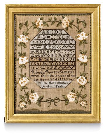 Sampler, 1804, Country Living.com
A Swedish Rococo Chest Rococo Period 1750-1775 A beautiful Rococo chest of drawers with amazing inlays and construction. All original hardware and locks, Laserow Antiques
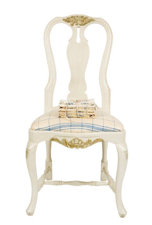
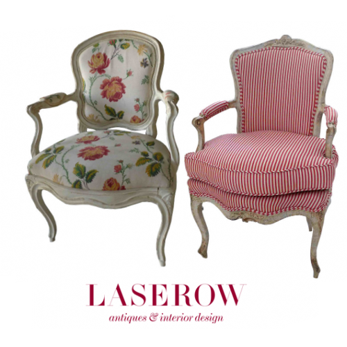 Swedish Rococo Armchair from the Rococo period 1750-1775 A Swedish Rococo armchair with cabriole legs and curved armrests and back. Laserow Antiques, Armchair Rococo period 1750-1775– A lovely armchair from the Rococo period with amazing carvings and curved shapes. Frieze and back splat is decorated with carved flowers and leaves. The scrolled legs and armrests are typical for the Rococo period featured at Laserow Antiques

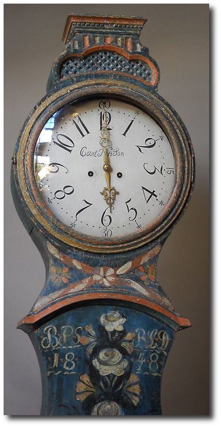
Mora Clock, from Real Gustavian and the Creamy White Mora Clock with orange detailing is from The Nordic Place.
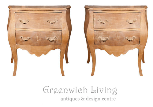 Pair of Bombe Swedish Commodes 102-4870 Greenwich Living Ebay
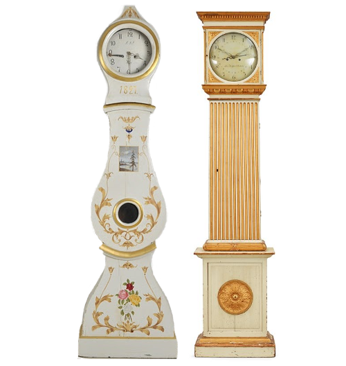
A Gustavian late 18th century longcase clock From Bukowskis, A Swedish Mora Clock From 1820-40, from Lauritz
Nordic Style Furniture Collections
Swedish Interior Seen On Inredningshjälpen Blog
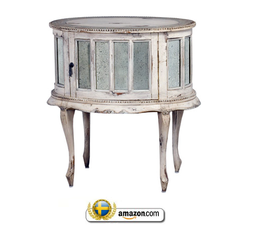
Drink Cabinet $807.75 From Guild Master On Amazon
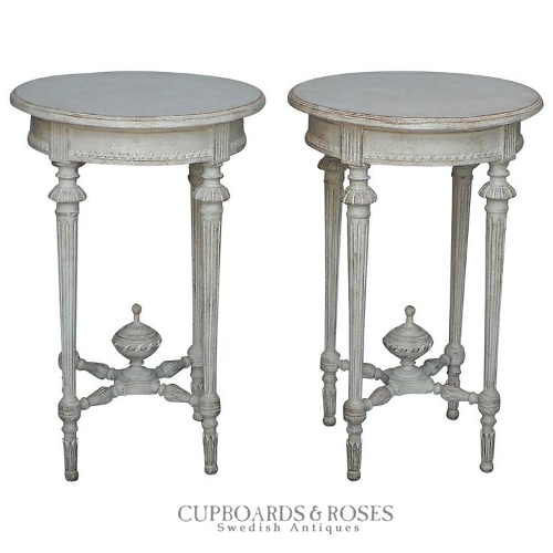 Pair Of Gustavian Side Tables- Cupboards & Roses Antiques
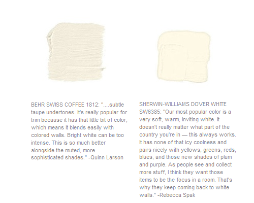
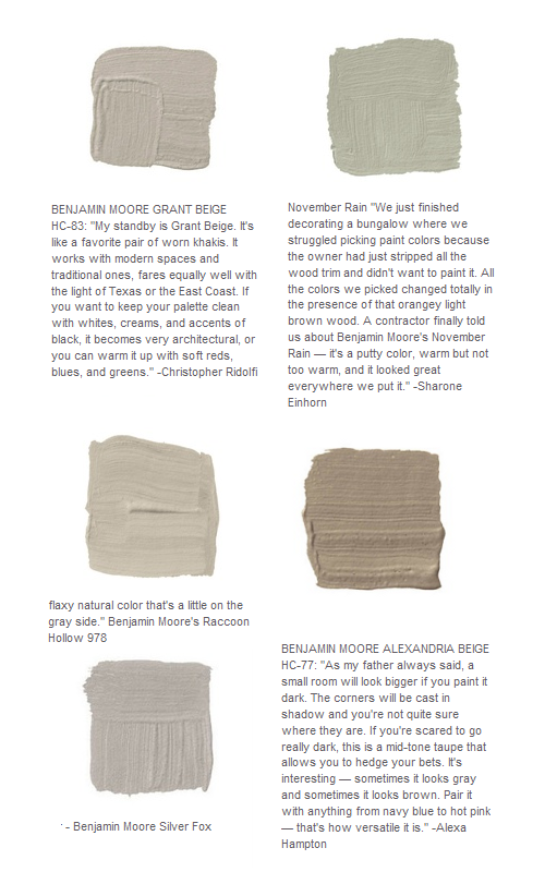 The Best Designer Paint Suggestions Seen In House Beautiful Magazine
Antique Swedish canape – Augustus Brandt
Found on augustus-brandt-antiques.co.uk

A Passion for Collecting: Decorating with Your Favorite Objects- Caroline Clifton Mogg
We are all born collectors. In childhood we hoard all manner of knick-knacks-marbles, ribbons, toy soldiers-and experience an instinctive thrill in finding the next and even better one. This book explores the ways in which collectibles as diverse as antique maps, ceramics, and seashells can be used in interior design. With lavish illustrations of interiors that make wonderful decorative use of collections, A PASSION FOR COLLECTING reveals the secrets for display that can make an incredible visual impact on the décor of any collector’s home.
 Decorating With China and Glass By Caroline Clifton-Mogg
Caroline Clifton-Mogg is a writer and journalist who specializes in interior design and gardens. She is a contributing editor to both Harpers & Queen and Christie’s Magazine and also contributes regularly to magazines and newspapers such as House & Garden, Country Life, and The Financial Times. Her many books include Textile Style (Bulfinch, 2000), The Curtain Book (Bulfinch, 1998), Decorating with Antiques (Bulfinch, 1999), Passion For Collecting (Bulfinch, 2002) and The Bedroom Book (Bulfinch, 2003).


The Best Designer Paint Suggestions Seen In House Beautiful Magazine
Graham and Green’s Vienna Petite Four Drawer Chest, mango wood chest of drawers with brass accessories and a putty grey wash finish.
Graham and Green opened their first shop in Notting Hill in 1974, and since then Graham and Green has expanded from humble beginnings to a delightfully identifiable, British establishment. Today, Graham and Green have 2 beautiful shops, four catalogues each year and their online store.
 Pair of carved wood Swedish stools. Upholstered in Rubelli silk. Eighteenth Century.
An Old House in Whitechapel | Spitalfields Life
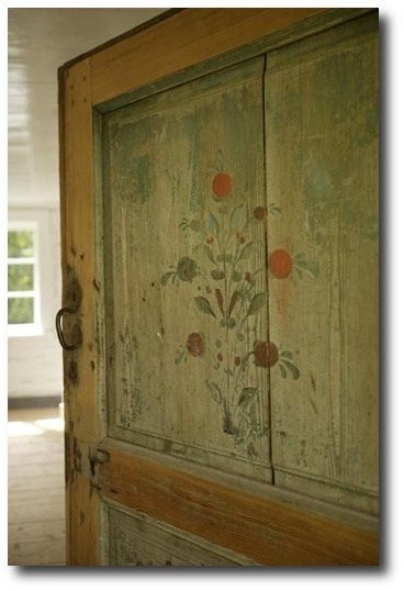
 Swedish Panel – Giannetti Home Visit Providence lt Ddesign
61 Leather Bound Decorative Swedish Books, Debenham Antiques EBAY
70 Swedish Books, Debenham Antiques EBAY
Via Svenska Flicka (Swedish Girl)
Tussah Flower wallpaper from Zoffany

The Best Designer Paint Suggestions Seen In House Beautiful Magazine
Royal Palace, Stockholm. Chimneypiece graces the Blue cabinet in Queen Louisa Ulrika’s study.
The Best Designer Paint Suggestions Seen In House Beautiful Magazine
Swedish Medallion Seen In Veranda 2011
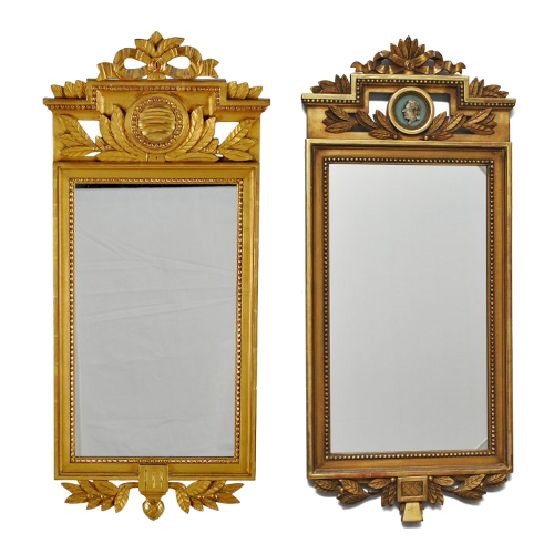
Gustavian Mirror, 1, 2 – Auction Catalogue From Live Auctioneers
More Pictures – Credits In The Article


Paint It White He Says…. Washington Interior Designer Darryl Carter – Swedish Decorating

Washington, D.C., interior designer Darryl Carter certainly has made a memorable mark on the color white. Fifteen years ago he had a busy career as a lawyer when he decided to change course and open his own interior-design firm. He made a name for himself by transforming rooms that were grounded in a neutral palettes with an appreciation for showcasing art and antiques. Swedish interiors have always been known for their white based interiors. In an interview by Veranda, designer Darryl Carter gives his best tips for using the color white in your home.
1. Pick Your Paint First
“It’s not a cop out,” he insists. “It’s a way to harmonize a house in its entirety.” Once you’ve chosen your paint, select textiles next—preferably a hue that closely matches the walls. “Navigate the drapery into the wall color so that you are not so aware of the window treatment,” he suggests.
2. Paint Your Architecture In White
He says that architecture looks best in white. He gives an example pointing to a bookshelf cabinet in a Virginia townhouse which was painted to blend into the walls. The coffered ceiling was also painted the same color, which added a subtle architectural element to the space.
3. Don’t Shy Away From White Or Cream Around Kids
He tells Veranda, that you don’t have to sacrifice style and serenity because there’s a toddler in the house. “There is a presumption that neutral cannot be kid-friendly,” says Carter.
“Instead of shying away from softer shades, he suggests changing the materials. Try enamel finishes and high-gloss paint in high-traffic areas, as well as durable faux leather and outdoor fabrics for upholstered pieces that withstand the wear and tear of young children”
4. Unite Your Kids Rooms Into The Rest Of The House
Carter encourages parents to integrate their child’s room into the larger experience of the home.
“You don’t want to open the door and suddenly wonder where you’ve landed,” he says.
In one family home, Carter created a space in the child’s room which matched the overall modern style of the family’s home. Over time, parents can adjust the space with different pillows and textiles as the child matures.
5. A White Backdrop Makes Antiques Feel Modern.
I love a monumental secretary in a white space,” says Carter. Despite its size, he says, the piece could easily be lost in a wallpapered room.
“People often tell me that my rooms are very modern,” he says, “but generally they are populated with a lot of antiques.”
6. Experiment With Finishes.
“A material change in the same color can be a very subtle way to articulate the architecture of a space,” he says.
In one space, the cabinets are lacquered, the walls were matte, and the floors are reclaimed barn flooring, all washed in the same shade.
7. Revamp Old Pieces With A Coat Of Paint.
“I have redefined so many things in my house with a coat of paint,” says Carter. In the breakfast room of his D.C. home, the apothecary is now black. His latest temptation? Sepia paint, to give the Gustavian dining chairs a khaki color.
8. Be consistent, Inside And Out.
The exterior of a D.C. home was featured in Veranda’s May/June 2012 issue. Carter wanted the exterior to honor the style and presence of its surroundings. The house was painted, then power-washed until some of the original brick showed through to suggest age.
“As you approach a house, you are getting a sense of what it is,” says Carter. “I think it’s important, when you open the door, that the interior is consistent with the exterior’s approach. And then when you go out into the rear garden—the same thing.”
More About Darryl Carter:
His Website- www.darrylcarter.com
Darryl Carter On Facebook
Interesting Articles:
- – Home Decorating Ideas: DarrylCarter‘s DC Townhouse –Elle Decor
- – Darryl Carter’s New Store |DC by Design Blog
- – DarrylCarter‘s Paint Tips – Veranda –Veranda.com
- – DarrylCarter Updates A Home Near Washington, D.C. :Architectural Digest
- – DarrylCarter Paint Colors-Benjamin Moore
- – DarrylCarter and the thrill of the hunt –Washington Post
Darryl Carter Books
Darryl Carter Colors by Benjamin Moore, perfectly encapsulates his painting philosophy: “It’s more about tonality than saturation. I always suggest the fainter color.” For more on Carter’s design philosophy, his new book, The Collected Home ($24, Amazon)
The New Traditional, Darryl Carter laid out the principles of his recognized design, which balances comfort with a subtle color palette to achieve a timeless style. Darryl explores the essence of what brings a home to life, from textures to furniture to unexpected objects.
The Collected Home dazzles with gorgeous photographs of rooms that are extraordinary. Darryl provides advice for approaching home design, Lavishly illustrated, this book is a must-have for anyone who desires a home that feels richly layered, full of character, and unquestionably calm.
Reviews:
As a designer, every time I see Darryl’s work, I marvel at his talent to “white out” what would otherwise be same old traditional or colonial spaces. In other words, he can take your typical (and sometimes cluttered) design and edit it, clarify it to such a poetic yet livable state, that you wonder how modern it is despite the very colonial roots. Not that anything is wrong with color or traditional design (I’m a fan of both), but his work feels like the antithesis to hundreds of well-designed but boring spaces that seem to have a complete lack of innovative design given the modern world we live in. His second book, The Collected Home, is a heart-felt rendition of some of his latest work, his aesthetics and guiding principles. I particularly enjoyed the photographs that beautifully illustrate his strong emphasis on architectural integrity and how little ornamentation you really need if the bones are exceptionally designed. A personal favorite quote from the book, as he describes his first show house experience “..young and intimidated by the veteran designers also presenting their work, I thought, “This is not at all the way a home should be experienced.”” Knowing the context, I can completely relate to that feeling – Raji Radhakrishnan / Murali Narasimhan
By NJLeoOH
This book inspired me. I sat through only about 10-15 pages before jumping up, moving furniture, shelves, display items, putting items away and taking others out for prominent positioning. I discovered my colors (which were there all along but I didn’t see them!). Highly recommend and have shared my copy with friends for their own inspiration.
Modernism was in part a reaction to the excessive ornamentation that characterized the late Nineteenth and early Twentieth Century. Modernists craved clean lines and simplicity. Function rather than beauty dictated form. Some early modernists thinkers decried ornamentation as a crime. In pursuit of their aesthetic project, the modernists rejected 2,500 years of classical wisdom.It is into this hotly waged conflict that Darryl Carter enters. With great tact, Carter strips away excessive ornamentation and works his way back to the nature inspired origins of classical thought. He is able to find common ground between these two not so disimilar aesthetics. Carter has the artist’s gift of mixing what initially appear to be dissimilar objects and finding a coherent overall vision. His “cool” approach reminds of Swedish neo-classicism. This is Carter’s second book. Like his first book, “The Collected Home” is a great success. Highly recommended.
Picture Credits :
- The Relished Roost Blog
- Elle Decor
- Veranda Magazine
- Veranda Magazine
- June 2012 Elle Decor
- Veranda
- Elle Decor
- Architectural Digest
- Darryl Carter via 1stdibs
- Darryl Carter-Veranda Magazine
- Elle Decor
- Darryl Carter-One Kings Lane
 Darryl Carter- Seen On The Relished Roost Blog
 Darryl Carter- Seen On The Relished Roost Blog
 Darryl Carter- Elle Decor


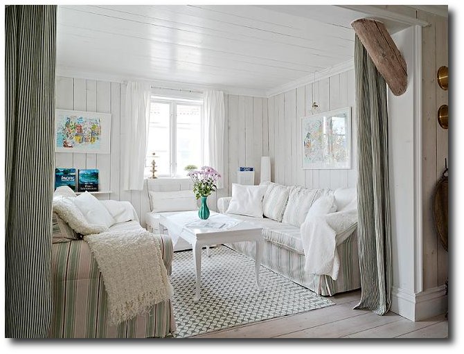
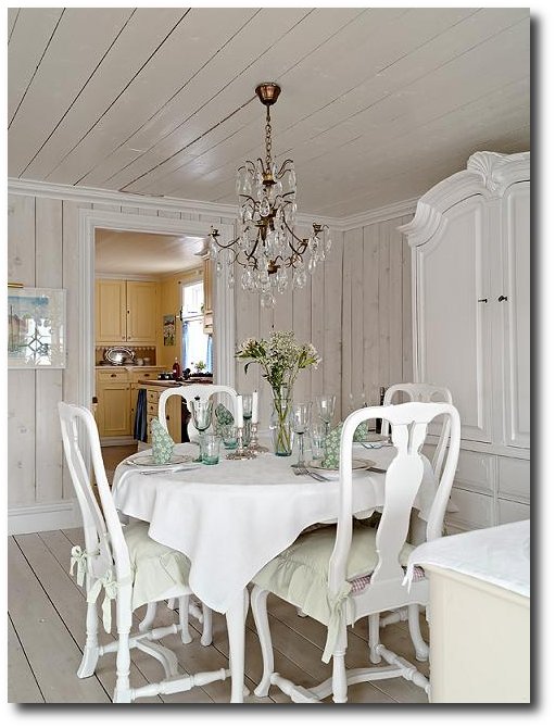
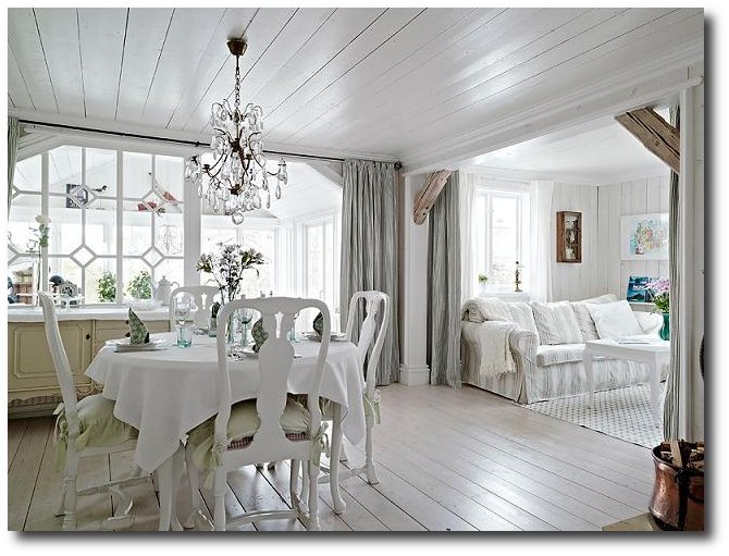
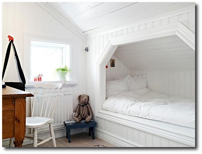
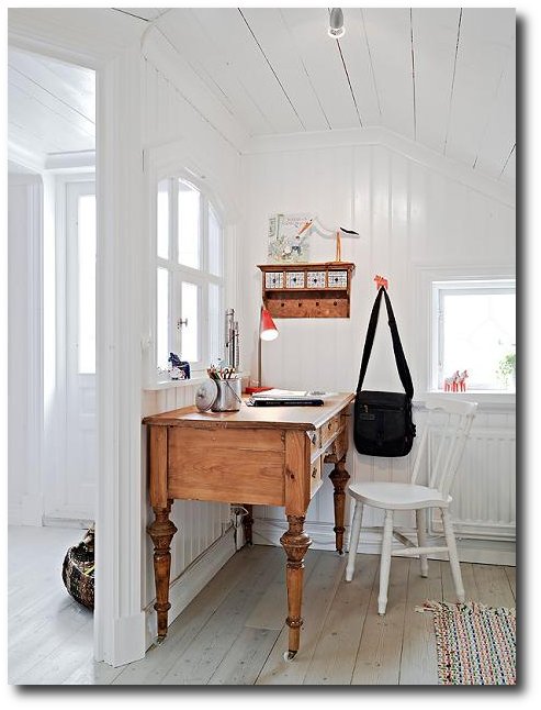
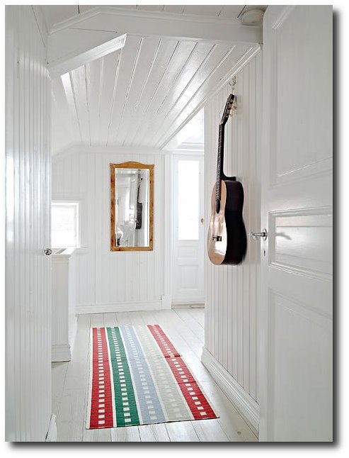
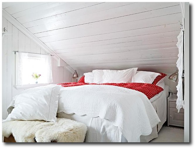
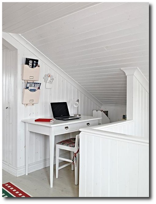
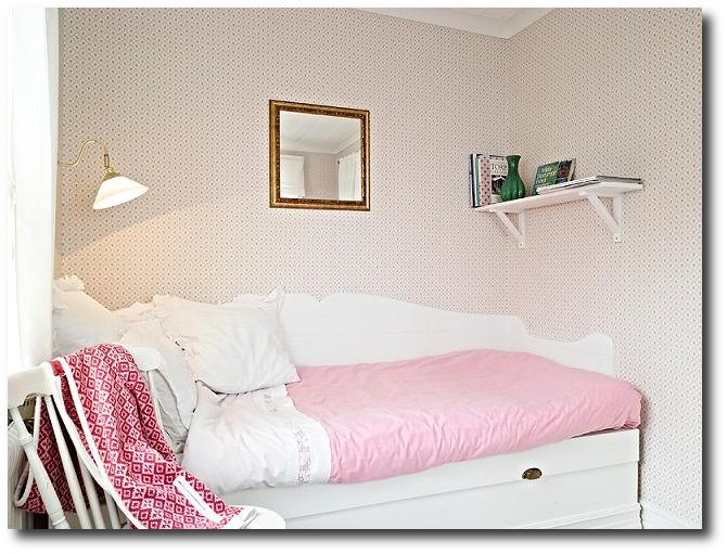
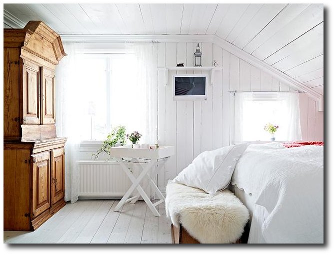
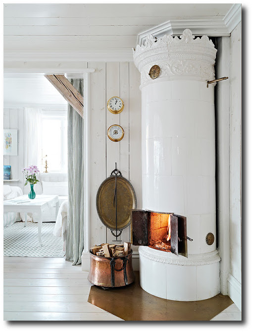
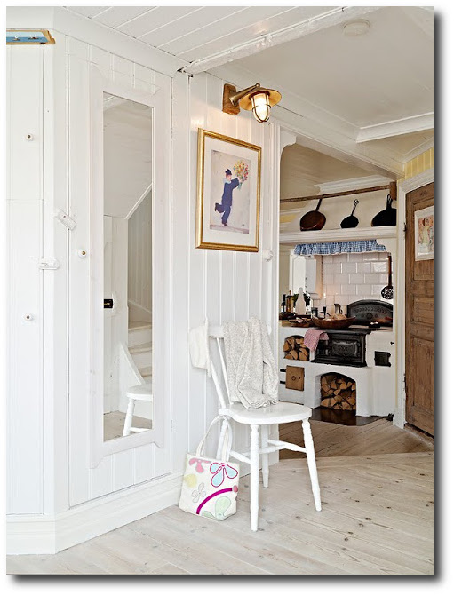
The Country Side Of Sweden- An All White Based Home
Wood has always played an integral part in the Swedish home life. Beech, birch and pine are the most popular woods in the Nordic region. Hardwoods such as mahogany were rarely used in Sweden as they would have to be imported, as well as the blonder woods were native to the land making it practical to make everything out of wood other than the kitchen sink. Swedish design is known for their use of pale wood, paneling, and solid wood furniture. Furniture was often elaborately painted, or left bare. In this country home we see this very design; shades of white, minimal design, and outstanding Swedish wood furniture.
Tips From This Interior To Your Home:
1. Add Interest- This Swedish interior is based around whites. They add an interesting floor mat to spice things up. A guitar hangs on the wall, which adds a stamp of personality into the home. Make your textiles count in a minimal home. Consider fabrics that have a Swedish styled patterns. Look for upholstery fabric, slipcovers, tablecloths with a distinct Swedish design.
2. Skip Painting Some Pieces. If you are hoping to decorate around white, add in plenty of untouched wood pieces to the overall scheme. Raw wood furniture can be very beautiful. This directoire style chest is washed with solid paint in a unique way that shows off the wood, but at the same time presents a very rustic edge to the style. Use the paint technique for your own wood pieces. Give a Swedish touch to these raw pieces by adding a oil rubbed hardware…. The rustic details won’t be overlooked.
3. Hang Swedish Styled Art- Look around for one of a kind art for your walls. Find a local artist who can create dimensional embroidery for your walls. Pick up 9 identical frames, and have the artist create a story or pattern that can be told through the embroidery. Add color into your home through the thread. Opt for brighter reds, yellow or blues.