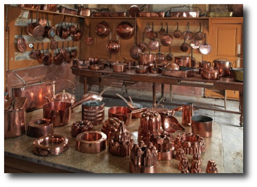
Swedish Gustavian Decorating: 25 Of The Best Copper Kitchenware

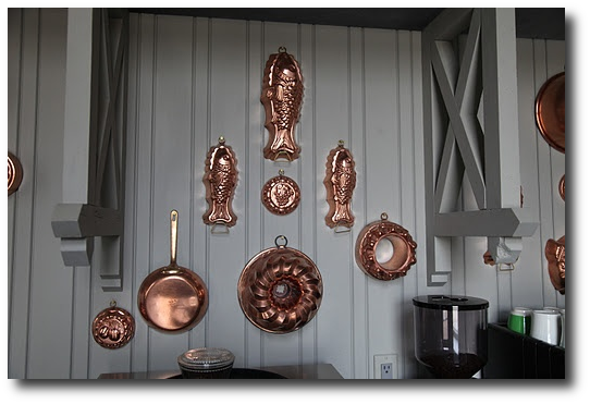
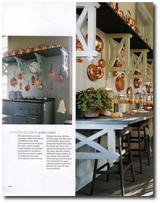
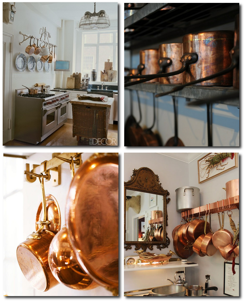
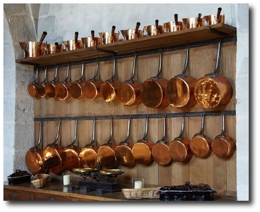
An 18th Century Copenhagen Apartment (below) shows off great looking Swedish style. Decorating with copper can be just the touch you need in your home. Martha Stewart is famous for collecting dozens of copper molds which hang on her kitchen wall. Copper can add a distinct rich appeal to your home. Hang your copper pots from a pot rack. Copper molds can be hung on the wall for a very rich effect.
All the greatest chefs around the world have pieces of copper cookware in their collection. Copper is an excellent conductor of heat. When cooking with copper, you rarely have to turn the stove higher then a medium low to get very high heat. You will use a lot less energy cooking with copper cookware because it retains the heat. The only type of cookware that is close to having equivalent heat conduction of copper is cast iron cookware.
Here are 20 of the most interesting copper kitchenware that would look fabulous in your home.
Copper Plated Oval Tub $58, 17.75 x 11 Round Tub $79 22.5 x 13.25 x11.25 Oval Tub 11 Gal. $114
1. Cuisinart 33-Inch Bar-Style Wall-Mount Pot Rack, Polished Copper $40
2. Cuisinart Half-Circle Wall-Mount Pot Rack, Polished Copper $60
3.Extra Polished Copper Pot Rack Hooks Set of 6 $33
4.Old Dutch Round Dome Pot Rack, Copper $112
5. 48 x 18 Oval Satin Copper Pot Rack w/16 Hooks $171
6. Old Dutch 2 Quart Solid Copper Zabaglione Pan $34
7. Mauviel M’Passion Copper 15-Quart Jam Pan with Bronze Handles $290
8. Mauviel M’Heritage 3-1/2-Inch Butter Warme with Bronze Handle $77
9. Mauviel M’Passion Copper 3-1/2-Quart Zabaglione Pan $155
10.22 1/2 x 11 1/4 x 11 1/2 Satin Copper Pot Rack w/Grid & 12 Hooks $60
11. Old Dutch International 4¼ Inch Solid Copper Stovetop Salt & Pepper Set $18
12.Old Dutch Copper Clad Stainless Steel Hammered Canister, Set of 4 $61

An 18th Century Copenhagen Apartment
13. Olde Thompson Columbia Copper Peppermill & Salt Shaker Set $25
14. Wright’s Copper Cream Polish, 8-oz $7
15. Cover that Microwave, or Dishwasher front. Metal FX Brushed Copper Contact Paper, 18″ x 6′ $12.
16. Pepper Mill Imports Atlas Pepper Mill, Copper, 9″ $56
17.Old Dutch 9-Inch Pedestal Colander, Copper $28
18. Old Dutch Solid Copper 4-Quart Beating Bowl $40
19. Old Dutch Solid Copper and Brass Antique Reproduction 13 1/2″ tray $20
20. Waring MBB520 Bar Blender, Bright Copper $91
21. Rumford Gardener Copper Thermometer Outdoor Clock $76
22. Good Directions Large Oil Lamp $72
23.Hanging 2 Tier J-Arms Antique Copper 12 Candelabra Sockets $626
24. 8″ Solid Copper Wall Tile with Rose Design , Dogwood Flower– Polished Copper $25
25. Copperplated Revere Bowl, 10 $53

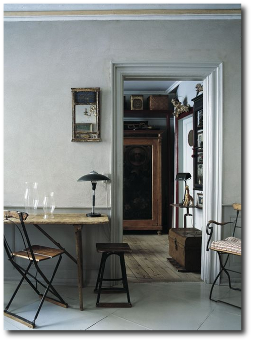
An 18th Century Copenhagen Apartment
How To Decorate With Yellow For A Historical Look
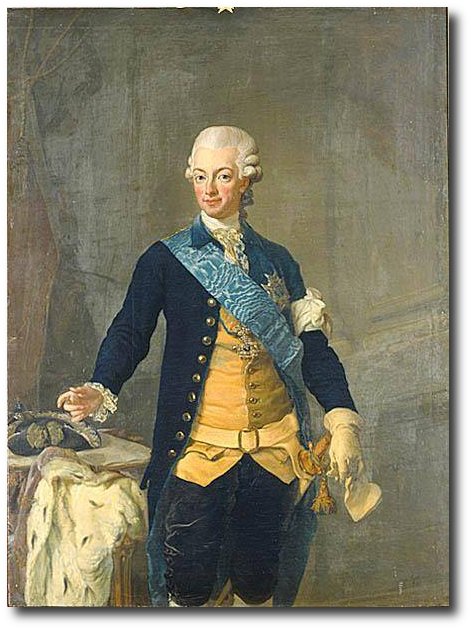
- Swedish Decorating Colors- Blue, Yellow, Navy And Gray- Painting of King Gustav III
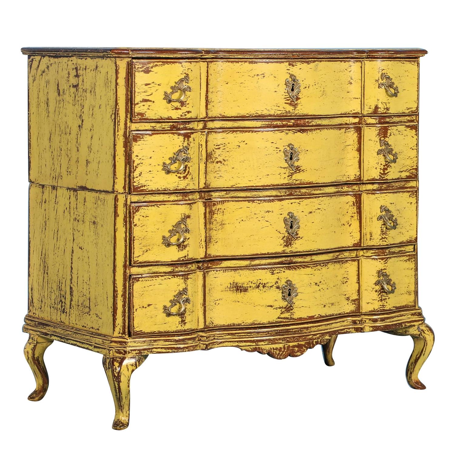
- Antique Yellow Rococo Chest- Scandinavian Antiques 1st Dibs
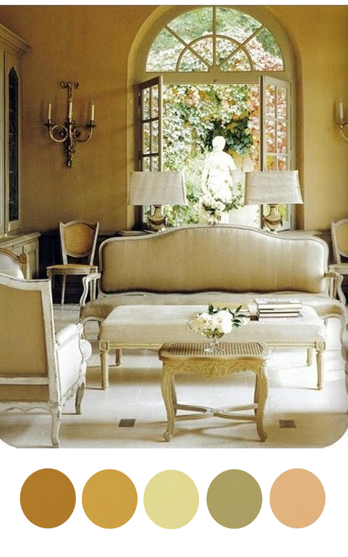
Yellow along side blue and white are colors that are known to be distinctively Swedish, so when it comes to picking a color for a room around, yellow is a fantastic choice. If you have ever based your home around the darker colors such as red, or black, over time it can be very overwhelming, and just gloomy. Yellow produces the opposite effect. It is enlightening, encouraging, and uplifting.
The color yellow can apply to so many decorating styles, so when considering a period look that is Swedish, here are three tips to keep in mind to make it uniquely Gustavian.
1. Pick the Right Hue– Yellows such as pale yellow or ocher yellow are more historical than high-voltage tones. Brighter tones of yellow can be very fluorescent, which are not at all what you want for a period room. Choose yellows that have a rich brown or slight reddish undertone for the best period looks. Take an ochre yellow and go a few shades darker or lighter on the scale for a perfect tone.
2. Don’t rely on the Paint Chip- A hue that appears just right on the paint chip will usually intensify once it’s on your walls.
In our small town we don’t have a paint store close to us which can match customized colors, so I experienced this very thing when I went to our local hardware store last week for yellow paint. Our local paint store cannot custom match pre-mixed colors, so I had to pick from the selection that was available for sale. The color which was almost right in the store turned out to be very bright on my outdoor table. I added in every can of yellow paint that I had left in my home, and a gallon of dark ochre, and it happened to work out to be the perfect shade for the project I was painting. The shade of ochre works every time I find when I am customizing colors.
With that being said, consider getting a couple samples of paint which cost only 2 or 3 dollars than getting a whole gallon of the shade you think is right. Consider the color you think is right, and try a shade a few shades lighter.
3. Combining 2 different tones of yellows can be quite stunning.
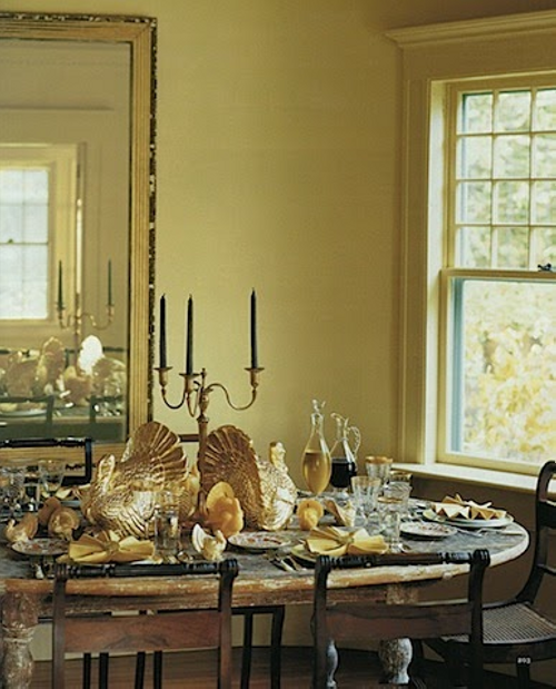
This classic Gustavian room that appeared in “Classic Swedish Interiors,” by Lars Sjoberg, featured on Mentar Mentar Blog shows classic painted paneling. The paneling is a saturated tone of yellow, which is very rich in color. The walls are painted yellow, which appears to be a duled down yellow. The combination is absolute perfection. You can see in this photo, they dressed up this room with a white painted Swedish Mora clock and a black painted french styled desk with a brown leather desk chair. The three tones are perfect color combinations for a Gustavian effect in this yellow based room.
Again the same tones appear in this photograph of the Drottningholm Theatre. Like the leather desk chair in the above picture, you see the same tone of burnt umber on the doors and window frames. White is the second dominant color in this photograph. You can also take tones of the gray marble from the base of the marble statue. The light blue sky is a beautiful accent color.
You cannot go wrong with adding in a couple different shades of yellows. Choose your dominant color of yellow, and add in a few more shades of yellow in the accessories. Neoclassical lamps often feature a pedestal of some sort and a fluted section which can be painted in three tones. Pick a shade of yellow, and combine it with black and gold, or yellow, gray and gold. Paintings also allow you to add in several rich tones of the Gustavian palette. Painted furniture is another way of adding in the just right tone into a scheme.
5. Picking out the right upholstery fabric and throw pillows can go a long way in making your room more period in style. Gustavian decorating often features fabrics that are based on white backgrounds. Picking a fabric that is floral, check or stripe will give you that period style you are looking for. Finding the right fabric can be a true battle, but remember you have so many other elements that can work in your favor to create the Swedish effect.
Picking the right paint tone, along with the right tones for your accent colors will go a long way in recreating a Gustavian home.
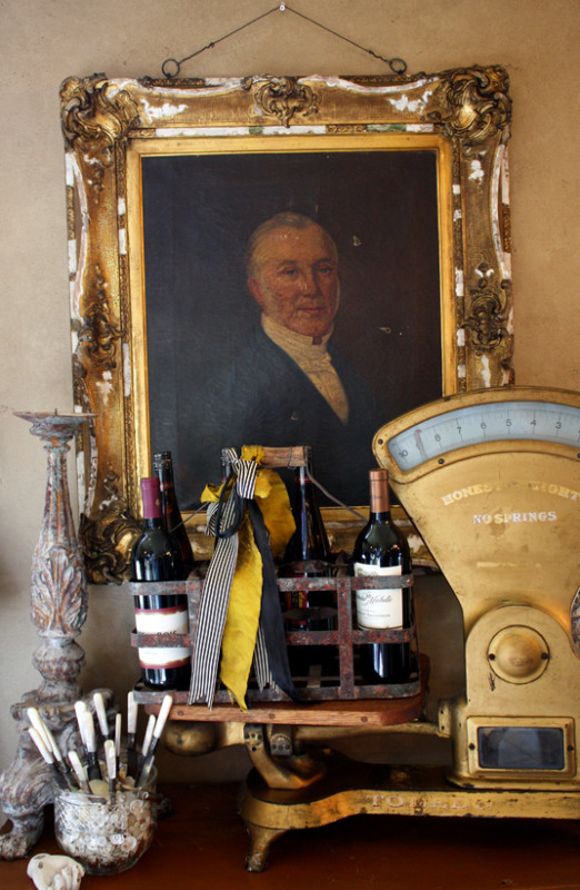
You can see in this photograph a slight yellow tone on the wall, which may be from the camera flash. If you can imagine the wall painted a yellow tone, with layers of gold paintings on the wall, and gold brass accents. The weigh scale has a slightly brown tray holding black bottles, with a very bright yellow ribbon. The various tones of black, yellow, red ( the bottom of the photograph) and navy, seen in the scale itself is the perfect color palette for Gustavian styled decorating.
“I like a buoyant, light-filled house, so I usually use all warm or yellow-based colors. This ocher is really a contemporary yellow shade with an antique resonance. It doesn’t draw attention to itself as, say, bold yellow or even white would. The ocher walls provide support for the exceptional paintings and furniture. Bright-colored walls would visually compete. This shade flatters everyone — it complements every skin tone.” – designer Thomas Jayne
You can see in this photograph of Gustav IV Adolf of Sweden his suit is a brighter yellow against a backdrop of yellow ochre. You can see the painting has a stunning blue sash, and a darker blue jacket, that isn’t quite navy. The brighter yellow, and the peach tones such as the colors in his face would be a great color scheme for a yellow room.
Take some inspiration from the brighter yellow interiors found in the Swedish Chinese Pavilion. The interior featured brighter yellows and bold fabrics on upholstered Swedish chairs.
Here we find a combination of yellow and orange at the Chinese Pavilion. The walls are lined with a light blue paint.
In this picture we find a combination of greens, lighter greens and pastel tones with brighter colored yellow ribbons. Consider a scheme of pastel greens and yellows.
Designer Mary Douglas Drysdale uses brighter tones of yellow in her neoclassical room with Federal antiques. She combines a brighter yellow check pattern in the upholstery and for the window drapes
This ravishing yellow silk gown from 1760 gives off the perfect tone of yellow.
This 17th Century styled room features tones of beige, gray, and natural wood herringbone wood floors and a brightly colored yellow fabric cover. Consider using yellow as your pop of color, such as they did in this room.