10 Tips From Interior Designer Furlow Gatewood

Here are a few tips Designer Furlow Gatewood
Wood Boards On The Walls Give An Antique Appearance – “Furlow often uses simple rough boards as panels for a room. This gives texture and character that plain drywall cannot provide. In some cases, the boards run vertically with horizontal boards at the ceiling, chair rail, and base”
Work With Antique Pieces, And The Occasional Modern Upholstered Piece “Generous upholstered pieces are used sparingly”
Buying What You Really Love ” It’s certainly true that fabric houses would never get rich off him. There is not a single curtain in any of his houses he much prefers shutters or blinds. The bulk of his upholstered furniture is slipcovered in simple cotton duck, and rugs, when they exist at all are sisal or Indian dhurries or the odd antique Oriental. But the most salient quality of his “look” is that he only buys what he absolutely loves”
Great Design Doesn’t Have To Be Costly “Finally, for all of Furlow’s knowledge, for all his world travels and world-class stuff, he has never been a snob. One of my very favorite things in the whole Barn is on the drinks tray outside the bedroom where I slept. A blue liner, it fit perfectly inside a handsome silver urn that doubles as an ice bucket, and I assumed it was some fine piece of cobalt glass. Upon further inspection, it was a plastic bowl Furlow said he found at the Dollar Store, a detail that delighted him to repeat.”
Cutting Plywood Can Create Architectural Detail – The stylish entrance hall of the Cuthbert House was created by simply cutting pieces of plywood in six-by-twenty-inch rectangles. The edges of each piece of wood were beveled and installed in a running bond pattern over the drywall. This was a technique often used in American nineteenth-century Federal houses to simulate stone patterns, as dwellings were then built of wood”
Work With Brackets To Display Pictures, Pottery and Collections On The Wall – “………small pictures that are stacked one atop the other, with a bracket above to draw the eye up and accentuate the sense of grandeur.”
Turn Fabric Inside Out…Sometimes It Can Be Nicer On The Back Side ” A Billy Baldwin slipper chair is covered in fabric on the wrong side, a favorite Furlow trick”
Center A Room Around A Soda, And Work Your Other Pieces In “In each living room, the furniture is always arranged in comfortable seating groups consisting of large frame sofas and various frame chairs placed around them. He often implements period sofas and chairs with exposed legs to give the rooms a light, airy quality”
Painted Floors Can Be A Beautiful Solution” Manhattan-based painter John Campbell painted the faux marbre floors, and a grisaille wallpaper panel hangs above the console. A similar gray palate (with white) extends throughout the house. Furlow says he finds the color scheme cooling.”
Use Solid Fabrics On Sofas and Prints With Throws And Pillows To Make Them Interesting. Save Patterned Fabrics For Accent Chairs “Large sofas are covered in a solid fabric and then filled with pillows of different florals, stripes, and checks in a single color scheme. A single chair might have a patterned fabric that blends with the others”
Old Leather Is A Gem Of A Find….If You Stumble Across Old Leather, Leave It Be “If a chair has lovely old leather upholstery, it is left as is”
Additional Links:
– Furlow Gatewood – Porcelain Collection – House Beautiful
– Beautiful Interiors – Furlow Gatewood on Pinterest
– The Exceptional Houses of Furlow Gatewood | Garden and Gun Magazine
– 4.2.14 | One Man’s Folly | New York Social Diary
Martha Stewart’s Creative Director- Erik Pike’s Gustavian Townhouse In New York Part 2

The settee, chest, and rounded-back chair in this photo are genuine Swedish antiques. Eric purchased the other chair at auction and had it copied for the dining room. The tables in the room are vintage, which he painted himself. Look at the three color combinations on the walls. It appears that the wall color, crown molding and ceiling colors are slightly different tones. With the painted antiques, and color of upholstery, this room is rich with detail.
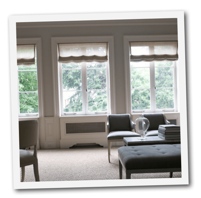
The gray wood flooring doesn’t go unnoticed, tying together the various rooms in his home. The wide planks were bleached, then stained a neutral gray. He decided to upholster all of the living room furniture in a single gray linen, allowing individual antiques to be unified as a set. Hints of silver are found in the candlesticks, light fixtures, and hardware and have always been a classic Gustavian element found in Swedish style.
The house originally appeared in Martha Stewart’s September issue way back in 2005. “I wasn’t going to buy until I could find the right place,” he tells Martha Stewart Living Magazine. He ended up renting a small one-bedroom apartment for sixteen years until the perfect place showed itself to him. The 1840s Federal-style townhouse on a historic block had all the right bones for what he always had in mind.
In this photo from Marthas website, a decorative box houses some objects he used for inspiration. If you look closely, you can see two pictures of the townhouse before renovations. New York City architect Richard Perry, Pike set out to make the apartment his own.
“I like the neoclassical forms and the sculptural lines combined with rustic painted finishes,” Pike says. “They have no unnecessary embellishment — there’s a purity in that.”
I have loved his townhouse for years. I hope you find as much inspiration from his home as I did.
See Martha Stewart For More Information

Martha Stewart’s Creative Director- Erik Pike’s Gustavian Townhouse In New York
The sitting area above lacks the height compared to the rest of the apartment, so a skylight was introduced into the space. Support beams are concealed yet present a dramatic look to this room. Eric sought a square pedestal table to complete this room; finding none, he designed one with architect Richard Perry.
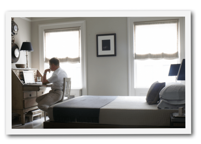
You would never know a television hangs over the living room mantel because an antiqued mirror lifts to reveal it. Look at this photo of the kitchen where one wall houses a refrigerator and washer and dryer behind cabinet doors. A toaster and coffeemaker are housed in an appliance “garage” on a tray that pulls out so you can pour in water. The bathroom is designed just right to make it appear bigger with glass shower doors. The bedroom and the bathroom are the most modern rooms in the home.
Eric Pike is Creative Director of Martha Stewart Living. Stefan Steil is an interior designer and founder of Stelish. Some of his design work can be found at Stefan Steil. Portraits taken at their townhouse in Manhattan.