Jeffrey Bilhuber gives hope to all of us. He had his first start in hotel management, and studied at the protegious Cornell University focusing on hotel administration. He graduated from Cornell and lasted about three years in the business knowing that it just wasn’t the right fit. His big break was at the Carlyle Hotel when he was placed in the housekeeping department with designer Mark Hampton, who happened to be doing in-house redecoration of the rooms. It was there that Bilhuber understood where he belonged.
Being a business man at heart, he needed a creative outlet to combine with the dry world of business. He tells New York Social Diary – “Here is this man, Mark Hampton, who seems to be at the top of his field … here was somebody who had managed to actually put creativity and business together.’ And I thought ‘Why didn’t I think of this?” The New York Social Diary features some astounding pictures of his Manhattan Apartment, and are still by far one of the best designed homes of all time.
Gingham Room
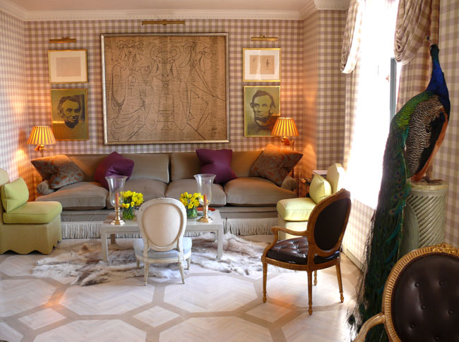
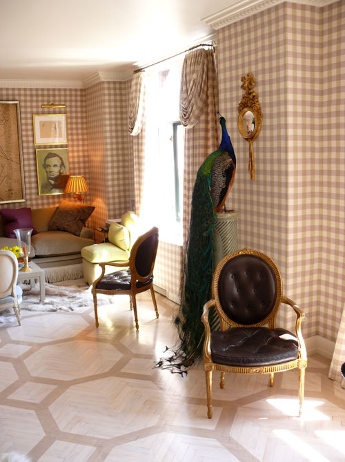
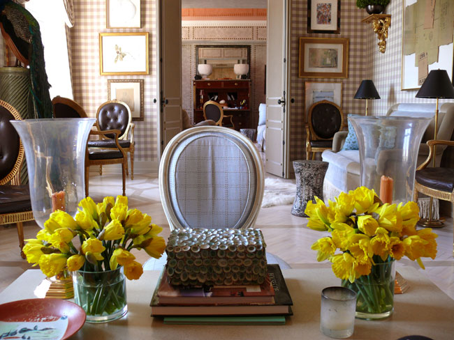
This room screams Swedish Decorating with modern touches. Who knew Gingham fabric would look so striking on the walls. This classic Swedish pattern looks stunning with hues of lavender and beige. The fabric was extended to the windows, for a traditional cohesive appeal. Bilhuber moved the beige from the walls onto the floor. The floor design is one of the most incredibly beautiful yet simplistic patterns.
The floors were first limed and then paint was added to form the pattern on top of the herringbone wood floor. It is interesting to see the pattern he choose for the floor. The alternate patterns do work with the natural pattern of the herringbone. The pattern is quite modern looking but the diagonal slant gives an interesting appeal to the room instead of a pattern which would run straight. Do you see that the wood was limed, or white washed? Having the natural wood showing through the white wash is especially beautiful.
A stuffed peacock was found on Ebay stands on a pedestal, and touches of green break up the natural colors adding a bit of punch.
The sketches of Abraham Lincoln are not on a white background. This simplistic appeal of adding a colored background for a sketch is rather inspiring.
Above the sofa hangs a drawing on linen by Jean Cocteau. Bilhuber obviously has expensive taste, as the Chinese style coffee table was purchased at Christies.
In the living room, slipper chairs designed by Jeffrey flank a 10 ft. long sofa covered in velvet by Jack Lenor Larson with Samuel & Sons bullion fringe. The Louis XVI gilt black leather chairs are the gem of the room. The set of four 18th century gilt armchairs were purchased from Christies.
Groves Brothers Room
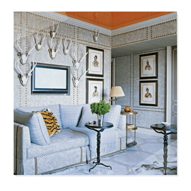
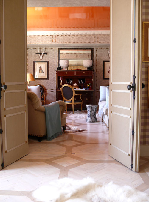
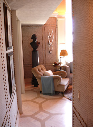
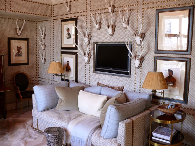
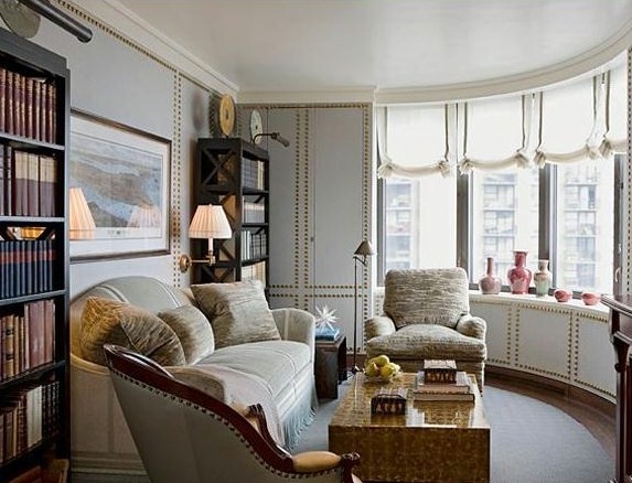
Peeking into the library, the stenciled floor in white and beige sets the tone for the adjacent study. Bilhuber uses Groves Brothers fabric to upholster the walls and uses the same fabric which continue onto the sofas. The most interesting aspect of this room is the nail head trim on the walls. Bilhuber creates architectural depth with the square nail head trim on the walls and doors.
The first thing you see in this room is the bright tangerine colored lacquer ceiling and then your eyes refocus on the contemporary colors in the living space. Bilhuber shows us a trick here. If you are someone who is afraid of adding color into a room, why not try an unexpected place such as a ceiling, inside of a pantry, or a closet?
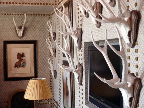
Bilhuber’s apartment features some superb antiques such as the Gustavian secretary and the 1930’s mirror which gives it an upscale appeal. I think the secret to any really superb design is including authentic or reproduction antiques. The collection of white resin antlers surrounds a recessed television in the guest room and give a masculine feel to the room. Ebay sells a number of faux antler trophies which range in price from $30- $60. Don’t limit yourself to just antlers, consider other wall statues, that may be improved with some gray paint.
Gournay Room
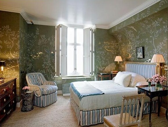
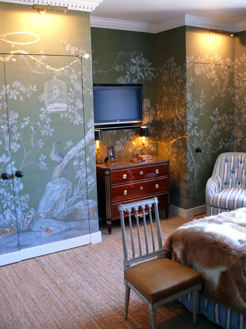
This room is by far the prettiest room I have EVER come across. Bilhuber commissioned artist Nancy Lorenz to add designs of gold leaf on resin to the de Gournay wallpaper. Did she use something quite thick such as silicone sealant, and then gold leafed the silicone when it dried? If you look very closely, the designs are quite heavy, which is almost impossible for paint to do alone. Perhaps she formed the designs on an upright surface, and once they dried, she gold leafed them and then hammered them on to the wall. This is how I would achieve the look.
A Gustavian chest is topped with a pair of lotus lamps , and an antique chair is white washed with a leather seat giving the room that masculine appeal. Again, all high end antiques, show high-end style.
Jeffrey Bilhuber’s Design Basics: Expert Solutions for Designing the House of Your Dreams, by Jeffrey Bilhuber and Annette Tapert (Rizzoli, 2003) This book offers luxurious photography and easy-to-follow lessons on space, scale, color, and materials.
Jeffrey Bilhuber: Defining Luxury: The Qualities of Life at Home – Jeffrey Bilhuber returns with a second book after Design Basics, his successful debut volume. In Defining Luxury cortails his most recent projects from coast to coast. The book features seven chapters in which each project is discussed extensivly from Bilhuber’s style and insight.
York Wallcoverings Ashford Toiles Gingham Check Prepasted Wallpaper, IN Yellow And Black
York Wallcoverings Ashford Toiles Gingham Check Prepasted Wallpaper, IN White and Green
York Wallcoverings Ashford Toiles Gingham Check Prepasted Wallpaper, IN Cream And Brown
York Wallpaper features a number of classy designs. The toile is named for the French town from which the design style originated as a popular cloth print in the 1700’s. Ashford House has artfully recreated some of the original 18th century French pastoral scenes that define the style, while offering some beautiful contemporary interpretations that expand the boundaries of the definition. An extraordinary collection of elegant wallpapers, Ashford House Toiles provides classic designs in rich, traditional colors, as well as modern variations in color and style that are delightfully unexpected.
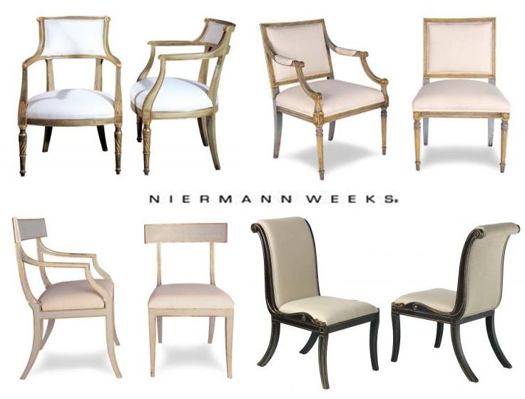
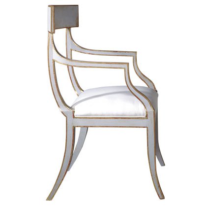
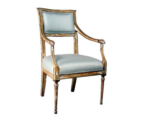
The Klismos Chair has been one of the most sought after chairs for years, but honestly almost impossible to find, leaving many people scouring antique shops from coast to coast. Its popularity peaked around 400 B.C., but was then resurrected in the 18th century, when classical furniture and architecture came into fashion.
Joe Niermann founder of Niermann Weeks, started his career in the insurance industry, but his passions for porcelain, pottery, and antiques lead him to volunteer at the Wisconsin Historical Society, which he learned all there is to know about restorations, paint finishes and antique furniture. That platform of knowledge enabled him to start his own restoration business in 1971. Niermann discovered that if most antiques could be restored while maintaining their structural integrity and original finish, antiques could then be cloned and reinterpreted into new designs.
In 1984, six years after the founding of the company, Niermann Weeks moved to Annapolis, Maryland, where it was incorporated in 1985. The Niermann Weeks chair above and to the left is a painted modern reproduction of an 18th-Swedish interpretation of an ancient klismos chair, and retails for $2,420. Over 40 percent of their business is custom-designed furniture requested from professional architects and designer clients. Niermann Weeks features more than 600 standard designs with 500 finishes.The company prides itself on employing a team of skilled artisans who create, by hand, 18th-, 19th- and 20th-century-style furniture that Niermann picks up in his world travels and thinks about reproducing.
European-style furniture with gold-leafed ornate decorations and glazed finishes are what the manufacturer is known for producing. Bradshaw Orrell,whom is the companies design director has lead the company in a unique direction featuring more rustic finishes that have the appearance of antique weathering that would look as if wear and tear took place over centuries of use. Hand carving and primitive techniques give the look of furniture made 150 years ago. Hand-painted finishes, some with floral motifs or gilded detailing, that give them a rich and original appearance, like one-of-a-kind furniture often found in antiques shops.
The attention to detail and unique faux finishes really take their furniture to the next level compared to all other manufactures. Niermann Weeks has showrooms in New York, Washington, D.C., and Los Angeles, and in 16 other showrooms across the country and in 21 shops in other regions in the United States.
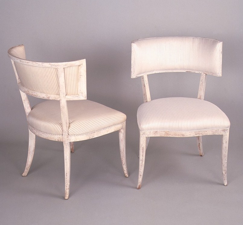
Stunning Niermann Weeks Klismos Chairs Found on La Design Concepts Blog
