An Amazing Design Secret That Professional Designers Use All The Time
Jeffree Turney from Lone Ranger is one biggest dealers who specialize in Gustavian antiques, and also happened to be on Martha Stewart and revealed some of his refinishing secrets. He recommends after initially painting and distressing your piece using milk paint, mixing 20 percent “Howard’s Feed ‘n’ Wax” furniture wax to 80 percent “Dark Walnut” Minwax. Wearing latex or rubber gloves covered with socks, apply wax, and use a paint brush for tight spots. Rub off excess wax immediately with a long plastic-bristled scrub brush. The overall faux finish gives you an antique effect.
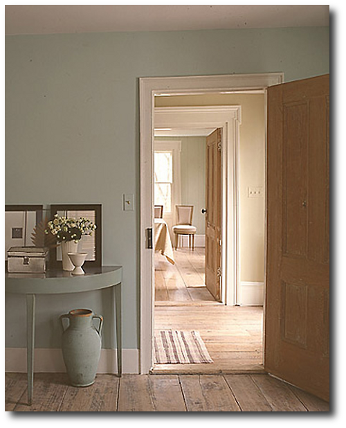
I always found this picture from Martha Stewart captivating. Matching furniture up with the wall color is a very interesting design concept. Adding a dark wax to your piece will allow your furniture to stand out from your wall color.
Here are some unique examples:
In this kids room wall storage is painted a bright red. The design look appears minimal.
This room is painted a vibrant teal blue. Wall letters on the wall and furniture is painted in the same paint color.
A matching set of Swedish chests are placed in a room where the wall color and drapes are designed to match.
In one of my favorite pictures a kitchen is painted in a mute blue. The walls and the kitchen island and cabinets are painted in almost the exact shades. The walls are 5 shades lighter and brighter than the cabinets. It is one of the best kitchens I have seen.
Gustavian Designed Interior From Swedishinteriordesign.co.uk
Gustavian Decorating – Martha Stewart
Martha Stewart always seems to get color right. I believe she has an eye for historical colors palettes. In this photo we see a console table that is matched up to the wall color. The look is absolute perfection. See additional Martha Stewart interiors based on Gustavian influences.

Gray Paint Tones
Gray Paint Tones
A series of gray tones are paired together in this dark interior. The bar table is painted in a lighter shade of gray with glass cloche’s are paired together. Limed wood add to the gray appearance without loosing the detail of the wood. Stainless steel also works with the gray interiors like no other metal. The metal adds a richness and some light to dark room. If you love this appearance, but find it too dark, consider the same elements with lighter paint tones.
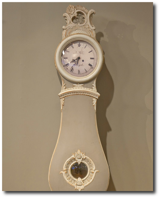
Look How This Mora Clock Is Painted The Same Color As The Wall- A Gray And White Combination -Clock From Jeffree Turney of Lone Ranger Antiques
Matching Wall Paint and Furniture
This photo takes the concept to the extreme, where everything is painted in the same shade except for the stool, and the accessories. Furniture that may be an eyesore, could be given a face lift using this concept. It allows the furniture to disappear into the room, giving other pieces the spot light. This concept also gives a minimal look to a room, allowing a busy room to appear less cluttered.
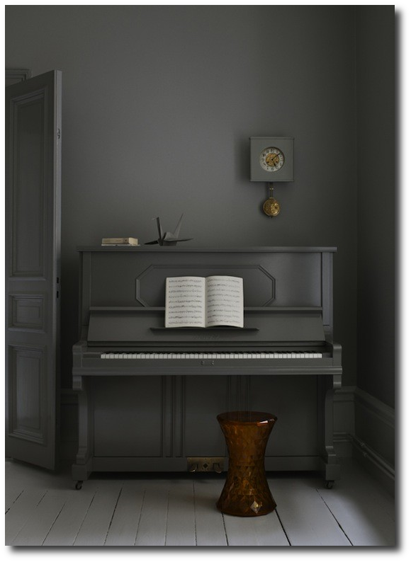
Matching Wall Paint and Furniture
Matching Wall Paint Up With Furniture
In this photo, we see a very interesting effect using two paint colors instead of one shade for the entire room. We see a chair rail used to divide the wall. A brighter paint color is used on the bottom of the wall, and the furniture is painted in the exact same color. Using this idea, adding a brown glaze to the furniture which can be painted on and wiped off would give the furniture a bit of a distinction and less of a newly painted appearance.
How To Get This Look
-Use the same shade as your wall color on your furniture. After your piece has been distressed (and dried), consider painting a thin coat of brown glaze to give it an antique appearance. Ralph Lauren glaze works terrific. You simply mix one third paint to glaze, or half glaze/ half paint in a cup. (The glaze is white, but dries clear with what ever paint you mix with it) Add brown paint to your glaze, and simply paint a thin coat on to your furniture. You can either paint on a thin coat, and call it done, or you can wipe off some of the glaze with a rag leaving some of the glaze behind. I cannot tell you how thrilled I am to have discovered this secret for brighter paint colors. Brighter paint colors automatically look antique when a translucent brown is added. Bright blues become muted, everything looks better.
-Heavily distress your furniture to give your furniture more depth. The natural wood will give more warmth in your room, and add to the overall look of the furniture.
– Add furniture ornaments to your furniture painted in white or in gold to add some detail to your painted furniture. Cake molds often have beautiful designs that would look just as beautiful on furniture. These designs can be made easily with plaster, concrete, or resin inexpensively.
Gustavian Pedestal- Neoclassical Decorating From Gift & Home Today
Eighteenth century Neoclassical style had made its way into Swedish style when King Gustav III of Sweden corresponded with Marie Antoinette about his decorating projects. Scandinavia responded to the French style with even more elegance and sophistication. While Sweden wouldn’t be able to duplicate the vast wealth of the French, The Swedes made it better with less to work with.
Swedish decorating is based around wood. In order to get the look, consider basing your entire interior around wood. Painted wood furniture, distressed wood floors, wood paneling, and painted wood accessories are all key elements to Swedish style. If you have just one of those elements you are on your way to attaining the elegant Gustavian interior looks.
Pearl grey was the universally popular shade, and often accompanied by carved flourishes, ribbons, florals and bows. These elegant carved details were very neoclassical in nature and often ornamented mirror frames, chairs and furniture alike.
One of the most common draws to Swedish furniture is the paint shades that were used. Muted tones were used, and the pastel family was at the height of fashion through the 18th century. Common shades found in Sweden were blues. pinks, pale green, and straw yellow. Gold leaf was used less than in the rococo period, but were still used to add richness to furniture and decorating.
- The lines of the Rococo period were still in style, yet more streamlined designs came into play. Splayed legs become more straight, though finely tapered.
- Fluted legs had the sophistication of something more classy while the tapered legs played to the country side of Swedish decorating.
- Chairs were designed with straight backs instead of curved, and long narrow sofas became very fashionable.
- Mirrors were a must have in the 17th and 18th century, and this was especially true for Sweden, as their interiors became darker earlier because of the early sun sets.
- Candles were often placed in front of mirrors to magnify the reflective light. for Mirrors became longer and rectangular instead of round or oval.
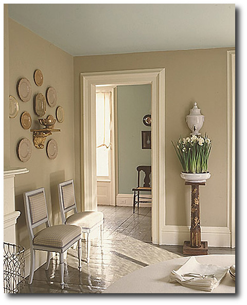 Swedish Style Decorating Ideas From Martha Stewart
Martha Stewart has such a good eye for style and her impeccable taste shows in these photographs. Here she uses her own paint- Drabware on the walls. One of the highlights of this room is the Wedgwood china on the wall. Do you see how well they match with the wall color? You have to wonder if the entire room was decided with those few pieces? The china is a few shades darker than the wall color. The Swedish check is chosen for the chairs, again matching perfectly with the wall color. The white in the check pattern gives depth to these chairs.
In the next room, the perfect shade of blue is used on the walls in a saturated shade. Look how blue is chosen for the ceilings instead of white. The floors are painted a darker hue than the walls.
These series of photographs has remained some of my all time favorite photographs out of the thousands I have looked at and compiled for our many blogs.
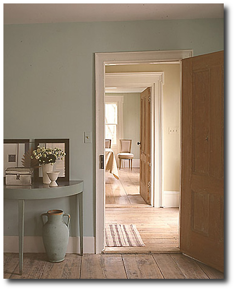 Swedish Gustavian Decorating Ideas From Martha Stewart
Again, another perfect example of classic Swedish style. Orange has to be one of my favorite colors, and here you can see how that hue comes alive in this room. The doors are stripped back so you can appreciate their details and patina.
In the past I have taken all natural wood (or faux painted) and painted an entire piece with plain light gray paint. After letting the piece dry for 5 to 7 minutes I have washed with a hose (for bigger furniture) or running water (for smaller pieces) to reveal a more distressed look than pickling or white washing. The overall effect leaves a very rustic painted appearance than your typical clean look of white washing.
Here, the floors are bare and rustic which is a classic Gustavian must have. One of the best features in this room is the demilune tapered leg console table. Look how the paint shade is within the same color family as the wall except darker?
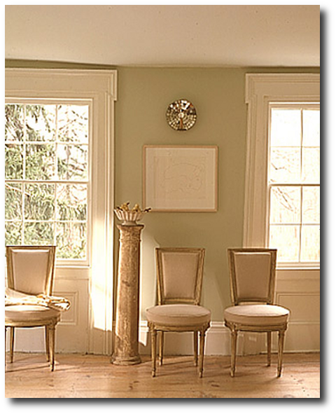 Swedish Gustavian Decorating Ideas From Martha Stewart
Here you see in the picture above extremely elegant neoclassical chairs. The right period style can really make a room look distinctively Swedish. This room is very simple yet the architectural features are incredibly ornate.
Quiet luxury inspired by 18th-century Sweden
Light - Patina - Heritage

Restoration Tools
- Matte Topcoat
- Pro Grade Brush Set
- Finishing Sealer In Matte
- Bronze Spray For Hardware
- Sticks To Everything Primer
- Dead Flat Varnish
- Stick To Everything - Matte Primer
- Transparent Aged Glaze
- Sticks To Everything Brown Primer
- Prima Transfers
- Dyke Brown Glaze
- Escutcheons
- Medallion Silicone Mold
- French Key Molds
- Portico Scroll
- Rusty Paint Finishes
Recent Posts
- 200 Swedish Antiques A Person Can Look For
- Rococo In The Nordic Countries
- For The Love Of Collecting Antiques – A Swedish Interior
- Gustavian Furniture – How to get the look – Ulla Kloster
- 3 Swedish Must Haves – Decorating A Home Around Swedish Antiques
- The Beautiful Wall Paintings Of von Echstedtska gården In Sweden
- 400 Professional Designers Picked Green As The New Color To Watch
- 5 Scandinavian Interior Design Tricks – Megan Slack
- 30 Gray Toned Paint Colors For Swedish Styled Interiors – Behr
- DIY Upper Kitchen Cabinets – Lindsay – White Buffalo Styling
- Bringing The Garden In For The Winter
- The Home Office – Why Not Make Yours Unique ?
- The Light And Airy Furniture Of Sweden
- Slipcovers Have Always Been Popular Through Time – Swedish Decorating
- The Couple Behind D. Larsson Interior and Antikhandel – Swedish Antiques
- 6 Colors You’ll Find In Every Scandinavian Home – Laura Barry
- 5 Decorating Mistakes Not To Make – By Gabrielle Savoie
- Designer Marshall Watson’s Scandinavian Newport Beach Home
- Designer Marshall Watson’s Scandinavian Summer House
- Swedish Inspired Kids Bedrooms
- 5 Kitchen Design Lessons You Can Learn from Scandinavian Interiors
- Jenny’s DIY Wide-Plank Plywood Flooring Studio Renovation
- Decor Mistakes All 20-Somethings Make
- Can I Stain Over Paint To Produce A Patina?
- Q&A With Swedish Designers Edie Van Breems and Rhonda Eleish
- How To Avoid Yellowed White Painted Furniture With General Finishes Products
- Colleen Martin, Founder of Swede Collection Tells Us Her Journey Of How She Began Reproducing Gustavian Furniture
- Expect To See More Warm Grays, Blues And Creams In Gustavian Decorating
- 8 Brands Of Gold Spray Paint Were Compared To Find The Best Color
- Essential Characteristics Of 18th Century Swedish Interiors
- Gustavian Style By Kristie Barnett
- 7 Places To Find Swedish Design For Toddlers
- Study Shows The Gustavian Period Has Defined All Tastes Through Time In Sweden
- Mix Old and New Like the Scandinavians Do- Chloe Taylor
- Swedish Furniture Design – What Makes The 1800’s So Obsessive
- 5 Pieces Of Wise Decorating Advice From Tricia Foley
- Impressive History Of Fine Swedish Table Linen
- Linen Has An Incredible History- Find Out Why……
- Life In 17th Century Norway & Sweden
- How To Select The Right Linen For Your Children’s Bedroom- Kids Room Decor Ideas
- Nordic Style Kids Bedroom Decor Ideas
- Decorator Tricia Foley’s Signature White Interiors
- 10 Tips From Interior Designer Furlow Gatewood
- Living In Norway- Norwegian Life In The 18th & 19th Centuries By Elisabeth Holte
- Investing In Mora Clocks – Expert Advice From Jo From Swedish Interior Design
- International Interior Decorating Magazines Worth Buying
- Swedish Council Of America Articles
- 5 Homes Decorated Around The Nordic Style
- Swedish Reproduction Furniture At Solgarden
- Behind The Rundale Palace in Latvia
- Nordic Style Historical Interior Decorating Books – Living Museums in Scandinavia
- Decorating Around Red- Historical Interior Design Ideas
- Florence De Dampierre Comments On Nordic Furniture In Sweden And Denmark
- 12 Designers Pick Their Favorite Paint Colors – House Beautiful
- 7 Of The Most Famous Swedish Furniture Designers And Decorators
- New Research Suggests Swedish Furniture In The 1700’s May Have Had Strong Colors
- Swedish Tripod Tilt-Top Candle Stand Tables
- Decorators Who Have Embraced The Nordic Style – 30+ Pictures
- A Look Behind Skogaholm Manor -18th century Swedish Decorating
- Decorating With Swedish Country Antiques- Darlene Peterson Buchanan
- 12 Interior Designers Pick Their Favorite Swedish Paint Colors
- 50+ Decorating Books Worth Looking At
- Swedish Decorating Inspirations In Yellow, Ivory And Beige- 50+ Pictures
- Decorating Around The Color Green – Swedish Style
- A Dallas, Texas Home Decorated Around The Swedish Style
- 3 Houses Decorated Around The Rustic Swedish Style
- Reproduction Distressed Furniture And Home Decor From Bliss Studio
- Buy The Swedish Style For Less
- 3 Swedish Style Homes Featured In Magazines
- Swedish Antiques From Debenham Antiques
- The History Behind Jean Bernadotte Otherwise Known As Karl Johan
- 5 Faux Wall Painting Techniques That Are Easier Than You Think
- Swedish Kids Rooms: 6 Ideas To Get The Look
- 5+ Nordic Homes Decorated Around White
- 10 Of The Best Tours In Sweden
- 3 Rustic Scandinavian Country Homes – Borrow Ideas From Norway and Denmark
- Spring Summer Checks and Florals For The Swedish Home
- 70 Swedish Furniture Pieces That Sell For Less- Swedish Decorating On A Budget
- Decorating With Blue: Swedish Style Decorating Ideas
- An Interview With Daniel Larsson- The Go-To Guy For Swedish Antiques
- 7 Scandinavian Country Decorating Books
- 75 Swedish Nordic Pinterest Pages! Oh Yes…More Eye Candy!
- 69 Inspiring Pictures Of Nordic Country Style Decorating
- 20 Scandinavian Gift Ideas
- 5 Ways To Add Life Into Worn-Out Furniture
- Mora Clocks: Investing In Swedish Heritage
- How To Decorate With Botanicals
- Buying Property In Sweden
- Get The Swedish Look By Installing Tongue And Groove Paneling
- The Lavish Interior Of The Swedish Häringe Castle
- The Swedish Wreta Gestgifveri Inn
- Paint It White He Says…. Washington Interior Designer Darryl Carter – Swedish Decorating
- 5 Pro Painting Tips For Black Furniture
- The Swedish Artist Carl Larsson
- A Guesthouse Decorated in The Swedish Style
- Swedish Furniture From Bukowski Market
- 216 Selections From Wallpaper Direct – Swedish Decorating
- A Look Behind The National Museum of Stockholm
- Antique Swedish Dealer Jane Moore’s Home Veranda Magazine
- A Swedish Collected Home In Upstate New York – Swedish Gustavian Decorating
- $100+ Solid Braided Rugs
- 60 Scandinavian Country Folk Art Books On Amazon
- 50 Examples Of Swedish Folk Country Interiors
- Designers Pick Their Favorite Gray Paints
- HOW TO: Paint Gustavian Finishes
- “Söderbo” A Home Untouched Since 1920
- Designer Martha Angus Loves Gustavian Style
- Les Indiennes Fabrics
- Decorating Secrets- 60 Quotes From The Best Experts In Design
- Swedish Kakelugn Stoves
- Helen Olsen’s Rungstedlund Home Revealed In Gods & Gardar Magazine
- The 1700 Collection Swedish Furniture
- Swedish Plaster Medallions
- The History Behind Empire Furniture From The Karl Johan Period -Liza Laserow
- Swedish Styled Wallpaper
- Nordic Style Drapery And Window Coverings
- The Gentle Palette of Swedish Antiques-Corey Amaro
- Custom Reproduction Swedish Furniture From Garbo Interiors
- 30 Spectacular Picks From Frantz Hemeleers Antiques
- Go Bold With Red- Part 1 Grand Sophisticated Interiors
- Go Bold With Red- Nordic Country Interiors
- The Baroque Style Of Switzerland
- Daniel Romualdez’s Swedish Montauk Home
- The Shocking History Behind “Emerald Green” Paint
- Stylish Looks For Slip-covering Your Furniture
- The Best 5 Websites For Purchasing Antique Hardware
- Fired Earth’s Anniversary Paint Collection
- Swedish Furniture Auctions -Uppsala Auktionskammare
- Louis Masreliez- The Designer Behind Gustav III’s Pavilion At Haga Park
- A Nordic Design Staple- The Swedish Kakelugn Tile Stove
- Swedish Antique Mirrors
- How To Decorate A Child’s Room In The Swedish Style
- Ruby Beets Swedish Rustic Home
- The Country Side Of Sweden- An All White Based Home
- Akerö in Södermanland, Sweden
- Krusenberg Herrgård: An 18th Century Swedish Luxury Hotel
- Wood Plank Flooring, A Swedish Design Must Have – Part 1
- Vinyl Plank Flooring, A Swedish Design Must Have – Part 2
- Laminate Wood Flooring, A Swedish Design Must Have – Part 3
- Plywood Plank Flooring, A Swedish Design Must Have – Part 4
- Painted Wood Flooring, A Swedish Design Must Have – Part 5
- The Romantic Baroque Style: Part 1- Stromholm
- The Romantic Baroque Style: Part 2 King Gustav Vasa
- The Romantic Baroque Style: Part 3 Skokloster & Steninge Palace
- The Romantic Baroque Style: Part 4 – A Collectors Home
- The Romantic Baroque Style: Part 5 Add Color
- Sweden’s Empire Decorated Rosersberg Palace
- The Most Beautiful Rococo Library In The World:The Anna Amalia Library
- 4 Resources For Swedish Decorating
- How Important Are Accent Pieces In A Swedish Home?
