Martha Stewart’s Creative Director- Erik Pike’s Gustavian Townhouse In New York Part 2
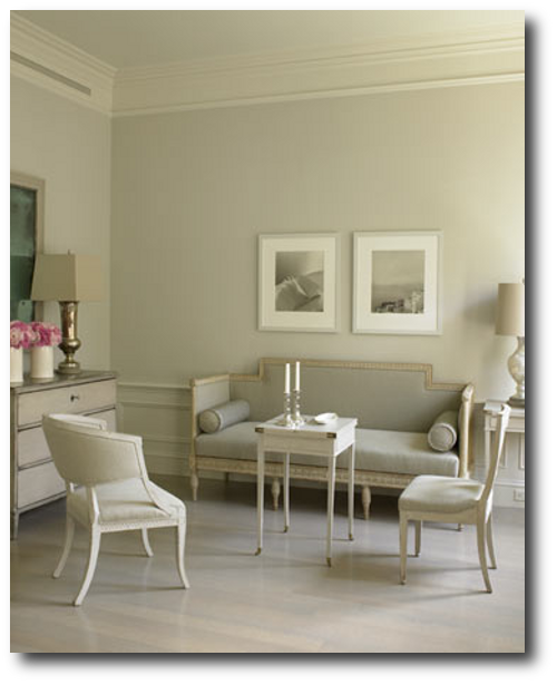
The settee, chest, and rounded-back chair in this photo are genuine Swedish antiques. Eric purchased the other chair at auction and had it copied for the dining room. The tables in the room are vintage, which he painted himself. Look at the three color combinations on the walls. It appears that the wall color, crown molding and ceiling colors are slightly different tones. With the painted antiques, and color of upholstery, this room is rich with detail.
The gray wood flooring doesn’t go unnoticed, tying together the various rooms in his home. The wide planks were bleached, then stained a neutral gray. He decided to upholster all of the living room furniture in a single gray linen, allowing individual antiques to be unified as a set. Hints of silver are found in the candlesticks, light fixtures, and hardware and have always been a classic Gustavian element found in Swedish style.
The house originally appeared in Martha Stewart’s September issue way back in 2005. “I wasn’t going to buy until I could find the right place,” he tells Martha Stewart Living Magazine. He ended up renting a small one-bedroom apartment for sixteen years until the perfect place showed itself to him. The 1840s Federal-style townhouse on a historic block had all the right bones for what he always had in mind.
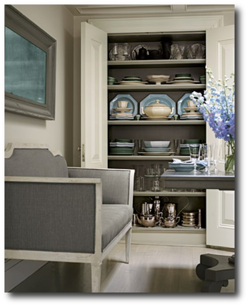
In this photo from Marthas website, a decorative box houses some objects he used for inspiration. If you look closely, you can see two pictures of the townhouse before renovations. New York City architect Richard Perry, Pike set out to make the apartment his own.
“I like the neoclassical forms and the sculptural lines combined with rustic painted finishes,” Pike says. “They have no unnecessary embellishment — there’s a purity in that.”
I have loved his townhouse for years. I hope you find as much inspiration from his home as I did.
See Martha Stewart For More Information
Martha Stewart’s Creative Director- Erik Pike’s Gustavian Townhouse In New York
The sitting area above lacks the height compared to the rest of the apartment, so a skylight was introduced into the space. Support beams are concealed yet present a dramatic look to this room. Eric sought a square pedestal table to complete this room; finding none, he designed one with architect Richard Perry.
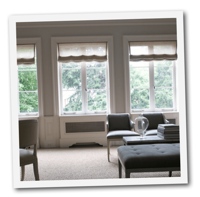
You would never know a television hangs over the living room mantel because an antiqued mirror lifts to reveal it. Look at this photo of the kitchen where one wall houses a refrigerator and washer and dryer behind cabinet doors. A toaster and coffeemaker are housed in an appliance “garage” on a tray that pulls out so you can pour in water. The bathroom is designed just right to make it appear bigger with glass shower doors. The bedroom and the bathroom are the most modern rooms in the home.
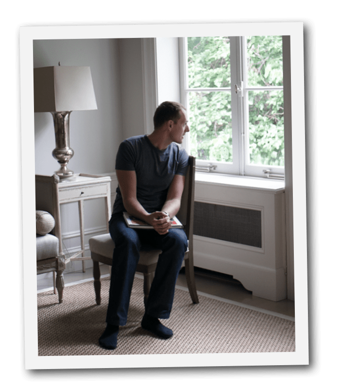
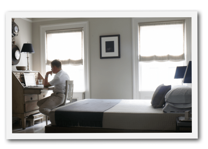
Eric Pike is Creative Director of Martha Stewart Living. Stefan Steil is an interior designer and founder of Stelish. Some of his design work can be found at Stefan Steil. Portraits taken at their townhouse in Manhattan.

Quiet luxury inspired by 18th-century Sweden
Light - Patina - Heritage

Restoration Tools
- Matte Topcoat
- Pro Grade Brush Set
- Finishing Sealer In Matte
- Bronze Spray For Hardware
- Sticks To Everything Primer
- Dead Flat Varnish
- Stick To Everything - Matte Primer
- Transparent Aged Glaze
- Sticks To Everything Brown Primer
- Prima Transfers
- Dyke Brown Glaze
- Escutcheons
- Medallion Silicone Mold
- French Key Molds
- Portico Scroll
- Rusty Paint Finishes
Recent Posts
- 200 Swedish Antiques A Person Can Look For
- Rococo In The Nordic Countries
- For The Love Of Collecting Antiques – A Swedish Interior
- Gustavian Furniture – How to get the look – Ulla Kloster
- 3 Swedish Must Haves – Decorating A Home Around Swedish Antiques
- The Beautiful Wall Paintings Of von Echstedtska gården In Sweden
- 400 Professional Designers Picked Green As The New Color To Watch
- 5 Scandinavian Interior Design Tricks – Megan Slack
- 30 Gray Toned Paint Colors For Swedish Styled Interiors – Behr
- DIY Upper Kitchen Cabinets – Lindsay – White Buffalo Styling
- Bringing The Garden In For The Winter
- The Home Office – Why Not Make Yours Unique ?
- The Light And Airy Furniture Of Sweden
- Slipcovers Have Always Been Popular Through Time – Swedish Decorating
- The Couple Behind D. Larsson Interior and Antikhandel – Swedish Antiques
- 6 Colors You’ll Find In Every Scandinavian Home – Laura Barry
- 5 Decorating Mistakes Not To Make – By Gabrielle Savoie
- Designer Marshall Watson’s Scandinavian Newport Beach Home
- Designer Marshall Watson’s Scandinavian Summer House
- Swedish Inspired Kids Bedrooms
- 5 Kitchen Design Lessons You Can Learn from Scandinavian Interiors
- Jenny’s DIY Wide-Plank Plywood Flooring Studio Renovation
- Decor Mistakes All 20-Somethings Make
- Can I Stain Over Paint To Produce A Patina?
- Q&A With Swedish Designers Edie Van Breems and Rhonda Eleish
- How To Avoid Yellowed White Painted Furniture With General Finishes Products
- Colleen Martin, Founder of Swede Collection Tells Us Her Journey Of How She Began Reproducing Gustavian Furniture
- Expect To See More Warm Grays, Blues And Creams In Gustavian Decorating
- 8 Brands Of Gold Spray Paint Were Compared To Find The Best Color
- Essential Characteristics Of 18th Century Swedish Interiors
- Gustavian Style By Kristie Barnett
- 7 Places To Find Swedish Design For Toddlers
- Study Shows The Gustavian Period Has Defined All Tastes Through Time In Sweden
- Mix Old and New Like the Scandinavians Do- Chloe Taylor
- Swedish Furniture Design – What Makes The 1800’s So Obsessive
- 5 Pieces Of Wise Decorating Advice From Tricia Foley
- Impressive History Of Fine Swedish Table Linen
- Linen Has An Incredible History- Find Out Why……
- Life In 17th Century Norway & Sweden
- How To Select The Right Linen For Your Children’s Bedroom- Kids Room Decor Ideas
- Nordic Style Kids Bedroom Decor Ideas
- Decorator Tricia Foley’s Signature White Interiors
- 10 Tips From Interior Designer Furlow Gatewood
- Living In Norway- Norwegian Life In The 18th & 19th Centuries By Elisabeth Holte
- Investing In Mora Clocks – Expert Advice From Jo From Swedish Interior Design
- International Interior Decorating Magazines Worth Buying
- Swedish Council Of America Articles
- 5 Homes Decorated Around The Nordic Style
- Swedish Reproduction Furniture At Solgarden
- Behind The Rundale Palace in Latvia
- Nordic Style Historical Interior Decorating Books – Living Museums in Scandinavia
- Decorating Around Red- Historical Interior Design Ideas
- Florence De Dampierre Comments On Nordic Furniture In Sweden And Denmark
- 12 Designers Pick Their Favorite Paint Colors – House Beautiful
- 7 Of The Most Famous Swedish Furniture Designers And Decorators
- New Research Suggests Swedish Furniture In The 1700’s May Have Had Strong Colors
- Swedish Tripod Tilt-Top Candle Stand Tables
- Decorators Who Have Embraced The Nordic Style – 30+ Pictures
- A Look Behind Skogaholm Manor -18th century Swedish Decorating
- Decorating With Swedish Country Antiques- Darlene Peterson Buchanan
- 12 Interior Designers Pick Their Favorite Swedish Paint Colors
- 50+ Decorating Books Worth Looking At
- Swedish Decorating Inspirations In Yellow, Ivory And Beige- 50+ Pictures
- Decorating Around The Color Green – Swedish Style
- A Dallas, Texas Home Decorated Around The Swedish Style
- 3 Houses Decorated Around The Rustic Swedish Style
- Reproduction Distressed Furniture And Home Decor From Bliss Studio
- Buy The Swedish Style For Less
- 3 Swedish Style Homes Featured In Magazines
- Swedish Antiques From Debenham Antiques
- The History Behind Jean Bernadotte Otherwise Known As Karl Johan
- 5 Faux Wall Painting Techniques That Are Easier Than You Think
- Swedish Kids Rooms: 6 Ideas To Get The Look
- 5+ Nordic Homes Decorated Around White
- 10 Of The Best Tours In Sweden
- 3 Rustic Scandinavian Country Homes – Borrow Ideas From Norway and Denmark
- Spring Summer Checks and Florals For The Swedish Home
- 70 Swedish Furniture Pieces That Sell For Less- Swedish Decorating On A Budget
- Decorating With Blue: Swedish Style Decorating Ideas
- An Interview With Daniel Larsson- The Go-To Guy For Swedish Antiques
- 7 Scandinavian Country Decorating Books
- 75 Swedish Nordic Pinterest Pages! Oh Yes…More Eye Candy!
- 69 Inspiring Pictures Of Nordic Country Style Decorating
- 20 Scandinavian Gift Ideas
- 5 Ways To Add Life Into Worn-Out Furniture
- Mora Clocks: Investing In Swedish Heritage
- How To Decorate With Botanicals
- Buying Property In Sweden
- Get The Swedish Look By Installing Tongue And Groove Paneling
- The Lavish Interior Of The Swedish Häringe Castle
- The Swedish Wreta Gestgifveri Inn
- Paint It White He Says…. Washington Interior Designer Darryl Carter – Swedish Decorating
- 5 Pro Painting Tips For Black Furniture
- The Swedish Artist Carl Larsson
- A Guesthouse Decorated in The Swedish Style
- Swedish Furniture From Bukowski Market
- 216 Selections From Wallpaper Direct – Swedish Decorating
- A Look Behind The National Museum of Stockholm
- Antique Swedish Dealer Jane Moore’s Home Veranda Magazine
- A Swedish Collected Home In Upstate New York – Swedish Gustavian Decorating
- $100+ Solid Braided Rugs
- 60 Scandinavian Country Folk Art Books On Amazon
- 50 Examples Of Swedish Folk Country Interiors
- Designers Pick Their Favorite Gray Paints
- HOW TO: Paint Gustavian Finishes
- “Söderbo” A Home Untouched Since 1920
- Designer Martha Angus Loves Gustavian Style
- Les Indiennes Fabrics
- Decorating Secrets- 60 Quotes From The Best Experts In Design
- Swedish Kakelugn Stoves
- Helen Olsen’s Rungstedlund Home Revealed In Gods & Gardar Magazine
- The 1700 Collection Swedish Furniture
- Swedish Plaster Medallions
- The History Behind Empire Furniture From The Karl Johan Period -Liza Laserow
- Swedish Styled Wallpaper
- Nordic Style Drapery And Window Coverings
- The Gentle Palette of Swedish Antiques-Corey Amaro
- Custom Reproduction Swedish Furniture From Garbo Interiors
- 30 Spectacular Picks From Frantz Hemeleers Antiques
- Go Bold With Red- Part 1 Grand Sophisticated Interiors
- Go Bold With Red- Nordic Country Interiors
- The Baroque Style Of Switzerland
- Daniel Romualdez’s Swedish Montauk Home
- The Shocking History Behind “Emerald Green” Paint
- Stylish Looks For Slip-covering Your Furniture
- The Best 5 Websites For Purchasing Antique Hardware
- Fired Earth’s Anniversary Paint Collection
- Swedish Furniture Auctions -Uppsala Auktionskammare
- Louis Masreliez- The Designer Behind Gustav III’s Pavilion At Haga Park
- A Nordic Design Staple- The Swedish Kakelugn Tile Stove
- Swedish Antique Mirrors
- How To Decorate A Child’s Room In The Swedish Style
- Ruby Beets Swedish Rustic Home
- The Country Side Of Sweden- An All White Based Home
- Akerö in Södermanland, Sweden
- Krusenberg Herrgård: An 18th Century Swedish Luxury Hotel
- Wood Plank Flooring, A Swedish Design Must Have – Part 1
- Vinyl Plank Flooring, A Swedish Design Must Have – Part 2
- Laminate Wood Flooring, A Swedish Design Must Have – Part 3
- Plywood Plank Flooring, A Swedish Design Must Have – Part 4
- Painted Wood Flooring, A Swedish Design Must Have – Part 5
- The Romantic Baroque Style: Part 1- Stromholm
- The Romantic Baroque Style: Part 2 King Gustav Vasa
- The Romantic Baroque Style: Part 3 Skokloster & Steninge Palace
- The Romantic Baroque Style: Part 4 – A Collectors Home
- The Romantic Baroque Style: Part 5 Add Color
- Sweden’s Empire Decorated Rosersberg Palace
- The Most Beautiful Rococo Library In The World:The Anna Amalia Library
- 4 Resources For Swedish Decorating
- How Important Are Accent Pieces In A Swedish Home?
