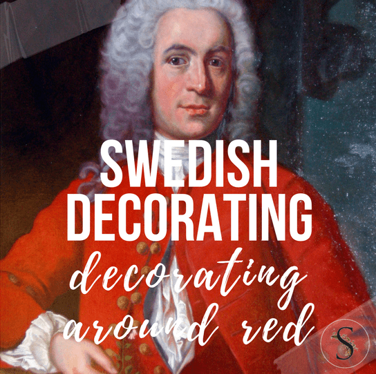
Decorating Around Red- Historical Interior Design Ideas
Antique Vintage European Textiles On Ebay
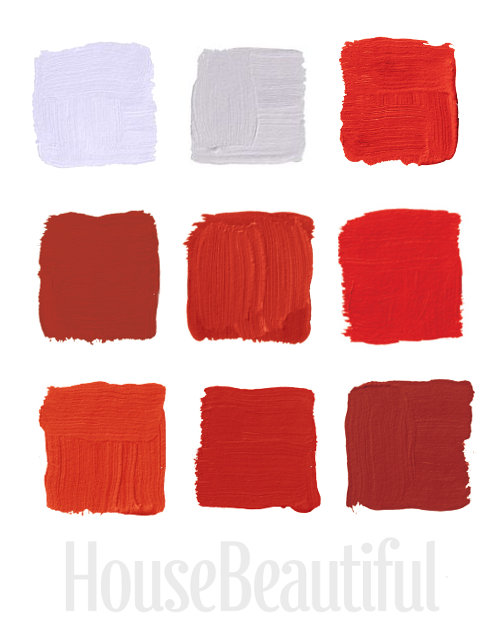
House Beautiful Magazine featured the top favorite red colors from the most famous interior designers. Here are my favorite 9 red shades of paint from their selection of 24
TOP ROW:
1.”This is a really deep coral, kind of like a cheerful Chinese red. Pinks and reds to me are synonymous with frozen drinks and relaxing.” –Richard Mishaan Pictured, Benjamin Moore‘s Chili Pepper 2004-20
2.”When I look for red, I want a pure, true red, like the color in the American flag. Ralph Lauren does absolutely the best. It’s the essence of red. It makes me think of boating or polo.” –Suzanne Kasler Pictured, Ralph Lauren Paint‘s Dressage Red TH41
3. “Red never goes out of style. It’s full of life — always fresh, always fun to wake up to. We go for reds with less blue in them and more orange because they’re happier to live with.” –William Diamond and Anthony Baratta Pictured, Ralph Lauren Paint‘s Lattice Red IB57
MIDDLE ROW:
4. “It’s a true, deep red. I like the temperature of it: it’s a bit cooler. But a little red goes a long way. It’s good in areas where you don’t spend much time or in boring areas that need a strong burst of color.” –Roderick Shade Pictured, Benjamin Moore‘s Million Dollar Red 2003-10
5. Benjamin Moore‘s Redstone was used in Eldon Wong’s cupboard.
6. “All my life I’ve pursued the perfect red. I can never get painters to mix it for me. It’s exactly as if I’d said “I want Rococo with a spot of Gothic in it and a bit of Buddhist temple” — they have no idea what I’m talking about.” –Diana Vreeland Pictured, Benjamin Moore‘s Red 2000-10
BOTTOM ROW:
7. “Red is the color of excitement, and I tend to go for corally orange reds. With red, you know you’ve arrived and you glance in the mirror and realize how great you look and breeze right in.” –Keith Irvine Pictured, Benjamin Moore‘s Salsa 2009-20
8.”I prefer the warm, vibrant reds to the historic reds, which are beautiful but sedate. This is a daring red, a real fire engine red. It has a playfulness that reminds me of a little red schoolhouse.” –Ruthie Sommers Pictured, Fine Paints of Europe‘s Dutchlac Brilliant Tulip Red W1001B-M
9.”Lately I’m on this anti-completely-neutral kick. You have to have some seasoning in your rooms. Sangria is good, universal-donor red — not too blue, not too orange, not too dark.” –Elissa Cullman Pictured, Benjamin Moore‘s Sangria 2006-20
Frijsenborg Castle
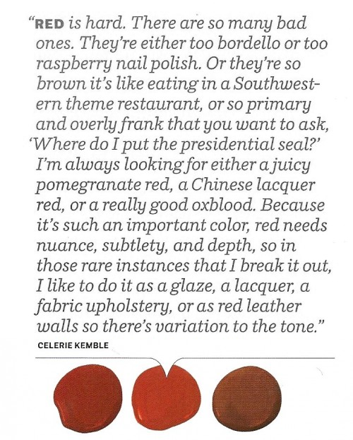 House Beautiful Color Celerie Kemble’s Advice
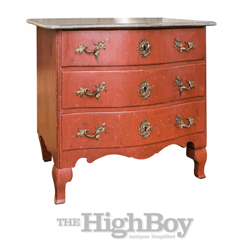 1760 Swedish Rococo Period Painted Commode thehighboy.com
Unknown Library Painted In Red
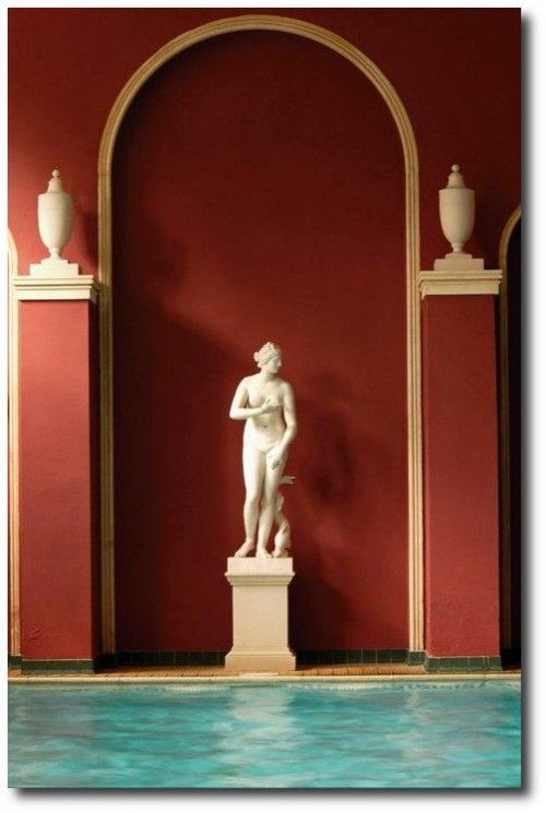
Photography By Simon Upton

Favorite Red Paint Colors Seen In House Beautiful Magazine
Hartwell House in Aylesbury, Buckinghamshire
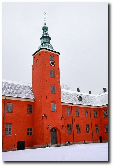
Halmstad Slott, Halland, Sweden- 2013-02-10 by Giåm on Flickr (cc)
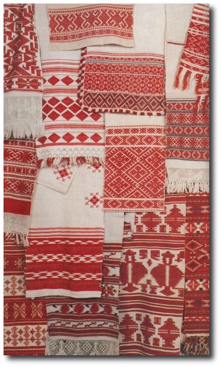
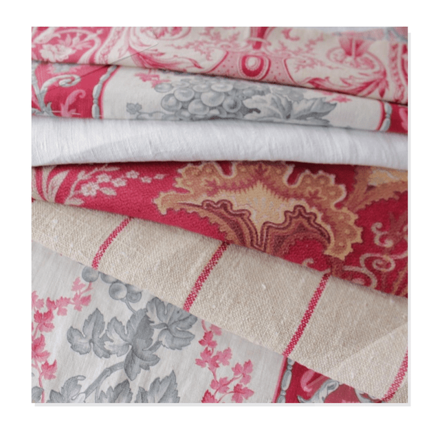
Beautiful Red Textiles Found on bohemianwornest.tumblr.com
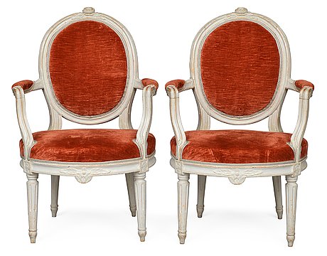
Gustavian armchairs signed Jacob Malmsten ( master in handcraft Stockholm 1780- 1788) from Bukowskis Classical auction 26-27 of May godsochgardar.se
18th Century Swedish Gustavian Grandfather Clock from Stjernsund Castle. The clock face is signed by Daniel Frång from Stjernsund. The inside of the clock case has preserved newspaper articles from the auction at Stjernsund Castle as well as information about important Swedish antiques clocks.- Scandinavian Antiques
Rembrandt Paintings Seen On Habitually Chic Blog
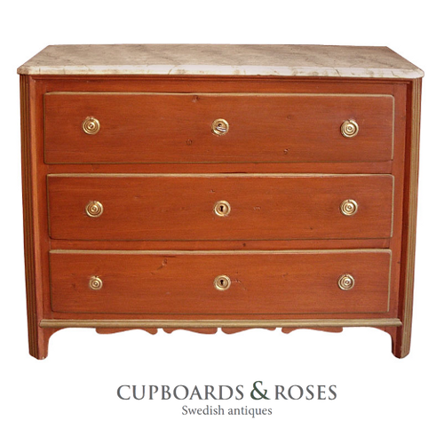 Early Gustavian chest of drawers, Sweden circa 1780, in secondary red paint. Chamfered corners, shaped bracket base, and faux marbled top. Cupboards & Roses
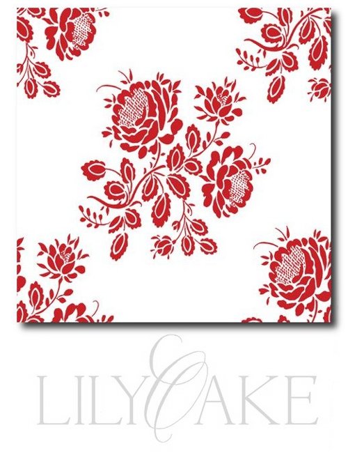 Gustavian Fabrics – Seen Pictured is Kristianstad Rose In Cranberry Red


17th Century Primitive Painted Homes
La Pouyette featured a unique post of a primitive painted cabin located a few kilometers from Gstaad. The cabin was originally featured in the 1993 Home and Garden magazine. Gstaad is a village in the German-speaking section of the Canton of Bern in southwestern Switzerland, and home to one of the largest ski areas in the Alps. This home was at one time considered a wellness area with sauna, and built in 1628. The evidence is found in the inscriptions. The walls are decorated with paint in black, green and red. In some areas of the home, formulas of blessings in Roman letters in Gothic characters are seen on the walls. Painted wooden panels, decorated beams, friezes carved into the woodwork, all add to the beauty of this home. Blonde wood is used on the floor boards, and the furniture is found in in natural pine. Visit La Pouyette‘s Blog for additional photos of this spectacular home.

17th Century Primitive Painted Homes

17th Century Primitive Painted Homes

17th Century Primitive Painted Homes

17th Century Primitive Painted Homes


