


Watch Jeffree Turney of Lone Ranger Antiques on Martha Stewart
Jeffree Turney from Lone Ranger is one biggest dealers who specialize in Gustavian antiques, and also happened to be on Martha Stewart and revealed some of his refinishing secrets. He recommends after initially painting and distressing your piece using milk paint, mixing 20 percent “Howard’s Feed ‘n’ Wax” furniture wax to 80 percent “Dark Walnut” Minwax. Wearing latex or rubber gloves covered with socks, apply wax, and use a paint brush for tight spots. Rub off excess wax immediately with a long plastic-bristled scrub brush. The overall faux finish gives you an antique effect.
I always found this picture from Martha Stewart captivating. Matching furniture up with the wall color is a very interesting design concept. Adding a dark wax to your piece will allow your furniture to stand out from your wall color.
Here are some unique examples:
In this kids room wall storage is painted a bright red. The design look appears minimal.
This room is painted a vibrant teal blue. Wall letters on the wall and furniture is painted in the same paint color.
A matching set of Swedish chests are placed in a room where the wall color and drapes are designed to match.
In one of my favorite pictures a kitchen is painted in a mute blue. The walls and the kitchen island and cabinets are painted in almost the exact shades. The walls are 5 shades lighter and brighter than the cabinets. It is one of the best kitchens I have seen.

Gustavian Designed Interior From Swedishinteriordesign.co.uk

Gustavian Decorating – Martha Stewart
Martha Stewart always seems to get color right. I believe she has an eye for historical colors palettes. In this photo we see a console table that is matched up to the wall color. The look is absolute perfection. See additional Martha Stewart interiors based on Gustavian influences.

Gray Paint Tones
A series of gray tones are paired together in this dark interior. The bar table is painted in a lighter shade of gray with glass cloche’s are paired together. Limed wood add to the gray appearance without loosing the detail of the wood. Stainless steel also works with the gray interiors like no other metal. The metal adds a richness and some light to dark room. If you love this appearance, but find it too dark, consider the same elements with lighter paint tones.

Matching Wall Paint and Furniture
This photo takes the concept to the extreme, where everything is painted in the same shade except for the stool, and the accessories. Furniture that may be an eyesore, could be given a face lift using this concept. It allows the furniture to disappear into the room, giving other pieces the spot light. This concept also gives a minimal look to a room, allowing a busy room to appear less cluttered.

Matching Wall Paint Up With Furniture
In this photo, we see a very interesting effect using two paint colors instead of one shade for the entire room. We see a chair rail used to divide the wall. A brighter paint color is used on the bottom of the wall, and the furniture is painted in the exact same color. Using this idea, adding a brown glaze to the furniture which can be painted on and wiped off would give the furniture a bit of a distinction and less of a newly painted appearance.
How To Get This Look
-Use the same shade as your wall color on your furniture. After your piece has been distressed (and dried), consider painting a thin coat of brown glaze to give it an antique appearance. Ralph Lauren glaze works terrific. You simply mix one third paint to glaze, or half glaze/ half paint in a cup. (The glaze is white, but dries clear with what ever paint you mix with it) Add brown paint to your glaze, and simply paint a thin coat on to your furniture. You can either paint on a thin coat, and call it done, or you can wipe off some of the glaze with a rag leaving some of the glaze behind. I cannot tell you how thrilled I am to have discovered this secret for brighter paint colors. Brighter paint colors automatically look antique when a translucent brown is added. Bright blues become muted, everything looks better.
-Heavily distress your furniture to give your furniture more depth. The natural wood will give more warmth in your room, and add to the overall look of the furniture.
– Add furniture ornaments to your furniture painted in white or in gold to add some detail to your painted furniture. Cake molds often have beautiful designs that would look just as beautiful on furniture. These designs can be made easily with plaster, concrete, or resin inexpensively.
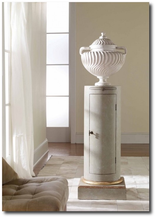
Gustavian Pedestal- Neoclassical Decorating From Gift & Home Today
Eighteenth century Neoclassical style had made its way into Swedish style when King Gustav III of Sweden corresponded with Marie Antoinette about his decorating projects. Scandinavia responded to the French style with even more elegance and sophistication. While Sweden wouldn’t be able to duplicate the vast wealth of the French, The Swedes made it better with less to work with.
Swedish decorating is based around wood. In order to get the look, consider basing your entire interior around wood. Painted wood furniture, distressed wood floors, wood paneling, and painted wood accessories are all key elements to Swedish style. If you have just one of those elements you are on your way to attaining the elegant Gustavian interior looks.
Pearl grey was the universally popular shade, and often accompanied by carved flourishes, ribbons, florals and bows. These elegant carved details were very neoclassical in nature and often ornamented mirror frames, chairs and furniture alike.
One of the most common draws to Swedish furniture is the paint shades that were used. Muted tones were used, and the pastel family was at the height of fashion through the 18th century. Common shades found in Sweden were blues. pinks, pale green, and straw yellow. Gold leaf was used less than in the rococo period, but were still used to add richness to furniture and decorating.
- The lines of the Rococo period were still in style, yet more streamlined designs came into play. Splayed legs become more straight, though finely tapered.
- Fluted legs had the sophistication of something more classy while the tapered legs played to the country side of Swedish decorating.
- Chairs were designed with straight backs instead of curved, and long narrow sofas became very fashionable.
- Mirrors were a must have in the 17th and 18th century, and this was especially true for Sweden, as their interiors became darker earlier because of the early sun sets.
- Candles were often placed in front of mirrors to magnify the reflective light. for Mirrors became longer and rectangular instead of round or oval.
 Swedish Style Decorating Ideas From Martha Stewart
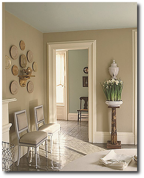
Martha Stewart has such a good eye for style and her impeccable taste shows in these photographs. Here she uses her own paint- Drabware on the walls. One of the highlights of this room is the Wedgwood china on the wall. Do you see how well they match with the wall color? You have to wonder if the entire room was decided with those few pieces? The china is a few shades darker than the wall color. The Swedish check is chosen for the chairs, again matching perfectly with the wall color. The white in the check pattern gives depth to these chairs.
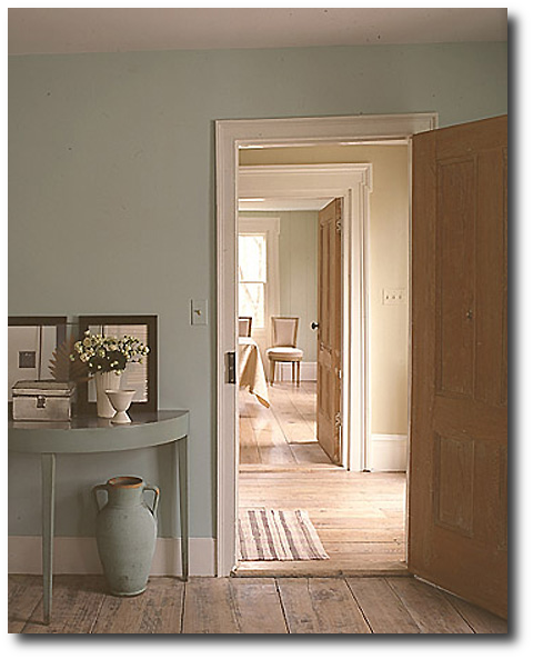
In the next room, the perfect shade of blue is used on the walls in a saturated shade. Look how blue is chosen for the ceilings instead of white. The floors are painted a darker hue than the walls.
These series of photographs has remained some of my all time favorite photographs out of the thousands I have looked at and compiled for our many blogs.
 Swedish Gustavian Decorating Ideas From Martha Stewart
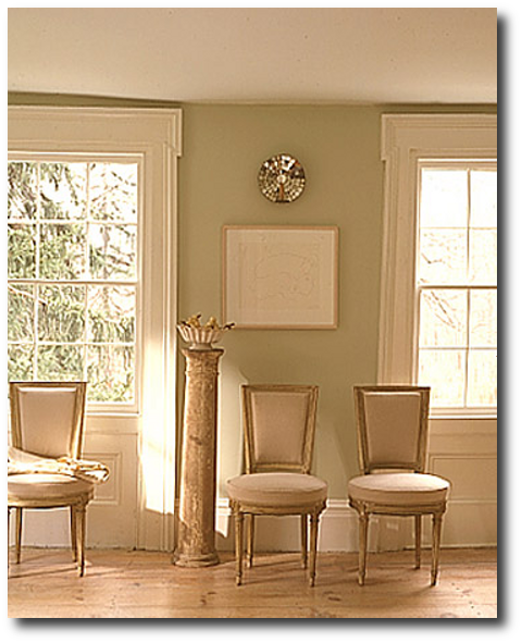
Again, another perfect example of classic Swedish style. Orange has to be one of my favorite colors, and here you can see how that hue comes alive in this room. The doors are stripped back so you can appreciate their details and patina.
In the past I have taken all natural wood (or faux painted) and painted an entire piece with plain light gray paint. After letting the piece dry for 5 to 7 minutes I have washed with a hose (for bigger furniture) or running water (for smaller pieces) to reveal a more distressed look than pickling or white washing. The overall effect leaves a very rustic painted appearance than your typical clean look of white washing.
Here, the floors are bare and rustic which is a classic Gustavian must have. One of the best features in this room is the demilune tapered leg console table. Look how the paint shade is within the same color family as the wall except darker?
 Swedish Gustavian Decorating Ideas From Martha Stewart
Here you see in the picture above extremely elegant neoclassical chairs. The right period style can really make a room look distinctively Swedish. This room is very simple yet the architectural features are incredibly ornate.